Re-Identify Fibroblast-Related Cell Cluster through Imaging-Based SRT Data

1. Description of the Figure
I used similar dimensionality reduction techniques and differential gene expression analysis on the imaging-based pikachu dataset.
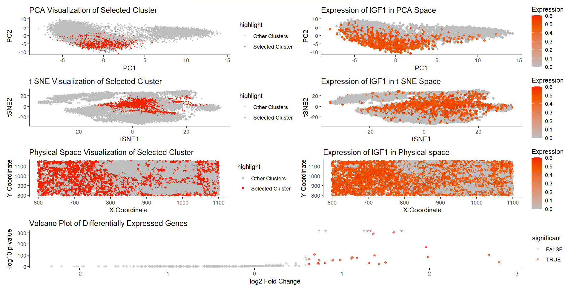
The figure consists of 7 plots. K-means clustering is performed with k=8, and cluster 8 is chosen as the cluster of interest (will highlight IGF1 expression).
Row 1: Both figures on this row utilize PCA. The figure on the left visualizes the cluster in the reduced PCA space (first 2 PCs), and the selected cluster is highlighted in red dots. We could see that the selected cluster is relatively localized and separated from other clusters. The figure on the right visualizes IGF1 gene expression in the PCA space (with color saturation encoding expression level), and we could also see relatively high expression in the cluster of interest.
Row 2: Both figures on this row utilize tSNE, and are figures that support PCA results. The figure on the left visualizes the cluster in tSNE space (tSNE1 and 2), and the selected cluster is highlighted in red dots. Again, we could observe the localization of the cluster, and relative separation from other clusters. The figure on the right visualizes IGF1 gene expression in the tSNE space (with color saturation encoding expression level), and we could see relatively high expression in the cluster of interest.
Row 3: Both figures on this row relate to the physical space. The figure on the left visualizes the cluster in the physical space (x and y coordinates). The figure on the right visualizes the expression of IGF1 in physical space (with color saturation encoding expression level). There is no strong conclusion that could be drawn from the physical space plots, but we could see a general trend that match between two plots (highlighted cluster or gene tend to be on the left half of the plot).
Row 4: A volcano plot is provided to visualize results from differential gene expression analysis, with significantly expressed genes highlighted.
Due to pikachu dataset limitations, I choose to analyze IGF1, which is also a top gene from differential analysis in eevee dataset (relates to fibroblasts). The plots I generated from the pikachu dataset proves that the presence of IGF1 is significant in highlighted cluster, which means fibroblast related cell cluster still exists in the imaging-based SRT dataset.
2. Changes from Eevee Data Analysis
I previously used k-mean clustering with 8 clusters in the eevee dataset, with cluster 2 as the selected cluster. In the pikachu dataset, 8 distinct clusters are still used in k-means clustering, as the elbow rule signals 8 clusters as one of the optimal ones. Cluster 8 is choosed in the pikachu dataset, which is different from eevee, but that is based on random centroid initialization in the k-means algorithm.
A normalization and log-transformation have been applied on the dataset before processing to ensure a better representation of expression data. Also, as pikachu dataset only has ~300 genes, no filtering of genes is needed as a part of data pre-processing.
According to previous feedback, a volcano plot is created for visualization of differential gene expression analysis. Differentially expressed genes are highlighted with red.
Finally, due to limitations of pikachu dataset (only 300 genes), many of the genes I found in the eevee dataset are not represented within the pikachu dataset. As opposed to analyzing AEBP1 (in eevee), I choose to analyze IGF1, which is also highly related to fibroblasts (and differentially expressed in the cluster of interest in the eevee dataset).
3. Code (paste your code in between the ``` symbols)
1
2
3
4
5
6
7
8
9
10
11
12
13
14
15
16
17
18
19
20
21
22
23
24
25
26
27
28
29
30
31
32
33
34
35
36
37
38
39
40
41
42
43
44
45
46
47
48
49
50
51
52
53
54
55
56
57
58
59
60
61
62
63
64
65
66
67
68
69
70
71
72
73
74
75
76
77
78
79
80
81
82
83
84
85
86
87
88
89
90
91
92
93
94
95
96
97
98
99
100
101
102
103
104
105
106
107
108
109
110
111
112
113
114
## PRE-PROCESSING
library(ggplot2)
library(Rtsne)
library(patchwork)
set.seed(1)
file <- 'D:/Spring 2025/GDV/genomic-data-visualization-2025/data/pikachu.csv.gz'
data <- read.csv(file)
# extract gene expression data
pos <- data[, 5:6]
rownames(pos) <- data$cell_id
gexp <- data[, 7:ncol(data)]
rownames(gexp) <- data$barcode

norm <- gexp / rowSums(gexp) * 10000
loggexp <- log10(norm + 1)
gexpsub <- loggexp

## FIGURE 1: Cluster of interest in reduced PCA space
pcs <- prcomp(gexpsub, center = TRUE, scale. = TRUE) # PCA
com <- kmeans(gexpsub, centers = 8) # kmeans on the first 30 PCs
clusters <- as.factor(com$cluster) # convert to categorical var
names(clusters) <- rownames(gexpsub)
# select cluster of interest
selected_cluster <- 8
selected_cells <- names(clusters)[clusters == selected_cluster]

df <- data.frame(PC1 = pcs$x[, 1], PC2 = pcs$x[, 2], cluster = clusters) # create df for visualization
df$highlight <- ifelse(df$cluster == selected_cluster, "Selected Cluster", "Other Clusters")
g1 <- ggplot(df, aes(x = PC1, y = PC2, col = highlight)) +
  geom_point(size = 0.5) +
  scale_color_manual(values = c("Selected Cluster" = "red", "Other Clusters" = "gray")) +
  theme_classic() +
  labs(title = "PCA Visualization of Selected Cluster", x = "PC1", y = "PC2")

## FIGURE 2: Cluster of interest in tSNE space (similar to Figure 1)
emb <- Rtsne(gexpsub)
df_tsne <- data.frame(tSNE1 = emb$Y[, 1], tSNE2 = emb$Y[, 2], cluster = clusters)
df_tsne$highlight <- ifelse(df_tsne$cluster == selected_cluster, "Selected Cluster", "Other Clusters")
g2 <- ggplot(df_tsne, aes(x = tSNE1, y = tSNE2, col = highlight)) +
  geom_point(size = 0.5) +
  scale_color_manual(values = c("Selected Cluster" = "red", "Other Clusters" = "gray")) +
  theme_classic() +
  labs(title = "t-SNE Visualization of Selected Cluster", x = "tSNE1", y = "tSNE2")

## FIGURE 3: Cluster of interest in physical space
# create a new df to store information
df_physical <- data.frame(x = data$aligned_x, y = data$aligned_y, cluster = clusters)
df_physical$highlight <- ifelse(df_physical$cluster == selected_cluster, "Selected Cluster", "Other Clusters")
g3 <- ggplot(df_physical, aes(x = x, y = y, col = highlight)) +
  geom_point(size = 1.5) +
  scale_color_manual(values = c("Selected Cluster" = "red", "Other Clusters" = "gray")) +
  theme_classic() +
  labs(title = "Physical Space Visualization of Selected Cluster", x = "X Coordinate", y = "Y Coordinate")

## FIGURE 4: Differentially expressed genes for cluster of interest, using volcano plot
# compute mean expression
cellsOfInterest <- names(clusters)[clusters == selected_cluster]
otherCells <- names(clusters)[clusters != selected_cluster]
SumCluster1Cell <- colSums(norm[cellsOfInterest,]) / length(cellsOfInterest)
SumOtherClustersCell <- colSums(norm[otherCells,]) / length(otherCells)
# compute log2 fold change
log_2FC <- log2((SumCluster1Cell + 1) / (SumOtherClustersCell + 1))
# t-test
pvals <- sapply(1:ncol(norm), function(i) {
  t.test(norm[cellsOfInterest, i], norm[otherCells, i], alternative = "greater")$p.value
})
# store results
df_volcano <- data.frame(gene = colnames(norm), logFC = log_2FC, pval = pvals)
# define significance threshold: p-value < 0.05 and |log2FC| > 0.6
df_volcano$significant <- df_volcano$pval < 0.05 & abs(df_volcano$logFC) > 0.6
# plot
g4 <- ggplot(df_volcano, aes(x = logFC, y = -log10(pval), col = significant)) +
  geom_point(alpha = 0.5) +
  scale_color_manual(values = c("TRUE" = "red", "FALSE" = "gray")) +
  theme_classic() +
  labs(title = "Volcano Plot of Differentially Expressed Genes",
       x = "log2 Fold Change",
       y = "-log10 p-value")

## FIGURE 5: selected gene in reduced PCA Space
selected_gene <- "IGF1" # most differentially expressed, EDITED
df$gene_expression <- gexpsub[, selected_gene]
# plot, using log-transformed expression data
g5 <- ggplot(df, aes(x = PC1, y = PC2, col = log10(gene_expression + 1))) +
  geom_point(size = 1.5) +
  scale_color_gradient(low = "gray", high = "red") +
  theme_classic() +
  labs(title = paste("Expression of", selected_gene, "in PCA Space"), x = "PC1", y = "PC2", col = "Expression")

## FIGURE 6: selected gene in reduced tSNE space
df_tsne$gene_expression <- gexpsub[, selected_gene]
g6 <- ggplot(df_tsne, aes(x = tSNE1, y = tSNE2, col = log10(gene_expression + 1))) +
  geom_point(size = 1.5) +
  scale_color_gradient(low = "gray", high = "red") +
  theme_classic() +
  labs(title = paste("Expression of", selected_gene, "in t-SNE Space"), x = "tSNE1", y = "tSNE2", col = "Expression")

## FIGURE 7: selected gene in physical space
df_physical$gene_expression <- gexpsub[, selected_gene]
g7 <- ggplot(df_physical, aes(x = x, y = y, col = log10(gene_expression + 1))) +
  geom_point(size = 1.5) +
  scale_color_gradient(low = "gray", high = "red") +
  theme_classic() +
  labs(title = paste("Expression of", selected_gene, "in Physical space"), x = "X Coordinate", y = "Y Coordinate", col = "Expression")

## FINAL ASSEMBLY
final_plot <- (g1 + g5) / (g2 + g6) / (g3 + g7) / g4
final_plot

## REFERENCES
# Prof Fan's code for processing pikachu dataset in class
# https://www.rdocumentation.org/packages/base/versions/3.6.2/topics/ifelse
# https://www.datacamp.com/tutorial/sorting-in-r
# https://ggplot2.tidyverse.org/reference/geom_bar.html