Reanlaysis of another dataset

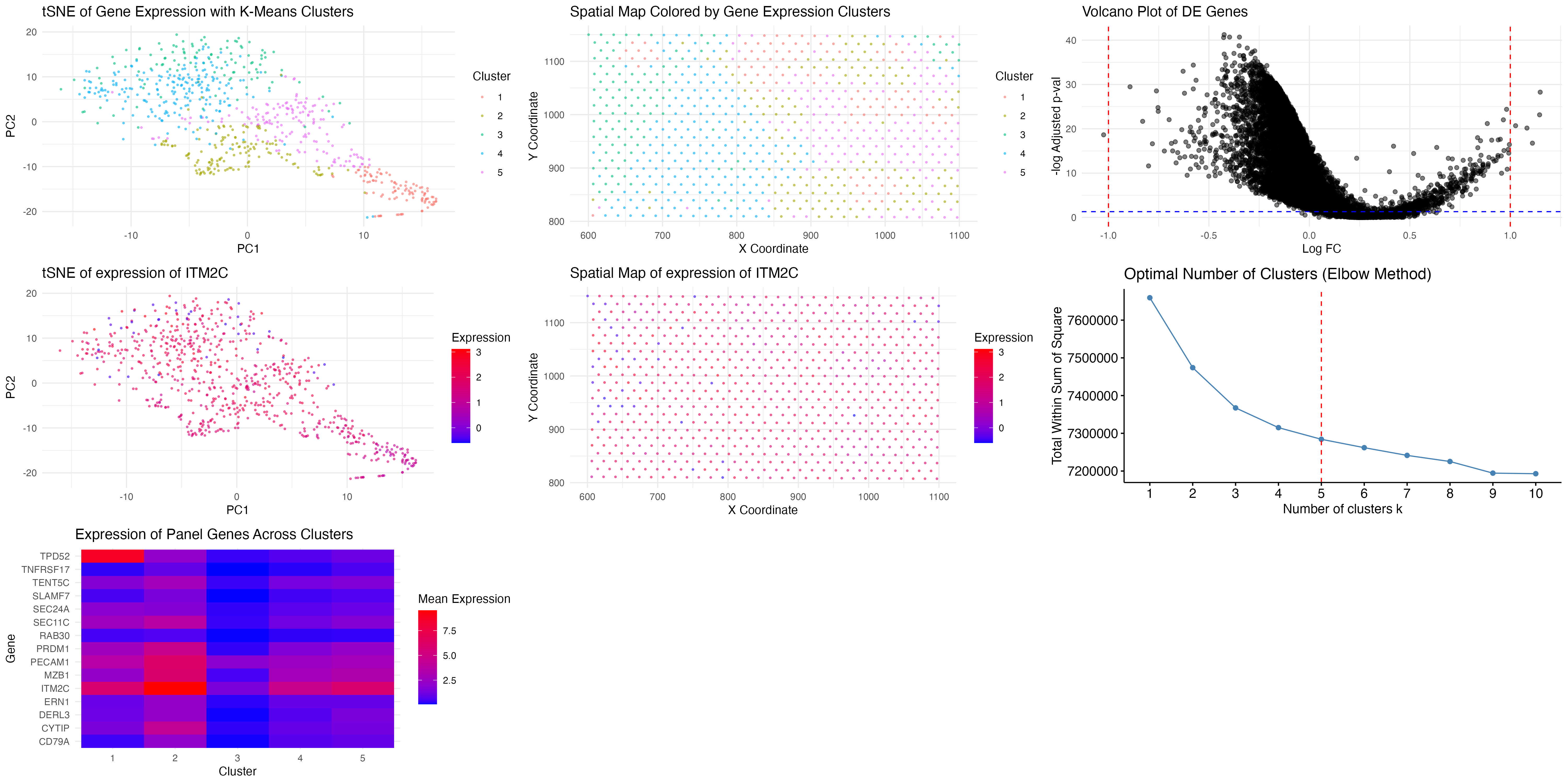
We previously performed k-means clustering with k=8, assuming that a higher number of clusters would better capture transcriptional heterogeneity. However, after applying the elbow method, we found that the optimal k was 5, as indicated by the inflection point in the total within-cluster sum of squares. This suggests that the dataset contains fewer transcriptionally distinct clusters than initially assumed. We suspect this is due to having less transcriptional granularity compared to single-cell resolution datasets.
Additionally, we ploted the mean expression heatmap from top 10 DE genes from previously identified cluster. It shows that the same panel of genes is now enriched in a specific subset of clusters, particularly cluster 2. Notably, TPD52 and ITM2C are still highly expressed, and genes such as MZB1, SEC11C, and PRDM1 exhibit similar cluster specificity as in the previous clustering attempt. This strongly indicates that we have recaptured the same biological cell type, but now with a more refined clustering approach that reduces redundancy and noise.
1
2
3
4
5
6
7
8
9
10
11
12
13
14
15
16
17
18
19
20
21
22
23
24
25
26
27
28
29
30
31
32
33
34
35
36
37
38
39
40
41
42
43
44
45
46
47
48
49
50
51
52
53
54
55
56
57
58
59
60
61
62
63
64
65
66
67
68
69
70
71
72
73
74
75
76
77
78
79
80
81
82
83
84
85
86
87
88
89
90
91
92
93
94
95
96
97
98
99
100
101
102
103
104
105
106
107
108
109
library(ggplot2)
library(ggpubr)
library(dplyr)
library(cluster)
library(scales)
library(Rtsne)
library(factoextra)
library(tidyverse)

file <- "/Users/sky2333/Downloads/genomic-data-visualization-2025/data/eevee.csv"
data <- read.csv(file)

gene_expr <- data[, 5:ncol(data)]
sample_names <- rownames(gene_expr)
gene_names <- colnames(gene_expr)

gene_expr <- t(apply(log1p(gene_expr / rowSums(gene_expr) * 1e6), 1, scale))
rownames(gene_expr) <- sample_names
colnames(gene_expr) <- gene_names

set.seed(222)
elbow_plot <- fviz_nbclust(gene_expr, kmeans, method = "wss") +
  geom_vline(xintercept = 5, linetype = "dashed", color = "red") +
  labs(title = "Optimal Number of Clusters (Elbow Method)")

#pca_result <- prcomp(gene_expr, center = TRUE, scale. = TRUE)
pca_result <- Rtsne(gene_expr, perplexity = 30, theta = 0.5, dims = 2, pca = TRUE, verbose = TRUE)

data$PC1 <- pca_result$Y[, 1]
data$PC2 <- pca_result$Y[, 2]

k <- 5
kmean_result <- kmeans(gene_expr, centers = k, nstart = 25)

data$Cluster <- as.factor(kmean_result$cluster)

# Identify which cluster best represent this gene pannel
panel_genes <- c("ITM2C", "MZB1", "SEC11C", "SLAMF7", "TENT5C",
                 "TPD52", "CD79A", "PRDM1", "ERN1", "SEC24A",
                 "DERL3", "CYTIP", "TNFRSF17", "PECAM1", "RAB30")

cluster_means <- data %>%
  group_by(Cluster) %>%
  summarise(across(all_of(panel_genes), mean))

cluster_means_long <- cluster_means %>%
  pivot_longer(-Cluster, names_to = "Gene", values_to = "Mean_Expression")

cluster_expression_plot <- ggplot(cluster_means_long, aes(x = Cluster, y = Gene, fill = Mean_Expression)) +
  geom_tile() +
  scale_fill_gradient(low = "blue", high = "red") +
  labs(title = "Expression of Panel Genes Across Clusters", fill = "Mean Expression") +
  theme_minimal()

pca_plot <- ggplot(data, aes(x = PC1, y = PC2, color = Cluster)) +
    geom_point(alpha = 0.5, size = 0.5) +
    scale_color_manual(values = hue_pal()(k)) +
    labs(title = "tSNE of Gene Expression with K-Means Clusters", x = "PC1", y = "PC2", color = "Cluster") +
    theme_minimal()

spatial_plot <- ggplot(data, aes(x = aligned_x, y = aligned_y, color = Cluster)) +
    geom_point(alpha = 0.5, size = 0.5) +
    scale_color_manual(values = hue_pal()(k)) +
    labs(title = "Spatial Map Colored by Gene Expression Clusters", x = "X Coordinate", y = "Y Coordinate", color = "Cluster") +
    theme_minimal()
cluster_interest <- "2"
genes_pvals <- sapply(gene_names, function(gene) {
    wilcox.test(
        gene_expr[data$Cluster == cluster_interest, gene],
        gene_expr[data$Cluster != cluster_interest, gene]
    )$p.value
})

genes_pvals_adj <- p.adjust(genes_pvals, method = "fdr")

logFC <- apply(gene_expr, 2, function(gene) {
    mean(gene[data$Cluster == cluster_interest]) - mean(gene[data$Cluster != cluster_interest])
})

de_genes <- data.frame(Gene = gene_names, p_value = genes_pvals, adj_p_value = genes_pvals_adj, logFC = logFC)

volcano_plot <- ggplot(de_genes, aes(x = logFC, y = -log10(adj_p_value))) +
    geom_point(alpha = 0.5) +
    geom_vline(xintercept = c(-1, 1), linetype = "dashed", color = "red") +
    geom_hline(yintercept = -log10(0.05), linetype = "dashed", color = "blue") +
    theme_minimal() +
    labs(title = "Volcano Plot of DE Genes", x = "Log FC", y = "-log Adjusted p-val")
top_genes <- arrange(filter(de_genes, adj_p_value < 0.05 & abs(logFC) > 1), adj_p_value)
selected_gene <- top_genes$Gene[1]
selected_gene <- "ITM2C"

pca_gene_plot <- ggplot(data, aes(x = PC1, y = PC2, color = gene_expr[, selected_gene])) +
    geom_point(alpha = 0.5, size = 0.5) +
    scale_color_gradient(low = "blue", high = "red") +
    labs(title = paste("tSNE of expression of", selected_gene), x = "PC1", y = "PC2", color = "Expression") +
    theme_minimal()

spatial_gene_plot <- ggplot(data, aes(x = aligned_x, y = aligned_y, color = gene_expr[, selected_gene])) +
    geom_point(alpha = 0.5, size = 0.5) +
    scale_color_gradient(low = "blue", high = "red") +
    labs(title = paste("Spatial Map of expression of", selected_gene), x = "X Coordinate", y = "Y Coordinate", color = "Expression") +
    theme_minimal()

final_plot <- ggarrange(
    pca_plot, spatial_plot, volcano_plot, pca_gene_plot, spatial_gene_plot, elbow_plot, cluster_expression_plot,
    ncol = 3, nrow = 3,
    width = 40, height = 40
)
ggsave("hw4.jpeg", final_plot, width = 20, height = 10, dpi = 300)