Switching to the Eevee Dataset! (and Identifying Differentially Expressed Genes to Annotate a Specific Cell Type)

This homework was very similar to HW3, but involved a switch from the Pikachu dataset (imaging-based spatial transcriptomics) to the Eevee dataset (sequencing-based spatial transcriptomics).
Write a description of what you changed and why you think you had to change it.
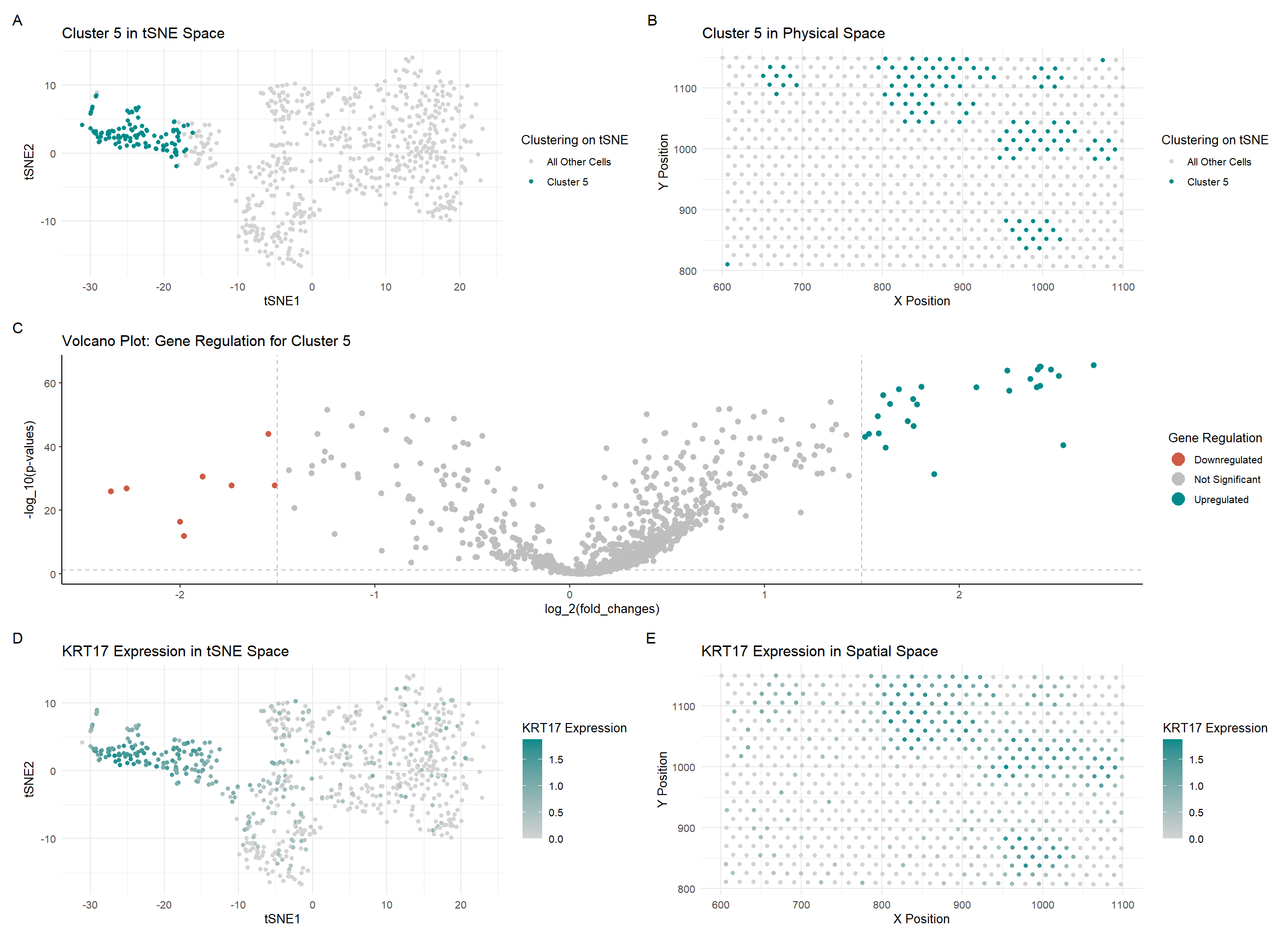
In my code, I changed a lot of the colors used in my graphs to maintain consistency and make the relationship between the graphs more salient. I also changed the visualization of the last two graphs (D and E) to show an upregulated gene in this new cluster rather than the gene which was visualized in the previous HW. I also changed some code when creating the gexp matrix in the Eevee dataset by filtering in the spot and gene data. I only used the top 1000 genes instead of the ~17000 genes which were captured by the Eevee dataset. I also noticed that there was a difference in the number of upregulated and downregulated genes when determining them using the previous bounds on the logfc values, so I decreased them from +/- 2 to +/- 1.5 to include more genes which were upregulated and downregulated.
Write a description to convince me that your cluster interpretation is correct. Your description may reference papers and content that allowed you to interpret your cell cluster as a particular cell-type. You must provide attribution to external resources referenced. Links are fine; formatted references are not required.
Although the cluster is spatially very similar to the cluster I picked in HW3, the cell type I determined was not the same as the one I found last time. I learned how to use The Human Protein Atlas a bit better, and by comparing the gene expression values in breast tissue for the top 5 upregulated genes (KRT17 [1], CD24 [2], TACSTD2 [3], KRT19 [4], S100A14 [5]). I saw that expression of those genes was quite high in both Breast Glandular Cells and relatively high in Brest Myoepithelial Cells. However, since the most upregulated gene was KRT17, which was the highest expressed in Breast Myoepithelial Cells, I decided that this cluster consisted primarily of Breast Myoepithelial Cells.
Relevant Links:
[1] https://www.proteinatlas.org/ENSG00000128422-KRT17/single+cell/breast [2] https://www.proteinatlas.org/ENSG00000272398-CD24/single+cell/breast [3] https://www.proteinatlas.org/ENSG00000184292-TACSTD2/single+cell/breast [4] https://www.proteinatlas.org/ENSG00000171345-KRT19/single+cell/breast [5] https://www.proteinatlas.org/ENSG00000189334-S100A14/single+cell/breast
Code
### Ayan Vaishnav
### Genomic Data Visualization 2025
### Homework Assignment 4
##### EEVEE!

## Source for most of the initial code: Ayan's HW3 +
## some of Dr. Fan's code with how to manipulate the Eevee dataset

## Let's load the libraries
library(ggplot2)
library(patchwork)
library(tidyverse)
library(Rtsne)

set.seed(6)

## Loading the Pikachu (imaging) dataset
file <- "C:/Users/Ayan PC/Desktop/genomic-data-visualization-2025/data/eevee.csv.gz"
data <- read.csv(file)
head(data)
names(data)


## Making a matrix with only cells vs. genes (removing position/area data)
pos <- data[, 3:4]
rownames(pos) <- data$barcode
gexp <- data[, 5:ncol(data)]
rownames(gexp) <- data$barcode
gexp[1:10,1:10] # columns are genes, rows are cells
dim(gexp) # 709 rows (spots), 18085 columns (genes)


## Take the first few
topgenes <- names(sort(colSums(gexp), decreasing=TRUE)[1:1000])
gexp <- gexp[, topgenes]


## Normalize + log transform data
gexp_norm <- gexp / rowSums(gexp) # normalize!
gexp_norm <- gexp_norm * 10000
gexp_norm <- log10(gexp_norm + 1) # transform!
# gexp_scaled <- scale(gexp_norm)
# ?scale
# head(gexp_scaled)


## Dimensionality reduction - both PCA and tSNE
pca <- prcomp(gexp_norm)
set.seed(123123)
emb <- Rtsne(gexp_norm)


## Getting the names
names(pca)
names(emb)


## Cluster on PCA, but plot on tSNE
pca_kmeaned <- kmeans(pca$x, centers=6)
pca_clusters <- as.factor(pca_kmeaned$cluster)
names(pca_clusters) <- rownames(gexp)


## Let's visualize these clusters (tSNE now)

tsne_df <- data.frame(emb$Y, pca_clusters, pos)

ggplot(tsne_df, aes(x=X1, y=X2, col=pca_clusters)) + geom_point()

ggplot(tsne_df, aes(x=aligned_x, y=aligned_y, col=pca_clusters)) + geom_point()


## Let's visualize Cluster 5 in tSNE space

g1 <- ggplot(tsne_df, aes(x=X1, y=X2, col = ifelse(pca_clusters == 5, "Cluster 5", "All Other Cells"))) +
  labs(col = "Clustering on tSNE",  x = "tSNE1", y = "tSNE2", title = "Cluster 5 in tSNE Space") +
  scale_color_manual(values = c("Cluster 5" = "cyan4", "All Other Cells" = "lightgray")) +
  theme_minimal() +
  geom_point()

g1

## Let's visualize Cluster 5 in physical space

g2 <- ggplot(tsne_df, aes(x=aligned_x, y=aligned_y, col = ifelse(pca_clusters == 5, "Cluster 5", "All Other Cells"))) +
  labs(col = "Clustering on tSNE",  x = "X Position", y = "Y Position", title = "Cluster 5 in Physical Space") +
  scale_color_manual(values = c("Cluster 5" = "cyan4", "All Other Cells" = "lightgray")) +
  theme_minimal() +
  geom_point()

g2

### Differential Gene Expression

## Wilcox test for PCA clusters
# For this code, I referred to my code from my Intersession 2025 course,
# Introduction to Spatial Omics Data Analysis taught by GDV2024 TA Rafael Peixoto

volcano_data = list()
num_clusters <- 6
num_genes = ncol(gexp_norm)

for (i in 1:num_clusters) {
  pvals = numeric(num_genes)
  fold_changes = numeric(num_genes)

  curr_cluster <- gexp_norm[pca_clusters == i, ]
  other_clusters <- gexp_norm[pca_clusters != i, ]

  for (j in 1:num_genes) {
    fold_change <- mean(curr_cluster[, j]) / mean(other_clusters[, j])
    fold_changes[j] <- fold_change

    pval <- wilcox.test(curr_cluster[, j], other_clusters[, j])$p.value
    pvals[j] <- pval
  }

  volcano_data[[i]] <- data.frame(fold_changes = fold_changes, pvalues = pvals)
}

saveRDS(volcano_data, "HW4_volcano.RDS")


## CLUSTER 5

summary(volcano_data[[5]])

rownames(volcano_data[[5]]) <- colnames(gexp)

head(volcano_data[[5]])

head(rownames(volcano_data[[5]])[order(volcano_data[[5]]$pvalues)], 5)
## KRT17, CD24, TACSTD2, KRT19, S100A14


## Volcano Plot

library(ggrepel)

df <- data.frame(
  pv = -log10(volcano_data[[5]]$pvalues + 1e-100),
  logfc = log2(volcano_data[[5]]$fold_changes),
  genes = colnames(gexp)
)

df$delabel <- ifelse(df$logfc > 3, df$genes, NA)
df$delabel <- ifelse(df$logfc < -3, df$genes, df$delabel)

df$diffexpressed <- ifelse(df$logfc > 1.5, "Upregulated", "Not Significant")
df$diffexpressed <- ifelse(df$logfc < -1.5, "Downregulated", df$diffexpressed)

# Select top 5 genes for labeling based on p-value
top_genes <- df[order(df$pv, decreasing = TRUE), ][1:5, ]
head(top_genes)

g3 <- ggplot(df, aes(x = logfc, y = pv, label = delabel, color = diffexpressed)) +
  geom_point(size = 2) +
  geom_vline(xintercept = c(-1.5, 1.5), col = "gray", linetype = 'dashed') +
  geom_hline(yintercept = -log10(0.05), col = "gray", linetype = 'dashed') +
  scale_color_manual(values = c("Downregulated" = "coral3", "Not Significant" = "grey", "Upregulated" = "cyan4"),
                     labels = c("Downregulated", "Not Significant", "Upregulated")) +
  theme_classic() +
  labs(color = 'Gene Regulation',
       x = expression("log_2(fold_changes)"),
       y = expression("-log_10(p-values)"),
       title = "Volcano Plot: Gene Regulation for Cluster 5") +
  geom_text_repel(aes(label = delabel),
                  box.padding = 0.35, point.padding = 0.5, segment.color = 'grey50',
                  max.overlaps = getOption("ggrepel.max.overlaps", default = 60)) +
  scale_x_continuous(breaks = seq(-5, 5, 1)) +
  guides(size = "none", color = guide_legend(override.aes = list(size = 5)))

g3

## Let's visualize KRT17 (a very upregulated DEG) in tSNE space

specific_gene_df <- data.frame(emb$Y, pca_clusters, gene = gexp_norm[, "KRT17"], pos)

g4 <- ggplot(specific_gene_df, aes(x=X1, y=X2, col=gene)) +
  geom_point() +
  scale_color_gradient(low='lightgray', high='cyan4') +
  labs(color = "KRT17 Expression", x = "tSNE1", y = "tSNE2", title = "KRT17 Expression in tSNE Space") +
  theme_minimal()

g4

g5 <- ggplot(specific_gene_df, aes(x=aligned_x, y=aligned_y, col=gene)) +
  geom_point() +
  scale_color_gradient(low='lightgray', high='cyan4') +
  labs(color = "KRT17 Expression", x = "X Position", y = "Y Position", title = "KRT17 Expression in Spatial Space") +
  theme_minimal()

g5

(g1 + g2) / (g3) / (g4 + g5) + plot_annotation(tag_levels = 'A')