Multi-dimensional Analysis of HER2+ Cells: Spatial Distribution and Gene Expression Patterns

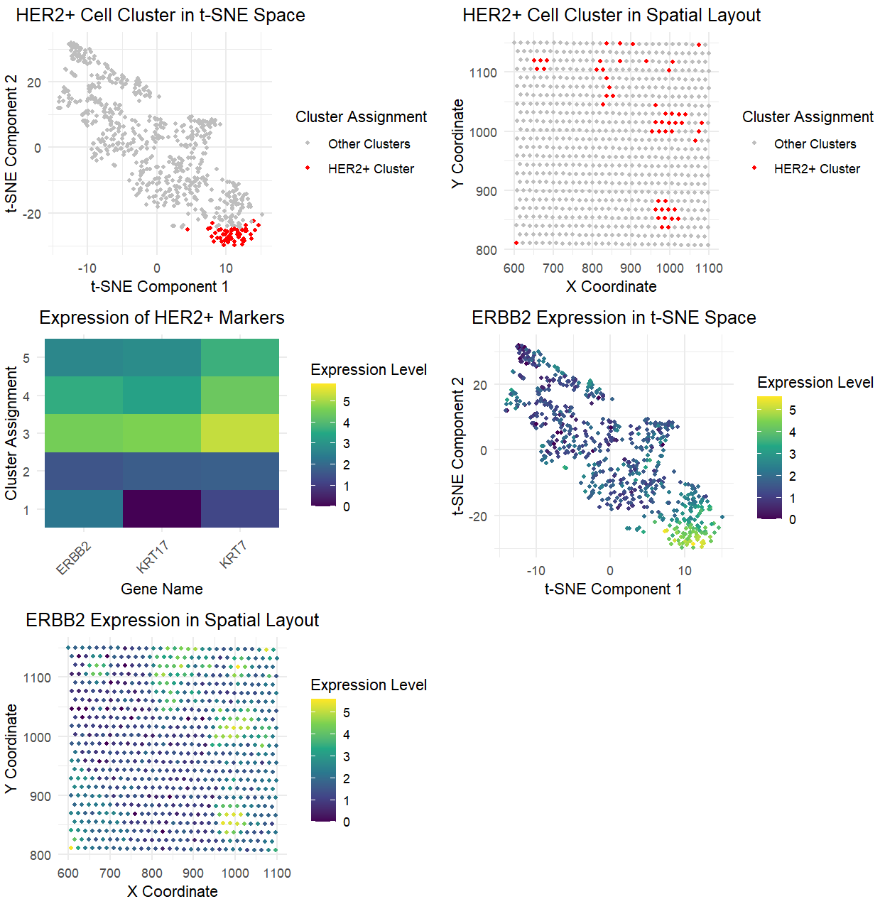
In analyzing both the Pikachu and Eevee datasets, I successfully identified similar cell populations while making several key adjustments to account for the different data types. The most significant change was in the gene selection approach. While the Pikachu analysis used the top 100 most variable genes selected agnostically, the Eevee analysis specifically focused on known HER2+ epithelial markers (ERBB2, KRT7, KRT17). This change was necessary because the spot-based nature of the Eevee dataset provides lower resolution, making it more reliable to use known markers rather than an unbiased approach with the other top 100 variable genes.
The data processing pipeline underwent several refinements for the Eevee dataset. I implemented more robust handling of zero values in the normalization step, added zero-variance column removal, and switched to using log1p instead of log10 which was done for a more stable log transformation. I also added specific checks for data dimension wchich was done to ensure the integrity of the analysis. Despite these technical changes, both analyses maintained k=5 clusters, though the Eevee analysis utilized PCA-reduced dimensions (top 50 PCs) for clustering instead of directly using the log-transformed expression matrix. I also added specific identification of the HER2+ cluster based on ERBB2 expression levels.
While the basic visualization framework remained similar between the two analyses, I adapted it to focus on HER2+ marker genes in the Eevee dataset rather than differentially expressed genes. The evidence suggests successful identification of the same cell type (HER2+ cells) in both datasets, supported by similar spatial layout patterns, similar patterns in marker gene expression levels that match expected profiles for HER2+ cells, and successful separation of these cells into distinct populations in both datasets.
I used my code from homework 3, class activities, and ChatGPT to implement my code, aggregate all the graphs to show the five panels in my final post, and format my graphs.
1
2
3
4
5
6
7
8
9
10
11
12
13
14
15
16
17
18
19
20
21
22
23
24
25
26
27
28
29
30
31
32
33
34
35
36
37
38
39
40
41
42
43
44
45
46
47
48
49
50
51
52
53
54
55
56
57
58
59
60
61
62
63
64
65
66
67
68
69
70
71
72
73
74
75
76
77
78
79
80
81
82
83
84
85
86
87
88
89
90
91
92
93
94
95
96
97
98
99
100
101
102
103
104
105
106
107
108
109
110
111
112
113
114
115
116
117
118
119
120
121
122
123
124
125
126
127
128
129
130
131
132
133
134
135
136
137
138
139
140
141
142
143
144
145
146
147
148
149
150
151
152
153
# Load required libraries
library(ggplot2)
library(Rtsne)
library(gridExtra)
library(dplyr)
library(tidyr)

# Load Eevee data
file <- 'C:/Users/reach/OneDrive/Documents/2024-25/SPRING/Genomic Data Visualization/genomic-data-visualization-2025/data/eevee.csv.gz'
data <- read.csv(file)

# Separate position and expression data
pos <- data[, 3:4]
rownames(pos) <- data$cell_id
gexp <- data[, 7:ncol(data)]
rownames(gexp) <- data$barcode

# Focus on known HER2+ epithelial markers
target_genes <- c("ERBB2", "KRT7", "KRT17")

# Check if all target genes are present
present_genes <- target_genes[target_genes %in% colnames(gexp)]
print("Available marker genes:")
print(present_genes)

# Normalize counts (avoiding division by zero)
colsums <- colSums(gexp)
colsums[colsums == 0] <- 1
norm_gexp <- t(t(gexp)/colsums * 10000)

# Log transform with pseudocount
loggexp <- log1p(norm_gexp)

# Scale the data
scaled_gexp <- scale(loggexp)
scaled_gexp[is.na(scaled_gexp)] <- 0

# Remove zero-variance columns
var_cols <- apply(scaled_gexp, 2, var)
nonzero_var_cols <- which(var_cols > 0)
if(length(nonzero_var_cols) < ncol(scaled_gexp)) {
  print(paste("Removed", ncol(scaled_gexp) - length(nonzero_var_cols), "zero-variance columns"))
  scaled_gexp <- scaled_gexp[, nonzero_var_cols]
}

# Perform PCA
pcs <- prcomp(scaled_gexp)

# Determine number of PCs to use (minimum of 50 or max available)
n_pcs <- min(50, ncol(pcs$x))
print(paste("Using", n_pcs, "principal components"))

# Perform clustering
set.seed(42)
k <- 5
clustering_data <- pcs$x[,1:n_pcs]
com <- kmeans(clustering_data, centers=k)
clusters <- as.factor(com$cluster)

# Verify dimensions match
print(paste("Number of clusters:", length(clusters)))
print(paste("Number of rows in expression data:", nrow(loggexp)))
print(paste("Number of rows in position data:", nrow(pos)))

# Identify HER2+ cluster
cluster_erbb2_means <- tapply(loggexp[, "ERBB2"], clusters, mean)
her2_cluster <- which.max(cluster_erbb2_means)

# Perform t-SNE
set.seed(42)
tsne_result <- Rtsne(pcs$x[,1:n_pcs],
                     perplexity=30,
                     max_iter=1000,
                     check_duplicates=FALSE)
tsne_coords <- tsne_result$Y

# Create visualizations
p1 <- ggplot(data.frame(tSNE1=tsne_coords[,1],
                        tSNE2=tsne_coords[,2],
                        Cluster=clusters),
             aes(x=tSNE1, y=tSNE2, color=Cluster == her2_cluster)) +
  geom_point(size=1) +
  scale_color_manual(values=c("grey", "red"),
                     labels=c("Other Clusters", "HER2+ Cluster")) +
  theme_minimal() +
  labs(title="HER2+ Cell Cluster in t-SNE Space",
       x="t-SNE Component 1",
       y="t-SNE Component 2",
       color="Cluster Assignment") +
  theme(plot.title = element_text(hjust = 0.5))

p2 <- ggplot(data.frame(x=pos[,1],
                        y=pos[,2],
                        Cluster=clusters),
             aes(x=x, y=y, color=Cluster == her2_cluster)) +
  geom_point(size=1) +
  scale_color_manual(values=c("grey", "red"),
                     labels=c("Other Clusters", "HER2+ Cluster")) +
  theme_minimal() +
  labs(title="HER2+ Cell Cluster in Spatial Layout",
       x="X Coordinate",
       y="Y Coordinate",
       color="Cluster Assignment") +
  theme(plot.title = element_text(hjust = 0.5))

# Create heatmap of marker genes
marker_data <- data.frame(
  Gene = rep(present_genes, each=nrow(loggexp)),
  Expression = as.vector(loggexp[, present_genes]),
  Cluster = rep(clusters, times=length(present_genes))
)

p3 <- ggplot(marker_data, aes(x=Gene, y=Cluster, fill=Expression)) +
  geom_tile() +
  scale_fill_viridis_c() +
  theme_minimal() +
  theme(axis.text.x=element_text(angle=45, hjust=1)) +
  labs(title="Expression of HER2+ Markers",
       x="Gene Name",
       y="Cluster Assignment",
       fill="Expression Level") +
  theme(plot.title = element_text(hjust = 0.5))

p4 <- ggplot(data.frame(tSNE1=tsne_coords[,1],
                        tSNE2=tsne_coords[,2],
                        Expression=loggexp[, "ERBB2"]),
             aes(x=tSNE1, y=tSNE2, color=Expression)) +
  geom_point(size=1) +
  scale_color_viridis_c() +
  theme_minimal() +
  labs(title="ERBB2 Expression in t-SNE Space",
       x="t-SNE Component 1",
       y="t-SNE Component 2",
       color="Expression Level") +
  theme(plot.title = element_text(hjust = 0.5))

p5 <- ggplot(data.frame(x=pos[,1],
                        y=pos[,2],
                        Expression=loggexp[, "ERBB2"]),
             aes(x=x, y=y, color=Expression)) +
  geom_point(size=1) +
  scale_color_viridis_c() +
  theme_minimal() +
  labs(title="ERBB2 Expression in Spatial Layout",
       x="X Coordinate",
       y="Y Coordinate",
       color="Expression Level") +
  theme(plot.title = element_text(hjust = 0.5))

# Arrange plots
final_plot <- grid.arrange(p1, p2, p3, p4, p5,
                           ncol=2,
                           widths=c(1.5, 1.5))