Identifying a Transcriptionally Similar Cell Type Across Datasets: Clustering and Differential Expression Analysis

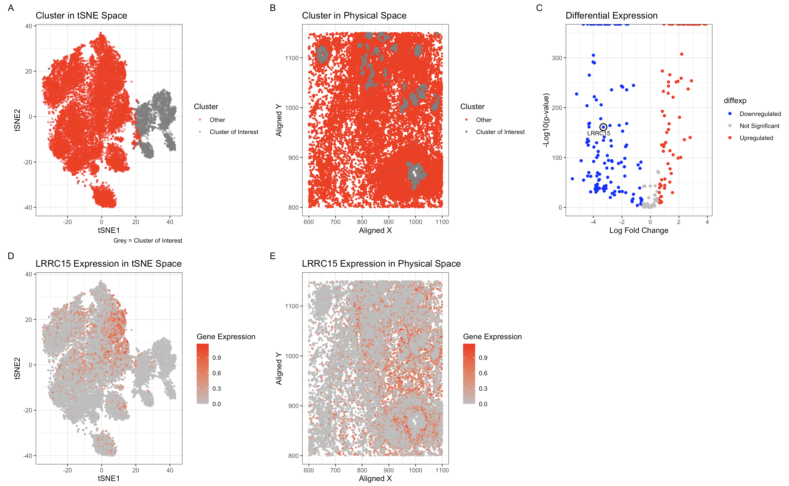
I previously performed k-means clustering with k=6 to identify distinct transcriptional clusters in the Eevee dataset. When analyzing the Pikachu dataset, I initially used the same approach but found that the cluster containing the LRRC15-downregulated cells was not well-separated. To better capture the transcriptional differences in this dataset, I recalculated the optimal number of clusters based on the total within-cluster sum of squares and found that k=5 was more appropriate. This adjustment likely reflects a lower number of transcriptionally distinct populations in the spot-based Pikachu dataset compared to the single-cell resolution Eevee dataset, where finer granularity allows for more subtle distinctions between cell types.
To confirm that I identified the same cell type in both datasets, I compared the cluster where LRRC15 is highly downregulated. In the Pikachu dataset, I identified a cluster where LRRC15 expression was the lowest. Ideally I would have been able to check for other marker genes but LRRC15 seemed to be the only common highly downregulated/upregulated marker across the datasets.
1
2
3
4
5
6
7
8
9
10
11
12
13
14
15
16
17
18
19
20
21
22
23
24
25
26
27
28
29
30
31
32
33
34
35
36
37
38
39
40
41
42
43
44
45
46
47
48
49
50
51
52
53
54
55
56
57
58
59
60
61
62
63
64
65
66
67
68
69
70
71
72
73
74
75
76
77
78
79
80
81
82
83
84
85
86
87
88
89
90
91
92
93
94
95
96
97
98
99
100
101
102
103
104
105
106
107
108
109
110
111
112
113
114
115
116
117
118
119
120
121
122
123
124
125
126
127
128
129
130
131
132
133
134
135
136
137
138
139
# Load necessary libraries
library(ggplot2)
library(patchwork)
library(Rtsne)
library(ggrepel)
library(dplyr)

# Load new dataset
file_new <- 'pikachu.csv.gz'  # Update with actual filename
data_new <- read.csv(file_new, row.names = 1)

# Extract position and gene expression data
pos_new <- data_new[, c("aligned_x", "aligned_y")]
gexp_new <- data_new[, 4:ncol(data_new)]

# Filter and normalize gene expression
gexpfilter_new <- gexp_new[, colSums(gexp_new) > 1000]
gexpnorm_new <- log10(gexpfilter_new / rowSums(gexpfilter_new) * mean(rowSums(gexpfilter_new)) + 1)

# Clustering using k-means
set.seed(40)
kmeans_result_new <- kmeans(gexpnorm_new, centers = 5)
clusters_new <- as.character(kmeans_result_new$cluster)

# Find the cluster where LRRC15 is most downregulated
lrrc15_expr <- gexpnorm_new[, "LRRC15"]
cluster_means <- tapply(lrrc15_expr, clusters_new, mean)
target_cluster <- names(which.min(cluster_means))  # Cluster with lowest LRRC15 expression

# Assign clusters
clusters_new[clusters_new != target_cluster] <- "Other"
clusters_new <- as.factor(clusters_new)

# PCA analysis
pcs_new <- prcomp(gexpnorm_new)

# t-SNE embedding
set.seed(40)
tsne_result_new <- Rtsne(pcs_new$x, perplexity = 30)
tsne_df_new <- data.frame(tsne_result_new$Y, clusters_new)
colnames(tsne_df_new) <- c("tSNE1", "tSNE2", "clusters")

# Panel A: Cluster visualization in t-SNE space
clusters_factor <- factor(clusters_new, levels = c("Cluster of Interest", "Other"))

# Use factor version in the tSNE space plot
p1 <- ggplot(tsne_df_new, aes(x = tSNE1, y = tSNE2, color = clusters_factor)) +
  geom_point(alpha = 0.5, size = 0.8) +  # Smaller dot size
  scale_color_manual(
    values = c("Other" = "red", "Cluster of Interest" = "grey"),  # Explicit mapping
    labels = c("Other", "Cluster of Interest")  # Ensure correct legend text
  ) +
  ggtitle("Cluster in tSNE Space") +
  labs(color = "Cluster", caption = "Grey = Cluster of Interest") +
  theme_bw()

# Use factor version in the physical space plot
p2 <- ggplot(pos_df_new, aes(x = aligned_x, y = aligned_y, color = clusters_factor)) +
  geom_point(size = 0.8) +  # Smaller dot size
  scale_color_manual(
    values = c("Other" = "red", "Cluster of Interest" = "grey"),  # Explicit mapping
    labels = c("Other", "Cluster of Interest")  # Ensure correct legend text
  ) +
  ggtitle("Cluster in Physical Space") +
  labs(x = "Aligned X", y = "Aligned Y", color = "Cluster") +
  theme_bw()


# Panel C: Differential Expression
pv_new <- sapply(colnames(gexpnorm_new), function(i) {
  wilcox.test(gexpnorm_new[clusters_new == target_cluster, i], gexpnorm_new[clusters_new != target_cluster, i])$p.value
})
logfc_new <- sapply(colnames(gexpnorm_new), function(i) {
  log2(mean(gexpnorm_new[clusters_new == target_cluster, i]) / mean(gexpnorm_new[clusters_new != target_cluster, i]))
})

df_diffexp_new <- data.frame(gene = colnames(gexpnorm_new), logfc = logfc_new, logpv = -log10(pv_new))
df_diffexp_new$diffexp <- "Not Significant"
df_diffexp_new[df_diffexp_new$logpv > 2 & df_diffexp_new$logfc > 0.58, "diffexp"] <- "Upregulated"
df_diffexp_new[df_diffexp_new$logpv > 2 & df_diffexp_new$logfc < -0.58, "diffexp"] <- "Downregulated"

df_diffexp_new$diffexp <- as.factor(df_diffexp_new$diffexp)

# Select top genes and highlight LRRC15
df_diffexp_new$highlight <- ifelse(df_diffexp_new$gene == "LRRC15", "LRRC15", NA)

p3 <- ggplot(df_diffexp_new, aes(x = logfc, y = logpv, color = diffexp)) +
  geom_point() +

  # Add a circle around LRRC15
  geom_point(
    data = df_diffexp_new[df_diffexp_new$gene == "LRRC15", ],
    aes(x = logfc, y = logpv),
    shape = 1,   # Hollow circle
    size = 4,    # Make it large enough to be visible
    color = "black",
    stroke = 1   # Adjust line thickness
  ) +

  geom_text_repel(
    data = df_diffexp_new[!is.na(df_diffexp_new$highlight), ],
    aes(label = highlight),
    size = 3,  # Make label smaller
    color = "black",
    box.padding = 0.3,  # Space out labels
    segment.color = "black",  # Add a line connecting label to point
    segment.size = 0.3  # Make connecting line thinner
  ) +

  scale_color_manual(values = c("blue", "grey", "red")) +
  ggtitle("Differential Expression") +
  labs(x = "Log Fold Change", y = "-Log10(p-value)") +
  ylim(0, 350) +  # Increase y-axis range
  theme_bw()


# Panel D: LRRC15 Expression in tSNE Space
tsne_df_new$gene_expression <- gexpnorm_new[, "LRRC15"]
p4 <- ggplot(tsne_df_new, aes(x = tSNE1, y = tSNE2, color = gene_expression)) +
  geom_point(size = 0.8) +  # Smaller dot size
  scale_color_gradient(low = "grey", high = "red") +
  labs(x = "tSNE1", y = "tSNE2", color = "Gene Expression") +
  ggtitle("LRRC15 Expression in tSNE Space") + theme_bw()

# Panel E: LRRC15 Expression in Physical Space
pos_df_new$gene_expression <- gexpnorm_new[, "LRRC15"]
p5 <- ggplot(pos_df_new, aes(x = aligned_x, y = aligned_y, color = gene_expression)) +
  geom_point(size = 0.8) +  # Smaller dot size
  scale_color_gradient(low = "grey", high = "red") +
  labs(x = "Aligned X", y = "Aligned Y", color = "Gene Expression") +
  ggtitle("LRRC15 Expression in Physical Space") + theme_bw()

# Combine all plots
(p1 + p2 + p3 + p4 + p5) +
  plot_annotation(tag_levels = 'A') +
  plot_layout(nrow = 2, ncol = 3)

# ChatGPT was used to help refine the HW3 adaptation to improve the cluster visualization and LRRC15 identification.