HW4 Data Exploration - Cluster 4 and MMP2 Gene

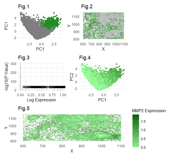
Some modifications for this visualization compared to previous was the gene I selected to focus on - the Pikachu dataset does not contain the CCN1 gene which I focused on in the eevie dataset. This is because the number of genes present in the Pikachu set itself is much smaller, since it was created using image-based rather than sequencing based spatial transcriptomics. These image-based methods are limited in their capability to detect large numbers of genes due to the issue of spectral overlap using smfish, rather than a sequencing based technique merfish which relies on barcode methods, allowing more genes to be detected than in smfish. Since the CCN1 gene was not present in this dataset, I chose to analyze MMP2, which is also upregulated in cancer-associated fibroblast cells, specifically stroma-derived. The plots were similar to the ones from hw3. Plot 1 shows my cluster of interest (4) in PCA space, where cluster 4 is highlighted in green. The rest of the clusters are in grey. Plot 2 shows cluster 4 in physical space. Plot 3 shows a volcano plot with upregulated genes in cluster 4 labeled, of which MMP2 is present with very low p value and very high expression levels, indicating statistical significance. Plot 4 shows the expression of MMP2 across clusters in the first two PCs. We can see that the fourth cluster (identified in plot 1) has the highest MMP2 expression levels. The fifth plot shows MMP2 expression levels in physical space. Again, we can see that the areas with highest expression tended to be in the fourth cluster, which we view in physical space in Plot 2. I am confident in the results, as I performed careful checks throughout. For example, I confirmed that k=6 was still optimal by plotting the total witness for various k values, and k=6 still sat at the elbow of optimality. Also, I visualized MMP2 expression across all clusters prior to picking one specific one to focus on as a “sanity check.” Through this sanity check, I was able to confirm and see the high expression levels of MMP2 in cluster 4. Additionally, I checked the p value of the MMP2 expression, and it was very very low (almost zero), indicating a very strong statistical significance. I also made sure to check whether this was one of the top most statistically significant gene within the cluster, which it was. It was amongst the top 30 genes which had similarly almost-zero p values. Overall, we see a pattern of statistically significant MMP2 upregulation in the fourth cluster and can visualize this in physical space as well. Compared to hw3, the major change I had to make was to find a new gene to focus on, whose upregulation also indicates cancer-associated fibroblasts. Other than that, and some minor code formatting modifications, I did not need to make any major code changes. Literature suggests that MMP2 upregulation is associated with cancer-associated fibroblast, similar to the CCN1 gene I focused on in HW3 from the eevie dataset. Due to my careful checks and very strong statistical significance in upregulated MMP2, I have confident reason to believe that cluster 4 is a cancer-associated fibroblast, just like the cluster I identified from HW3 in the eevie dataset.
Sources:
https://pubmed.ncbi.nlm.nih.gov/12000221/#:~:text=These%20observations%20were%20confirmed%20by,contact%20with%20malignant%20tumor%20epithelium.
https://biostatsquid.com/volcano-plots-r-tutorial/
Code:
1
2
3
4
5
6
7
8
9
10
11
12
13
14
15
16
17
18
19
20
21
22
23
24
25
26
27
28
29
30
31
32
33
34
35
36
37
38
39
40
41
42
43
44
45
46
47
48
49
50
51
52
53
54
55
56
57
58
59
60
61
62
63
64
65
66
67
68
69
70
71
72
73
74
75
76
77
78
79
80
81
82
83
84
85
86
87
88
89
90
91
92
93
94
95
96
97
98
99
100
101
102
103
104
105
106
107
108
109
110
111
112
113
114
115
116
117
118
119
120
121
122
123
library(ggplot2)
library(patchwork)
file <- 'C:\\Hopkins School Stuff\\GenomicDataVis\\data\\pikachu.csv.gz'
data <- read.csv(file)
data[1:5,1:10]
pos <- data[, 5:6]
rownames(pos) <- data$cell_id
head(pos)
gexp <- data[, 7:ncol(data)]
rownames(gexp) <- data$barcode
head(gexp)
head(pos)

loggexp <- log10(gexp + 1)

ks = c(2,3,4,5,6,7,8,9,10,11, 12, 13, 14, 15, 16)
totw <-sapply(ks,function(k){
  print(k)
  com <-kmeans(loggexp,centers=k)
  return(com$tot.withinss)
})
plot(ks,totw)
# from the plot, it appears that the elbow is at 6. Thus choose 6 clusters
com <-kmeans(loggexp, centers=6)
clusters <- com$cluster
clusters <- as.factor(clusters)
names(clusters) <-rownames(gexp)
head(clusters)

pcs <-prcomp(loggexp)
#sanity check to try to visualize where mmp2 is most expressed. It appears in 4, I will put cluster 4 as cluster of interest
head(pcs)
df <- data.frame(pcs$x, clusters, gene = loggexp[, 'MMP2'])
ggplot(df, aes(x=PC1, y=PC2, col=gene)) + geom_point() + scale_color_gradient(low="lightblue", high="darkblue")
ggplot(df, aes(x=PC1, y=PC2, col=clusters)) + geom_point()
df <- data.frame(pcs$x, clusters)
ggplot(df, aes(x=PC1, y=PC2, col=clusters)) + geom_point()


#cluster of interest is cluster 4
interest <- 4
cellsOfInterest <- names(clusters)[clusters == interest]
otherCells <- names(clusters)[clusters != interest]

plot1 <-ggplot(df, aes(x = PC1, y = PC2, color = as.factor(clusters))) +
  geom_point() +
  scale_color_manual(values = setNames(c("forestgreen", "lightgrey"), c(interest, "other"))) +
  labs(title = 'Fig.1', x = 'PC1', y = 'PC1', color = "Cluster") +
  theme_minimal() +  theme(legend.position = "none")

## Visualizing Cluster 4 in Physical Space
df2 <-data.frame(pos, clusters, gene = loggexp[, 'MMP2'])
colnames(df2) <- c('x','y','clusters','MMP2')
#plot2<-ggplot(df2, aes(x=x, y=y, col=clusters)) +geom_point(size=.1, alpha=.5)
#plot2
plot2<-ggplot(df2, aes(x = x, y = y, color = as.factor(clusters == interest))) +
  geom_point(size = .5, alpha = 0.5) +
  scale_color_manual(values = c("FALSE" = "grey", "TRUE" = "forestgreen")) +
  labs(title = 'Fig.2', x = 'X', y = 'Y') +
  theme_minimal() +
  theme(legend.position = "none")

##visualizing differentially expressed genes for your cluster of interest. Identifying upregulation, so looking for "greater" expression

#only selecting top 2000 genes for computational efficiency
results <- sapply(1:313,function(i) {
  genetest <- loggexp[,i]
  names(genetest) <- rownames(loggexp)
  out <- wilcox.test(genetest[cellsOfInterest], genetest[otherCells], alternative = 'greater')
  out$p.value
})
names(results) <- colnames(loggexp[,1:313])

diff_genes <-sort(results, decreasing = FALSE)
## printing the 30 most statistically significant outcomes (aka most differentially expressed upregulated genes)
diff_genes[1:30]

df_diff_genes <- data.frame(
  gene = names(diff_genes),
  logFC = as.numeric(diff_genes),
  expression = as.numeric(diff_genes)
)

neg_log_pval <- -log10(df_diff_genes$expression)
volcano_df <- cbind(df_diff_genes, neg_log_pval)

# Select the top 50 genes based on highest expression, and only label those ones
top_genes <- head(volcano_df$gene[order(volcano_df$expression, decreasing = TRUE)], 50)
volcano_df$label <- ifelse(volcano_df$gene %in% top_genes, volcano_df$gene, "")

#volcano plot
plot3 <- ggplot(volcano_df, aes(x = logFC, y = neg_log_pval, label = label)) +
  geom_point(size = 1, alpha = 0.7, col="lightgrey") +
  geom_text(size = 3, vjust = -0.75) +
  labs(title = "Fig.3",
       x = "Log Expression",
       y = "-log10(P Value)") +
  theme_minimal() +
  theme(legend.position = "none")


#visualizing one of these genes in reduced dimensional space (PCA)
MMP2_Clust_df <- df[cellsOfInterest,1:2]
MMP2_Clust_df$MMP2_expression <- loggexp[cellsOfInterest, 'MMP2']

df <- data.frame(pcs$x, clusters, gene = loggexp[, 'MMP2'])
plot4<-ggplot(df, aes(x=PC1, y=PC2, col=gene)) + geom_point() + scale_color_gradient(low="palegreen", high="forestgreen")+labs(title = "Fig.4",x = "PC1", y = "PC2")+theme_minimal() + theme(legend.position = "none")

library(patchwork)


df2 <- data.frame(pos, gene = loggexp[, 'MMP2'])  # Keep only the MMP2 gene expression data
colnames(df2) <- c('x', 'y', 'MMP2')

plot5 <- ggplot(df2, aes(x = x, y = y, color = MMP2)) +
  geom_point(size = .5, alpha = 0.5) +
  scale_color_gradient(low = "lightgreen", high = "darkgreen") +
  labs(title = 'Fig.5', x = 'X', y = 'Y', color="MMP2 Expression") +
  theme_minimal()

combined_plot <- (plot1 | plot2) / (plot3 | plot4) / plot5

combined_plot