Interpreting CODEX data

Describe your figure briefly so we know what you are depicting (you no longer need to use precise data visualization terms as you have been doing).
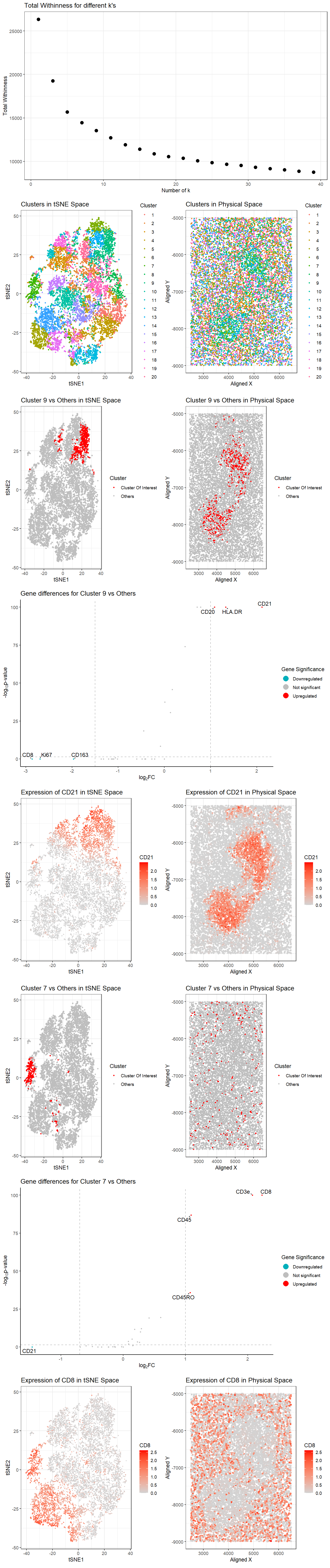
The data was normalized by the area and then log transformed. There are 12 plots in this figure.
Perform a full analysis (quality control, dimensionality reduction, kmeans clustering, differential expression analysis) on your data. Your goal is to figure out what tissue structure is represented in the CODEX data. Options include: (1) Artery/Vein, (2) White pulp, (3) Red pulp, (4) Capsule/Trabecula
You will need to visualize and interpret at least two cell-types. Create a data visualization and write a description to convince me that your interpretation is correct.
Clusters were determined using the kmeans algorithm with k=20 clusters, the number of k determined by plotting total withinness over different k (Plot A0) and finding the elbow in the plot.
Plot B1 shows tSNE space with the 20 distinct clusters.
Plot C2 shows physical space with the 20 distinct clusters.
Cluster 9 and 7 were chosen for the analyses based on the interesting patterning of these clusters in physical space.
Plot D3 shows the cluster 9 in red and all other clusters in gray in tSNE space.
Plot E4 shows the cluster 9 in red and all other clusters in gray in physical space.
Plot F5 shows a volcano plot of the gene differences for the cluster of interest vs all other clusters. Here, genes in red are upregulated, genes in blue are downregulated, and genes in gray are not significant when taking into account p-values (P<0.05) and a fold change greater than 1 or less than -1.5. The names of the top genes based on the thresholds mentioned are printed within the plot. Genes were determined to be significant based on their pvalue from the two-sided Wilcoxon Rank Sum test.
Plot G9 shows the tSNE space with the top gene found from DE analysis, CD21, in the cluster of interest (cluster 9) as a gradient from gray to red.
Plot H10 shows the physical space with CD21 expression as a gradient from gray to red.
Plot I6 shows the cluster 7 in red and all other clusters in gray in tSNE space.
Plot J7 shows the cluster 7 in red and all other clusters in gray in physical space.
Plot K8 shows a volcano plot of the gene differences for the cluster of interest vs all other clusters. Here, genes in red are upregulated, genes in blue are downregulated, and genes in gray are not significant when taking into account p-values (P<0.05) and a fold change greater than 1 or less than -1.5. The names of the top genes based on the thresholds mentioned are printed within the plot. Genes were determined to be significant based on their pvalue from the two-sided Wilcoxon Rank Sum test.
Plot L11 shows the tSNE space with the top gene found from DE analysis, CD8, in the cluster of interest (cluster 7) as a gradient from gray to red.
Plot M12 shows the physical space with CD8 expression as a gradient from gray to red.
Your description should reference papers and content that allowed you to interpret your cell clusters as a particular cell-types. You must provide attribution to external resources referenced. Links are fine; formatted references are not required.
Cluster 9 is likely to represent B cells. This is based on the expression of the top highly upregulated genes CD21 (or CR2) [1], HLA.DR [2], CD20 [3], CD1c [4] identified with Wilcox, which are known to be the most highly expressed in B cells. In both tSNE and physical space, locations with high expression of CD21, the B cell marker, also corresponds to the location of cluster 9.
Cluster 7 is likely to represent T cells. This is based on the expression of the top highly upregulated genes CD8 [5], CD3e [6], and CD45RO [7] identified with Wilcox, which are known to be the most highly expressed in T cells. In both tSNE and physical space, locations with high expression of CD8, the T cell marker, also corresponds to the location of cluster 7.
After some research, I’ve decided that the tissue is the white pulp of the spleen due to the presence of B cells clusters in the physical space [8]. In the spleen, the B cell zones are the follicles that contain a mixture of cells important for the activation and survival of B cells in addition to the B cells themselves. This description matches our observation of 2 clusters of cluster/ cell type 9 in physical space. In addition, we also observe T cells evenly distributed across the tissue except in the zones where cluster 9 is present. In the spleen, the T cell zone (TCZ), also called the periarteriolar lymphoid sheath (PALS), forms around the central arteriole that runs through the white pulp on its way to the border between the red pulp and the white pulp. This description also matches our observation of cell type/ cluster 7 in physical space.
In conclusion, I believe the tissue rerpresents white pulp in the spleen, with cluster 9 representing B cells and cluster 7 representing T cells.
[1] https://www.proteinatlas.org/ENSG00000117322-CR2/single+cell/spleen [2] https://www.proteinatlas.org/ENSG00000204287-HLA-DRA/single+cell/spleen [3] https://doi.org/10.3324/haematol.2019.243543 [4] https://www.proteinatlas.org/ENSG00000158481-CD1C/single+cell/spleen
[5] https://www.proteinatlas.org/ENSG00000153563-CD8A/single+cell/spleen
[6] https://www.proteinatlas.org/ENSG00000198851-CD3E/single+cell/spleen
[7] https://pmc.ncbi.nlm.nih.gov/articles/PMC2734248/
[8] https://pmc.ncbi.nlm.nih.gov/articles/PMC6495537/
Code (paste your code in between the ``` symbols)
1
2
3
4
5
6
7
8
9
10
11
12
13
14
15
16
17
18
19
20
21
22
23
24
25
26
27
28
29
30
31
32
33
34
35
36
37
38
39
40
41
42
43
44
45
46
47
48
49
50
51
52
53
54
55
56
57
58
59
60
61
62
63
64
65
66
67
68
69
70
71
72
73
74
75
76
77
78
79
80
81
82
83
84
85
86
87
88
89
90
91
92
93
94
95
96
97
98
99
100
101
102
103
104
105
106
107
108
109
110
111
112
113
114
115
116
117
118
119
120
121
122
123
124
125
126
127
128
129
130
131
132
133
134
135
136
137
138
139
140
141
142
143
144
145
146
147
148
149
150
151
152
153
154
155
156
157
158
159
160
161
162
163
164
165
166
167
168
169
170
171
172
173
174
175
176
177
178
179
180
181
182
183
184
185
186
187
188
189
190
191
192
193
194
195
196
197
198
199
200
201
202
203
204
205
206
207
208
209
210
211
212
213
214
215
216
217
218
219
220
221
222
223
224
225
226
227
228
229
230
231
232
233
234
235
236
237
238
239
240
241
242
243
244
245
246
247
248
249
250
251
252
253
254
255
256
257
258
259
260
261
262
263
264
265
266
267
268
269
270
271
272
273
274
275
276
277
278
279
280
281
282
283
284
285
286
287
288
289
290
291
292
293
294
295
296
297
298
299
300
301
302
303
304
305
306
307
308
309
310
311
312
313
314
315
316
317
318
319
320
321
322
323
324
325
326
327
328
329
330
331
332
333
334
335
336
337
338
339
340
341
342
343
344
345
346
347
348
349
350
351
352
353
354
355
356
357
358
359
360
361
362
363
364
365
366
367
368
369
370
371
372
373
374
375
376
file <- "data/codex_spleen_3.csv.gz"

data <- read.csv(file)
data[1:5,1:10]

pos <- data[, 1:4]
rownames(pos) <- data$barcode
head(pos)
exp <- data[, 4:ncol(data)]
rownames(exp) <- data$barcode
exp[1:5,1:5]
dim(exp)

#proteomics- 28

norm<- exp
norm<- log10(exp/exp$area +1)
norm[1:5,1:5]

## try many ks
ks = seq.int(1, 40, 2)
totw <- sapply(ks, function(k) {
  print(k)
  set.seed(1)
  com <- kmeans(norm, centers=k)
  return(com$tot.withinss)
})

## find optimal k from elbow plot
library(ggplot2)
df0<-data.frame(ks,totw)
p0<-ggplot(df0, aes(x=ks, y=totw)) + geom_point(size=3)+
  labs(
    title = "Total Withinness for different k's",
    x = "Number of k",
    y = "Total Withinness"
  ) +
  theme_bw()
p0
## elbow at roughly k=20

set.seed(1)
com<- kmeans(norm,centers=20)
clusters<-as.factor(com$cluster)
clusters
names(clusters) <- rownames(norm)
head(clusters)

## Plot 1: A panel visualizing all clusters in reduced dimensional space (tSNE)
emb <- Rtsne::Rtsne(norm)
head(emb$Y)
df1 <- data.frame(emb$Y, clusters=clusters)
p1<-ggplot(df1, aes(x=X1, y=X2, col=clusters)) + geom_point(size=1)+
  labs(
    title = "Clusters in tSNE Space",
    color = "Cluster",
    x = "tSNE1",
    y = "tSNE2"
  ) +
  theme_bw()
p1


##Plot 2: A panel visualizing all clusters in physical space
df2 <- data.frame(aligned_x = data$x, aligned_y = data$y, emb$Y, clusters)
p2<- ggplot(df2) + geom_point(aes(x = aligned_x, y = aligned_y,
                             color= clusters), size=1)  +
  labs(
    title = "Clusters in Physical Space",
    color = "Cluster",
    x = "Aligned X",
    y = "Aligned Y"
  ) +
  theme_bw()
p2

## characterizing cluster 9
interest <- 9
cellsOfInterest<-names(clusters)[clusters==interest]
OtherCells<-names(clusters)[clusters!=interest]
ClusterOfInterest<- ifelse(clusters=='9','Cluster Of Interest','Others')


## Plot 3: A panel visualizing your one cluster of interest (cluster 9) in reduced dimensional space (tSNE)
df3 <- data.frame(emb$Y, clusters=clusters,ClusterOfInterest)
p3<-ggplot(df3, aes(x=X1, y=X2, col=ClusterOfInterest)) + geom_point(size=1) +
  scale_color_manual(values = c("red","gray")) +
  labs(
    title = "Cluster 9 vs Others in tSNE Space",
    color = "Cluster",
    x = "tSNE1",
    y = "tSNE2"
  ) +
  theme_bw()
p3


##Plot 4: A panel visualizing your one cluster of interest in physical space
df4 <- data.frame(aligned_x = data$x, aligned_y = data$y, emb$Y, clusters,ClusterOfInterest)
p4<- ggplot(df4) + geom_point(aes(x = aligned_x, y = aligned_y,
                                  color= ClusterOfInterest), size=1)  +
  scale_color_manual(values = c("red","gray")) +
  labs(
    title = "Cluster 9 vs Others in Physical Space",
    color = "Cluster",
    x = "Aligned X",
    y = "Aligned Y"
  ) +
  theme_bw()
p4

?wilcox.test
# do wilcox for DE genes
interest<-9
pv <- sapply(colnames(norm), function(i) {
  print(i) ## print out gene name
  wilcox.test(norm[clusters == interest, i], norm[clusters != interest, i],alternative='greater')$p.val
})
head(sort(pv)) #   CD21        HLA.DR          CD20          CD35         CD44          CD1c

logfc <- sapply(colnames(norm), function(i) {
  print(i) ## print out gene name
  log2(mean(norm[clusters == interest, i])/mean(norm[clusters != interest, i]))
})


## Plot 5: volcano plot
df <- data.frame(pv=-(log10(pv+1e-100)), logfc,genes=names(pv))
# add gene names
df$genes <- rownames(df)
# add labeling for 10 fold change
df$delabel <- ifelse(df$logfc > 1, df$genes, NA)
df$delabel <- ifelse(df$logfc < -1.5, df$genes, df$delabel)
# add if DE
df$diffexpressed <- ifelse(df$logfc > 1, "Upregulated", "Not Significant")  #2 or 1.5
df$diffexpressed <- ifelse(df$logfc < -1.5, "Downregulated", df$diffexpressed)

library(ggrepel)
# plot
p5<-ggplot(df, aes(x = logfc, y = pv, label = delabel, color = diffexpressed)) +
  geom_point(size= 0.75) +
  geom_vline(xintercept = c(-1.5, 1), col = "gray", linetype = 'dashed') +
  geom_hline(yintercept = -log10(0.05), col = "gray", linetype = 'dashed') +
  scale_color_manual(values = c("#00AFBB", "grey", "red"),
                     labels = c("Downregulated", "Not significant", "Upregulated")) +
  # theme
  theme_classic() +
  # labels
  labs(color = 'Gene Significance',
       x = expression("log"[2]*"FC"),
       y = expression("-log"[10]*"p-value"),
       title = "Gene differences for Cluster 9 vs Others") +
  geom_text_repel(aes(label = delabel), na.rm = TRUE,
                  max.overlaps = Inf, box.padding = 0.25, point.padding = 0.25, min.segment.length = 0, size = 4, color = "black") +
  scale_x_continuous(breaks = seq(-5, 5, 1)) +
  guides(size = "none",color = guide_legend(override.aes = list(size=5)))
p5

## Plot 9: A panel visualizing one of these genes (CD21) in reduced dimensional space (tSNE)
df9 <- data.frame(emb$Y, clusters, gene=norm[,'CD21'])
p9<-ggplot(df9, aes(x=X1, y=X2, col=gene)) + geom_point(size=0.5) +
  scale_color_gradient(low = 'lightgrey', high='red') +
  labs(
    title = "Expression of CD21 in tSNE Space",
    color = "CD21",
    x = "tSNE1",
    y = "tSNE2"
  ) +
  theme_bw()
p9
p4

## Plot 10: A panel visualizing one of these genes in space

df10 <- data.frame(aligned_x = data$x, aligned_y = data$y, emb$Y, clusters, gene=norm[,'CD21'],ClusterOfInterest)
p10<-ggplot(df10) + geom_point(aes(x = aligned_x, y = aligned_y,
                                 color= gene), size=1.5)  +
  scale_color_gradient(low = 'lightgrey', high='red') +
  labs(
    title = "Expression of CD21 in Physical Space",
    color = "CD21",
    x = "Aligned X",
    y = "Aligned Y"
  ) +
  theme_bw()
p10


## characterizing cluster 7
interest <- 7
cellsOfInterest<-names(clusters)[clusters==interest]
OtherCells<-names(clusters)[clusters!=interest]
ClusterOfInterest<- ifelse(clusters=='7','Cluster Of Interest','Others')


## Plot 6: A panel visualizing your one cluster of interest (cluster 7) in reduced dimensional space (tSNE)
df6 <- data.frame(emb$Y, clusters=clusters,ClusterOfInterest)
p6<-ggplot(df6, aes(x=X1, y=X2, col=ClusterOfInterest)) + geom_point(size=1) +
  scale_color_manual(values = c("red","gray")) +
  labs(
    title = "Cluster 7 vs Others in tSNE Space",
    color = "Cluster",
    x = "tSNE1",
    y = "tSNE2"
  ) +
  theme_bw()
p6


##Plot 7: A panel visualizing your one cluster of interest in physical space
df7 <- data.frame(aligned_x = data$x, aligned_y = data$y, emb$Y, clusters,ClusterOfInterest)
p7<- ggplot(df7) + geom_point(aes(x = aligned_x, y = aligned_y,
                                  color= ClusterOfInterest), size=1)  +
  scale_color_manual(values = c("red","gray")) +
  labs(
    title = "Cluster 7 vs Others in Physical Space",
    color = "Cluster",
    x = "Aligned X",
    y = "Aligned Y"
  ) +
  theme_bw()
p7

?wilcox.test
# do wilcox for DE genes
interest<-7
pv <- sapply(colnames(norm), function(i) {
  print(i) ## print out gene name
  wilcox.test(norm[clusters == interest, i], norm[clusters != interest, i],alternative='greater')$p.val
})
head(sort(pv)) #   CD8          CD3e          CD45        CD45RO         CD163          CD44           CD1c

logfc <- sapply(colnames(norm), function(i) {
  print(i) ## print out gene name
  log2(mean(norm[clusters == interest, i])/mean(norm[clusters != interest, i]))
})

df
## Plot 8: volcano plot for cluster 7
df8 <- data.frame(pv=-(log10(pv+1e-100)), logfc,genes=names(pv))
# add gene names
df8$genes <- rownames(df8)
# add labeling for 10 fold change
df8$delabel <- ifelse(df8$logfc > 1, df8$genes, NA)
df8$delabel <- ifelse(df8$logfc < -0.7, df8$genes, df8$delabel)
# add if DE
df8$diffexpressed <- ifelse(df8$logfc > 1, "Upregulated", "Not Significant")  #2 or 1.5
df8$diffexpressed <- ifelse(df8$logfc < -0.7, "Downregulated", df8$diffexpressed)

library(ggrepel)
# plot
p8<-ggplot(df8, aes(x = logfc, y = pv, label = delabel, color = diffexpressed)) +
  geom_point(size= 0.75) +
  geom_vline(xintercept = c(-0.7, 1), col = "gray", linetype = 'dashed') +
  geom_hline(yintercept = -log10(0.05), col = "gray", linetype = 'dashed') +
  scale_color_manual(values = c("#00AFBB", "grey", "red"),
                     labels = c("Downregulated", "Not significant", "Upregulated")) +
  # theme
  theme_classic() +
  # labels
  labs(color = 'Gene Significance',
       x = expression("log"[2]*"FC"),
       y = expression("-log"[10]*"p-value"),
       title = "Gene differences for Cluster 7 vs Others") +
  geom_text_repel(aes(label = delabel), na.rm = TRUE,
                  max.overlaps = Inf, box.padding = 0.25, point.padding = 0.25, min.segment.length = 0, size = 4, color = "black") +
  scale_x_continuous(breaks = seq(-5, 5, 1)) +
  guides(size = "none",color = guide_legend(override.aes = list(size=5)))
p8


## Plot 11: A panel visualizing one of these genes (CD8) in reduced dimensional space (tSNE)
df11 <- data.frame(emb$Y, clusters, gene=norm[,'CD8'])
p11<-ggplot(df11, aes(x=X1, y=X2, col=gene)) + geom_point(size=0.5) +
  scale_color_gradient(low = 'lightgrey', high='red') +
  labs(
    title = "Expression of CD8 in tSNE Space",
    color = "CD8",
    x = "tSNE1",
    y = "tSNE2"
  ) +
  theme_bw()
p11
p6

## Plot 12: A panel visualizing one of these genes in space

df12 <- data.frame(aligned_x = data$x, aligned_y = data$y, emb$Y, clusters, gene=norm[,'CD8'],ClusterOfInterest)
p12<-ggplot(df12) + geom_point(aes(x = aligned_x, y = aligned_y,
                                   color= gene), size=1.5)  +
  scale_color_gradient(low = 'lightgrey', high='red') +
  labs(
    title = "Expression of CD8 in Physical Space",
    color = "CD8",
    x = "Aligned X",
    y = "Aligned Y"
  ) +
  theme_bw()
p12
p7


install.packages("gridExtra")  # Install if not already installed
library(gridExtra)  # Load the package
library(ggplot2)


# Set up the PNG output
png("white_pulp_analysis.png", width = 1200, height = 2000, res = 150)

## Combine plots together
lay <- rbind(c(1, 1),
             c(2, 3),
             c(4, 5),
             c(6, 6)
)

grid1<-grid.arrange(p0,
                   p1,p2,
                   p3,p4,
                   p5,
                   layout_matrix = lay,
                   top = "Analyzing for White Pulp Within Spleen")

## Combine plots together
lay <- rbind(
             c(7, 8),
             c(9, 10),
             c(11, 11),
             c(12, 13)
)

grid2<-grid.arrange(
             p9,p10,
             p6,p7,
             p8,
             p11,p12,
             layout_matrix = lay,
             top = "Analyzing for White Pulp Within Spleen")


dev.off()


library(patchwork)
png("white_pulp_analysis.png", width = 1200, height = 2000, res = 150)
p0
dev.off
p1+p2
p3+p4
p5
p9+p10
p6+p7
p8
p11+p12


## Combine plots together
lay <- rbind(c(1,1),
             c(2, 3),
             c(4, 5)
)
install.packages("gridExtra")  # Install if not already installed
library(gridExtra)  # Load the package
library(ggplot2)
grid.arrange(p0,
             p1,p2,
             p3,p4,
             layout_matrix = lay,
             top = "Analyzing for White Pulp Within Spleen")
Code for volcano plot referenced https://jef.works/genomic-data-visualization-2024/blog/2024/02/14/challin1/
The final png was merged on https://products.groupdocs.app/merger/png#folderName=dd1be75e-700e-4c83-b0c3-8787377d0c58 because the the viewport on R is too small for my figure.