CODEX dataset analysis

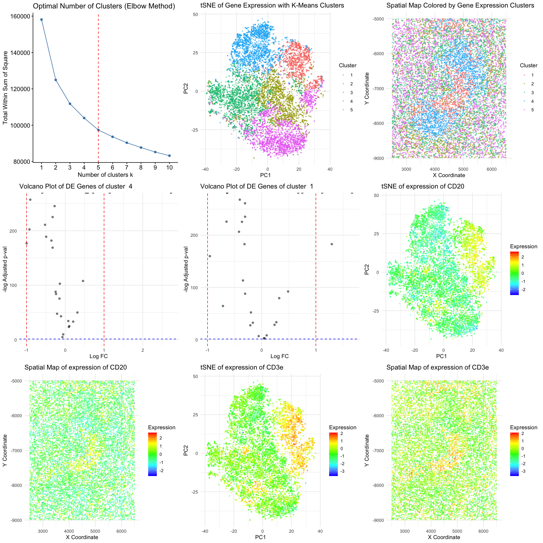
We conducted normalization, standardization, dimensionality reduction, k-means clustering, and differential expression analysis to reveal two distinct cell clusters within the CODEX data. tSNE plots and marker expression heatmaps is plotted with their spatial organization, indicating structural significance of the clustering. Cluster 1 expressed high levels of T cell markers (CD3e and CD45RO), as well as CD21, which suggest memory T cells characteristic. Cluster 4 was characterized by strong expression of B cell markers CD20 and CD21. Memory T cells are primarily located in the periarteriolar lymphoid sheaths and B cells in the lymphoid follicles, we concluded that the tissue of interest in part of the white pulp region [1, 2].
[1] Mebius, R. E., & Kraal, G. (2005). Structure and function of the spleen. Nature reviews immunology, 5(8), 606-616. [2] Waterfield, J. D., Ekstedt, R. D., & Möller, G. (1977). Functional Heterogeneity of Splenic T Lymphocyte Subpopulations I. Determination of Splenic Subpopulations by the Use of Mitogenic Probes. Scandinavian Journal of Immunology, 6(6‐7), 615-623.
1
2
3
4
5
6
7
8
9
10
11
12
13
14
15
16
17
18
19
20
21
22
23
24
25
26
27
28
29
30
31
32
33
34
35
36
37
38
39
40
41
42
43
44
45
46
47
48
49
50
51
52
53
54
55
56
57
58
59
60
61
62
63
64
65
66
67
68
69
70
71
72
73
74
75
76
77
78
79
80
81
82
83
84
85
86
87
88
89
90
91
92
93
94
95
96
97
98
99
100
101
102
103
104
105
106
107
108
109
110
111
112
113
114
115
116
117
118
119
120
121
122
123
124
125
126
127
128
129
130
131
132
133
134
135
136
137
138
139
140
141
142
143
144
145
146
147
148
149
150
151
152
153
154
155
156
157
158
159
library(ggplot2)
library(ggpubr)
library(dplyr)
library(cluster)
library(scales)
library(Rtsne)
library(factoextra)
library(tidyverse)

file <- "/Users/sky2333/Downloads/genomic-data-visualization-2025/data/codex_spleen_3.csv"
data <- read.csv(file)
gene_expr <- data[, 4:ncol(data)]
sample_names <- rownames(gene_expr)
gene_names <- colnames(gene_expr)

gene_expr <- t(apply(log1p(gene_expr / rowSums(gene_expr) * 1e6), 1, scale))
rownames(gene_expr) <- sample_names
colnames(gene_expr) <- gene_names

set.seed(222)
elbow_plot <- fviz_nbclust(gene_expr, kmeans, method = "wss",k.max = 10,nstart = 25,iter.max = 25) +
  geom_vline(xintercept = 5, linetype = "dashed", color = "red") +
  labs(title = "Optimal Number of Clusters (Elbow Method)")

#pca_result <- prcomp(gene_expr, center = TRUE, scale. = TRUE)
pca_result <- Rtsne(gene_expr, perplexity = 30, theta = 0.5, dims = 2, pca = TRUE, verbose = TRUE)

data$PC1 <- pca_result$Y[, 1]
data$PC2 <- pca_result$Y[, 2]

k <- 5
kmean_result <- kmeans(gene_expr, centers = k, nstart = 25, iter.max = 1000)


pca_plot <- ggplot(data, aes(x = PC1, y = PC2, color = Cluster)) +
    geom_point(alpha = 0.5, size = 0.5) +
    scale_color_manual(values = hue_pal()(k)) +
    labs(title = "tSNE of Gene Expression with K-Means Clusters", x = "PC1", y = "PC2", color = "Cluster") +
    theme_minimal()

spatial_plot <- ggplot(data, aes(x = x, y = y, color = Cluster)) +
    geom_point(alpha = 0.5, size = 0.5) +
    scale_color_manual(values = hue_pal()(k)) +
    labs(title = "Spatial Map Colored by Gene Expression Clusters", x = "X Coordinate", y = "Y Coordinate", color = "Cluster") +
    theme_minimal()

spatial_plot
pca_plot
cluster_interest <- "4"
genes_pvals <- sapply(gene_names, function(gene) {
    wilcox.test(
        gene_expr[data$Cluster == cluster_interest, gene],
        gene_expr[data$Cluster != cluster_interest, gene]
    )$p.value
})

genes_pvals_adj <- p.adjust(genes_pvals, method = "fdr")

logFC <- apply(gene_expr, 2, function(gene) {
    mean(gene[data$Cluster == cluster_interest]) - mean(gene[data$Cluster != cluster_interest])
})

de_genes <- data.frame(Gene = gene_names, p_value = genes_pvals, adj_p_value = genes_pvals_adj, logFC = logFC)

volcano_plot_1 <- ggplot(de_genes, aes(x = logFC, y = -log10(adj_p_value))) +
    geom_point(alpha = 0.5) +
    geom_vline(xintercept = c(-1, 1), linetype = "dashed", color = "red") +
    geom_hline(yintercept = -log10(0.05), linetype = "dashed", color = "blue") +
    theme_minimal() +
    labs(title = paste("Volcano Plot of DE Genes of cluster ", cluster_interest), x = "Log FC", y = "-log Adjusted p-val")

top_genes <- arrange(filter(de_genes, adj_p_value < 0.05 & abs(logFC) > 1), adj_p_value)
selected_gene <- top_genes$Gene[1]

top_genes

pca_gene_plot_1 <- ggplot(data, aes(x = PC1, y = PC2, color = gene_expr[, selected_gene])) +
    geom_point(alpha = 0.5, size = 0.5) +
    scale_color_gradientn(
        colors = c("blue", "cyan", "green", "yellow", "red"),
        limits = range(gene_expr[, selected_gene]),
        breaks = pretty(gene_expr[, selected_gene], n = 5)
    ) +
    labs(title = paste("tSNE of expression of", selected_gene), x = "PC1", y = "PC2", color = "Expression") +
    theme_minimal()

spatial_gene_plot_1 <- ggplot(data, aes(x = x, y = y, color = gene_expr[, selected_gene])) +
    geom_point(alpha = 0.5, size = 0.5) +
    scale_color_gradientn(
        colors = c("blue", "cyan", "green", "yellow", "red"),
        limits = range(gene_expr[, selected_gene]),
        breaks = pretty(gene_expr[, selected_gene], n = 5)
    ) +
    labs(title = paste("Spatial Map of expression of", selected_gene), x = "X Coordinate", y = "Y Coordinate", color = "Expression") +
    theme_minimal()


volcano_plot
spatial_gene_plot
pca_gene_plot
cluster_interest <- "1"
genes_pvals <- sapply(gene_names, function(gene) {
    wilcox.test(
        gene_expr[data$Cluster == cluster_interest, gene],
        gene_expr[data$Cluster != cluster_interest, gene]
    )$p.value
})

genes_pvals_adj <- p.adjust(genes_pvals, method = "fdr")

logFC <- apply(gene_expr, 2, function(gene) {
    mean(gene[data$Cluster == cluster_interest]) - mean(gene[data$Cluster != cluster_interest])
})

de_genes <- data.frame(Gene = gene_names, p_value = genes_pvals, adj_p_value = genes_pvals_adj, logFC = logFC)

volcano_plot_2 <- ggplot(de_genes, aes(x = logFC, y = -log10(adj_p_value))) +
    geom_point(alpha = 0.5) +
    geom_vline(xintercept = c(-1, 1), linetype = "dashed", color = "red") +
    geom_hline(yintercept = -log10(0.05), linetype = "dashed", color = "blue") +
    theme_minimal() +
    labs(title = paste("Volcano Plot of DE Genes of cluster ", cluster_interest), x = "Log FC", y = "-log Adjusted p-val")

top_genes <- arrange(filter(de_genes, adj_p_value < 0.05 & abs(logFC) > 1), adj_p_value)
selected_gene <- top_genes$Gene[1]

top_genes

pca_gene_plot_2 <- ggplot(data, aes(x = PC1, y = PC2, color = gene_expr[, selected_gene])) +
    geom_point(alpha = 0.5, size = 0.5) +
    scale_color_gradientn(
        colors = c("blue", "cyan", "green", "yellow", "red"),
        limits = range(gene_expr[, selected_gene]),
        breaks = pretty(gene_expr[, selected_gene], n = 5)
    ) +
    labs(title = paste("tSNE of expression of", selected_gene), x = "PC1", y = "PC2", color = "Expression") +
    theme_minimal()

spatial_gene_plot_2 <- ggplot(data, aes(x = x, y = y, color = gene_expr[, selected_gene])) +
    geom_point(alpha = 0.5, size = 0.5) +
    scale_color_gradientn(
        colors = c("blue", "cyan", "green", "yellow", "red"),
        limits = range(gene_expr[, selected_gene]),
        breaks = pretty(gene_expr[, selected_gene], n = 5)
    ) +
    labs(title = paste("Spatial Map of expression of", selected_gene), x = "X Coordinate", y = "Y Coordinate", color = "Expression") +
    theme_minimal()


volcano_plot
spatial_gene_plot
pca_gene_plot
final_plot <- ggarrange(
    elbow_plot, pca_plot, spatial_plot, volcano_plot_1, volcano_plot_2, pca_gene_plot_1, spatial_gene_plot_1, pca_gene_plot_2, spatial_gene_plot_2,
    ncol = 3, nrow = 3,
    width = 40, height = 40
)
options(repr.plot.width = 15, repr.plot.height = 15)
final_plot