HWEC1: Exploring Differences Between Linear and Non-linear Dimensionality Reduction

1. Figure Description.
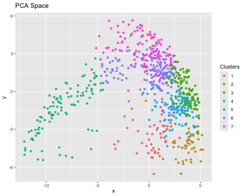
Figure State 1: Eevee’s cell spots in PCA space, with x axis for PC1 andy y axis for PC2. Figure State 2: Eevee’s cell spots in t-SNE space, with x axis for X1 and y axis for X2.
2. Differences between linear and nonlinear dimensionality reduction
In Figure State 1, I performed PCA for dimensionality reduction on Eevee’s spatial omics spots and the top 2000 genes. In the 2D PC1 vs. PC2 visualization, the cell spots are closely positioned, forming a large, cohesive cluster. In Figure State 2, the X1 Vs. X2 in t-SNE visualization also shows that some cell spots cluster with similar ones. However, clusters 6 and 7 are distributed across several disconnected groups. Also, there is greater dispersion among cell spots within individual clusters in the PCA plot.
3. Code
1
2
3
4
5
6
7
8
9
10
11
12
13
14
15
16
17
18
19
20
21
22
23
24
25
26
27
28
29
30
31
32
33
34
35
36
37
38
39
40
41
42
43
44
45
46
47
48
49
50
51
52
53
54
55
56
57
58
59
60
61
62
63
64
65
library(gganimate)
library(ggplot2)

file <- "~/Downloads/eevee.csv.gz"
data <- read.csv(file)
data[1:5,1:10]

pos <- data[, 3:4]
rownames(pos) <- data$cell_id
gexp <- data[, 5:ncol(data)]
rownames(gexp) <- data$barcode
head(gexp)
head(pos)

gexp[1:5, 1:10]
dim(gexp)

# limiting to top 1000 most highly expressed genes
topgenes <- names(sort(colSums(gexp), decreasing=TRUE)[1:2000])
gexpsub <- gexp[,topgenes]
gexpsub[1:5,1:5]
dim(gexpsub)

# normalization
norm <- gexpsub/rowSums(gexpsub) *10000
loggexp <- log10(norm+1)
dim(loggexp)


# pick k = 7
com <- kmeans(loggexp, centers=7)
clusters <- com$cluster
clusters <- as.factor(clusters)
names(clusters) <- rownames(loggexp)
head(clusters)


#PCA
pcs <- prcomp(loggexp)
df1 <- data.frame(pcs$x[,1:2],clusters)
colnames(df1) <- c('x', 'y','Clusters')
ggplot(df1, aes(x=x, y=y, col= Clusters)) + geom_point()


#t-SNE
emb <- Rtsne::Rtsne(loggexp)
df2 <- data.frame(emb$Y, clusters)
colnames(df2) <- c('x', 'y','Clusters')
ggplot(df2, aes(x=x, y=y, col= Clusters)) + geom_point()

# combine two df
df <- rbind(
  cbind(df1, order = "PCA Space"),
  cbind(df2, order = "t-SNE Space")
)
dim(df1)
dim(df2)
head(df)
dim(df)
p <- ggplot(df, aes(x=x, y=y, col=Clusters)) + geom_point()

# make animation
anim <- p + transition_states(order) + view_follow() + ease_aes('linear') + labs(title = '{closest_state}')
animate(anim, height=400, width=500)