Deducing tissue structure in CODEX dataset

1. Write a description explaining why you believe your data visualization is effective using vocabulary terms from Lesson 1.
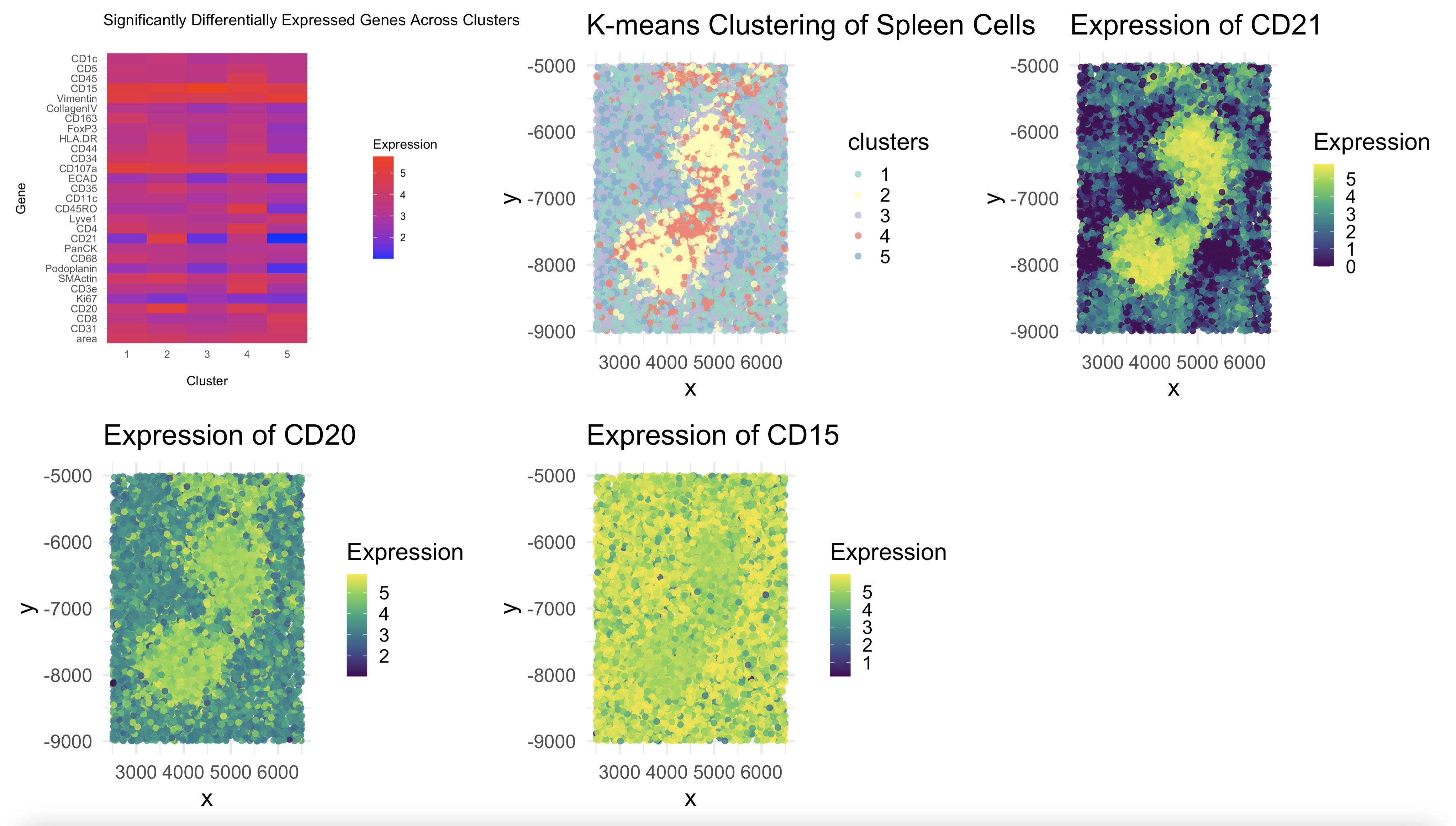
To identify different spleen tissue structures, I began with K-means clustering. Clustering alone does not indicate which genes drive separation between groups, so I performed differential expression analysis from here. Specifically, I used one-way ANOVA to compare the expresion levels of each gene across all the clusters. This allowed me to create a heatmap of the most relevant genes by expression across the clusters.
By analyzing the heatmap, I identified CD21 and CD20 as highly expressed in Cluster 2, while CD15 showed strong expression in Cluster 3. These genes were compelling candidates for distinguishing spleen structures because their differential expression patterns indicated that Cluster 2 had a strong B-cell signature, aligning with white pulp, and Cluster 3 contained granulocyte and myeloid markers, consistent with red pulp. To confirm these assignments, I mapped the spatial distribution of these key genes and found that their expression patterns correlated well with the expected locations of these tissue structures in the spleen based 0on the original kmeans clustering. In other words, I could see clearly how high expression of CD20, for instance, had a clear mapping to cluster 2 in the original kmeans depiction.
citation links: https://pubmed.ncbi.nlm.nih.gov/26418972/#:~:text=Based%20on%20this%20knowledge%2C%20we,adhesion;%20thrombin%2Dactivated%20platelets.
https://www.sciencedirect.com/science/article/pii/S0006497120704921#:~:text=(C)%20Section%20of%20spleen%20stained%20with%20CD20,involvement%20of%20both%20white%20and%20red%20pulp.&text=CD21%20shows%20a%20diffuse%20FDC%20meshwork%20in%20white%20pulp%20nodules
https://www.sthda.com/english/wiki/one-way-anova-test-in-r
2. Code (paste your code in between the ``` symbols)
1
2
3
4
5
6
7
8
9
10
11
12
13
14
15
16
17
18
19
20
21
22
23
24
25
26
27
28
29
30
31
32
33
34
35
36
37
38
39
40
41
42
43
44
45
46
47
48
49
50
51
52
53
54
55
56
57
58
59
60
61
62
63
64
65
66
67
68
69
70
71
72
73
74
75
76
77
78
79
80
81
82
83
84
85
86
87
88
89
90
91
92
93
94
95
96
97
98
99
100
101
102
103
104
105
106
107
108
109
110
111
112
113
114
115
116
117
118
119
120
121
122
123
124
125
126
127
128
129
library(ggplot2)

# Read the dataset
data <- read.csv("~/code/genomic-data-visualization-2025/data/codex_spleen_3.csv.gz")

# Extract spatial position and gene expression data
pos <- data[, c("x", "y")]  # Spatial coordinates
exp <- data[, 4:ncol(data)]  # Gene expression matrix (excluding metadata)

#Data Preprocessing

# Remove rows where rowSums(exp) is zero (cells with no detected expression)
valid_rows <- rowSums(exp) > 0
exp <- exp[valid_rows, ]
pos <- pos[valid_rows, ]  # Ensure pos matches filtered exp

# Replace negative expression values with 0
exp[exp < 0] <- 0

# Normalize data using log10(Counts Per Million + 1)
norm <- log10(exp / rowSums(exp) * 1e6 + 1)
norm <- as.matrix(norm)  # Convert to matrix

# Dimensionality Reduction (PCA)

pca_res <- prcomp(norm, scale. = TRUE)  # PCA for dimension reduction
summary(pca_res)  # Check variance explained

# Use the top 10 principal components for clustering
pca_data <- pca_res$x[, 1:10]

# K-means Clustering

set.seed(42)  # Ensures reproducibility
com <- kmeans(pca_data, centers = 5, nstart = 10)  # K=5 clusters

# Convert cluster labels to a factor
clusters <- as.factor(com$cluster)

# Differential Expression Analysis

# Create a dataframe that includes clusters
exp_with_clusters <- as.data.frame(norm)
exp_with_clusters$Cluster <- clusters

# Perform one-way ANOVA for each gene
p_values <- sapply(colnames(exp), function(gene) {
  aov_result <- aov(exp_with_clusters[[gene]] ~ exp_with_clusters$Cluster)
  summary(aov_result)[[1]][["Pr(>F)"]][1]  # Extract p-value
})

# Adjust p-values for multiple testing (Bonferroni correction)
p_values_adj <- p.adjust(p_values, method = "bonferroni")

# Identify significantly differentially expressed genes (DEGs)
DEGs <- names(p_values_adj[p_values_adj < 0.05])  # Adjusted p-value < 0.05
print(DEGs)  # List of significant genes

# Visualizing Differentially Expressed Genes

# Subset the normalized data for significant DEGs
deg_expression <- norm[, DEGs]

# Compute mean expression of DEGs per cluster
deg_means <- aggregate(deg_expression, by = list(Cluster = clusters), FUN = mean)

# Convert data to long format for heatmap visualization
# install.packages("reshape2")  # If reshape2 is not installed
library(reshape2)

deg_means_long <- melt(deg_means, id.vars = "Cluster", variable.name = "Gene", value.name = "Expression")

# Heatmap of DEGs per cluster
p0 <- ggplot(deg_means_long, aes(x = Cluster, y = Gene, fill = Expression)) +
  geom_tile() +
  scale_fill_gradient(low = "blue", high = "red") +
  theme_minimal() +
  ggtitle("Significantly Differentially Expressed Genes Across Clusters")

# Spatial Visualization of Clusters

df <- data.frame(pos, clusters)

ggplot(df, aes(x = x, y = y, color = clusters)) +
  geom_point(alpha = 0.7) +
  theme_minimal() +
  ggtitle("K-means Clustering of Spleen Cells")

# Print cluster sizes
table(clusters)

# Load required libraries
library(patchwork)  # For arranging multiple plots

#  Multi-Panel Visualization

# Select a smaller set of key marker genes
selected_genes <- c("CD21", "CD20", "CD15")  # 4 key markers

# Ensure selected genes exist in dataset
selected_genes <- intersect(selected_genes, colnames(norm))

# Create spatial plot of clusters
df <- data.frame(pos, clusters)

p1 <- ggplot(df, aes(x = x, y = y, color = clusters)) +
  geom_point(size = 2, alpha = 0.8) +  # Larger points
  theme_minimal(base_size = 20) +  # Bigger text for readability
  ggtitle("K-means Clustering of Spleen Cells") +
  scale_color_brewer(palette = "Set3")

# Generate spatial expression plots for selected genes
gene_plots <- lapply(selected_genes, function(gene) {
  df_gene <- data.frame(pos, Expression = norm[, gene])
  ggplot(df_gene, aes(x = x, y = y, color = Expression)) +
    geom_point(size = 2, alpha = 0.8) +  # Larger points
    theme_minimal(base_size = 20) +  # Bigger text
    ggtitle(paste("Expression of", gene)) +
    scale_color_viridis_c()
})

# Combine plots into a clean 2x2 multi-panel visualization
# final_plot <- (p1 | gene_plots[[1]]) / (gene_plots[[2]] | gene_plots[[3]]) / (gene_plots[[4]]) +
#   plot_layout(ncol = 2, heights = c(1, 1, 1))

combined <- p0 + p1 +  gene_plots[[1]] + gene_plots[[2]] +  gene_plots[[3]]

# Display the multi-panel figure
print(combined)