Multi-Panel Data Visualization of CODEX Spleen Data

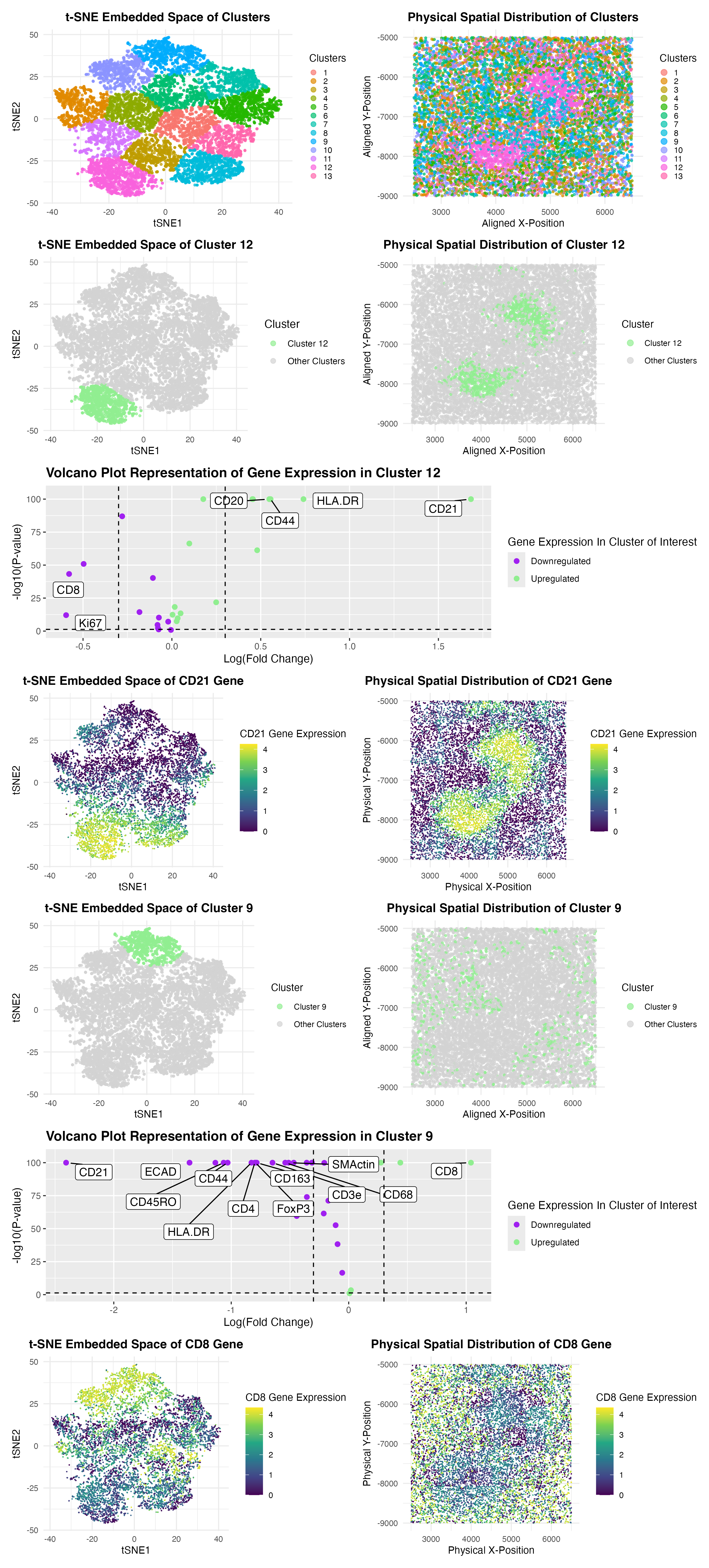
My analysis of the CODEX dataset aims to determine the tissue structure represented by the CODEX Spleen image by applying quality control, dimensionality reduction, K-means clustering, and differential expression analysis. I began performing quality control by filtering out cells with no gene expression, followed by log-transformation and normalization of gene expression data in order to preserve the most meaningful expression of cells. Principal Component Analysis (PCA) was used for dimensionality reduction, and the top nine principal components were selected based on the optimal variance explained. I then incorporated dimensionality reduction through t-distributed Stochastic Neighbor Embedding (t-SNE) to generate a low-dimensional embedding, allowing for the visualization of cellular heterogeneity. K-means clustering with an optimal cluster number of k = 13 (determined through the elbow method and total withinness) was applied to group similar cell populations together. After this was done, I conducted differential expression analysis using Wilcoxon tests, generating volcano plots to highlight significantly upregulated and downregulated genes within the biological context of the CODEX tissue.
From the results, I initially identified Cluster 12 as being enriched in CD21 (CR2) expression. As referenced in the Human Protein Atlas, this marker has been found extensively in mature B cells, which are primarily found in the white pulp region of the spleen. As shown by the volcano plot, the high expression of CD21 being upregulated within cluster 12 suggests that it corresponds to B-cell zones in the white pulp: a region within the spleen responsible for adaptive immune responses. This concept is confirmed through the Human Protein Atlas, which confirms the presence of CD21+ B cells in the spleen. When looking at alternative spatially distinct clusters of interest, Cluster 9 exhibited high expression of the genes CD8, CD163, and CD8 which have been represented as markers for cytotoxic T cells and macrophages. Through further research within the Human Protein Atlas, cytotoxic CD8+ T cells are commonly found in the red pulp of the spleen, where they help regulate immune responses, while CD163+ and CD68+ macrophages play a role in scavenging old red blood cells. The presence of these markers strongly suggests that unlike Cluster 12, Cluster 9 represents the red pulp, where immune surveillance and red blood cell clearance occur. This conclusion aligns with biological knowledge of the spleen tissue and its roles in immune surveillance, adaptive immune response, and erythrocyte cell clearance.
Ultimately, to visualize these findings within the clusters of interest, 9 and 12, I generated t-SNE plots to display the spatial clustering of different cell types and mapped their physical distribution within the tissue. Volcano plots highlighted key differentially expressed genes in the clusters of interest, reinforcing my earlier interpretation. In particular, gene expression maps of CD21 (B cells in white pulp) and CD8 (T cells in red pulp) corroborated further evidence for the respective tissue assignments of Cluster 12 and Cluster 9. Based on these results, I conclude that Cluster 12 depicts the white pulp of the spleen, represented by high CD21 expression, while Cluster 9 portrays the spleen’s red pulp, emphasized through high cytotoxic CD8+ T cells along with macrophages. These findings are consistent with known spleen histology from the cited research papers of Lampert and Nagelkerke SQ et al. below, demonstrating the power of computational analysis in deciphering previously unknown tissue structure from spatial transcriptomic data and CODEX datasets.
Sources:
- https://www.proteinatlas.org/ENSG00000117322-CR2
- https://www.proteinatlas.org/ENSG00000153563-CD8A
- https://www.proteinatlas.org/ENSG00000172116-CD8B
- https://www.proteinatlas.org/ENSG00000177575-CD163
- https://www.proteinatlas.org/ENSG00000129226-CD68
- Lampert IA, Hegde U, Van Noorden S. The Splenic White Pulp in Chronic Lymphocytic Leukaemia: A Microenvironment Associated with CR2 (CD21) Expression, Cell Transformation and Proliferation. Leuk Lymphoma. 1990;1(5-6):319-326. doi:10.1080/10428199009169601
- Nagelkerke SQ, Bruggeman CW, den Haan JMM, et al. Red pulp macrophages in the human spleen are a distinct cell population with a unique expression of Fc-γ receptors. Blood Adv. 2018;2(8):941-953. doi:10.1182/bloodadvances.2017015008
1
2
3
4
5
6
7
8
9
10
11
12
13
14
15
16
17
18
19
20
21
22
23
24
25
26
27
28
29
30
31
32
33
34
35
36
37
38
39
40
41
42
43
44
45
46
47
48
49
50
51
52
53
54
55
56
57
58
59
60
61
62
63
64
65
66
67
68
69
70
71
72
73
74
75
76
77
78
79
80
81
82
83
84
85
86
87
88
89
90
91
92
93
94
95
96
97
98
99
100
101
102
103
104
105
106
107
108
109
110
111
112
113
114
115
116
117
118
119
120
121
122
123
124
125
126
127
128
129
130
131
132
133
134
135
136
137
138
139
140
141
142
143
144
145
146
147
148
149
150
151
152
153
154
155
156
157
158
159
160
161
162
163
164
165
166
167
168
169
170
171
172
173
174
175
176
177
178
179
180
181
182
183
184
185
186
187
188
189
190
191
192
193
194
195
196
197
198
199
200
201
202
203
204
205
206
207
208
209
210
211
212
213
214
215
216
217
218
219
220
221
222
223
224
225
226
227
228
229
230
231
232
233
234
235
236
237
238
239
240
241
242
243
244
245
246
247
248
249
250
251
252
253
254
255
256
257
258
259
260
261
262
263
264
265
266
267
268
269
270
271
272
273
274
275
276
277
278
279
280
281
282
283
284
285
286
287
288
289
290
291
292
293
294
295
296
297
298
299
300
301
302
303
304
305
306
307
308
309
310
311
312
313
314
315
316
317
318
319
320
321
322
323
324
325
326
327
328
329
330
331
332
333
334
335
336
337
338
339
340
341
342
343
344
345
346
347
348
349
350
351
352
353
354
355
356
357
358
359
360
361
362
363
364
365
366
367
368
369
370
371
372
373
374
375
376
377
378
379
380
381
382
383
384
385
386
387
388
389
390
391
392
393
394
395
396
397
398
399
400
401
402
403
404
405
406
407
408
409
410
411
412
413
414
415
416
417
418
419
420
421
422
423
424
425
426
# Loads necessary libraries
library(ggplot2)
library(Rtsne)
library(patchwork)
library(dplyr)
library(cluster)
library(factoextra)
library(ggrepel)
library(NbClust)
library(gridExtra)
library(magick)

# Loads CODEX dataset
file <- '~/Desktop/genomic-data-visualization-2025/data/codex_spleen_3.csv.gz'
data <- read.csv(file, row.names = 1)

# Extracts spatial coordinates and gene expression data
pos <- data[, 1:2]
exp <- data[, 3:ncol(data)]

# Keeps cells which exhibit meaningful expression
cell_exp <- rownames(exp)[rowSums(exp) > 0]
pos <- pos[cell_exp, , drop=FALSE]  # Ensure correct indexing
exp <- exp[cell_exp, , drop=FALSE]

# Log-transforms gene expression data and normalizes data
norm <- log10(exp / rowSums(exp) * mean(rowSums(exp)) + 1)

# Performs PCA on gene expression data
pcs <- prcomp(norm, center = TRUE, scale. = TRUE)

# Chooses optimal PCs
pc_opt <- 9

df_pca <- data.frame(pcs$x[, 1:pc_opt])
rownames(df_pca) <- rownames(norm)
print(dim(df_pca))
print(dim(norm))


# Performs t-SNE embedding on PCA-reduced gene expression data
set.seed(5)
tsne_emb <- Rtsne(pcs$x[, 1:pc_opt])$Y
colnames(tsne_emb) <- c("tSNE1", "tSNE2")  # Ensure proper column names


# Sets optimal cluster count (k = 13 based on elbow method)
k_clusters <- 13
kmean_cluster <- kmeans(tsne_emb, centers = k_clusters)

# Creates cluster, tsne, and pos dataframes
df_cluster <- data.frame(pos,
                         cluster = as.factor(kmean_cluster$cluster),
                         tSNE1 = tsne_emb[, 1],
                         tSNE2 = tsne_emb[, 2])


df_tsne <- df_cluster[, c("tSNE1", "tSNE2")]
df_pos <- df_cluster[, c("x", "y")]

# Visualizes the clusters in tSNE space
p1 <- ggplot(df_cluster, aes(x = tSNE1, y = tSNE2, color = cluster)) +
  geom_point(size = 0.75, alpha = 0.7) +
  theme_minimal() +
  labs(title = "t-SNE Embedded Space of Clusters",
       x = "tSNE1", y = "tSNE2", color = "Clusters") +
  theme(
    plot.title = element_text(size = 12, face = "bold", hjust = 0.5),
    axis.title = element_text(size = 10),
    axis.text = element_text(size = 8)
  ) + theme(legend.title = element_text(size = 10), legend.text = element_text(size = 8)) +
  guides(color = guide_legend(override.aes = list(size = 2)))

# Visualizes the clusters in physical space
p2 <- ggplot(df_cluster, aes(x = x, y = y, color = cluster)) +
  geom_point(size = 0.75, alpha = 0.7) +
  theme_minimal() +
  labs(title = "Physical Spatial Distribution of Clusters", x = "Aligned X-Position", y= "Aligned Y-Position", color = "Clusters") +
  theme(
    plot.title = element_text(size = 12, face = "bold", hjust = 0.5),
    axis.title = element_text(size = 10),
    axis.text = element_text(size = 8)
  ) + theme(legend.title = element_text(size = 10), legend.text = element_text(size = 8)) +
  guides(color = guide_legend(override.aes = list(size = 2.5)))


p1 <- p1 + theme(
  legend.key.size = unit(0.3, "cm"),
  legend.title = element_text(size = 10),
  legend.text = element_text(size = 8)
)

p2 <- p2 + theme(
  legend.key.size = unit(0.3, "cm"),
  legend.title = element_text(size = 10),
  legend.text = element_text(size = 8)
)

# Highlights cluster of interest, cluster 12, separately from other clusters
df_cluster$cluster_highlight <- ifelse(df_cluster$cluster == "12", "Cluster 12", "Other Clusters")

# Visualizes cluster of interest, cluster 12, in t-SNE space
p3 <- ggplot(df_cluster, aes(x = tSNE1, y = tSNE2, color = cluster_highlight)) +
  geom_point(size = 0.75, alpha = 0.7) +
  theme_minimal() +
  labs(title = "t-SNE Embedded Space of Cluster 12",
       x = "tSNE1", y = "tSNE2", color = "Cluster") +
  scale_color_manual(values = c('lightgreen', 'lightgrey')) +
  theme(
    plot.title = element_text(size = 12, face = "bold", hjust = 0.5),
    axis.title = element_text(size = 10),
    axis.text = element_text(size = 8)
  ) +
  guides(color = guide_legend(override.aes = list(size = 2)))

# Visualizes cluster of interest, cluster 12, in physical space
p4 <- ggplot(df_cluster, aes(x = x, y = y, color = cluster_highlight)) +
  geom_point(size = 0.75, alpha = 0.7) +
  theme_minimal() +
  labs(title = "Physical Spatial Distribution of Cluster 12", x = "Aligned X-Position", y= "Aligned Y-Position", color = "Cluster") +
  scale_color_manual(values = c('lightgreen', 'lightgrey')) +
  theme(
    plot.title = element_text(size = 12, face = "bold", hjust = 0.5),
    axis.title = element_text(size = 10),
    axis.text = element_text(size = 8)
  ) + theme(legend.title = element_text(size = 10), legend.text = element_text(size = 8)) +
  guides(color = guide_legend(override.aes = list(size = 2.5)))


# Identifies the cluster of interest as variable
cluster_interest <- "12"

# Calculations for volcano plot of cluster of interest, cluster 12

# Performs Wilcoxon test for differential expression
p_value <- sapply(colnames(norm), function(i) {
  wilcox.test(norm[df_cluster$cluster == cluster_interest, i],
              norm[df_cluster$cluster != cluster_interest, i])$p.value
})

# Computes log fold change (logFC)
logfc <- sapply(colnames(norm), function(i) {
  mean_cluster <- mean(norm[df_cluster$cluster == cluster_interest, i], na.rm = TRUE)
  mean_other <- mean(norm[df_cluster$cluster != cluster_interest, i], na.rm = TRUE)
  log2(mean_cluster / mean_other)
})


# Creates volcano plot dataframe
df_volcano <- data.frame(
  p_value = -log10(p_value + 1e-100),
  logfc,
  genes = colnames(norm)
)

# Remove any NA values from the dataset which caused errors with missing values
df_volcano <- df_volcano[complete.cases(df_volcano), ]

# Adjusts labeling threshold to make more genes visible in volcano plot
df_volcano$gene_label <- ifelse(
  df_volcano$p_value > 2 & abs(df_volcano$logfc) > 0.5,
  as.character(df_volcano$genes),
  NA
)

# Assigns additional labels to ensure highly upregulated and downregulated genes are visible
num_labels_down <- 10
num_labels_up <- 10

top_down <- df_volcano %>% filter(logfc < -0.5) %>% top_n(num_labels_down, wt = p_value)
top_up <- df_volcano %>% filter(logfc > 0.5) %>% top_n(num_labels_up, wt = p_value)

df_volcano$gene_label <- ifelse(
  df_volcano$genes %in% c(top_down$genes, top_up$genes),
  as.character(df_volcano$genes),
  NA
)

# Generates the volcano plot for cluster of interest, cluster 12
volcano_plot_12 <- ggplot(df_volcano, aes(x = logfc, y = p_value, col = logfc > 0)) +
  geom_point(size = 2) +
  geom_label_repel(aes(label = gene_label), box.padding = 0.5,  point.padding = 0.5,
    segment.color = 'black', fill = "white", color = "black", max.overlaps = 25,
    force = 4, size = 4) +
  ylim(0, max(df_volcano$p_value, na.rm = TRUE) + 5) +
  geom_hline(yintercept = -log10(0.05), linetype = "dashed") +
  geom_vline(xintercept = c(-0.3, 0.3), linetype = "dashed") +
  labs(col = "Gene Expression In Cluster of Interest",
    title = "Volcano Plot Representation of Gene Expression in Cluster 12",
    x = "Log(Fold Change)",
    y = "-log10(P-value)") +
  scale_color_manual(values = c("purple", "lightgreen"), labels = c("Downregulated", "Upregulated")) +
  theme(plot.title = element_text(face = "bold"))

# Defines most highly upregulated gene within cluster of interest, cluster 12, to visualize: CD21
selected_gene <- "CD21"

# Assigns selected gene expression values as numeric value
df_pca$gene <- norm[rownames(df_pca), selected_gene]
df_tsne$gene <- norm[rownames(df_tsne), selected_gene]
df_pos$gene <- norm[rownames(df_pos), selected_gene]

# Visualizes selected gene, CD21, in t-SNE space
p5 <- ggplot(df_tsne, aes(x = tSNE1, y = tSNE2, col = gene)) +
  geom_point(size = 0.01) +
  scale_color_viridis_c() +
  theme_minimal() +
  labs(title = "t-SNE Embedded Space of CD21 Gene",
       x = "tSNE1", y = "tSNE2", color = "CD21 Gene Expression") +
  theme(
    plot.title = element_text(size = 12, face = "bold", hjust = 0.5),
    axis.title = element_text(size = 10),
    axis.text = element_text(size = 8)
  ) + theme(legend.title = element_text(size = 10), legend.text = element_text(size = 8))

# Visualizes selected gene, CD21, in physical space
p6 <- ggplot(df_pos, aes(x = x, y = y, col = gene)) +
  geom_point(size = 0.01) +
  scale_color_viridis_c() +
  theme_minimal() +
  labs(title = "Physical Spatial Distribution of CD21 Gene",
       x = "Physical X-Position", y = "Physical Y-Position", color = "CD21 Gene Expression") +
  theme(
    plot.title = element_text(size = 12, face = "bold", hjust = 0.5),
    axis.title = element_text(size = 10),
    axis.text = element_text(size = 8)
  ) + theme(legend.title = element_text(size = 10), legend.text = element_text(size = 8))

######################################################################################
# Change cluster of interest to cluster 9 from cluster 12

# Highlights cluster of interest, cluster 9, separately
df_cluster$cluster_highlight <- ifelse(df_cluster$cluster == "9", "Cluster 9", "Other Clusters")

# Visualizes cluster of interest, cluster 9, in t-SNE space
p7 <- ggplot(df_cluster, aes(x = tSNE1, y = tSNE2, color = cluster_highlight)) +
  geom_point(size = 0.75, alpha = 0.7) +
  theme_minimal() +
  labs(title = "t-SNE Embedded Space of Cluster 9",
       x = "tSNE1", y = "tSNE2", color = "Cluster") +
  scale_color_manual(values = c('lightgreen', 'lightgrey')) +
  theme(
    plot.title = element_text(size = 12, face = "bold", hjust = 0.5),
    axis.title = element_text(size = 10),
    axis.text = element_text(size = 8)
  ) + theme(legend.title = element_text(size = 10), legend.text = element_text(size = 8)) +
  guides(color = guide_legend(override.aes = list(size = 2)))

# Visualizes cluster of interest, cluster 9, in physical space
p8 <- ggplot(df_cluster, aes(x = x, y = y, color = cluster_highlight)) +
  geom_point(size = 0.75, alpha = 0.7) +
  theme_minimal() +
  labs(title = "Physical Spatial Distribution of Cluster 9", x = "Aligned X-Position", y= "Aligned Y-Position", color = "Cluster") +
  scale_color_manual(values = c('lightgreen', 'lightgrey')) +
  theme(
    plot.title = element_text(size = 12, face = "bold", hjust = 0.5),
    axis.title = element_text(size = 10),
    axis.text = element_text(size = 8)
  ) + theme(legend.title = element_text(size = 10), legend.text = element_text(size = 8)) +
  guides(color = guide_legend(override.aes = list(size = 2.5)))

# Identifies the cluster of interest
cluster_interest <- "9"

# Calculations for volcano plot of cluster of interest, cluster 9

# Performs Wilcoxon test for differential expression
p_value <- sapply(colnames(norm), function(i) {
  wilcox.test(norm[df_cluster$cluster == cluster_interest, i],
              norm[df_cluster$cluster != cluster_interest, i])$p.value
})

# Computes log fold change (logFC)
logfc <- sapply(colnames(norm), function(i) {
  mean_cluster <- mean(norm[df_cluster$cluster == cluster_interest, i], na.rm = TRUE)
  mean_other <- mean(norm[df_cluster$cluster != cluster_interest, i], na.rm = TRUE)
  log2(mean_cluster / mean_other)
})

# Creates a volcano plot dataframe for cluster 9
df_volcano <- data.frame(
  p_value = -log10(p_value + 1e-100),
  logfc,
  genes = colnames(norm)
)

# Removes any NA values from the dataset to eliminate warning message about missing values
df_volcano <- df_volcano[complete.cases(df_volcano), ]

# Adjusts labeling threshold to make more genes visible
df_volcano$gene_label <- ifelse(
  df_volcano$p_value > 2 & abs(df_volcano$logfc) > 0.5,
  as.character(df_volcano$genes),
  NA
)

# Assigns more labels to ensure important genes in cluster of interest, cluster 9, are visible
num_labels_down <- 10
num_labels_up <- 10

top_down <- df_volcano %>% filter(logfc < -0.5) %>% top_n(num_labels_down, wt = p_value)
top_up <- df_volcano %>% filter(logfc > 0.5) %>% top_n(num_labels_up, wt = p_value)

df_volcano$gene_label <- ifelse(
  df_volcano$genes %in% c(top_down$genes, top_up$genes),
  as.character(df_volcano$genes),
  NA
)

# Generates the volcano plot for the cluster of interest, cluster 9
volcano_plot_9 <- ggplot(df_volcano, aes(x = logfc, y = p_value, col = logfc > 0)) +
  geom_point(size = 2) +
  geom_label_repel(
    aes(label = gene_label),
    box.padding = 0.5,
    point.padding = 0.5,
    segment.color = 'black',
    fill = "white",
    color = "black",
    max.overlaps = 25,
    force = 4,
    size = 4) +
  ylim(0, max(df_volcano$p_value, na.rm = TRUE) + 5) +
  geom_hline(yintercept = -log10(0.05), linetype = "dashed") +
  geom_vline(xintercept = c(-0.3, 0.3), linetype = "dashed") +
  labs(
    col = "Gene Expression In Cluster of Interest",
    title = "Volcano Plot Representation of Gene Expression in Cluster 9",
    x = "Log(Fold Change)",
    y = "-log10(P-value)") +
  scale_color_manual(values = c("purple", "lightgreen"), labels = c("Downregulated", "Upregulated")) +
  theme(plot.title = element_text(face = "bold"))

# Defines a specific gene within cluster of interest, cluster 9, to visualize: CD8
selected_gene <- "CD8"

# Assigns selected gene expression values as numeric value
df_pca$gene <- norm[rownames(df_pca), selected_gene]
df_tsne$gene <- norm[rownames(df_tsne), selected_gene]
df_pos$gene <- norm[rownames(df_pos), selected_gene]

# Visualizes selected gene, CD8, in t-SNE space
df_tsne$gene <- norm[, selected_gene]
p9 <- ggplot(df_tsne, aes(x = tSNE1, y = tSNE2, col = gene)) +
  geom_point(size = 0.01) +
  scale_color_viridis_c() +
  theme_minimal() +
  labs(title = "t-SNE Embedded Space of CD8 Gene",
       x = "tSNE1", y = "tSNE2", color = "CD8 Gene Expression") +
  theme(
    plot.title = element_text(size = 12, face = "bold", hjust = 0.5),
    axis.title = element_text(size = 10),
    axis.text = element_text(size = 8)) +
  theme(legend.title = element_text(size = 10), legend.text = element_text(size = 8))

# Visualizes selected gene, CD8, in physical space
df_pos$gene <- norm[, selected_gene]
p10 <- ggplot(df_pos, aes(x = x, y = y, col = gene)) +
  geom_point(size = 0.01) +
  scale_color_viridis_c() +
  theme_minimal() +
  labs(title = "Physical Spatial Distribution of CD8 Gene",
       x = "Physical X-Position", y = "Physical Y-Position", color = "CD8 Gene Expression") +
  theme(
    plot.title = element_text(size = 12, face = "bold", hjust = 0.5),
    axis.title = element_text(size = 10),
    axis.text = element_text(size = 8)) +
  theme(legend.title = element_text(size = 10), legend.text = element_text(size = 8))


# Combines all plots using cowplot library for visualization
library(cowplot)

final_plot <- plot_grid(
  plot_grid(p1, p2, ncol = 2),
  plot_grid(p3, p4, ncol = 2),
  volcano_plot_12,
  plot_grid(p5, p6, ncol = 2),
  plot_grid(p7, p8, ncol = 2),
  volcano_plot_9,
  plot_grid(p9, p10, ncol = 2),
  ncol = 1,
  rel_heights = c(6, 6, 5.5, 6, 6, 5.5, 6),
  guides = "collect") +
  theme(plot.margin = unit(c(1,0.5,0.5,0.5), "cm"))

ggsave("hw5_mbhat6.png", final_plot, width = 10, height = 25, dpi = 300, bg = "white", units = "in")

# Loads the saved image to crop the excess white space and save as new page
img <- image_read("hw5_mbhat6.png")
img_cropped <- image_trim(img)
image_write(img_cropped, path = "hw5_mbhat6.png", format = "png")

img_cropped <- image_read("hw5_mbhat6.png")
img_with_margins <- image_border(img_cropped, color = "white", geometry = "50x50")
image_write(img_with_margins, path = "hw5_mbhat6.png", format = "png")


# Sources:
# https://www.datacamp.com/doc/r/cluster
# https://rpkgs.datanovia.com/factoextra/
# https://ggrepel.slowkow.com/
# code-lesson-5.R
# code-lesson-6.R
# code-lesson-7.R
# code-lesson-8.R
# code-lesson-9.R
# code-lesson-10.R
# code-lesson-11.R
# code-lesson-12.R
# https://www.statology.org/set-seed-in-r/
# https://www.appsilon.com/post/r-tsne
# https://www.datacamp.com/tutorial/pca-analysis-r
# https://www.datacamp.com/tutorial/k-means-clustering-r
# https://www.rdocumentation.org/packages/base/versions/3.6.2/topics/data.frame
# https://stackoverflow.com/questions/21271449/how-to-apply-the-wilcox-test-to-a-whole-dataframe-in-r
# https://biostatsquid.com/volcano-plots-r-tutorial/
# https://www.geeksforgeeks.org/how-to-create-and-visualise-volcano-plot-in-r/
# https://sjmgarnier.github.io/viridis/reference/scale_viridis.html
# https://www.analyticsvidhya.com/blog/2021/01/in-depth-intuition-of-k-means-clustering-algorithm-in-machine-learning/
# https://www.rdocumentation.org/packages/patchwork/versions/1.3.0/topics/plot_layout
# https://cran.r-project.org/web/packages/cowplot/vignettes/introduction.html
# https://www.geeksforgeeks.org/decrease-margins-between-plots-when-using-cowplot-in-r/
# https://rdrr.io/cran/magick/man/transform.html
# https://www.proteinatlas.org/ENSG00000117322-CR2
# https://www.proteinatlas.org/ENSG00000153563-CD8A