Identifying tissue structure in spleen tissue sample

1. Written Answer
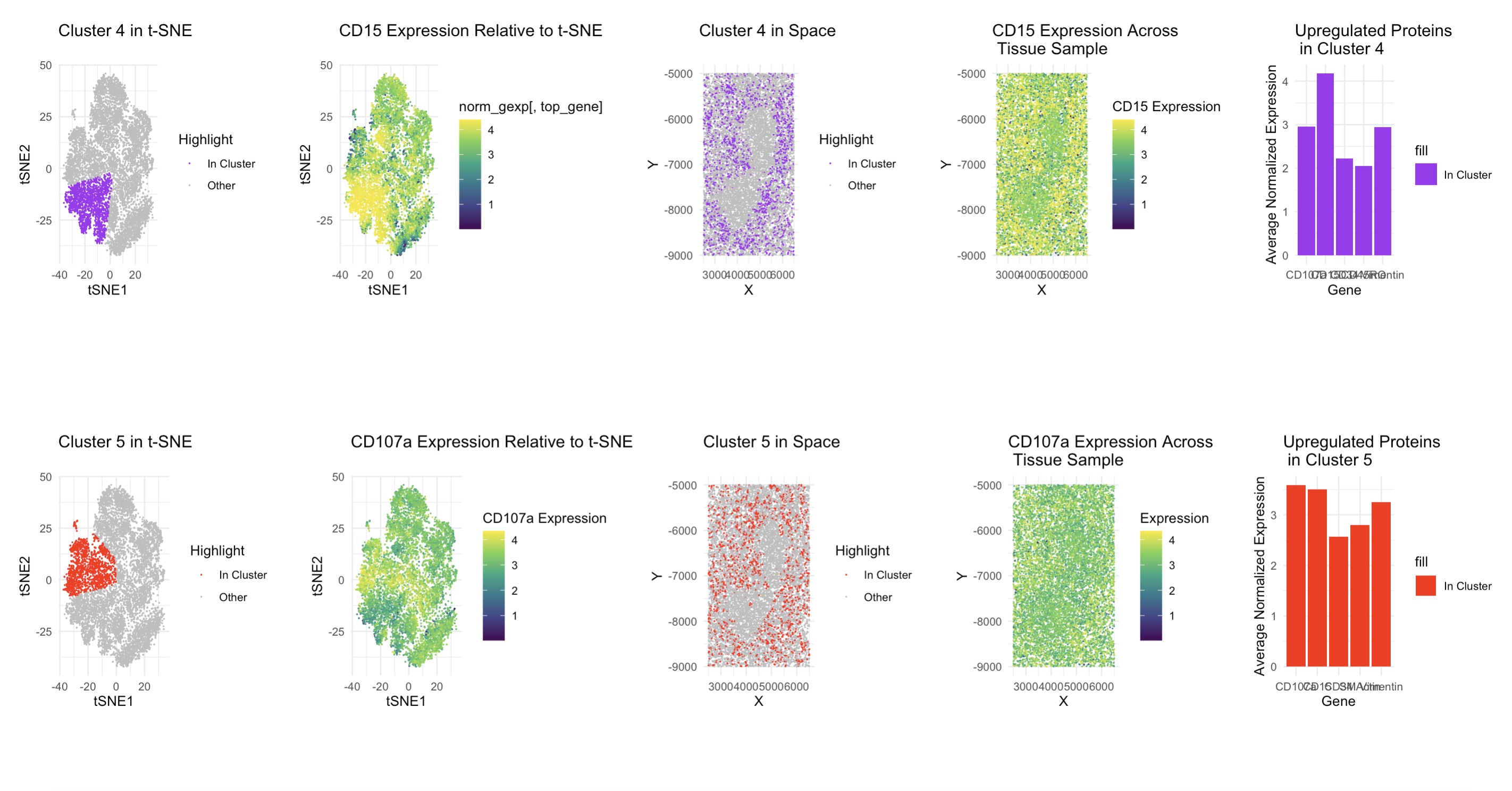
I decided to use techniques such as t-SNE and dimensionality reduction as well as normalizing the protein expression data to figure out the tissue structure in the CODEX sample. I found that using 5 clusters (determined by the elbow method) and Wilcoxon tests to find the unregulated proteins in clusters 4 and 5 worked well. For cluster 4, I found CD15, CD3e, CD45, CD21, and ECAD to be upregulated and I examined CD15 in more detail. CD15 is a granulocyte marker found on some dendritic cells, CD3e is a component of the T cell receptor complex, and CD21 is a B cell and dendritic cell marker, so this cluster is likely a mix of T cells, B cells, and other antigen presenting cells, and since white pulp contains lymphocytes, I believe this is white pulp. For cluster 5, I found CD107a, Podoplanin, PanCK, CD21, CD35, and HLA-DR to be upregulated. Here, CD107a is a marker on activated T cells and CD21 and CD35 are both expressed on B cells and dendritic cells. This means that this is likely activated immune cells like dendritic, B cells, and T cells, which supports the white pulp conclusion I made from cluster 4.
Sources Springer, T. A., et al. (1981). Granulocyte marker CD15 and its role in immune responses. Journal of Experimental Medicine Weiss, A., et al. (1984). The role of CD3 in TCR signaling. Nature Fearon, D. T. (1993). CD21: Complement receptor 2 and B cell activation. Immunological Reviews Mebius, R. E., & Kraal, G. (2005). Structure and function of the spleen white pulp. Nature Reviews Immunology Steinman, R. M., & Cohn, Z. A. (1973). Dendritic cells and antigen presentation in white pulp. The Journal of Experimental Medicine
2. Code (paste your code in between the ``` symbols)
Note: I used the class code as a base and used ChatGPT for graph formatting and debugging some functions.
1
2
3
4
5
6
7
8
9
10
11
12
13
14
15
16
17
18
19
20
21
22
23
24
25
26
27
28
29
30
31
32
33
34
35
36
37
38
39
40
41
42
43
44
45
46
47
48
49
50
51
52
53
54
55
56
57
58
59
60
61
62
63
64
65
66
67
68
69
70
71
72
73
74
75
76
77
78
79
80
81
82
83
84
85
86
87
88
89
90
91
92
93
94
95
96
97
98
99
100
101
102
103
104
105
106
107
108
109
110
111
112
113
114
115
116
117
118
119
120
121
122
123
124
125
126
127
128
129
130
131
132
133
134
135
136
137
138
139
140
141
142
143
144
145
146
147
148
149
150
151
152
153
154
155
156
157
158
159
160
161
162
163
164
165
166
167
168
169
170
171
172
173
174
175
176
177
178
179
180
181
182
183
184
185
186
187
188
189
190
191
192
193
194
library(ggplot2)
library(patchwork)
library(Rtsne)
library(dplyr)
library(reshape2)

# Read and preprocess data
file_path <- '~/Desktop/genomic-data-visualization-2025/data/codex_spleen_3.csv.gz'
data <- read.csv(file_path, row.names = 1)
head(data)

# Extract spatial positions
pos <- data[, 1:2]
colnames(pos) <- c("X", "Y")

# Extract area data (column 3)
area <- data[, 3]

# Extract protein expression data
gexp <- data[, 4:ncol(data)]

# Normalize gene expression (log transformation)
norm_gexp <- log10(gexp/rowSums(gexp) * mean(rowSums(gexp)) + 1)

# Identify the most variable genes (for feature selection)
top_variable_genes <- sort(apply(norm_gexp, 2, var), decreasing=TRUE)
top_variable_genes

# Perform t-SNE for dimensionality reduction
set.seed(42)
tsne_res <- Rtsne(norm_gexp, perplexity=30)
tsne_df <- data.frame(tsne_res$Y)
colnames(tsne_df) <- c("tSNE1", "tSNE2")

# Perform k-means clustering (based on elbow method)
wcss <- sapply(2:15, function(k) {
  kmeans_result <- kmeans(tsne_df, centers=k)
  return(kmeans_result$tot.withinss)
})

# Generate elbow plot to determine optimal K
elbow_plot <- ggplot(data.frame(K=2:15, WCSS=wcss), aes(x=K, y=WCSS)) +
  geom_line() + geom_point() +
  theme_minimal() +
  ggtitle("Elbow Method for Optimal K") +
  xlab("Number of Clusters (K)") +
  ylab("Within-Cluster Sum of Squares")
elbow_plot

# Select optimal K
optimal_k <- 5
clusters <- kmeans(tsne_df, centers=optimal_k)$cluster
tsne_df$Cluster <- as.factor(clusters)

# Map clusters to spatial positions
df_pos <- data.frame(pos, Cluster=as.factor(clusters), Area=area)

# Identify the top differentially expressed gene per cluster
marker_genes <- aggregate(norm_gexp, by=list(Cluster=clusters), FUN=mean)
rownames(marker_genes) <- marker_genes$Cluster
marker_genes <- marker_genes[, -1]
top_genes <- apply(marker_genes, 1, function(x) names(which.max(x)))
df_top_genes <- data.frame(Cluster=rownames(marker_genes), TopGene=top_genes)

# Select a specific cluster for analysis
selected_cluster <- 4
top_gene <- df_top_genes$TopGene[df_top_genes$Cluster == selected_cluster]

# Create cluster-specific data
cluster_tsne <- tsne_df
cluster_tsne$Highlight <- ifelse(cluster_tsne$Cluster == selected_cluster, "In Cluster", "Other")

cluster_pos <- df_pos
cluster_pos$Highlight <- ifelse(cluster_pos$Cluster == selected_cluster, "In Cluster", "Other")

# Gene expression mapping for the selected cluster
gene_exp_df <- data.frame(pos, Expression=norm_gexp[, top_gene])

# Create plots

# 1. Cluster visualization in t-SNE space
p1 <- ggplot(cluster_tsne, aes(x=tSNE1, y=tSNE2, color=Highlight)) +
  geom_point(size=0.02) +
  scale_color_manual(values=c("purple", "gray")) +
  theme_minimal() +
  ggtitle(paste("Cluster", selected_cluster, "in t-SNE"))
p1

# 2. Expression of the top gene in t-SNE
p2 <- ggplot(tsne_df, aes(x=tSNE1, y=tSNE2, color=norm_gexp[, top_gene])) +
  geom_point(size=0.01) +
  scale_color_viridis_c() +
  theme_minimal() +
  ggtitle(paste(top_gene, "Expression Relative to t-SNE"))
p2

# 3. Spatial distribution of cluster
p3 <- ggplot(cluster_pos, aes(x=X, y=Y, color=Highlight)) +
  geom_point(size=0.01) +
  scale_color_manual(values=c("purple", "gray")) +
  theme_minimal() +
  ggtitle(paste("Cluster", selected_cluster, "in Space"))
p3

# 4. Gene expression across tissue sample
p4 <- ggplot(gene_exp_df, aes(x=X, y=Y, color=Expression)) +
  geom_point(size=0.02) +
  scale_color_viridis_c(name="CD15 Expression") +
  theme_minimal() +
  ggtitle(paste(top_gene, "Expression Across \n Tissue Sample"))
p4

# 5. Bar plot of upregulated genes in the cluster
top_cluster_gene_values <- sort(t(marker_genes[selected_cluster, ]), decreasing=TRUE)[1:5]
top_cluster_gene_names <- colnames(marker_genes)[order(t(marker_genes[selected_cluster, ]), decreasing=TRUE)[1:5]]
df_upregulated <- data.frame(Gene=top_cluster_gene_names, Expression=top_cluster_gene_values)

p5 <- ggplot(df_upregulated, aes(x=Gene, y=Expression, fill="In Cluster")) +
  geom_bar(stat="identity", position="dodge", linewidth=0.1) +
  scale_fill_manual(values="purple") +
  theme_minimal() +
  ggtitle(paste("Upregulated Proteins \n in Cluster", selected_cluster)) +
  xlab("Gene") + ylab("Average Normalized Expression")
p5

# Repeat for a second cluster
selected_cluster_2 <- 5
top_gene_2 <- df_top_genes$TopGene[df_top_genes$Cluster == selected_cluster_2]

cluster_tsne_2 <- tsne_df
cluster_tsne_2$Highlight <- ifelse(cluster_tsne_2$Cluster == selected_cluster_2, "In Cluster", "Other")

cluster_pos_2 <- df_pos
cluster_pos_2$Highlight <- ifelse(cluster_pos_2$Cluster == selected_cluster_2, "In Cluster", "Other")

gene_exp_df_2 <- data.frame(pos, Expression=norm_gexp[, top_gene_2])

p6 <- ggplot(cluster_tsne_2, aes(x=tSNE1, y=tSNE2, color=Highlight)) +
  geom_point(size=0.01) +
  scale_color_manual(values=c("red", "gray")) +
  theme_minimal() +
  ggtitle(paste("Cluster", selected_cluster_2, "in t-SNE"))
p6

p7 <- ggplot(tsne_df, aes(x=tSNE1, y=tSNE2, color=norm_gexp[, top_gene_2])) +
  geom_point(size=0.01) +
  scale_color_viridis_c(name="CD107a Expression") +
  theme_minimal() +
  ggtitle(paste(top_gene_2, "Expression Relative to t-SNE"))
p7

p8 <- ggplot(cluster_pos_2, aes(x=X, y=Y, color=Highlight)) +
  geom_point(size=.01) +
  scale_color_manual(values=c("red", "gray")) +
  theme_minimal() +
  ggtitle(paste("Cluster", selected_cluster_2, "in Space"))
p8

p9 <- ggplot(gene_exp_df_2, aes(x=X, y=Y, color=Expression)) +
  geom_point(size=0.01) +
  scale_color_viridis_c() +
  theme_minimal() +
  ggtitle(paste(top_gene_2, "Expression Across \n Tissue Sample"))
p9

top_cluster_gene_values_2 <- sort(t(marker_genes[selected_cluster_2, ]), decreasing=TRUE)[1:5]
top_cluster_gene_names_2 <- colnames(marker_genes)[order(t(marker_genes[selected_cluster_2, ]), decreasing=TRUE)[1:5]]
df_upregulated_2 <- data.frame(Gene=top_cluster_gene_names_2, Expression=top_cluster_gene_values_2)

p10 <- ggplot(df_upregulated_2, aes(x=Gene, y=Expression, fill="In Cluster")) +
  geom_bar(stat="identity", position="dodge") +
  scale_fill_manual(values="red") +
  theme_minimal() +
  ggtitle(paste("Upregulated Proteins \n in Cluster", selected_cluster_2)) +
  xlab("Gene") + ylab("Average Normalized Expression")
p10

# Arrange all plots
increase_margin <- theme(plot.margin = margin(15, 15, 15, 15))
p1 <- p1 + increase_margin
p2 <- p2 + increase_margin
p3 <- p3 + increase_margin
p4 <- p4 + increase_margin
p5 <- p5 + increase_margin
p6 <- p6 + increase_margin
p7 <- p7 + increase_margin
p8 <- p8 + increase_margin
p9 <- p9 + increase_margin
p10 <- p10 + increase_margin

top <- p1 + p2 + p3 + p4 + p5 + plot_layout(ncol = 5, heights = c(2, 1))
bottom <- p6 + p7 + p8 + p9 + p10 + plot_layout(ncol=5, heights = c(2, 1))
top/bottom