Difference between linear or nonlinear dimensionality reduction

###
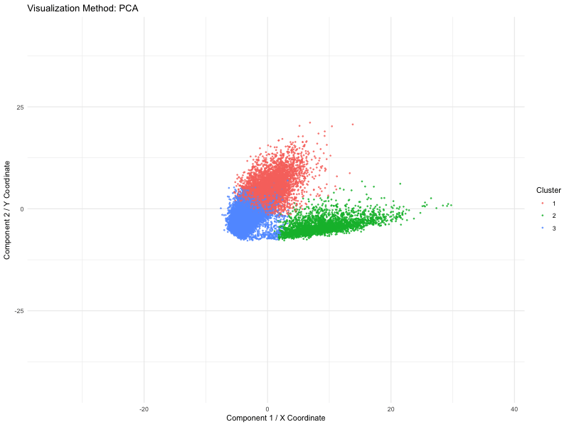
I used PCA (linear), t-SNE and UMAP (nonlinear) dimensionality reduction techniques on spatial transcriptomics data (the Pikachu dataset). The animation loops through these three methods to show how cells are mapped into a two-dimensional space while maintaining various structural characteristics of the original high-dimensional gene expression data.
We use a number of different methods to visualize these spots (defined by PCA, t-SNE or UMAP). Points are the dominant visual channel and color hue by K-means clusters (k = 3)). From the above, we see more compact clusters with some overlaps with PCA as it aims at retaining global variance. But t-SNE preserves local distances well, allowing it to cluster high dimensional data into distinct populations even if the global distances are distorted. Lastly, it retains both local and global organization, with persisted separation but the image size is quite small. Therefore, linear dimensionality reduction might not able to give raise to clear separation of cluster but non linear method (TSNE) is able to do so.
This visual emphasizes how each system of dimensionality reduction affects the eventual clustering structure and biological interpretation. The animation applies the Gestalt principle of continuity, allowing viewers to follow cluster positions between the methods. And the Gestalt principle of similarity gives the ability to compare relative arrangements of clusters across methods by using the same color for the same clusters.
Code (paste your code in between the ``` symbols)
1
2
3
4
5
6
7
8
9
10
11
12
13
14
15
16
17
18
19
20
21
22
23
24
25
26
27
28
29
30
31
32
33
34
35
36
37
38
39
40
41
42
43
44
45
46
47
48
49
50
51
52
53
54
55
56
57
58
library(ggplot2)
library(gganimate)
library(Rtsne)
library(dplyr)
library(uwot)
library(patchwork)

set.seed(46)
data <- read.csv('/Users/harriethe/GenomicDataVisualization/genomic-data-visualization-2025/data/pikachu.csv.gz')
pos <- data[, 5:6]
rownames(pos) <- data$cell_id
gexp <- data[, 7:ncol(data)]
rownames(gexp) <- data$cell_id
log_gexp <- log10(gexp + 1)

pca_emb <- prcomp(log_gexp, center = TRUE, scale. = TRUE)$x[, 1:2]
tsne_emb <- Rtsne(log_gexp, dims = 2, perplexity = 30, verbose = TRUE)$Y
umap_emb <- umap(log_gexp, n_components = 2, n_neighbors = 15)

wss <- sapply(1:10, function(k) {
  kmeans(log_gexp, centers = k, nstart = 10)$tot.withinss
})

elbow_df <- data.frame(k = 1:10, wss = wss)
elbow_plot <- ggplot(elbow_df, aes(x = k, y = wss)) +
  geom_line() +
  geom_point() +
  labs(title = "Elbow Method for Optimal k",
       x = "Number of Clusters (k)",
       y = "Total Within-Cluster Sum of Squares") +
  theme_minimal()


print(elbow_plot)
optimal_k <- 3
clusters <- kmeans(log_gexp, centers = optimal_k)$cluster

df_pca <- data.frame(x = pca_emb[, 1], y = pca_emb[, 2], method = "PCA", Cluster = as.factor(clusters))
df_tsne <- data.frame(x = tsne_emb[, 1], y = tsne_emb[, 2], method = "t-SNE", Cluster = as.factor(clusters))
df_umap <- data.frame(x = umap_emb[, 1], y = umap_emb[, 2], method = "UMAP", Cluster = as.factor(clusters))

df_combined <- rbind(
  cbind(df_pca),
  cbind(df_tsne),
  cbind(df_umap)
)

p <- ggplot(df_combined, aes(x = x, y = y, color = Cluster)) +
  geom_point(size = 0.5, alpha = 0.7) +
  theme_minimal() +
  labs(title = 'Visualization Method: {closest_state}',
       x = "Component 1 / X Coordinate",
       y = "Component 2 / Y Coordinate") +
  transition_states(method, transition_length = 2, state_length = 3) +
  ease_aes('cubic-in-out')

animation <- animate(p, width = 800, height = 600, fps = 10, duration = 12)
anim_save("ec1_jhe46.gif", animation)