EC1- tSNE on genes vs on PCs

Describe your figure briefly so we know what you are depicting (you no longer need to use precise data visualization terms as you have been doing).
The data was normalized by the count and then log transformed. This is an animation of 3 plots.
I first performed tSNE on gene expressions. The first plot encodes the expression of PTPRC as a gradient of color hue from gray to red in the tSNE space when tSNE was performed on genes. We see several distinct clusters, and some clusters from the bottom half of the tSNE plot seem to upregulate PTPRC. The choice of PTPRC would be explained later.
I plotted a scree plot of the standard deviations over the number of PCs and observed an elbow at about the 8th PC. This indicates that most variance is being captured by the first 8 PCs.Thus, I performed tSNE on the first 8 PCs. The second plot encodes the expression of PTPRC as a gradient of color hue from gray to red in the tSNE space when tSNE was performed on the first 8 PCs. We see that the clusters seem less distinct, which makes sense because information on some genes are lost. But still, we see PTPRC being upregulated in clusters from the bottom half of the tSNE plot.
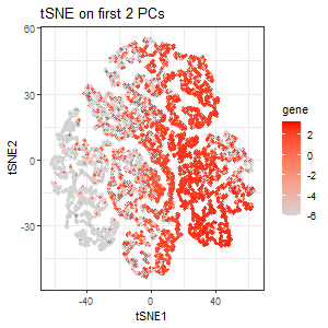
From the scree plot, we see that the standard deviation is still pretty high for the 3rd PC. But for the sake of exploration, I performed tSNE on the first 2 PCs. The third plot encodes the expression of PTPRC as a gradient of color hue from gray to red in the tSNE space when tSNE was performed only on the first 2 PCs. Here, we lost the pattern of upregulation of PTPRC in specific clusters.
PTPRC was specifically chosen because it is the gene with the highest loading (highest contribution) in the 3rd PC, and so I expect the expression of PTPRC in tSNE space to be different when tSNE is performed only on the first 2 PCs. Variation in PC3 is highly influenced by PTPRC expression. If we include PC3, where PTPRC contributes the most, the tSNE structure will reflect PTPRC’s expression pattern more strongly. If we exclude PC3 (only use the first two PCs), the tSNE representation will be missing the key variation from PTPRC, causing a different cluster structure or spatial distribution.
From this exploration, we see that we retain the most information when we perform non-linear dimensionality reduction on genes directly. However, to save time from running through the large number of genes, we might want to perform linear dimensionality reduction on the genes first before performing non-linear dimensionality reduction on those data (the PCs). In this case, it is important that we use the number of PCs that capture most of the variance of the genes such that we don’t lose important information.
Code (paste your code in between the ``` symbols)
1
2
3
4
5
6
7
8
9
10
11
12
13
14
15
16
17
18
19
20
21
22
23
24
25
26
27
28
29
30
31
32
33
34
35
36
37
38
39
40
41
42
43
44
45
46
47
48
49
50
51
52
53
54
55
56
57
58
59
60
61
62
63
64
65
66
67
68
69
70
71
72
73
74
75
76
77
78
79
80
81
82
83
84
85
86
87
88
89
90
91
92
93
94
95
96
97
98
99
100
101
102
103
104
105
106
107
108
109
110
111
112
113
114
115
116
117
118
119
120
121
122
123
124
125
126
127
128
129
130
131
132
133
134
135
136
137
138
139
140
141
142
143
144
145
146
147
148
149
150
151
152
153
154
155
156
157
158
159
160
161
162
163
164
165
166
167
168
169
170
171
172
173
174
175
176
177
178
179
180
181
182
183
184
185
186
187
188
189
190
191
192
193
file <- "data/pikachu.csv.gz"
install.packages('gganimate')
install.packages('gifski')

data <- read.csv(file)
data[1:5,1:10]
dim(data)

pos <- data[, 5:6]
rownames(pos) <- data$cell_id
gexp <- data[, 7:ncol(data)]
rownames(gexp) <- data$barcode


## normalize by total expression
norm <- gexp/rowSums(gexp) * 10000
norm[1:5,1:5]
loggexp <- log10(norm + 1)

## normalization by log transform
loggexp <- log10(norm + 0.000001)


## try many ks for genes
ks = seq.int(1, 20, 2)
ec1totw <- sapply(ks, function(k) {
  print(k)
  set.seed(1)
  com <- kmeans(loggexp, centers=k)
  return(com$tot.withinss)
})

## find optimal k from elbow plot
library(ggplot2)
ec1df0<-data.frame(ks,ec1totw)
gene_totw<-ggplot(ec1df0, aes(x=ks, y=ec1totw)) + geom_point(size=3)+
  labs(
    title = "Total Withinness for different k's",
    x = "Number of k",
    y = "Total Withinness"
  ) +
  theme_bw()
gene_totw

## k-means clustering
set.seed(1)
genes_com <- kmeans(loggexp, centers=15)
genes_clusters <- genes_com$cluster
genes_clusters <- as.factor(genes_clusters) ## tell R it's a categorical variable
names(genes_clusters) <- rownames(gexp)
head(genes_clusters)

## tSNE
set.seed(1)
genes_emb <- Rtsne::Rtsne(loggexp)
head(genes_emb$Y)

#PTPRC in tSNE space
genes_tSNE <- data.frame(genes_emb$Y, clusters=genes_clusters, gene = loggexp[, 'PTPRC'])
genes_tSNE_plot<- ggplot(genes_tSNE, aes(x=X1, y=X2, colour=gene)) + geom_point(size=1)+
  labs(
    title = "tSNE on genes",
    x = "tSNE1",
    y = "tSNE2"
  ) +
  scale_color_gradient(low = 'lightgrey', high='red') +
  theme_bw()
genes_tSNE_plot


## perform pca
set.seed(1)
pcs<- prcomp(loggexp)
names(pcs)
pcs$sdev
pcs$rotation[1:5,1:5]
?prcomp

## visualize a scree plot
screedf<- data.frame(sdev=pcs$sdev,index=1:length(pcs$sdev))
ggplot(screedf, aes(x=index, y=sdev))+geom_point()
ggplot(screedf[1:25,], aes(x=index, y=sdev))+geom_point()
##    most variance is being captured by first 8 PCs


## tSNE on first 8 PCs
elbow <- sapply(2:20, function(k) {
  out <- kmeans(pcs$x[,1:8], centers=k)
  out$tot.withinss
})
plot(2:20, elbow)
# 15 is a reasonable elbow for clustering on PCA data too

## k-means clustering
pc_com <- kmeans(pcs$x[,1:8], centers=15)
pc_cluster <- pc_com$cluster
pc_cluster <- as.factor(pc_cluster) ## tell R it's a categorical variable
names(pc_cluster) <- rownames(pcs)
head(pc_cluster)

## tSNE
pc_emb <- Rtsne::Rtsne(pcs$x[,1:8])
head(pc_emb$Y)

#PTPRC in tSNE space
pc_tSNE <- data.frame(pc_emb$Y, clusters=pc_cluster, gene = loggexp[, 'PTPRC'])
pc_tSNE_plot<- ggplot(pc_tSNE, aes(x=X1, y=X2, color=gene)) + geom_point(size=1)+
  labs(
    title = "tSNE on first 8 PCs",
    x = "tSNE1",
    y = "tSNE2"
  ) +
  scale_color_gradient(low = 'lightgrey', high='red') +
  theme_bw()
pc_tSNE_plot


## tSNE on first 2 PCs
elbow <- sapply(2:20, function(k) {
  out <- kmeans(pcs$x[,1:2], centers=k)
  out$tot.withinss
})
plot(2:20, elbow)
# 15 is a reasonable elbow for clustering on PCA data too

pc3_loadings <- pcs$rotation[, 3]
sort(pc3_loadings, decreasing=FALSE)
#PTPRC has the highest loading in PC3, which is not captured when performing tSNE on PC[,1:2]


## k-means clustering
pc_com <- kmeans(pcs$x[,1:2], centers=15)
pc_cluster <- pc_com$cluster
pc_cluster <- as.factor(pc_cluster) ## tell R it's a categorical variable
names(pc_cluster) <- rownames(pcs)
head(pc_cluster)

## tSNE on first 2 PCs
pc2_emb <- Rtsne::Rtsne(pcs$x[,1:2])
head(pc2_emb$Y)

#clusters in tSNE space
pc2_tSNE <- data.frame(pc2_emb$Y, clusters=pc_cluster, gene = loggexp[, 'PTPRC'])
pc2_tSNE_plot<- ggplot(pc2_tSNE, aes(x=X1, y=X2, color=gene)) + geom_point(size=1)+
  labs(
    title = "tSNE on first 2 PCs",
    x = "tSNE1",
    y = "tSNE2"
  ) +
  scale_color_gradient(low = 'lightgrey', high='red') +
  theme_bw()
pc2_tSNE_plot


## in order to animate, need to make new data frame with all the information
# Create the animation data frame with order labels
anim_df <- rbind(
  cbind(genes_tSNE, order = "tSNE on Genes"),
  cbind(pc_tSNE, order = "tSNE on first 8 PCs"),
  cbind(pc2_tSNE, order = "tSNE on first 2 PCs")
)

library(gganimate)
# Create the base plot
p <- ggplot(anim_df, aes(x = X1, y = X2, color = gene)) +
  geom_point(size = 1, alpha = 0.7) +
  scale_color_gradient(low = 'lightgrey', high='red') +
  labs(x = "tSNE1", y = "tSNE2") +
  theme_bw() +
  theme(legend.position = "right") +
  transition_states(order, transition_length = 3, state_length = 3) +
  ggtitle("{closest_state}") +  # Dynamic title based on 'order'
  ease_aes('linear') +
  view_follow()


anim <- p + transition_states(order) + view_follow() + ease_aes('linear')
animate(anim, height=300, width=300)
anim_save("hwEC1.gif", animation = last_animation(), path = "C:/Users/looia/OneDrive - Johns Hopkins/2025 Spring/Genomic Data Visualizations/ec1")
?animate
Code for volcano plot referenced https://jef.works/genomic-data-visualization-2024/blog/2024/02/14/challin1/
The final png was merged on https://products.groupdocs.app/merger/png#folderName=dd1be75e-700e-4c83-b0c3-8787377d0c58 because the the viewport on R is too small for my figure.