PCA, tSNE, and Spatial Distribution Animation of Pikachu Dataset

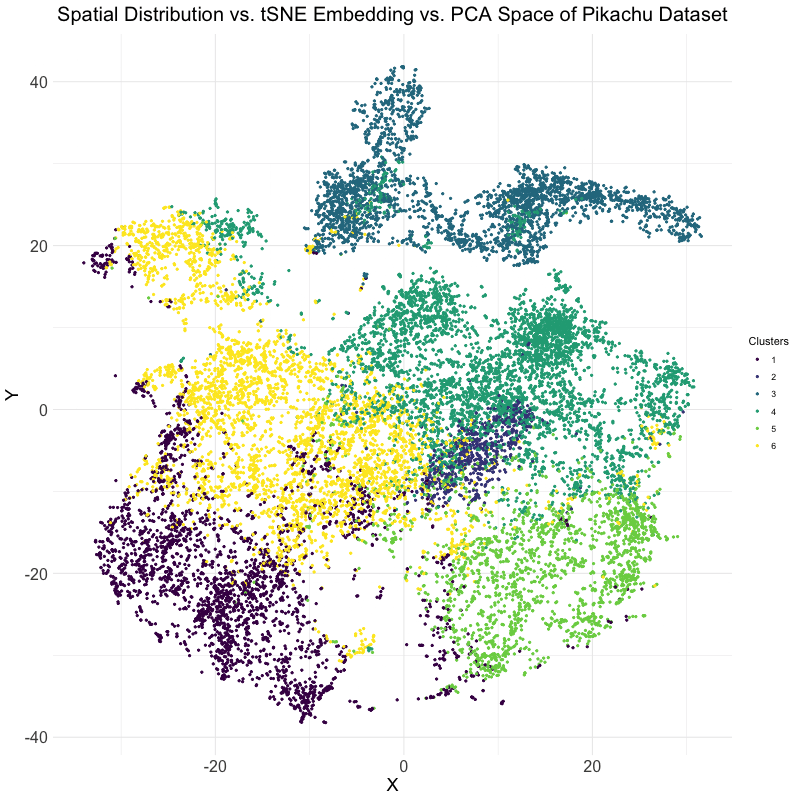
This visualization explores the differences between linear and nonlinear dimensionality reduction techniques for analyzing spatial transcriptomics data. Specifically, the animation compares the spatial distribution of cells, their representation in t-SNE embedding space, and their clustering in PCA space. The dataset used is the Pikachu dataset, where cells are clustered based on gene expression patterns. The transition between these visualizations helps to illustrate how different dimensionality reduction techniques organize and represent cellular relationships.
The analysis begins by extracting and log-transforming gene expression data to normalize expression levels. PCA is then performed to capture the main variance in the dataset using a linear approach, while t-SNE, a nonlinear, stochastic method, is applied to emphasize local structure in the high-dimensional gene expression space. The dataset is clustered using k-means clustering with an optimal cluster of k = 6 being identified utilizing the elbow point and total withinness method. These clusters are then mapped to both PCA and t-SNE spaces. Finally, the physical spatial distribution of these clusters is plotted to compare how cells are positioned in their original spatial arrangement versus how they are structured in lower-dimensional embeddings.
The animation cycles through three views: the t-SNE embedding, the original spatial distribution of cells, and the PCA projection. This allows for the visualization of the impact of using PCA versus t-SNE for dimensionality reduction. PCA maintains global variance structure, which can be useful for identifying large-scale trends, while t-SNE preserves local relationships, making it effective for visualizing distinct clusters. Comparing these projections with the spatial distribution helps in understanding how gene expression clusters relate to the physical organization of cells.
The code used to generate this visualization is as follows:
1
2
3
4
5
6
7
8
9
10
11
12
13
14
15
16
17
18
19
20
21
22
23
24
25
26
27
28
29
30
31
32
33
34
35
36
37
38
39
40
41
42
43
44
45
46
47
48
49
50
51
52
53
54
55
56
57
58
59
60
61
62
63
64
65
66
67
68
69
70
71
72
73
74
75
76
77
78
79
80
81
82
83
84
85
86
# Load necessary libraries
library(ggplot2)
library(Rtsne)
library(patchwork)
library(dplyr)
library(cluster)
library(factoextra)
library(ggrepel)
library(NbClust)
library(gridExtra)
library(magick)

# Loads the Pikachu dataset
file <- '~/Desktop/genomic-data-visualization-2025/data/pikachu.csv.gz'
data <- read.csv(file)
set.seed(40)

# Extracts relevant data from Pikachu
gexp <- data[, 7:ncol(data)]
rownames(gexp) <- data$cell_id
pos <- data[, 5:6]

# Log-transform gene expression data
loggexp <- log10(gexp + 1)

# Performs PCA
top_pcs <- prcomp(loggexp)
df_pca <- data.frame(top_pcs$x)

# Performs t-SNE
tsne_emb <- Rtsne(loggexp, dims = 3, pca = TRUE, perplexity = 30, verbose = FALSE)
tsne_data <- as.data.frame(tsne_emb$Y)
colnames(tsne_data) <- c("tSNE1", "tSNE2")

# Sets optimal cluster count (k = 6 based on elbow method)
k_clusters <- 6
kmean_cluster <- kmeans(loggexp, centers = k_clusters)
clusters <- as.factor(kmean_cluster$cluster)

# Creates data frames for pos, pca, and tsne
df_pos <- data.frame(x = pos$aligned_x, y = pos$aligned_y, cluster = clusters)
df_pca <- data.frame(x = top_pcs$x[,1], y = top_pcs$x[,2], cluster = clusters)
df_tsne <- data.frame(x = tsne_emb$Y[,1], y = tsne_emb$Y[,2], cluster = clusters)

# Creates animation of tsne, position, and pca together
df <- rbind(cbind(df_tsne, order = 1),
            cbind(df_pos, order = 2),
            cbind(df_pca, order = 3))

anim_plot <- ggplot(df, aes(x = x, y = y, color = cluster)) + geom_point(size=.75)

anim <- anim_plot + transition_states(order) + view_follow() +
  enter_fade() + exit_fade() +
  scale_color_viridis_d() + theme_minimal() +
  labs(title = "Spatial Distribution vs. tSNE Embedding vs. PCA Space of Pikachu Dataset",
       x = "X", y = "Y", color = "Clusters") +
  theme(
    plot.title = element_text(size = 20, face = "bold", hjust = 0.5),
    axis.title = element_text(size = 18),
    axis.text = element_text(size = 16)
  )

# Animates gif with 15 frames per second over the course of 5 seconds
gif <- animate(anim, height = 800, width = 800, fps = 15, duration = 5)

anim_save(filename = "hwEC1_mbhat6.gif", gif)

# Sources:
# https://www.datacamp.com/doc/r/cluster
# https://rpkgs.datanovia.com/factoextra/
# https://ggrepel.slowkow.com/
# code-lesson-5.R
# code-lesson-6.R
# code-lesson-7.R
# code-lesson-8.R
# code-lesson-9.R
# code-lesson-10.R
# code-lesson-11.R
# code-lesson-12.R
# https://www.statology.org/set-seed-in-r/
# https://www.appsilon.com/post/r-tsne
# https://www.datacamp.com/tutorial/pca-analysis-r
# https://www.datacamp.com/tutorial/k-means-clustering-r
# https://www.rdocumentation.org/packages/base/versions/3.6.2/topics/data.frame
# https://www.datanovia.com/en/blog/gganimate-how-to-create-plots-with-beautiful-animation-in-r/
# https://gganimate.com/reference/anim_save.html