Deconvolution

The data was normalized by counts and then log transformed. Deconvolution was performed on the raw data.
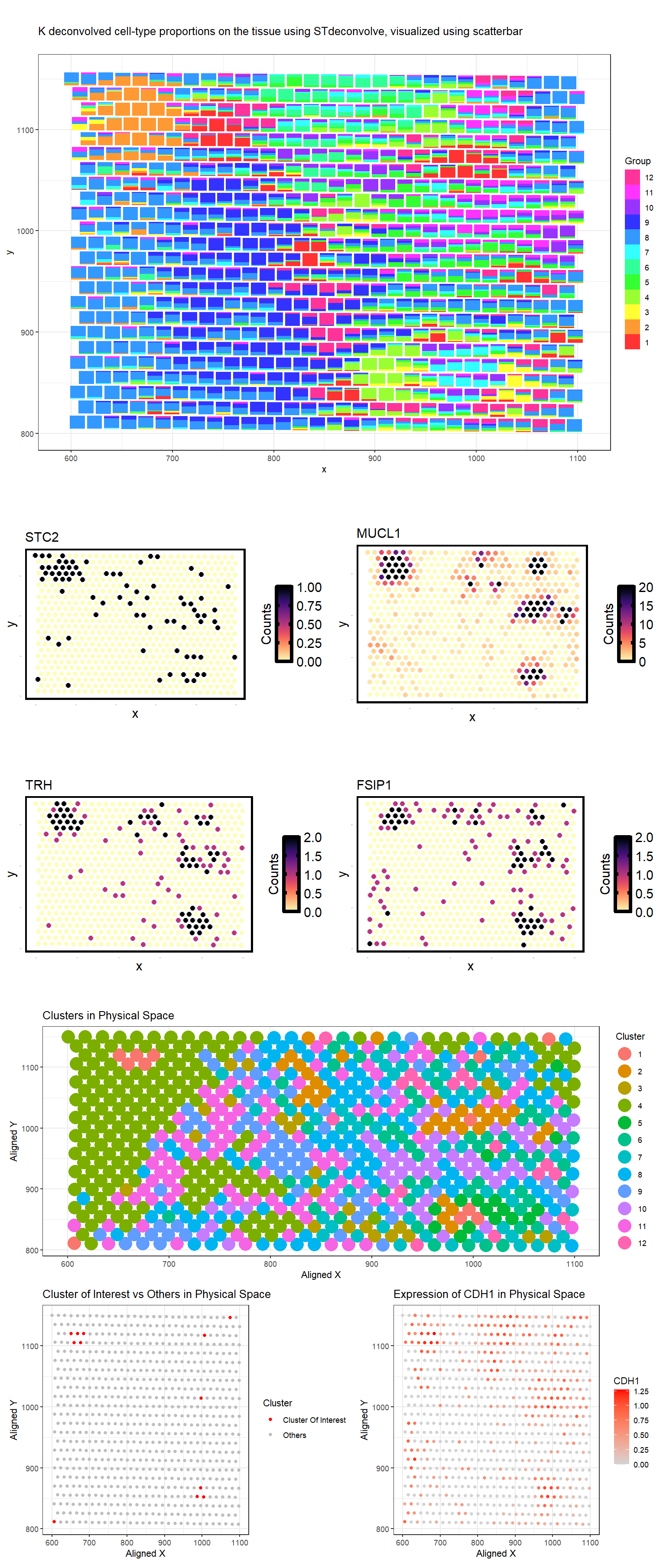
The first plot is a scatterplot visualizing 12 deconvolved cell-type proportions on the tissue using STdeconvolve.
I identified Breast glandular cells. It is cell type 2 from the deconvolved populations. We defined the top marker genes here as genes highly expressed in the deconvolved cell-type (count > 5) that also have the top 4 highest log2(fold change) when comparing the deconvolved cell-type’s expression profile to the average of all other deconvolved cell-types’ expression profiles. These genes include STC2, MUCL1, TRH, and FSIP1 [1-4]. The second plot shows the visualization of deconvolved gene expression associated with cell type 2 in physical space.
Next, clusters were determined using the kmeans algorithm with k=12 clusters, the same k used for the deconvolution. Plot 3 shows physical space with the 12 distinct clusters.
Plot 4 shows the cluster 1 in red and all other clusters in gray in tSNE space. Cluster 1 was chosen because its physical location corresponds to clusters with highest cluster 2 proportion in the deconvolution results.
Performing differential gene analysis (wilcox) showed CDH1, ANKRD30A, ALDH3B2, ELF3, MLPH, NQO1 as upregulated in this cluster 1 from k-means clustering. THese are also characteristic of breast glandular cells.
Plot 5 shows the physical space with the most highly upregulated geneCDH1 expression as a gradient from gray to red.
In terms of similarities, both deconvolution and k-means clustering highlight a spatially localized group of cells corresponding to breast glandular cells. Marker genes derived from deconvolution (STC2, MUCL1, TRH, FSIP1) and k-means clustering (CDH1, ANKRD30A, ALDH3B2, etc.) show a strong biological association with glandular cells. The spatial distribution of the deconvolved cell type also closely matches the cluster locations identified via k-means. This would be because the gene expression of each spot before deconvolution used for k-means clustering is dominated by the most abundant cell type within that spot.
However, since deconvolution directly assigns proportions of multiple cell types to each spot, whereas k-means clustering groups spots into discrete clusters, some distances exist. The most highly upregulated sets of genes identified by wilcox in deconvolution and k-means clustering were different, becuase gene expression of each spot before deconvolution used for k-means clustering represents a mixture of cells and is not accurate to the true expression of one type of cell. The cluster of breast glandular cells also appears smaller in the physical space in k-means clustering than in deconvolution. This suggests that many spots contain mixed cell populations, where glandular cells are present but not dominant enough to define the entire cluster. Deconvolution captures these mixed contributions, leading to a broader distribution.
Codes for deconvolution: https://jef.works/STdeconvolve/getting_started.html Codes for scatterbars: https://jef.works/scatterbar/articles/getting-started-with-scatterbars.html Images concatenated online: https://products.groupdocs.app/merger/png#folderName=dd1be75e-700e-4c83-b0c3-8787377d0c58 Other references: https://www.proteinatlas.org/ENSG00000113739-STC2/single+cell/breast https://www.proteinatlas.org/ENSG00000172551-MUCL1/single+cell/breast https://www.proteinatlas.org/ENSG00000170893-TRH/single+cell/breast https://www.proteinatlas.org/ENSG00000150667-FSIP1/single+cell/breast https://www.proteinatlas.org/ENSG00000039068-CDH1/single+cell/breast
Code (paste your code in between the ``` symbols)
1
2
3
4
5
6
7
8
9
10
11
12
13
14
15
16
17
18
19
20
21
22
23
24
25
26
27
28
29
30
31
32
33
34
35
36
37
38
39
40
41
42
43
44
45
46
47
48
49
50
51
52
53
54
55
56
57
58
59
60
61
62
63
64
65
66
67
68
69
70
71
72
73
74
75
76
77
78
79
80
81
82
83
84
85
86
87
88
89
90
91
92
93
94
95
96
97
98
99
100
101
102
103
104
105
106
107
108
109
110
111
112
113
114
115
116
117
118
119
120
121
122
123
124
125
126
127
128
129
130
131
132
133
134
135
136
137
138
139
140
141
142
143
144
145
146
147
148
149
150
151
152
153
154
155
156
157
158
159
160
161
162
163
164
165
166
167
168
169
170
171
172
173
174
175
176
177
178
179
180
181
182
183
184
185
186
187
188
189
190
191
192
193
194
195
196
197
198
199
200
201
202
203
204
205
require(remotes)
remotes::install_github('JEFworks-Lab/STdeconvolve')

if (!require("BiocManager", quietly = TRUE))
  install.packages("BiocManager")

BiocManager::install("fgsea")

file <- "C:/Users/looia/Desktop/genomic-data-visualization-2025/data/eevee.csv.gz"
data <- read.csv(file, row.names=1)
head(data)
pos <- data[,2:3]
colnames(pos) <- c('x', 'y')
cd <- data[, 4:ncol(data)]
rownames(pos) <- rownames(cd) <- data$barcode

## limiting to top 2000 most highly expressed genes
## to explore: what happens if you use top 2000, or all genes?
topgenes <- names(sort(colSums(cd), decreasing=TRUE)[1:2000])
gexpsub <- cd[,topgenes]
gexpsub[1:5,1:5]
dim(gexpsub)

## normalize by total expression
norm <- gexpsub/rowSums(gexpsub) * 10000
norm[1:5,1:5]
loggexp <- log10(norm + 1)

library(STdeconvolve)


# Deconvolution -----------------------------------------------------------


## remove pixels with too few genes--- no cells in these spots or technical reasons
counts <- cleanCounts(t(cd), min.lib.size = 100, verbose=TRUE, plot=TRUE)

## feature select for genes (highly variable)
corpus <- restrictCorpus(counts, removeAbove=1.0, removeBelow = 0.05, nTopOD=200)   #removeAbove: house keeping genes that are expressed in 100% of our spots.
                                                                        #rare cell type (with genes expressed in <5% of all cells) removed

## choose optimal number of cell-types
ldas <- fitLDA(t(as.matrix(corpus)), Ks = seq(6,15,3))
## 12 is at the elbow

## get best model results
optLDA <- optimalModel(models = ldas, opt = "12")

## extract deconvolved cell-type proportions (theta) and transcriptional profiles (beta)
results <- getBetaTheta(optLDA, perc.filt = 0.05, betaScale = 1000)     #matches filter to remove rare cell type
deconProp <- results$theta
deconGexp <- results$beta

## visualize deconvolved cell-type proportions
vizAllTopics(deconProp, pos,
             r=8, lwd=0)


## extract deconvolved cell-type proportions (theta) and transcriptional profiles (beta)
results <- getBetaTheta(optLDA, perc.filt = 0.05, betaScale = 1000)     #matches filter to remove rare cell type
deconProp <- results$theta
deconGexp <- results$beta

remotes::install_github('JEFworks-Lab/scatterbar')
library(scatterbar)


scatterbar<-scatterbar::scatterbar(deconProp, pos, size_x = 15, size_y = 13, padding_x = 0.1, padding_y = 0.1) + ggplot2::coord_fixed() + theme_bw() + ylab('y') + xlab('x') +
  labs(
    title = "K deconvolved cell-type proportions on the tissue using STdeconvolve, visualized using scatterbar
")

scatterbar


# gene expression deconvolved ---------------------------------------------

celltype <- 2
## highly expressed in cell-type of interest
highgexp <- names(which(deconGexp[celltype,] > 5))
## high log2(fold-change) compared to other deconvolved cell-types
log2fc <- sort(log2(deconGexp[celltype,highgexp]/colMeans(deconGexp[-celltype,highgexp])), decreasing=TRUE)
markers <- names(log2fc)[1:4]

## visualize spatial expression of top genes
df <- merge(as.data.frame(pos),
            as.data.frame(t(as.matrix(counts[markers,]))),
            by = 0)
ps <- lapply(markers, function(marker) {
  vizGeneCounts(df = df,
                gene = marker,
                # groups = annot,
                # group_cols = rainbow(length(levels(annot))),
                size = 3, stroke = 0.1,
                plotTitle = marker,
                winsorize = 0.05,
                showLegend = TRUE) +

    ## remove the pixel "groups", which is the color aesthetic for the pixel borders
    ggplot2::guides(colour = "none") +

    ## change some plot aesthetics
    ggplot2::theme(axis.text.x = ggplot2::element_text(size=0, color = "black", hjust = 0, vjust = 0.5),
                   axis.text.y = ggplot2::element_text(size=0, color = "black"),
                   axis.title.y = ggplot2::element_text(size=15),
                   axis.title.x = ggplot2::element_text(size=15),
                   plot.title = ggplot2::element_text(size=15),
                   legend.text = ggplot2::element_text(size = 15, colour = "black"),
                   legend.title = ggplot2::element_text(size = 15, colour = "black", angle = 90),
                   panel.background = ggplot2::element_blank(),
                   ## border around plot
                   panel.border = ggplot2::element_rect(fill = NA, color = "black", size = 2),
                   plot.background = ggplot2::element_blank()
    ) +
    ggplot2::guides(fill = ggplot2::guide_colorbar(title = "Counts",
                                                   title.position = "left",
                                                   title.hjust = 0.5,
                                                   ticks.colour = "black",
                                                   ticks.linewidth = 2,
                                                   frame.colour= "black",
                                                   frame.linewidth = 2,
                                                   label.hjust = 0
    ))
})
deconv<-gridExtra::grid.arrange(
  grobs = ps,
  layout_matrix = rbind(c(1, 2),
                        c(3, 4))
)


# k means clustering ------------------------------------------------------

set.seed(1)
com <- kmeans(cd, centers=12)
clusters <- com$cluster
clusters <- as.factor(clusters) ## tell R it's a categorical variable
names(clusters) <- rownames(gexp)
head(clusters)

##A panel visualizing clusters in physical space
df2 <- data.frame(aligned_x = data$aligned_x, aligned_y = data$aligned_y, emb$Y, clusters)
k_clusters<-ggplot(df2) + geom_point(aes(x = aligned_x, y = aligned_y,
                             color= clusters), size=7)  +
  labs(
    title = "Clusters in Physical Space",
    color = "Cluster",
    x = "Aligned X",
    y = "Aligned Y"
  ) +
  theme_bw()


## characterizing cluster 1
interest <- 1
cellsOfInterest<-names(clusters)[clusters==interest]
OtherCells<-names(clusters)[clusters!=interest]
ClusterOfInterest<- ifelse(clusters==interest,'Cluster Of Interest','Others')

##Plot 1: A panel visualizing your one cluster of interest in physical space
interest <- 1
ClusterOfInterest<- ifelse(clusters==interest,'Cluster Of Interest','Others')
df1 <- data.frame(aligned_x = data$aligned_x, aligned_y = data$aligned_y, emb$Y, clusters, ClusterOfInterest)
p1<-ggplot(df2) + geom_point(aes(x = aligned_x, y = aligned_y,
                                 color= ClusterOfInterest), size=1.5)  +
  scale_color_manual(values = c("red","gray")) +
  labs(
    title = "Cluster of Interest vs Others in Physical Space",
    color = "Cluster",
    x = "Aligned X",
    y = "Aligned Y"
  ) +
  theme_bw()
p1


# do wilcox for DE genes
interest<-1
pv <- sapply(colnames(loggexp), function(i) {
  print(i) ## print out gene name
  wilcox.test(loggexp[clusters == interest, i], loggexp[clusters != interest, i])$p.val
})
head(sort(pv)) # CDH1     ANKRD30A      ALDH3B2         ELF3         MLPH         NQO1


## Plot 5: A panel visualizing one of these genes in space

df5 <- data.frame(aligned_x = data$aligned_x, aligned_y = data$aligned_y, emb$Y, clusters, gene=loggexp[,'CDH1'],ClusterOfInterest)
CDH1<-ggplot(df5) + geom_point(aes(x = aligned_x, y = aligned_y,
                                 color= gene), size=1.5)  +
  scale_color_gradient(low = 'lightgrey', high='red') +
  labs(
    title = "Expression of CDH1 in Physical Space",
    color = "CDH1",
    x = "Aligned X",
    y = "Aligned Y"
  ) +
  theme_bw()
CDH1