Linear vs Nonlinear Dimension Reduction

I used the Pikachu dataset, an imaging based dataset. Therefore, I did not normalize the gene expression, as it was already for each cell. I then used a linear technique for dimension reduction: PCA. Computing an elbow plot allowed me to choose the best value for k and generate the appropriate number of clusters. I then employed a nonlinear technique to dimension reduction: tSNE. I used the same k value so the comparison would be more matched. The last step was to combine the data frames and display the two graphs as an animation.
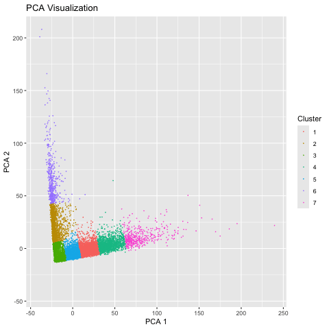
We can see that the linear method, PCA, is more spread out on the axes, which is due to the way it preserves global relationships in the data. However, tSNE is more compact because it does a better job at preserving local relationships, so the position of each cluster in relation to each other does not have much significance.
Code (paste your code in between the ``` symbols)
1
2
3
4
5
6
7
8
9
10
11
12
13
14
15
16
17
18
19
20
21
22
23
24
25
26
27
28
29
30
31
32
33
34
35
36
37
38
39
40
41
42
43
44
45
46
47
48
49
50
51
52
53
54
55
56
57
58
data <- read.csv('/Users/anishkabhartiya/Desktop/genomic-data-visualization-2025/data/pikachu.csv.gz', row.names=1)
data[1:5,1:10]

pos <- data[,4:5]
exp <- data[,6:ncol(data)]
head(pos)
head(exp)

pcs <- prcomp(exp)

elbow <- sapply(2:20, function(k) {
  out <- kmeans(pcs$x[,1:2], centers=k)
  out$tot.withinss
})
plot(2:20, elbow)

## elbow around 7, so choose k as 7

library(ggplot2)
library(gganimate)

pca_com <- as.factor(kmeans(pcs$x[,1:2], centers=7)$cluster)
df_pca <- data.frame(X = pcs$x[,1], Y = pcs$x[,2], Cluster = pca_com, Method = "PCA")
g1 <- ggplot(df_pca, aes(x = X, y = Y, col=pca_com)) + geom_point(size = 0.001) +
  ggtitle("Cell clusters in PCA Space (Linear Dimension Reduction)")

library(Rtsne)
set.seed(1)

emb <- Rtsne::Rtsne(exp)
tsne_com <- as.factor(kmeans(emb$Y[,1:2], centers = 7)$cluster)
df_tsne <- data.frame(X = emb$Y[,1], Y = emb$Y[,2], Cluster = tsne_com, Method = "t-SNE")
g2 <- ggplot(df_tsne, aes(x = X, y = Y, col = tsne_com)) + geom_point(size = 0.001) +
  ggtitle("Cell clusters in t-SNE Space (Nonlinear Dimension Reduction)")

library(gifski)
library(dplyr)

df <- bind_rows(df_pca, df_tsne)

g_animated <- ggplot(df, aes(x = X, y = Y, color = Cluster)) +
  geom_point(size = 0.01, alpha = 0.8) +
  labs(
    title = '{closest_state} Visualization',
    x = '{closest_state} 1',
    y = '{closest_state} 2'
  ) +
  transition_states(Method, transition_length = 2, state_length = 2) +
  enter_fade() +
  exit_fade() +
  ease_aes('cubic-in-out')

a <- animate(g_animated, renderer = gifski_renderer())

print(a)

anim_save("/Users/anishkabhartiya/Desktop/genomic-data-visualization-2025/homework/anishka.gif", a)