Using Clustering and Deconvolution to Identify B-Cell Populations in Spatial Transcriptomics

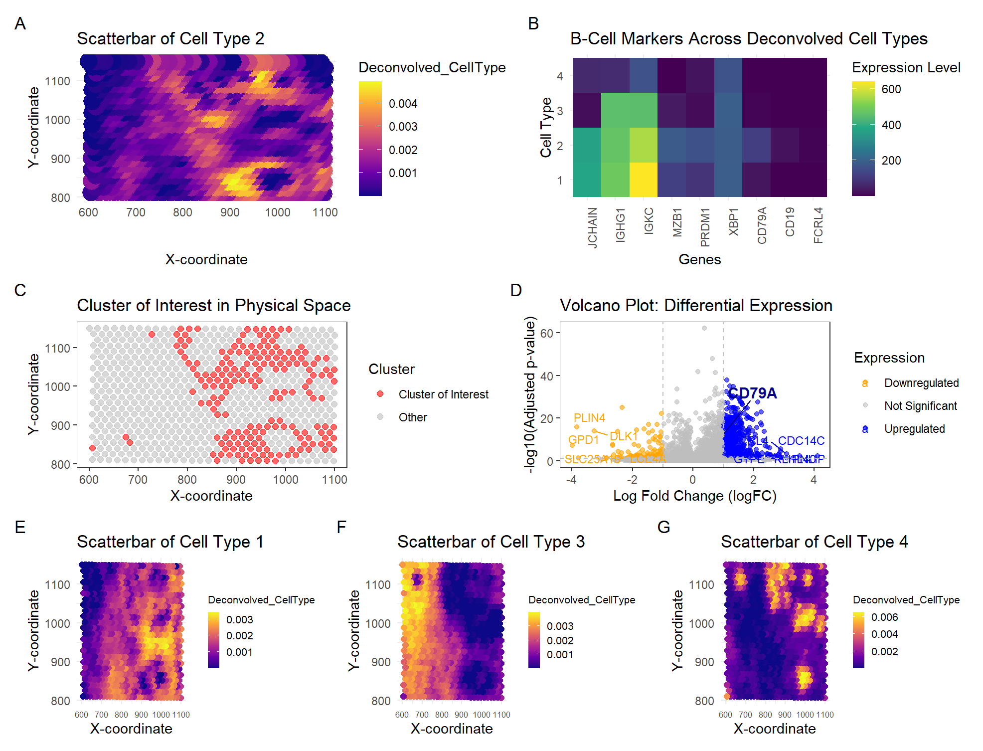
In HW4, I identified a B-cell population within the Eevee dataset, based on the upregulation of CD79A gene expression. I used K-means clustering with K=4 to classify spatial transcriptomics spots into distinct groups. To maintain consistency, I also used K=4 cell types for the deconvolution analysis using STdeconvolve. The objective was to determine which deconvolved cell type best corresponded to the previously identified B-cell cluster. By analyzing the expression levels of CD79A and additional B-cell markers (MZB1, IGKC, JCHAIN, IGHG1, PRDM1, XBP1), Cell Type 2 was identified as the most representative B-cell population, as it exhibited the highest expression of these markers compared to Cell Types 1, 3, and 4.
The scatterbar plot (A) visualizes the spatial distribution of Cell Type 2 across the tissue, representing the inferred deconvolved cell-type proportions from STdeconvolve. In comparison, the K-means clustering result from HW4 (C) (using the same k=4 on the tissue) identifies the Cluster of Interest previously linked to B cells. When comparing these two visualizations, there is a strong spatial correlation—regions where Cell Type 2 is abundant and appears in bright yellow in (A) largely align with the red-highlighted cluster in (C). This suggests that both deconvolution and clustering methods captured the same underlying biological population.
The heatmap (B) serves as a visualization of deconvolved gene expression associated with the cell-type of interest, specifically showing B-cell marker gene expression across all four deconvolved cell types. Cell Type 2 displays relatively high expression of CD79A, MZB1, IGKC, and IGHG1, reinforcing its classification as a B-cell population. However, CD19 and FCRL4, which were also identified as key B-cell markers in HW4, exhibit minimal expression across all deconvolved cell types. This discrepancy may be due to potential differences in sensitivity between methods—STdeconvolve may be more influenced by highly expressed genes, whereas clustering-based differential expression analysis in HW4 may have detected lower-expressed but still biologically relevant markers.
The volcano plot from HW4 (D) provides a visualization of differentially upregulated genes associated with the cell-type of interest. It shows that CD79A is significantly upregulated, further supporting the B-cell classification of Cell Type 2. Additionally, other differentially expressed genes are revealed, providing a broader view of gene expression variation. This visualization highlights how clustering treats cells as discrete groups, while deconvolution allows for mixed-cell proportions per spot. This can explain why some genes that were significant in HW4’s clustering approach are less prominent in the deconvolution analysis.
For further data visualization, I compared the spatial distribution of the other deconvolved cell types. Scatterbar plots (E, F, G) show the proportions of Cell Types 1, 3, and 4, respectively, beyond just Cell Type 2. These additional plots help contextualize the spatial organization of different cell types. You can see that each scatterbar plot shows bright yellow regions in distinct spatial locations, confirming that each deconvolved cell type occupies a different area of the tissue.
Overall, both clustering and deconvolution analyses yield highly similar results. This reinforces the identification of the same B-cell population. However, deconvolution provides a higher-resolution representation by quantifying mixed cell populations, while clustering enforces hard assignments. The differences in gene expression patterns suggest that using different visualizations together can provide a more comprehensive understanding of spatially resolved B-cell populations in the tissue.
#import libraries
library(ggplot2)
library(patchwork)
library(Rtsne)
library(ggrepel)
library(factoextra)
library(NMF)
library(cluster)
library(pheatmap)
library(grid)
library(reshape2)


set.seed(42)


# Read in data. Cells in rows, genes in columns
data <- read.csv("~/Desktop/eevee.csv.gz", row.names =1)
#View(data)


# Extract data
pos <- data[, 2:3]
gexp <- data[,4:ncol(data)]


# Normalize gene expression
gexpnorm <- log10(gexp / rowSums(gexp) * mean(rowSums(gexp)) + 1)


# Select top most variable genes to reduce computation and ensure that CD79A is included
gene_variances <- apply(gexpnorm, 2, var)
top_genes <- names(sort(gene_variances, decreasing = TRUE)[1:2000])

# Define key B cell markers that must be included
b_cell_markers <- c("CD79A", "CD19", "MZB1", "FCRL4")
print(paste("These are the key B cell markers to include:", paste(b_cell_markers, collapse = ", ")))

# Check which markers are missing from the top 2000
missing_markers <- setdiff(b_cell_markers, top_genes)
print(paste("These are the key B cell markers missing:", paste(missing_markers, collapse = ", ")))

# If all markers are in the top 2000, use them directly
if (length(missing_markers) == 0) {
  important_genes <- top_genes  # Use top 2000 genes directly
  print("All B cell markers are in the top 2000 genes.")
} else {
  # Select the top 2000 minus the number of missing markers (to maintain size = 2000)
  top_adjusted <- names(sort(gene_variances, decreasing = TRUE)[1:(2000 - length(missing_markers))])

  # Add the missing markers
  important_genes <- unique(c(top_adjusted, missing_markers))
  print(paste("The following B cell markers were added:", paste(missing_markers, collapse=", ")))
}


gexpnorm_filtered <- gexpnorm[, important_genes]


# Perform PCA dimensionality reduction
pcs = prcomp(gexpnorm_filtered)
plot(pcs$sdev[1:10])


# Perform t-SNE dimensionality reduction
emb = Rtsne(pcs$x[,1:10])$Y
df_tsne = data.frame(emb)


# K-means Clustering
# Find optimal k using Elbow Method
results <- sapply(2:15, function(i) {
  com <- kmeans(pcs$x[, 1:10], centers = i)
  return(com$tot.withinss)
})
plot(2:15, results, type = "b", xlab = "Number of Clusters (K)", ylab = "Total Within-Cluster Sum of Squares")


# Perform k-means clustering, using a quantitative variable for future changes.
# Based on Elbow plot, use k = 4
k <- 4
com <- as.factor(kmeans(pcs$x[, 1:10], centers = k)$cluster)

df_clusters <- data.frame(tsne_X = emb[,1], tsne_Y = emb[,2],
                          pca_X = pcs$x[,1], pca_Y = pcs$x[,2],
                          cluster = com)

#ggplot(df_clusters) + geom_point(aes(x = tsne_X, y = tsne_Y, col=cluster), size=3) + theme_bw()

## Cluster Identification
# Compute mean expression of CD79A per cluster
cluster_means <- tapply(gexpnorm[, "CD79A"], com, mean)

# Identify the cluster with the highest CD79A expression using quantitative variable cluster_of_interest
cluster_of_interest <- names(which.max(cluster_means))
print(paste("Cluster with highest CD79A expression:", cluster_of_interest))

# Compute mean expression for other key B cell markers across clusters
b_cell_markers <- c("CD19", "FCRL4")

# Create a data frame to store mean expression of each marker per cluster
cluster_means <- data.frame(cluster = levels(com))
for (gene in b_cell_markers) {
  cluster_means[[gene]] <- tapply(gexpnorm[, gene], com, mean, na.rm = TRUE)
}
print(cluster_means)

cluster_means$cluster <- as.character(cluster_means$cluster)

# Identify cluster with highest combined expression for B cell markers
cluster_highest_b_markers <- cluster_means$cluster[which.max(rowMeans(cluster_means[, b_cell_markers], na.rm = TRUE))]
print(paste("Cluster with highest overall B cell marker expression:", cluster_highest_b_markers))
print(paste("Cluster of Interest:", cluster_of_interest))
# I am using cluster_of_interest <- 3

# Add cluster highlight for visualization
df_clusters$highlight <- ifelse(df_clusters$cluster == cluster_of_interest, "Cluster of Interest", "Other")

# Store 'com' as a factor
df_clusters$cluster <- as.factor(df_clusters$cluster)

# Create a new column to highlight only the selected cluster
df_clusters$highlight <- ifelse(df_clusters$cluster == cluster_of_interest, "Cluster of Interest", "Other")

# Check if 'highlight' column was created correctly
table(df_clusters$highlight)

# Extract physical coordinates x, y positions
df_clusters$aligned_x <- data[,2]
df_clusters$aligned_y <- data[,3]

# Spatial plot of Cluster of Interest
p1 <- ggplot(df_clusters, aes(x = aligned_x, y = aligned_y, color = highlight)) +
  geom_point(alpha = 0.6, size = 2) +
  theme_minimal() +
  scale_color_manual(values = c("red", "grey")) +
  labs(title = "Cluster of Interest in Physical Space",
       x = "X-coordinate",
       y = "Y-coordinate",
       color = "Cluster") +
  theme(plot.title = element_text(size = 7)) +
  theme(legend.key.size = unit(0.3, "cm")) +
  theme_bw() +
  theme(panel.grid.major = element_blank(), panel.grid.minor = element_blank())


# Differential Expression Analysis
# Compute differential expression for the selected cluster using Wilcox for all genes
pv <- sapply(colnames(gexpnorm), function(i) {
  print(i)
  wilcox.test(gexpnorm[com == cluster_of_interest, i],
              gexpnorm[com != cluster_of_interest, i])$p.val
})

# Compute log2 fold change
logfc <- sapply(colnames(gexpnorm), function(i) {
  print(i)
  log2(mean(gexpnorm[com == cluster_of_interest, i]) /
         mean(gexpnorm[com != cluster_of_interest, i]))
})

# Create a dataframe for the Volcano plot
df_volcano <- data.frame(Gene = colnames(gexpnorm), p_value = pv, logFC = logfc)

# Adjust p-values for multiple testing using FDR correction
df_volcano$adj_p_value <- p.adjust(df_volcano$p_value, method = "fdr")

# Convert p-values to -log10 scale for better visualization
df_volcano$logP <- -log10(df_volcano$adj_p_value + 1e-300)

# Define Upregulated and Downregulated Genes
df_volcano$Expression <- "Not Significant"
df_volcano$Expression[df_volcano$logFC > 1 & df_volcano$adj_p_value < 0.05] <- "Upregulated"
df_volcano$Expression[df_volcano$logFC < -1 & df_volcano$adj_p_value < 0.05] <- "Downregulated"
df_volcano <- df_volcano[complete.cases(df_volcano), ]   # Remove rows with NA values
df_volcano <- df_volcano[is.finite(df_volcano$logFC) & is.finite(df_volcano$logP), ]   # Remove Inf values

top_up <- df_volcano[df_volcano$Expression == "Upregulated", ]
if (nrow(top_up) > 5) { top_up <- top_up[order(top_up$logFC, decreasing=TRUE), ][1:5, ] }
top_down <- df_volcano[df_volcano$Expression == "Downregulated", ]
if (nrow(top_down) > 5) { top_down <- top_down[order(top_down$logFC, decreasing=FALSE), ][1:5, ] }

print(top_up)
print(top_down)

# Volcano Plot
p2 <- ggplot(df_volcano, aes(x = logFC, y = logP, color = Expression)) +
  geom_point(alpha = 0.6) +
  geom_text_repel(data = top_up, aes(label = Gene), size = 3) +
  geom_text_repel(data = top_down, aes(label = Gene), size = 3) +
  geom_text_repel(data = df_volcano[df_volcano$Gene == "CD79A", ],
                  aes(label = Gene), size = 4, color = "darkblue", fontface = "bold", nudge_x=1, nudge_y=20) +
  scale_color_manual(values = c("Upregulated" = "blue",
                                "Not Significant" = "grey",
                                "Downregulated" = "orange")) +
  labs(title = "Volcano Plot: Differential Expression",
       x = "Log Fold Change (logFC)",
       y = "-log10(Adjusted p-value)") +
  geom_hline(yintercept = -log10(0.05), linetype = "dashed", color = "grey") +
  geom_vline(xintercept = c(-1, 1), linetype = "dashed", color = "grey") +
  theme(plot.title = element_text(size = 7)) +
  theme_bw() +
  theme(panel.grid.major = element_blank(), panel.grid.minor = element_blank())


#------------------------------------------------------------------------------------------

# Deconvolution using STdeconvolve (NMF)
run_stdeconvolve <- function(data, k) {
  nmf_res <- nmf(data, rank = k, method = "lee", seed = 42, nrun = 1, .options = "NMFStrategy")
  cell_type_proportions <- basis(nmf_res)  # Spot-level cell-type proportions
  gene_signatures <- coef(nmf_res)  # Gene loadings per cell type

  return(list(cell_type_proportions = as.data.frame(cell_type_proportions),
              gene_signatures = as.data.frame(gene_signatures)))
}

# Run STdeconvolve for k = 4
k_val <- 4
results <- run_stdeconvolve(gexpnorm_filtered, k_val)

# Extract expression values for B cell markers
gene_signatures <- as.data.frame(results$gene_signatures)

b_cell_signatures <- gene_signatures[, b_cell_markers, drop = FALSE]
print(b_cell_signatures)

# focus on CellTYpe2
celltype <- 2

# Scatterbar visualization: Spatial Scatter plot shows deconvolved cell-type proportions across tissue spots.
#
# Display deconvolved cell-type proportions for K=4
print("Deconvolved Cell-Type Proportions (K=4)")
print(head(results$cell_type_proportions))

df_plot <- data.frame(
  aligned_x = data[, 2],
  aligned_y = data[, 3],
  Deconvolved_CellType = results$cell_type_proportions[, celltype]
)


p3 <- ggplot(df_plot, aes(x=aligned_x, y=aligned_y, color=Deconvolved_CellType)) +
  geom_point(size=6) +
  scale_color_viridis_c(option="C") +
  labs(title=paste("Scatterbar of Cell Type", celltype),
       x="X-coordinate",
       y="Y-coordinate") +
  theme_minimal()


# Heatmap of gene signatures: Displays the top marker genes defining each inferred cell type.
# Add some broader known B-cell genes to observe
b_cell_genes <- c("CD79A", "MZB1", "CD19", "FCRL4", "PRDM1", "XBP1", "IGKC", "JCHAIN", "IGHG1")


print(b_cell_genes %in% colnames(gene_signatures))
# Subset the NMF results to show only these genes
b_cell_heatmap_data <- gene_signatures[, intersect(colnames(gene_signatures), b_cell_genes), drop = FALSE]


# Convert row names (cell types) into a proper column
b_cell_heatmap_data <- as.data.frame(b_cell_heatmap_data)
b_cell_heatmap_data$CellType <- rownames(b_cell_heatmap_data)

# Melt the data, treating "CellType" as an identifier
b_cell_heatmap_melted <- melt(b_cell_heatmap_data, id.vars = "CellType",
                              variable.name = "Gene", value.name = "Expression")

# Generate heatmap for B-cell markers
p4 <- ggplot(b_cell_heatmap_melted, aes(x = Gene, y = CellType, fill = Expression)) +
  geom_tile() +
  scale_fill_viridis_c(name = "Expression Level") +  # Custom legend title
  theme_minimal() +
  labs(title = "B-Cell Markers Across Deconvolved Cell Types",
       x = "Genes", y = "Cell Type") +
  theme(axis.text.x = element_text(angle = 90, hjust = 1))


## Additional Visualizations ##
# Visualizing Scatterbars for the other 3 deconvolved cell types for comparison

# Cell Type 1
df_plotx <- data.frame(
  aligned_x = data[, 2],
  aligned_y = data[, 3],
  Deconvolved_CellType = results$cell_type_proportions[, 1]
)
p11 <- ggplot(df_plotx, aes(x=aligned_x, y=aligned_y, color=Deconvolved_CellType)) +
  geom_point(size=2) +
  scale_color_viridis_c(option="C") +
  labs(title=paste("Scatterbar of Cell Type", 1),
       x="X-coordinate",
       y="Y-coordinate") +
  theme_minimal() +
  theme(legend.text = element_text(size = 8),
        legend.title = element_text(size = 8),
        legend.key.size = unit(0.3, "cm"),
        axis.text.x = element_text(size = 6))


# Cell Type 3
df_plotx <- data.frame(
  aligned_x = data[, 2],
  aligned_y = data[, 3],
  Deconvolved_CellType = results$cell_type_proportions[, 3]
)
p13 <- ggplot(df_plotx, aes(x=aligned_x, y=aligned_y, color=Deconvolved_CellType)) +
  geom_point(size=2) +
  scale_color_viridis_c(option="C") +
  labs(title=paste("Scatterbar of Cell Type", 3),
       x="X-coordinate",
       y="Y-coordinate") +
  theme_minimal() +
  theme(legend.text = element_text(size = 8),
        legend.title = element_text(size = 8),
        legend.key.size = unit(0.3, "cm"),
        axis.text.x = element_text(size = 6))


# Cell Type 4
df_plotx <- data.frame(
  aligned_x = data[, 2],
  aligned_y = data[, 3],
  Deconvolved_CellType = results$cell_type_proportions[, 4]
)
p14 <- ggplot(df_plotx, aes(x=aligned_x, y=aligned_y, color=Deconvolved_CellType)) +
  geom_point(size=2) +
  scale_color_viridis_c(option="C") +
  labs(title=paste("Scatterbar of Cell Type", 4),
       x="X-coordinate",
       y="Y-coordinate") +
  theme_minimal() +
  theme(legend.text = element_text(size = 8),
        legend.title = element_text(size = 8),
        legend.key.size = unit(0.3, "cm"),
        axis.text.x = element_text(size = 6))


#plots
(p3 + p4) / (p1 + p2) / (p11 + p13 + p14) + plot_annotation(tag_levels = 'A')