Exploring t-SNE Embeddings with Varying Numbers of Principal Components

Write a brief description of your figure so we know what you are visualizing.
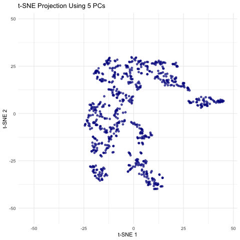
This animation shows a series of two-dimensional t-SNE plots, where each point represents a spot or cell from the spatial transcriptomics dataset. The x- and y-axes correspond to the t-SNE coordinates, which are derived by first performing PCA on the filtered gene expression data and then applying t-SNE to the top n principal components. As the animation progresses, the number of principal components used (ranging from 5 to 50 in steps of 5) is displayed, and you can observe how the overall distribution of points changes with each increase in dimensionality. Some frames may show clear clustering or separation, while others may appear more diffuse, highlighting how the choice of PCs can influence the final visualization. This helps illustrate how many principal components might be optimal for capturing meaningful biological structure without overcomplicating the model.
Code
1
2
3
4
5
6
7
8
9
10
11
12
13
14
15
16
17
18
19
20
21
22
23
24
25
26
27
28
29
30
31
32
33
34
35
36
37
38
39
40
41
42
43
44
45
46
47
48
49
50
51
52
53
54
55
56
57
58
59
60
61
62
63
64
65
66
67
# Load libraries
library(ggplot2)
library(gganimate)
library(Rtsne)
library(dplyr)

# Read the file
file <- "eevee.csv.gz"
data <- read.csv(file, row.names = 1)

# Split the data into positional data (first 2 columns) and gene expression data (remaining columns)
pos <- data[, 1:2]
exp <- data[, 3:ncol(data)]
head(pos)
head(exp)

# Remove genes that are expressed in fewer than 5% of the cells.
min_cells <- 0.05 * nrow(exp)
exp_filtered <- exp[, colSums(exp > 0) >= min_cells]
print(head(exp_filtered))

# Perform PCA on the filtered gene expression data
pca_res <- prcomp(exp_filtered, scale. = TRUE)

# Define a vector of different numbers of PCs to use
pc_numbers <- seq(5, 50, by = 5)

# Initialize a list to store t-SNE results for each number of PCs
tsne_list <- list()

# Loop over each chosen number of PCs, perform t-SNE on the top PCs, and store the results
for (n in pc_numbers) {
  # Extract the scores for the top n PCs
  pcs <- pca_res$x[, 1:n]

  # Run t-SNE on these PCs.
  set.seed(123)  # For reproducibility
  tsne_out <- Rtsne(pcs, perplexity = 15, verbose = FALSE, check_duplicates = FALSE)

  # Create a data frame for the t-SNE coordinates
  tsne_df <- as.data.frame(tsne_out$Y)
  colnames(tsne_df) <- c("tSNE1", "tSNE2")
  tsne_df$n_pc <- n  # Record the number of PCs used
  tsne_df$id <- 1:nrow(tsne_df)

  tsne_list[[as.character(n)]] <- tsne_df
}

tsne_all <- bind_rows(tsne_list)

# Create the animated scatterplot with ggplot2 and gganimate.
# Each frame represents the t-SNE embedding computed with a different number of PCs.
p <- ggplot(tsne_all, aes(x = tSNE1, y = tSNE2)) +
  geom_point(alpha = 0.7, color = "darkblue") +
  labs(title = "t-SNE Projection Using {closest_state} PCs",
       x = "t-SNE 1", y = "t-SNE 2") +
  theme_minimal() +
  transition_states(n_pc, transition_length = 2, state_length = 1) +
  ease_aes('sine-in-out')

# Animate and store the result
anim <- animate(p, nframes = 100, fps = 10, renderer = gifski_renderer())

# Save the animation as a GIF
anim_save("hwEC1_nchoudh5.gif", animation = anim)

# ChatGPT was used to help with generating the plots (particularly improving the aesthics).