Deconvolution of Eevee Dataset for Identification of the Epithelial Cell Type

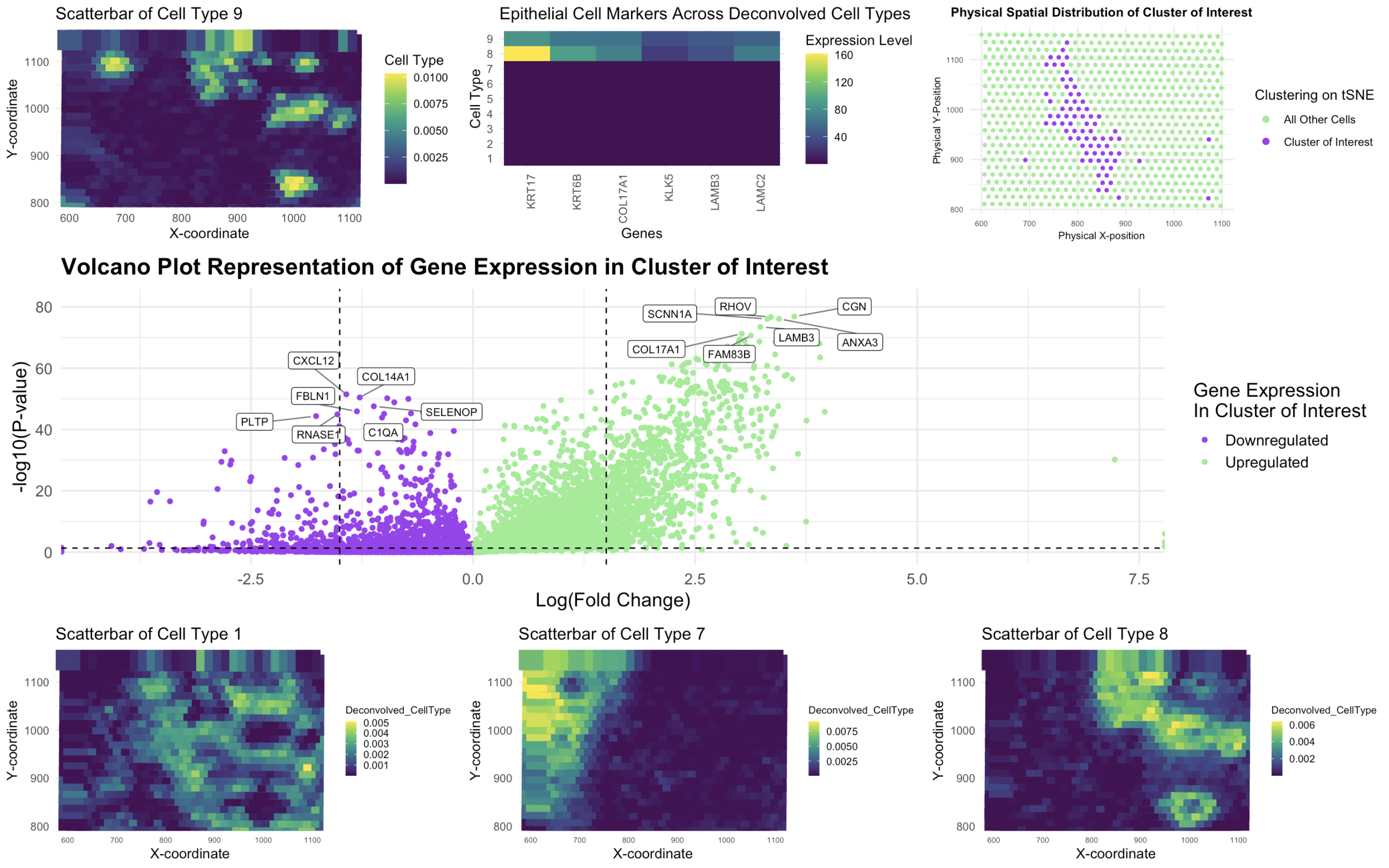
In this study, I analyzed the Eevee spatial transcriptomics dataset using deconvolution techniques and clustering methods to identify distinct cell types and visualize their gene expression patterns. The dataset was processed using STdeconvolve for deconvolution and k-means clustering to analyze spatial organization, followed by differential expression analysis to identify upregulated genes. I focused on cell type 9, which exhibited high expression of epithelial cell markers, including KRT17, KRT6B, KLK5, LAMB3, COL17A1, and LAMC2. This selection was informed by my previous work in HW4, where I identified an epithelial cell population as a key component within the dataset.
When comparing my results to previous analyses, I observed notable similarities and improvements. In HW4, k-means clustering was applied to identify spatially distinct cell clusters, revealing a heterogeneous distribution of cell types. In this analysis, I optimized k-means clustering with k = 9, which aligned with prior findings but included t-SNE visualization for refined cluster identification. The epithelial-associated cluster (cluster 9) showed a similar spatial distribution to HW4’s results, reinforcing its biological significance. However, the use of STdeconvolve for deconvolution provided a more nuanced perspective by estimating the proportion of multiple cell types within each spatial location. The scatterbar plot visualization highlighted the localized enrichment of cell type 9, confirming its spatial pattern in the tissue, a finding that complements previous clustering-based observations.
My differential gene expression analysis further supported these insights. The volcano plot revealed key differentially expressed genes within cell type 9, with SCNN1A, RHOV, CGN, COL17A1, FAM83B, LAMB3, and ANXA3 identified as significantly upregulated. These genes reinforce the epithelial identity of the cluster as confirmed by the Human Protein Atlas, suggesting a role in epithelial differentiation and function. Conversely, downregulated genes, including CXCL12, FBLN1, COL14A1, SELENOP, PLTP, RNASE1, and C1QA, indicate potential microenvironmental influences on the epithelial cell state. Compared to my HW4 analysis, deconvolution-based separation of mixed populations allowed for higher specificity in distinguishing transcriptional activity within the identified cell type.
The data visualizations effectively illustrate my findings. The scatterbar plot of deconvolved cell-type proportions showcases the spatial distribution of cell type 9, revealing its presence in specific tissue regions. The deconvolved gene expression plot further highlights the spatial pattern of epithelial marker expression, confirming the structured localization of these cells. However, across all cell types, it was observed that gene expression of epithelial cells were only strongly expressed in cell types 8 and 9. The k-means clustering visualization, using t-SNE, demonstrates how the epithelial-associated cluster aligns with the deconvolved map, reinforcing its consistency across different analytical approaches. Finally, the volcano plot captures differentially expressed genes, emphasizing key upregulated and downregulated genes associated with cell type 9, helping to pinpoint molecular markers defining this population. Therefore, this approach improves the resolution of spatial transcriptomic analyses and enhances our understanding of tissue heterogeneity, offering a more detailed perspective on cellular organization and gene expression in complex tissues.
Sources: https://www.proteinatlas.org/ENSG00000143375-CGN https://www.proteinatlas.org/ENSG00000138772-ANXA3 https://www.proteinatlas.org/ENSG00000196878-LAMB3 https://www.proteinatlas.org/ENSG00000168143-FAM83B https://www.proteinatlas.org/ENSG00000065618-COL17A1 https://www.proteinatlas.org/
The code used to generate this visualization is as follows:
1
2
3
4
5
6
7
8
9
10
11
12
13
14
15
16
17
18
19
20
21
22
23
24
25
26
27
28
29
30
31
32
33
34
35
36
37
38
39
40
41
42
43
44
45
46
47
48
49
50
51
52
53
54
55
56
57
58
59
60
61
62
63
64
65
66
67
68
69
70
71
72
73
74
75
76
77
78
79
80
81
82
83
84
85
86
87
88
89
90
91
92
93
94
95
96
97
98
99
100
101
102
103
104
105
106
107
108
109
110
111
112
113
114
115
116
117
118
119
120
121
122
123
124
125
126
127
128
129
130
131
132
133
134
135
136
137
138
139
140
141
142
143
144
145
146
147
148
149
150
151
152
153
154
155
156
157
158
159
160
161
162
163
164
165
166
167
168
169
170
171
172
173
174
175
176
177
178
179
180
181
182
183
184
185
186
187
188
189
190
191
192
193
194
195
196
197
198
199
200
201
202
203
204
205
206
207
208
209
210
211
212
213
214
215
216
217
218
219
220
221
222
223
224
225
226
227
228
229
230
231
232
233
234
235
236
237
238
239
240
241
242
243
244
245
246
247
248
249
250
251
252
253
254
255
256
257
258
259
260
261
262
263
264
265
266
267
268
269
270
271
272
273
274
275
276
277
278
279
280
281
282
283
284
285
286
287
288
289
290
291
292
293
294
295
296
297
298
299
300
301
302
303
304
305
306
307
308
309
310
311
312
313
314
315
316
317
318
319
320
321
322
323
324
325
326
327
328
329
330
331
332
333
334
335
336
337
338
339
340
341
342
343
344
345
346
347
348
349
350
351
352
353
354
355
356
357
358
359
360
361
362
363
364
365
366
367
368
369
370
371
372
373
374
375
376
377
378
379
380
381
382
383
384
385
386
387
388
389
390
391
392
393
394
395
396
397
398
399
400
401
402
403
404
405
406
407
408
409
410
411
412
413
414
415
416
417
418
419
420
421
422
423
424
425
426
427
428
429
430
431
432
433
434
435
436
437
438
439
440
441
442
443
444
445
446
447
448
449
450
451
452
453
454
455
456
457
458
459
460
461
462
463
464
465
466
467
468
469
470
471
472
473
474
475
476
477
478
479
480
481
482
483
484
485
486
487
488
489
490
491
492
493
494
495
496
497
498
499
500
501
502
503
504
505
# Necessary libraries loaded
library(ggplot2)
library(patchwork)
library(Rtsne)
library(ggrepel)
library(factoextra)
library(NMF)
library(cluster)
library(pheatmap)
library(grid)
library(reshape2)
library(dplyr)
library(tidyverse)


# Loads Eevee dataset
file <- '~/Desktop/genomic-data-visualization-2025/data/eevee.csv.gz'
data <- read.csv(file, row.names = 1)

# Extracts spatial coordinates and gene expression data from aligned_x and aligned_y columns
pos <- data[, 2:3]
#rownames(pos) <- data$cell_id
gexpsub <- data[, 4:ncol(data)]
#rownames(gexpsub) <- data$cell_id

# Log-transforms gene expression data and normalizes gexp
normgexpsub <- log10(gexpsub/rowSums(gexpsub) * mean(rowSums(gexpsub)) + 1)

# Chooses top most variable genes to ensure KRT17 is included
variable_genes <- apply(normgexpsub, 2, var)
top_genes <- names(sort(variable_genes, decreasing = TRUE)[1:1000])

# Defines key epithelial cell markers that must be included
epi_cell_markers <- c("KRT6B", "KRT17", "KLK5", "LAMB3", "COL17A1", "LAMC2")
print(paste("These are the key epithelial cell markers to include:", paste(epi_cell_markers, collapse = ", ")))

# Checks missing markers from the top 1000
miss_markers <- setdiff(epi_cell_markers, top_genes)
print(paste("These are the key epithelial cell markers missing:", paste(miss_markers, collapse = ", ")))

# If all markers are in the top 1000, use them directly
if (length(miss_markers) == 0) {
  import_genes <- top_genes  # Use top 1000 genes directly
  print("All epithelial cell markers are in the top 1000 genes.")
} else {
  # Select the top 1000 minus the number of missing markers (to maintain size = 1000)
  top_select <- names(sort(variable_genes, decreasing = TRUE)[1:(1000 - length(miss_markers))])

  # Add the missing markers
  import_genes <- unique(c(top_select, miss_markers))
  print(paste("The following epithelial cell markers were added:", paste(miss_markers, collapse=", ")))
}

norm_gexp_sub_filter <- normgexpsub[, import_genes]

# Performs PCA on gene expression data
pcs <- prcomp(norm_gexp_sub_filter)
plot(pcs$sdev[1:40])
plot(pcs$sdev[1:20])
plot(pcs$sdev[1:10])


# Finds optimal PCs for kMeans
plot(1:20, pcs$sdev[1:20], type = "l")
plot(1:10, pcs$sdev[1:10], type = "l")

# 6 PCs accounts for meaningful variance of the eevee dataset
pc_opt <- 6

# Perform t-SNE on PCA-reduced gene expression data
set.seed(5)  # Ensures reproducibility

# Determine optimal number of k's (centroids) for kMeans using elbow method
elbow <- fviz_nbclust(norm_gexp_sub_filter, kmeans, method = "wss") +
  geom_vline(xintercept = 5, linetype = 2) +
  labs(subtitle = "Elbow Method")

elbow

# 9 cluster k's accounts for meaningful variance of the eevee dataset
cluster <- 9

# Perform k-means clustering with k = 9
tsne_emb <- Rtsne(pcs$x[,1:pc_opt])$Y
com <- kmeans(norm_gexp_sub_filter, centers = 9)  # Example k-means clustering

# Creates a data frame for t-SNE visualization
df_tsne <- data.frame(tsne_emb)
colnames(df_tsne) <- c("tSNE1", "tSNE2")
#df_tsne$clusters <- as.factor(com$cluster)

# Assigns clusters to data frames
df_clusters <- data.frame(
  aligned_x = pos$aligned_x,
  aligned_y = pos$aligned_y,
  tSNE1 = tsne_emb[, 1],
  tSNE2 = tsne_emb[, 2],
  kmeans = as.factor(com$cluster)  # Ensure `com` is a kmeans object
)

## Cluster Identification

# Computes mean expression of KRT17 per cluster
mean_cluster <- tapply(normgexpsub[, "KRT17"], com$cluster, mean)

# Identify the cluster with the highest KRT17 expression using quantitative variable cluster_of_interest
cluster_of_interest <- names(which.max(mean_cluster))
print(paste("Cluster with highest KRT17 expression:", cluster_of_interest)) # Cluster of Interest: 5

# Compute mean expression for other key epithelial cell markers across clusters
epi_cell_markers <- c("KRT6B", "KLK5", "LAMB3", "COL17A1", "LAMC2")

# Create a data frame to store mean expression of each marker per cluster
mean_cluster <- data.frame(cluster = levels(com))
#for (gene in epi_cell_markers) {
  #mean_cluster[[gene]] <- tapply(normgexpsub[, "KRT17"], com, mean, na.rm = TRUE)
#}
#print(mean_cluster)

mean_cluster$cluster <- as.character(mean_cluster$cluster)

# Identify cluster with highest combined expression for epithelial cell markers
highest_epi_cell_markers_cluster <- mean_cluster$cluster[which.max(rowMeans(mean_cluster[, epi_cell_markers], na.rm = TRUE))]
print(paste("Cluster with highest overall epithelial cell marker expression:", highest_epi_cell_markers_cluster))
print(paste("Cluster of Interest:", cluster_of_interest))

# Add cluster highlight for visualization
df_clusters$highlight <- ifelse(df_clusters$kmeans == cluster_of_interest, "Cluster of Interest", "Other")

# Store 'com' as a factor
df_clusters$kmeans <- as.factor(df_clusters$kmeans)

# Create a new column to highlight only the selected cluster
df_clusters$highlight <- ifelse(df_clusters$kmeans == cluster_of_interest, "Cluster of Interest", "Other")

# Check if 'highlight' column was created correctly
table(df_clusters$highlight)

# Extract physical coordinates x, y positions
df_clusters$aligned_x <- data[,2]
df_clusters$aligned_y <- data[,3]

# Spatial plot of Cluster of Interest
p1 <- ggplot(df_clusters) +
  geom_point(aes(x = aligned_x, y = aligned_y,
                 col = ifelse(kmeans == cluster_interest, "Cluster of Interest", "All Other Cells")),
             size = 1) +
  theme_minimal() +
  labs(title = "Physical Spatial Distribution of Cluster of Interest",
       x = "Physical X-position", y = "Physical Y-Position", color = "Clustering on tSNE") +
  theme(
    plot.title = element_text(size = 10, face = "bold", hjust = 0.5),
    axis.title = element_text(size = 8),
    axis.text = element_text(size = 6)
  ) + guides(color = guide_legend(override.aes = list(size = 2)))  +
  scale_color_manual(values = c("lightgreen", "purple"))


p1

# Visualizes differentially expressed genes for cluster of interest, Cluster 1
com <- kmeans(normgexpsub, centers = 9)  # Example k-means clustering
com_categories <- as.factor(com$cluster)  # Extract and convert to factor

cluster_interest = 5

p_value = sapply(colnames(normgexpsub), function(i){
  print(i)
  wilcox.test(normgexpsub[com_categories == cluster_interest, i], normgexpsub[com_categories!= cluster_interest, i])$p.val
})

logfc = sapply(colnames(normgexpsub), function(i){
  print(i)
  log2(mean(normgexpsub[com_categories == cluster_interest, i])/mean(normgexpsub[com_categories != cluster_interest, i]))
})


# Creates a volcano plot dataframe
df_volcano <- data.frame(
  p_value = -log10(p_value + 1e-100),
  logfc,
  genes = colnames(normgexpsub)
)

# Removes NA values from df_volcano to reduce warning message error
df_volcano <- df_volcano[complete.cases(df_volcano), ]

# Adjusts threshold for gene labeling to avoid excessive overlap of labels
df_volcano$gene_label <- ifelse(
  df_volcano$p_value > 10 & abs(df_volcano$logfc) > 1.5,
  as.character(df_volcano$genes),
  NA
)

#Assigns number of labels as 7 to allow for proper labeling without excessive overlap
num_labels_down <- 7
num_labels_up <- 7

top_down <- df_volcano %>% filter(logfc < -1) %>% top_n(num_labels_down, wt = p_value)
top_up <- df_volcano %>% filter(logfc > 1) %>% top_n(num_labels_up, wt = p_value)

df_volcano$gene_label <- ifelse(
  df_volcano$genes %in% c(top_down$genes, top_up$genes),
  as.character(df_volcano$genes),
  NA
)

# Generates volcano plot
volcano_plot <- ggplot(df_volcano) +
  geom_point(aes(x = logfc, y = p_value, col = ifelse(logfc > 0, 'Upregulated', 'Downregulated'))) +
  geom_label_repel(aes(x = logfc, y = p_value, label = gene_label), box.padding = 0.5,
                   point.padding = 0.5, segment.color = 'grey50', max.overlaps = 30, min.segment.length = 0.5,
                   force = 2, size = 3) +
  ylim(0, max(df_volcano$p_value) + 5) + geom_hline(yintercept = -log10(0.05), linetype = "dashed") +
  geom_vline(xintercept = c(-1.5, 1.5), linetype = "dashed") +
  labs(col = "Gene Expression\nIn Cluster of Interest",
       title = "Volcano Plot Representation of Gene Expression in Cluster of Interest",
       x = "Log(Fold Change)", y = "-log10(P-value)") +
  theme(plot.title = element_text(face = "bold")) +
  scale_color_manual(values = c("purple", "lightgreen")) +
  theme(plot.title = element_text(face = "bold"),
        aspect.ratio = 0.25)  # Decrease the aspect ratio to make the plot wider

# Displays the volcano plot to identify clusters of downregulated and upregulated genes
volcano_plot


# Performs deconvolution using STdeconvolve (NMF)
st_deconvolve <- function(data, cluster) {
  nmf_res <- nmf(data, rank = cluster, method = "lee", seed = 42, nrun = 1, .options = "NMFStrategy")
  cell_type_proportions <- basis(nmf_res)
  gene_signatures <- coef(nmf_res)

  return(list(cell_type_proportions = as.data.frame(cell_type_proportions),
              gene_signatures = as.data.frame(gene_signatures)))
}
# Runs STdeconvolve for k = 9
k <- 9
results <- st_deconvolve(norm_gexp_sub_filter, k)

# Extract expression values for epithelial cell markers
gene_signatures <- as.data.frame(results$gene_signatures)
epi_cell_signatures <- gene_signatures[, epi_cell_markers, drop = FALSE]
print(epi_cell_signatures)

# Focuses on Cell Type 9
celltype <- 9

# Scatterbar visualization: Spatial Scatter plot shows deconvolved cell-type proportions across tissue spots.
#
# Display deconvolved cell-type proportions for K=9
print("Deconvolved Cell-Type Proportions (K=9)")
print(head(results$cell_type_proportions))
df_plot <- data.frame(
  aligned_x = data[, 2],
  aligned_y = data[, 3],
  Deconvolved_CellType = results$cell_type_proportions[, celltype]
)

p3 <- ggplot(df_plot, aes(x=aligned_x, y=aligned_y, color=Deconvolved_CellType)) +
  geom_tile(size=9) +
  scale_color_viridis_c() +
  labs(title=paste("Scatterbar of Cell Type", celltype),
       x="X-coordinate",
       y="Y-coordinate",
       col = "Cell Type") +
  theme_minimal()

p3

# Heatmap of gene signatures: Displays the top marker genes defining each inferred cell type.
# Add some broader known epithelial cell genes to observe
epi_cell_genes <- c("KRT6B", "KRT17", "KLK5", "LAMB3", "COL17A1", "LAMC2")
print(epi_cell_genes %in% colnames(gene_signatures))

# Subsets the NMF results to show only these genes
epi_cell_heatmap_data <- gene_signatures[, intersect(colnames(gene_signatures), epi_cell_genes), drop = FALSE]

# Converts row names (cell types) into a proper column
epi_cell_heatmap_data <- as.data.frame(epi_cell_heatmap_data)
epi_cell_heatmap_data$CellType <- rownames(epi_cell_heatmap_data)

# Melts the data, treating "CellType" as an identifier
epi_cell_heatmap_melted <- melt(epi_cell_heatmap_data, id.vars = "CellType",
                              variable.name = "Gene", value.name = "Expression")

# Generate heatmap for epithelial-cell markers
p4 <- ggplot(epi_cell_heatmap_melted, aes(x = Gene, y = CellType, fill = Expression)) +
  geom_tile() +
  scale_fill_viridis_c(name = "Expression Level") +  # Custom legend title
  theme_minimal() +
  labs(title = "Epithelial Cell Markers Across Deconvolved Cell Types",
       x = "Genes", y = "Cell Type") +
  theme(axis.text.x = element_text(angle = 90, hjust = 1))

p4

## Additional Visualizations ##
# Visualizing Scatterbars for the other 8 deconvolved cell types for comparison
# Cell Type 1
df_plotx <- data.frame(
  aligned_x = data[, 2],
  aligned_y = data[, 3],
  Deconvolved_CellType = results$cell_type_proportions[, 1]
)
p5 <- ggplot(df_plotx, aes(x=aligned_x, y=aligned_y, color=Deconvolved_CellType)) +
  geom_tile(size=9) +
  scale_color_viridis_c() +
  labs(title=paste("Scatterbar of Cell Type", 1),
       x="X-coordinate",
       y="Y-coordinate") +
  theme_minimal() +
  theme(legend.text = element_text(size = 8),
        legend.title = element_text(size = 8),
        legend.key.size = unit(0.3, "cm"),
        axis.text.x = element_text(size = 6))

p5

# Cell Type 2
df_plotx <- data.frame(
  aligned_x = data[, 2],
  aligned_y = data[, 3],
  Deconvolved_CellType = results$cell_type_proportions[, 2]
)
p6 <- ggplot(df_plotx, aes(x=aligned_x, y=aligned_y, color=Deconvolved_CellType)) +
  geom_tile(size=9) +
  scale_color_viridis_c() +
  labs(title=paste("Scatterbar of Cell Type", 2),
       x="X-coordinate",
       y="Y-coordinate") +
  theme_minimal() +
  theme(legend.text = element_text(size = 8),
        legend.title = element_text(size = 8),
        legend.key.size = unit(0.3, "cm"),
        axis.text.x = element_text(size = 6))

p6

# Cell Type 3
df_plotx <- data.frame(
  aligned_x = data[, 2],
  aligned_y = data[, 3],
  Deconvolved_CellType = results$cell_type_proportions[, 3]
)
p7 <- ggplot(df_plotx, aes(x=aligned_x, y=aligned_y, color=Deconvolved_CellType)) +
  geom_tile(size=9) +
  scale_color_viridis_c() +
  labs(title=paste("Scatterbar of Cell Type", 3),
       x="X-coordinate",
       y="Y-coordinate") +
  theme_minimal() +
  theme(legend.text = element_text(size = 8),
        legend.title = element_text(size = 8),
        legend.key.size = unit(0.3, "cm"),
        axis.text.x = element_text(size = 6))
p7

# Cell Type 4
df_plotx <- data.frame(
  aligned_x = data[, 2],
  aligned_y = data[, 3],
  Deconvolved_CellType = results$cell_type_proportions[, 4]
)
p8 <- ggplot(df_plotx, aes(x=aligned_x, y=aligned_y, color=Deconvolved_CellType)) +
  geom_tile(size=9) +
  scale_color_viridis_c() +
  labs(title=paste("Scatterbar of Cell Type", 4),
       x="X-coordinate",
       y="Y-coordinate") +
  theme_minimal() +
  theme(legend.text = element_text(size = 8),
        legend.title = element_text(size = 8),
        legend.key.size = unit(0.3, "cm"),
        axis.text.x = element_text(size = 6))
p8

# Cell Type 5
df_plotx <- data.frame(
  aligned_x = data[, 2],
  aligned_y = data[, 3],
  Deconvolved_CellType = results$cell_type_proportions[, 5]
)
p9 <- ggplot(df_plotx, aes(x=aligned_x, y=aligned_y, color=Deconvolved_CellType)) +
  geom_tile(size=9) +
  scale_color_viridis_c() +
  labs(title=paste("Scatterbar of Cell Type", 5),
       x="X-coordinate",
       y="Y-coordinate") +
  theme_minimal() +
  theme(legend.text = element_text(size = 8),
        legend.title = element_text(size = 8),
        legend.key.size = unit(0.3, "cm"),
        axis.text.x = element_text(size = 6))
p9

# Cell Type 6
df_plotx <- data.frame(
  aligned_x = data[, 2],
  aligned_y = data[, 3],
  Deconvolved_CellType = results$cell_type_proportions[, 6]
)
p10 <- ggplot(df_plotx, aes(x=aligned_x, y=aligned_y, color=Deconvolved_CellType)) +
  geom_tile(size=9) +
  scale_color_viridis_c() +
  labs(title=paste("Scatterbar of Cell Type", 6),
       x="X-coordinate",
       y="Y-coordinate") +
  theme_minimal() +
  theme(legend.text = element_text(size = 8),
        legend.title = element_text(size = 8),
        legend.key.size = unit(0.3, "cm"),
        axis.text.x = element_text(size = 6))
p10

# Cell Type 7
df_plotx <- data.frame(
  aligned_x = data[, 2],
  aligned_y = data[, 3],
  Deconvolved_CellType = results$cell_type_proportions[, 7]
)
p11 <- ggplot(df_plotx, aes(x=aligned_x, y=aligned_y, color=Deconvolved_CellType)) +
  geom_tile(size=9) +
  scale_color_viridis_c() +
  labs(title=paste("Scatterbar of Cell Type", 7),
       x="X-coordinate",
       y="Y-coordinate") +
  theme_minimal() +
  theme(legend.text = element_text(size = 8),
        legend.title = element_text(size = 8),
        legend.key.size = unit(0.3, "cm"),
        axis.text.x = element_text(size = 6))
p11

# Cell Type 8
df_plotx <- data.frame(
  aligned_x = data[, 2],
  aligned_y = data[, 3],
  Deconvolved_CellType = results$cell_type_proportions[, 8]
)
p12 <- ggplot(df_plotx, aes(x=aligned_x, y=aligned_y, color=Deconvolved_CellType)) +
  geom_tile(size=9) +
  scale_color_viridis_c() +
  labs(title=paste("Scatterbar of Cell Type", 8),
       x="X-coordinate",
       y="Y-coordinate") +
  theme_minimal() +
  theme(legend.text = element_text(size = 8),
        legend.title = element_text(size = 8),
        legend.key.size = unit(0.3, "cm"),
        axis.text.x = element_text(size = 6))
p12

#plots
library(cowplot)

# First row: Scatterbar, heatmap, and spatial distribution
row1 <- plot_grid(p3, p4, p1, ncol = 3, rel_widths = c(3, 3, 3))

# Second row: **WIDER Volcano plot**
row2 <- plot_grid(volcano_plot, ncol = 1)  # Max width

# Third row: Scatterbars for other cell types
row3 <- plot_grid(p5, p11, p12, ncol = 3, rel_widths = c(3, 3, 3))

# Combine everything, **giving row2 (volcano plot) the most space**
final_plot <- plot_grid(row1, row2, row3, ncol = 1, rel_heights = c(4, 6, 4))  # Volcano is largest

# Add annotations
#final_plot <- final_plot + plot_annotation(tag_levels = "A")

# Display the updated figure
print(final_plot)


# Sources:
# https://www.datacamp.com/doc/r/cluster
# https://rpkgs.datanovia.com/factoextra/
# https://ggrepel.slowkow.com/
# code-lesson-5.R
# code-lesson-6.R
# code-lesson-7.R
# code-lesson-8.R
# code-lesson-9.R
# code-lesson-10.R
# code-lesson-11.R
# code-lesson-12.R
# code-lesson-13.R
# https://www.statology.org/set-seed-in-r/
# https://www.appsilon.com/post/r-tsne
# https://www.datacamp.com/tutorial/pca-analysis-r
# https://www.datacamp.com/tutorial/k-means-clustering-r
# https://www.rdocumentation.org/packages/base/versions/3.6.2/topics/data.frame
# https://stackoverflow.com/questions/21271449/how-to-apply-the-wilcox-test-to-a-whole-dataframe-in-r
# https://biostatsquid.com/volcano-plots-r-tutorial/
# https://www.geeksforgeeks.org/how-to-create-and-visualise-volcano-plot-in-r/
# https://sjmgarnier.github.io/viridis/reference/scale_viridis.html
# https://www.analyticsvidhya.com/blog/2021/01/in-depth-intuition-of-k-means-clustering-algorithm-in-machine-learning/
# https://www.rdocumentation.org/packages/patchwork/versions/1.3.0/topics/plot_layout
# https://jef.works/scatterbar/index.html
# https://jef.works/scatterbar/articles/using-scatterbar-with-spatial-experiment.html
# https://jef.works/scatterbar/articles/getting-started-with-scatterbars.html
# https://www.proteinatlas.org/search/
# https://cran.r-project.org/web/packages/NMF/vignettes/heatmaps.pdf
# https://nmf.r-forge.r-project.org/heatmaps.html