A Comparative Analysis of Deconvolution and Clustering in Eevee Dataset

Write a brief description of your figure so we know what you are visualizing.
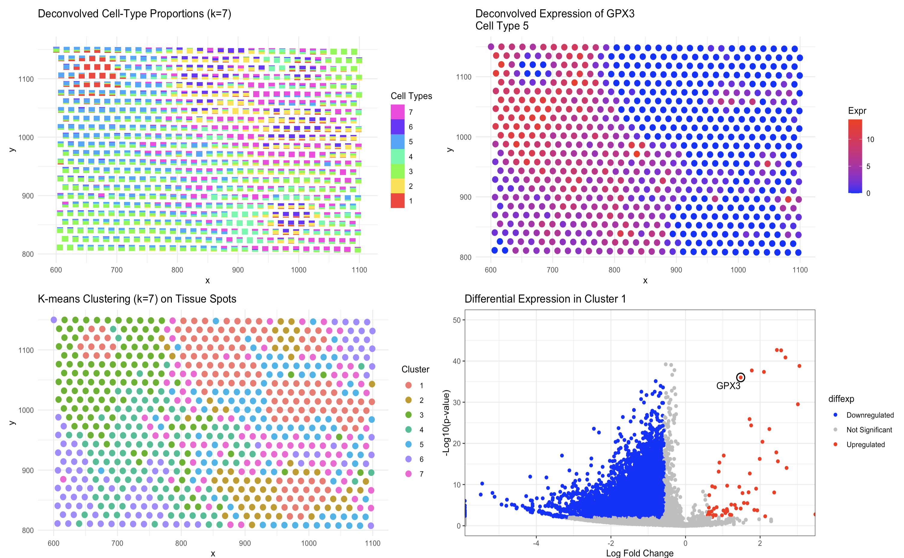
In the new analysis, the first panel uses scatterbar to display the deconvolved cell-type proportions for each tissue spot with k=7.Each spot shows a precise breakdown of cell types, with the height of each bar segment representing the fraction contributed by each cell type. The second panel maps the deconvolved expression of GPX3 to the cell type where it is most active, clearly showing the spatial distribution of GPX3. The third panel presents k-means clustering applied to the deconvolved proportions, ensuring that each spot is assigned to one of seven clusters based on its specific cell-type makeup. The accompanying volcano plot quantitatively distinguishes genes that are significantly different between one cluster and all others.
In the previous analysis (HW3) I relied on a t-SNE projection to reduce the high-dimensional gene expression data, where each tissue spot was assigned to a single cluster. This method identified broad spatial patterns and differential gene expression but did not account for overlapping cell-type contributions, as each spot was forced into one distinct group. Consequently, while the t-SNE approach highlighted major differences between clusters, it oversimplified the cellular composition by ignoring the possibility of mixed cell types within a spot.
Comparing the two methods reveals that the deconvolution-based approach provides a more detailed and accurate representation of the tissue’s cellular heterogeneity. The scatterbar visualization explicitly quantifies the exact proportions of multiple cell types in each spot, and the deconvolved GPX3 map pinpoints the regions with high expression of this gene within the specific cell type. In contrast, the t-SNE-based clustering assigns each spot to one group, which can mask the complex mixtures present in the tissue.
These differences also affect the differential expression analysis. The new volcano plot identifies genes that are enriched in a cluster defined by a specific mixture of cell types, offering clear and actionable insights into the biological markers that define that region. This level of detail confirms that the deconvolution approach not only captures the overlapping cellular architecture of the tissue but also improves the identification of key marker genes such as GPX3 when compared to the more coarse grouping of the t-SNE method.
Code
1
2
3
4
5
6
7
8
9
10
11
12
13
14
15
16
17
18
19
20
21
22
23
24
25
26
27
28
29
30
31
32
33
34
35
36
37
38
39
40
41
42
43
44
45
46
47
48
49
50
51
52
53
54
55
56
57
58
59
60
61
62
63
64
65
66
67
68
69
70
71
72
73
74
75
76
77
78
79
80
81
82
83
84
85
86
87
88
89
90
91
92
93
94
95
96
97
98
99
100
101
102
103
104
105
106
107
108
109
110
111
112
113
114
115
116
117
118
119
120
121
122
123
124
125
126
127
128
129
130
131
132
133
134
135
136
137
138
139
140
141
142
143
144
145
146
147
148
149
150
151
152
153
154
155
156
157
158
159
160
161
162
163
164
165
166
167
168
169
170
171
172
173
174
175
176
177
178
179
180
181
182
183
184
185
186
187
188
189
190
191
192
193
194
195
196
197
198
199
200
201
202
203
204
remotes::install_github("JEFworks-Lab/scatterbar", force = TRUE)
remotes::install_github("JEFworks-Lab/STdeconvolve", force = TRUE)

library(scatterbar)
library(STdeconvolve)
library(ggplot2)
library(patchwork)
library(ggrepel)
library(dplyr)

# 2) Read in the spatial transcriptomics data
data <- read.csv('~/Desktop/genomic-data-visualization-2025/data/eevee.csv.gz', row.names = 1)
data[1:10, 1:10]
# Extract spatial positions and gene expression data
pos <- data[, 2:3]        # Assuming columns 2 and 3 are spatial positions
colnames(pos) <- c('x', 'y')
gexp <- data[, 4:ncol(data)]
rownames(pos) <- rownames(gexp) <- data$barcode

# 3) Remove pixels with too few genes
# gexp is in spots x genes format; cleanCounts expects genes x spots, so we transpose.
counts <- cleanCounts(t(gexp), min.lib.size = 100, verbose = TRUE, plot = TRUE)

# 4) Feature selection for genes
# corpus will be a matrix with genes as rows and spots as columns.
corpus <- restrictCorpus(counts, removeAbove = 1.0, removeBelow = 0.05, nTopOD = 1000)


# 5) Fit LDA models across a range of K values (number of cell types)
# fitLDA expects spots in rows and genes in columns, so we transpose corpus.
ldas <- fitLDA(t(as.matrix(corpus)), Ks = 7)

# 6) Choose the optimal model; here, opting for K = 7
optLDA <- optimalModel(models = ldas, opt = "7")

# 7) Extract deconvolved cell-type proportions (theta) and transcriptional profiles (beta)
results <- getBetaTheta(optLDA, perc.filt = 0.05, betaScale = 1000)
deconProp <- results$theta  # Spots x cell types (clusters)
deconGexp <- results$beta   # Genes x cell types (clusters)


# 8) Use scatterbar to create a scattered stacked bar chart (a ggplot object)
p_deconvolve <- scatterbar(
  data         = as.data.frame(deconProp),
  xy           = pos,
  size_x       = 10,       # adjust to control bar width in x dimension
  size_y       = 10,       # adjust to control bar height in y dimension
  padding_x    = 0.01,     # add some padding to the x axis
  padding_y    = 0.01,     # add some padding to the y axis
  show_legend  = TRUE,
  legend_title = "Cell Types",
  verbose      = TRUE
) +
  labs(
    x = "x",           # x-axis label
    y = "y"            # y-axis label; adjust if you have specific units (e.g., "Y Position (µm)")
  ) +
  ggtitle("Deconvolved Cell-Type Proportions (k=7)") +
  theme_minimal()

p_deconvolve

# 9) Choose a gene of interest (here we use "6" as a placeholder gene name)
# Check the rownames of deconGexp to know what gene names are available.
transposed_dGexp = t(deconGexp)
rownames(transposed_dGexp)


gene_of_interest <- "GPX3"  # Replace with any valid gene name from deconGexp

# Check if the gene exists in the beta matrix
if (!gene_of_interest %in% rownames(transposed_dGexp)) {
  stop(paste("Gene", gene_of_interest, "not found in deconGexp."))
}

# 10) Identify which cell type (cluster) has the highest expression of this gene
cellTypeOfInterest <- which.max(transposed_dGexp[gene_of_interest, ])

# 11) Compute the spot-level, deconvolved expression for that gene
# For each spot, the deconvolved expression is:
# cell-type proportion (theta) * gene expression contribution (beta)
gene_decon_expr <- deconProp[, cellTypeOfInterest] * transposed_dGexp[gene_of_interest, cellTypeOfInterest]

# Create a data frame for plotting the gene expression spatially
df_gene_expr <- data.frame(
  x    = pos$x,
  y    = pos$y,
  expr = gene_decon_expr
)

# 12) Visualize the deconvolved gene expression as a spatial scatter plot
p_gene_expr <- ggplot(df_gene_expr, aes(x = x, y = y, color = expr)) +
  geom_point(size = 3) +
  scale_color_gradient(low = "blue", high = "red") +
  labs(
    title = paste("Deconvolved Expression of", gene_of_interest, "\nCell Type", cellTypeOfInterest),
    x = "x",
    y = "y",
    color = "Expr"
  ) +
  theme_minimal()

# 14) Perform K-means clustering on the tissue using the deconvolved cell-type proportions
set.seed(123)  # for reproducibility
kmeans_results <- kmeans(deconProp, centers = 7)
clusters <- as.factor(kmeans_results$cluster)

# Create a data frame with spatial coordinates and cluster assignments
df_clusters <- data.frame(
  x = pos$x,
  y = pos$y,
  cluster = clusters
)

# 15) Visualize the K-means clustering result as a spatial scatter plot
p_kmeans <- ggplot(df_clusters, aes(x = x, y = y, color = cluster)) +
  geom_point(size = 3) +
  labs(
    title = "K-means Clustering (k=7) on Tissue Spots",
    x = "x",
    y = "y",
    color = "Cluster"
  ) +
  theme_minimal()

p_kmeans


# 16) Differential Expression Analysis & Volcano Plot for Cluster 1
# First, create a normalized gene expression matrix (spots x genes).
# Here we use a simple log2 transformation.
gexpnorm_new <- log2(gexp + 1)

# Set the target cluster (as a string matching the factor levels) to "1"
target_cluster <- "3"

# Compute p-values for each gene using the Wilcoxon test
pv_new <- sapply(colnames(gexpnorm_new), function(i) {
  wilcox.test(gexpnorm_new[clusters == target_cluster, i],
              gexpnorm_new[clusters != target_cluster, i])$p.value
})

# Compute log2 fold-change for each gene
logfc_new <- sapply(colnames(gexpnorm_new), function(i) {
  mean_in <- mean(gexpnorm_new[clusters == target_cluster, i], na.rm = TRUE)
  mean_out <- mean(gexpnorm_new[clusters != target_cluster, i], na.rm = TRUE)
  log2(mean_in / mean_out)
})

# Create a data frame of differential expression results
df_diffexp_new <- data.frame(
  gene = colnames(gexpnorm_new),
  logfc = logfc_new,
  logpv = -log10(pv_new)
)

# Initialize diffexp column as "Not Significant"
df_diffexp_new$diffexp <- "Not Significant"

# Identify indices where logpv and logfc are not NA and meet thresholds
up_idx <- which(!is.na(df_diffexp_new$logpv) &
                  !is.na(df_diffexp_new$logfc) &
                  df_diffexp_new$logpv > 2 & df_diffexp_new$logfc > 0.58)
down_idx <- which(!is.na(df_diffexp_new$logpv) &
                    !is.na(df_diffexp_new$logfc) &
                    df_diffexp_new$logpv > 2 & df_diffexp_new$logfc < -0.58)

df_diffexp_new$diffexp[up_idx] <- "Upregulated"
df_diffexp_new$diffexp[down_idx] <- "Downregulated"
df_diffexp_new$diffexp <- as.factor(df_diffexp_new$diffexp)

# Optionally, highlight a gene of interest
df_diffexp_new$highlight <- ifelse(df_diffexp_new$gene == "GPX3", "GPX3", NA)

# 17) Create the volcano plot using ggplot2
p_volcano <- ggplot(df_diffexp_new, aes(x = logfc, y = logpv, color = diffexp)) +
  geom_point() +
  # Add a circle around GPX3
  geom_point(
    data = df_diffexp_new[df_diffexp_new$gene == "GPX3", ],
    aes(x = logfc, y = logpv),
    shape = 1,   # Hollow circle
    size = 4,    # Make it large enough to be visible
    color = "black",
    stroke = 1   # Adjust line thickness
  ) +
  geom_text_repel(
    data = df_diffexp_new[!is.na(df_diffexp_new$highlight), ],
    aes(label = highlight),
    size = 4,  # Make label smaller
    color = "black",
    box.padding = 0.3,  # Space out labels
    segment.color = "black",  # Add a line connecting label to point
    segment.size = 0.3  # Make connecting line thinner
  ) +
  scale_color_manual(values = c("blue", "grey", "red")) +
  ggtitle("Differential Expression in Cluster 1") +
  labs(x = "Log Fold Change", y = "-Log10(p-value)") +
  ylim(0, 50) +  # Increase y-axis range
  theme_bw()

combined_all <- (p_deconvolve | p_gene_expr) / (p_kmeans | p_volcano)
combined_all
# ChatGPT was used to help with generating the plots (particularly improving the aesthics).