Visualization of nonlinear-embedded gex data versus linear-embedded gex data

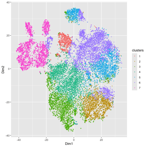
Here, I illustrate the effect of an embedding in either PC-embedded (linear) space or tSNE-embedded (nonlinear) space. As observed, the PC-embedded shape resembles a volcano plot, with prominent spot placement along two emerging buds from a single vanishing point. The overlaid colors indicate a poor differentiation between the clusters in this embedded space, suggesting that the first 2 PCs do not contain a dramatic portion of the variance in the data and thus a linear embedding method is a poor metric of gex profile similarity. In contrast, the tSNE-embedded space yields a nicely distributed set of clusters, which are fairly well (though not perfectly) dispersed into clusters with appropriate coloring. There is limited overlapping of color, so this stochastic method yielded a better representation of HD space than the linear method did. The number of clusters of 7 (k = 7) used for both the PCA and tSNE embedding was determined by examining an elbow plot illustrating withinness over a range of potential k values.
5. Code (paste your code in between the ``` symbols)
1
2
3
4
5
6
7
8
9
10
11
12
13
14
15
16
17
18
19
20
21
22
23
24
25
26
27
28
29
30
31
32
33
34
35
36
37
38
39
40
41
42
43
44
45
46
47
48
49
50
51
52
53
54
55
56
57
58
59
60
61
62
63
64
65
66
67
68
69
70
71
72
73
74
75
76
77
78
79
80
81
82
83
84
85
86


## SV Kammula

library(gifski)
library(gganimate)
library(patchwork)
library(ggplot2)

data <- read.csv('pikachu.csv.gz')
data[1:5,1:10]
pos <- data[, 5:6]

rownames(pos) <- data$cell_id
gexp <- data[, 7:ncol(data)]
rownames(gexp) <- data$barcode

loggexp <- log10(gexp + 1)
com <-kmeans(loggexp, centers=7)
clusters <- com$cluster
clusters <- as.factor(clusters)
names(clusters) <-rownames(gexp)
head(clusters)

pcs <-prcomp(loggexp)
#make individual plots
df1 <- data.frame(pcs$x[,1:2], clusters)
colnames(df1) <-c('Dim1','Dim2','clusters')
ggplot(df1, aes(x=Dim1, y=Dim2, col=clusters)) +geom_point()

df2 <-data.frame(pos, clusters)
colnames(df2) <- c('x','y','clusters')
ggplot(df2, aes(x=x, y=y, col=clusters)) +geom_point(size=.5, alpha=.5)

emb <- Rtsne::Rtsne(loggexp)
df_tsne <- data.frame(emb$Y, clusters)
colnames(df_tsne) <- c('Dim1','Dim2','clusters')
ggplot(df_tsne, aes(x = Dim1, y=Dim2, col=clusters)) + geom_point()


### lower number of pcs


com <-kmeans(loggexp, centers=4)
clusters <- com$cluster
clusters <- as.factor(clusters)
names(clusters) <-rownames(gexp)
head(clusters)


pcs <-prcomp(loggexp)
#make individual plots
df3 <- data.frame(pcs$x[,1:2], clusters)
colnames(df3) <-c('Dim1','Dim2','clusters')
#ggplot(df1, aes(x=Dim1, y=Dim2, col=clusters)) +geom_point()

df4 <-data.frame(pos, clusters)
colnames(df4) <- c('x','y','clusters')
ggplot(df4, aes(x=x, y=y, col=clusters)) +geom_point(size=.5, alpha=.5)

emb <- Rtsne::Rtsne(loggexp)
df_tsne_low <- data.frame(emb$Y, clusters)
colnames(df_tsne_low) <- c('Dim1','Dim2','clusters')
ggplot(df_tsne_low, aes(x = Dim1, y=Dim2, col=clusters)) + geom_point()


###
df<- rbind(
  cbind(df_tsne, order=1),
  cbind(df1, order=2)
)

head(df)
p<-ggplot(df, aes(x=Dim1, y=Dim2, col=clusters)) +geom_point(size=.5, alpha=.5)


anim <- p + transition_states(order) + view_follow()
animate(anim, height=300, width=300)


#anim_save("skammul3.gif", animation = anim)

###