Eevee Dataset Deconvolution and Cell-type Analysis

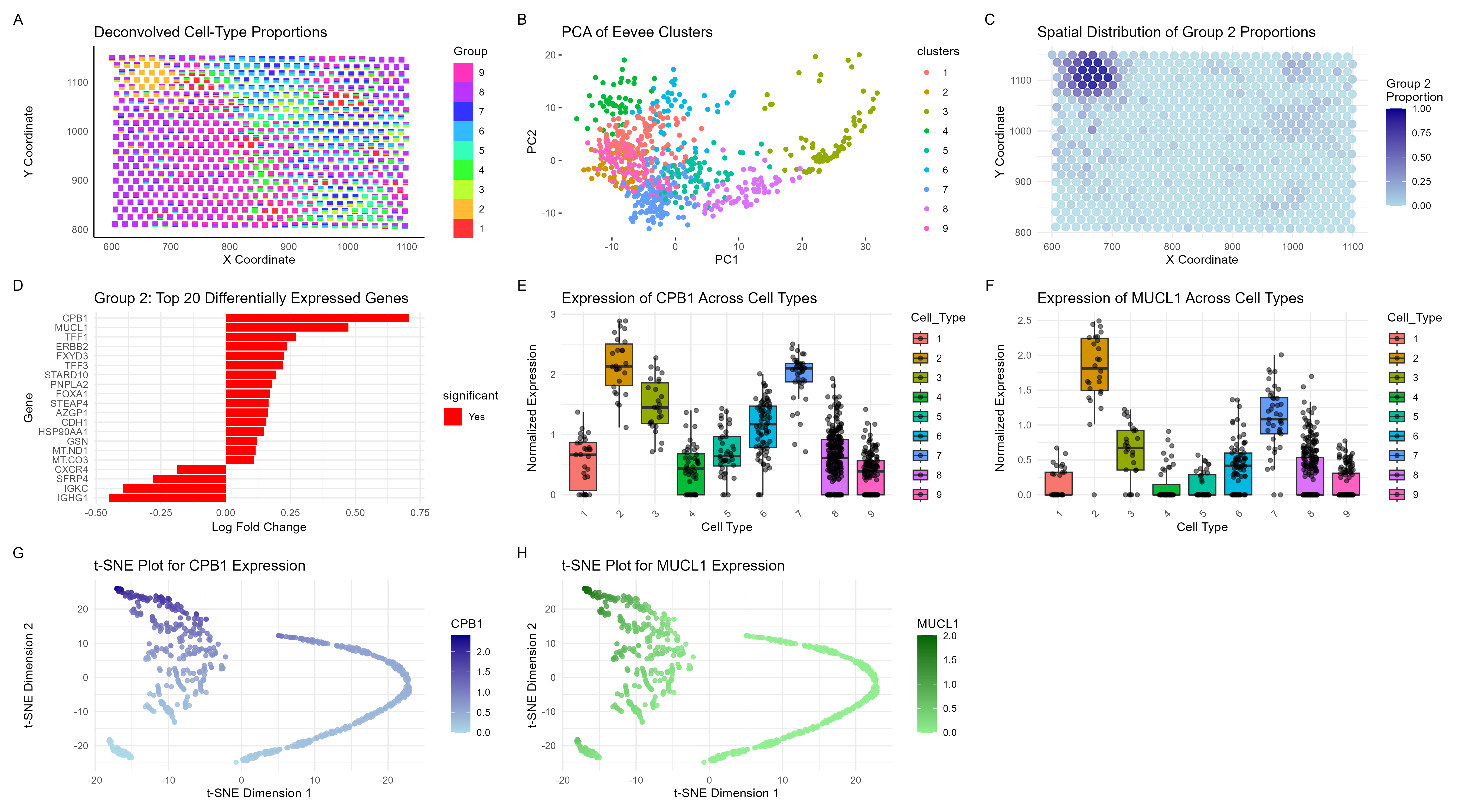
Visualization Summary In this visualization, I analyzed the eevee dataset for unique cell-types using deconvolution (through STdeconvolve) and visualized it using scatterbar. I found 9 distinct cell types (Figure A), but focused on cell-type 2 for future analyses as it was well clustered together and likely had a unique cell phenotype as compared to cluster 8 which was quite widespread. Next, the top 1000 genes in the dataset were normalized, log-transformed, and clustered (K = 9) (Figure B). Figure C illustrates a spatial representation of cell-type 2 which clustered spatially as well as through gene expression. The top 20 genes that were differentially expressed were then plotted (Figure D), and genes of interest were determined. Figures E-H contain boxplots and tSNE plots to demonstrate that cell type 2 is indeed a unique cell type.
The expression of CPB1 and MUCL1 are most closely linked to glandular cells. The Eevee dataset contains breast cancer cells, which tend to arise from glandular epithelial cells. More specifically, CPB1 has shown to be an early gene signature of breast cancer that appears prior to full-blown cancer [1]. Additionally, MUCL1 has been previously shown to be a breast-specific gene, linked to tumor progression and metastasis. Overall, it is clear that cell-type 2 is a unique cell type of early-forming breast cancer cells that is present in a small, subsection of the Eevee dataset.
References: [1] Kothari, C., Clemenceau, A., Ouellette, G., Ennour-Idrissi, K., Michaud, A., Diorio, C., & Durocher, F. (2021). Is Carboxypeptidase B1 a Prognostic Marker for Ductal Carcinoma In Situ?. Cancers, 13(7), 1726. https://doi.org/10.3390/cancers13071726 [2] Conley, S. J., Bosco, E. E., Tice, D. A., Hollingsworth, R. E., Herbst, R., & Xiao, Z. (2016). HER2 drives Mucin-like 1 to control proliferation in breast cancer cells. Oncogene, 35(32), 4225–4234. https://doi.org/10.1038/onc.2015.487
Code (paste your code in between the ``` symbols)
1
2
3
4
5
6
7
8
9
10
11
12
13
14
15
16
17
18
19
20
21
22
23
24
25
26
27
28
29
30
31
32
33
34
35
36
37
38
39
40
41
42
43
44
45
46
47
48
49
50
51
52
53
54
55
56
57
58
59
60
61
62
63
64
65
66
67
68
69
70
71
72
73
74
75
76
77
78
79
80
81
82
83
84
85
86
87
88
89
90
91
92
93
94
95
96
97
98
99
100
101
102
103
104
105
106
107
108
109
110
111
112
113
114
115
116
117
118
119
120
121
122
123
124
125
126
127
128
129
130
131
132
133
134
135
136
137
138
139
140
141
142
143
144
145
146
147
148
149
150
151
152
153
154
155
156
157
158
159
160
161
162
163
164
165
166
167
168
169
170
171
172
173
174
175
176
177
178
179
180
181
182
183
184
185
186
187
188
189
190
191
192
193
194
195
196
197
198
199
200
201
202
203
204
205
206
207
208
209
210
211
212
213
214
215
216
217
218
219
220
221
222
223
224
225
226
227
228
229
230
231
232
233
234
235
236
237
238
239
240
241
242
243
244
245
246
247
248
249
250
251
library(ggplot2)
library(dplyr)
library(tidyr)
library(RColorBrewer)
library(patchwork)
library(Rtsne)
library(gganimate)
library(scales)
library(STdeconvolve)
library(scatterbar)

data <- read.csv('eevee.csv.gz', row.names=1)
head(data)
pos <- data[,2:3]
colnames(pos) <- c('x', 'y')
gexp <- data[, 4:ncol(data)]
rownames(pos) <- rownames(gexp) <- data$barcode
head(pos)
gexp[1:5,1:5]

# Remove pixels with too few genes
counts <- cleanCounts(t(gexp), min.lib.size = 100, verbose=TRUE, plot=TRUE)

# Feature select for genes
corpus <- restrictCorpus(counts, removeAbove=1.0, removeBelow = 0.05, nTopOD=200)

# Choose optimal number of cell-types
ldas <- fitLDA(t(as.matrix(corpus)), Ks = seq(6, 10))

# Get best model results
optLDA <- optimalModel(models = ldas, opt = "9")

# Extract deconvolved cell-type proportions (theta) and transcriptional profiles (beta)
results <- getBetaTheta(optLDA, perc.filt = 0.05, betaScale = 1000)
deconProp <- results$theta
deconGexp <- results$beta

# Visualize deconvolved cell-type proportions
vizAllTopics(deconProp, pos,
             r=8, lwd=0)

# Make scatter plot and label with position axes
scatterbar_plot <- scatterbar(deconProp, pos, size_x = 10, size_y = 12) +
  ggtitle("Deconvolved Cell-Type Proportions") +
  xlab("X Coordinate") +
  ylab("Y Coordinate") +
  theme_minimal() +
  theme(axis.line = element_line(color = "black"),
        panel.grid = element_blank()) # Remove gridlines

print(scatterbar_plot)

## ANALYZE GROUP 2

group_2_prop <- deconProp[, "2"]
# Add Group 2 proportions to the spatial positions data frame
pos$group_2 <- group_2_prop

# Plot spatial distribution of Group 2
group_2_plot <- ggplot(pos, aes(x = x, y = y, color = group_2)) +
  geom_point(size = 3, alpha = 0.8) +
  scale_color_gradient(low = "lightblue", high = "darkblue", name = "Group 2\nProportion") +
  ggtitle("Spatial Distribution of Group 2 Proportions") +
  xlab("X Coordinate") +
  ylab("Y Coordinate") +
  theme_minimal()

print(group_2_plot)

# Gene Expression Profile for Group 2
group_2_gexp <- deconGexp["2", ]
top_genes_group_2 <- sort(group_2_gexp, decreasing = TRUE)[1:10]
print(top_genes_group_2)

# Normalize gexp using log normalization
gene_norm <- log10(gexp * 10000 / rowSums(gexp) + 1)

# Create a binary vector for group 8 vs others
group2_vs_others <- ifelse(deconProp[, "2"] > median(deconProp[, "2"]), 1, 0)

# Function to perform t-test for each gene
perform_t_test <- function(gene) {
  test_result <- t.test(gene_norm[group2_vs_others == 1, gene],
                        gene_norm[group2_vs_others == 0, gene])
  return(c(p_value = test_result$p.value,
           t_statistic = test_result$statistic))
}

# Perform t-test for all genes
t_test_results <- t(sapply(colnames(gene_norm), perform_t_test))

# Calculate log fold change
log_fc <- sapply(colnames(gene_norm), function(gene) {
  mean(gene_norm[group2_vs_others == 1, gene]) -
    mean(gene_norm[group2_vs_others == 0, gene])
})

# Combine results
results <- data.frame(
  gene = colnames(gene_norm),
  log_fc = log_fc,
  p_value = t_test_results[, "p_value"],
  t_statistic = t_test_results[, "t_statistic.t"]
)

# Adjust p-values for multiple testing
results$adj_p_value <- p.adjust(results$p_value, method = "BH")

# Sort by adjusted p-value
results <- results[order(results$adj_p_value), ]

# Add significance column
results$significant <- ifelse(results$adj_p_value < 0.05, "Yes", "No")

# Get top 20 genes
top_genes <- head(results, 20)

p4 <- ggplot(top_genes, aes(x = reorder(gene, log_fc), y = log_fc, fill = significant)) +
  geom_bar(stat = "identity") +
  scale_fill_manual(values = c("No" = "grey", "Yes" = "red")) +
  coord_flip() +
  labs(title = "Group 2: Top 20 Differentially Expressed Genes",
       x = "Gene",
       y = "Log Fold Change") +
  theme_minimal()

print(p4)

## K Means Clustering
pos <- data[, 5:6]
rownames(pos) <- data$cell_id
gexp <- data[, 7:ncol(data)]
rownames(gexp) <- data$barcode

topgenes <- names(sort(colSums(gexp), decreasing=TRUE)[1:1000])
gene_data <- gexp[,topgenes]

gene_norm <- log10(gene_data * 10000 / rowSums(gene_data) + 1)
com <- kmeans(gene_norm, centers=9)
clusters <- com$cluster
clusters <- as.factor(clusters)
names(clusters) <- rownames(gene_norm)
head(clusters)

pca_result <- prcomp(gene_norm, scale. = TRUE)
summary(pca_result)

df <- data.frame(pca_result$x, clusters)
p1 <- ggplot(df, aes(x = PC1, y = PC2, col = clusters)) +
  geom_point() +
  labs(title = "PCA of Eevee Clusters") +
  theme(
    panel.background = element_rect(fill = "white"),
    panel.grid.major = element_blank(), # Remove major grid lines
    panel.grid.minor = element_blank()  # Remove minor grid lines
  )

print(p1)

## Make Boxplots for Genes of Interest

# Extract normalized expression for CPB1 and MUCL1
genes_to_plot <- c("CPB1", "MUCL1")
expression_data <- gene_norm[, genes_to_plot]

# Add cell type labels (from deconProp)
cell_types <- apply(deconProp, 1, function(x) names(which.max(x))) # Assign each cell to its most likely type
expression_data <- cbind(expression_data, Cell_Type = cell_types)

# Convert to long format for ggplot
long_expression_data <- pivot_longer(as.data.frame(expression_data),
                                     cols = genes_to_plot,
                                     names_to = "Gene",
                                     values_to = "Expression")

# Subset data for CPB1 and MUCL1
cpb1_data <- long_expression_data %>% filter(Gene == "CPB1")
mucl1_data <- long_expression_data %>% filter(Gene == "MUCL1")

# Create box plot for CPB1
cpb1_plot <- ggplot(cpb1_data, aes(x = Cell_Type, y = Expression, fill = Cell_Type)) +
  geom_boxplot(outlier.shape = NA) +
  geom_jitter(width = 0.2, alpha = 0.5) +
  labs(title = "Expression of CPB1 Across Cell Types",
       x = "Cell Type",
       y = "Normalized Expression") +
  theme_minimal() +
  theme(axis.text.x = element_text(angle = 45, hjust = 1))

# Create box plot for MUCL1
mucl1_plot <- ggplot(mucl1_data, aes(x = Cell_Type, y = Expression, fill = Cell_Type)) +
  geom_boxplot(outlier.shape = NA) +
  geom_jitter(width = 0.2, alpha = 0.5) +
  labs(title = "Expression of MUCL1 Across Cell Types",
       x = "Cell Type",
       y = "Normalized Expression") +
  theme_minimal() +
  theme(axis.text.x = element_text(angle = 45, hjust = 1))

print(cpb1_plot)
print(mucl1_plot)

## Perform tSNE Analysis

# Normalize gexp using log normalization
gene_norm <- log10(gexp * 10000 / rowSums(gexp) + 1)

# Extract normalized expression for CPB1 and MUCL1
genes_to_plot <- c("CPB1", "MUCL1")
tsne_data <- gene_norm[, genes_to_plot]

# Perform t-SNE on the selected genes
set.seed(42) # For reproducibility
tsne_data <- unique(tsne_data)
tsne_result <- Rtsne(tsne_data, dims = 2, perplexity = 30, verbose = TRUE)

# Create a data frame for plotting
tsne_df <- data.frame(
  tSNE1 = tsne_result$Y[, 1],
  tSNE2 = tsne_result$Y[, 2],
  CPB1 = tsne_data[, "CPB1"],
  MUCL1 = tsne_data[, "MUCL1"]
)

# Plot t-SNE for CPB1
cpb1_tsne_plot <- ggplot(tsne_df, aes(x = tSNE1, y = tSNE2, color = CPB1)) +
  geom_point(alpha = 0.8) +
  scale_color_gradient(low = "lightblue", high = "darkblue", name = "CPB1") +
  labs(title = "t-SNE Plot for CPB1 Expression",
       x = "t-SNE Dimension 1",
       y = "t-SNE Dimension 2") +
  theme_minimal()

# Plot t-SNE for MUCL1
mucl1_tsne_plot <- ggplot(tsne_df, aes(x = tSNE1, y = tSNE2, color = MUCL1)) +
  geom_point(alpha = 0.8) +
  scale_color_gradient(low = "lightgreen", high = "darkgreen", name = "MUCL1") +
  labs(title = "t-SNE Plot for MUCL1 Expression",
       x = "t-SNE Dimension 1",
       y = "t-SNE Dimension 2") +
  theme_minimal()

print(cpb1_tsne_plot)
print(mucl1_tsne_plot)

combined_plot <- (scatterbar_plot + p1 + group_2_plot + p4 + cpb1_plot + mucl1_plot + cpb1_tsne_plot + mucl1_tsne_plot) + plot_layout(ncol = 3) +
  plot_annotation(tag_levels = 'A')

print(combined_plot)

ggsave("ec2_sraghav9.png", combined_plot, width = 18, height = 10, units = "in", dpi = 300)