HW1

1. What about the data are you trying to make salient through this data visualization?
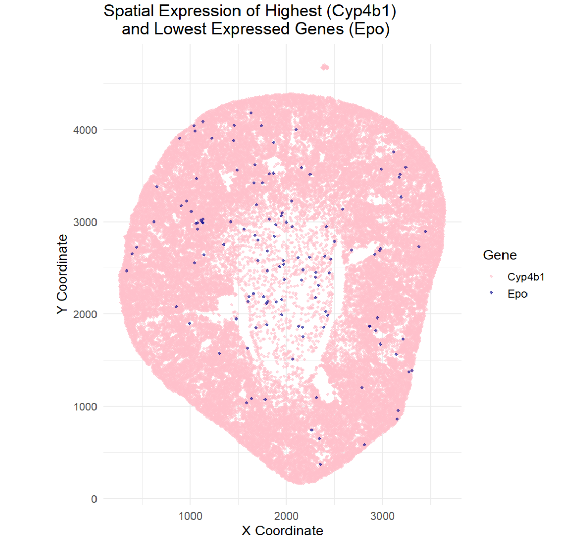
The goal of this visualization was to make salient the spatial location of the highest and lowest expressed genes. This visualization allows the viewer to see the areas where the highest expressed gene, Cyp4b1, and the lowest expressed gene, Epo, are in the kidney. I was curious to see if these genes overlapped in regions or if they were expressed in different regions. To determine the spatial location, I found where the genes were expressed, or had expression values greater than 0. This helped me determine the spatial location of the gene. The data visualization revealed that the highest expressing gene (Cyp4b1) is found throughout the tissue while the lowest expressed gene (Epo) us found sporadically throughout the tissue. This data visualization does not allow for co-expression of genes to be determined, rather it can only give spatial information on where the genes are actively being expressed.
2. What are the data types represented?
The data types represented in this visualization are quantitative data, spatial coordinates/positional data, and categorical data. The gene expression values are numerical counts and the x and y coordinates show where each expression measurement is in the tissue (location of the gene). The type of gene (highest expressing and lowest expressing) is categorical.
3. What data encodings (geometric primitives and visual channels) are you choosing to visualize these data types?
The geometric primitives used were points to represent each spot in the tissue. Color, more specifically hue, was used to depict the different genes and where the gene was expressed. This allows one to quickly discern the highest expressed gene from the lowest expressed gene. the highest expressed gene and the lowest expressed gene.
4. What Gestalt principles or knowledge about perceptiveness of visual encodings are you using to accomplish this?
This visualization used the Gestalt principles of similarity and proximity. Similarity is seen through the different hues used. Spots of the same color express the same gene making it easy to identify the most expressed gene and the least expressed gene. This allows one to automatically group the genes together. Proximity was also used as points that are close together from clusters which helps show the different regions of gene activity.
5. Code
```r library(ggplot2)
reading in the data
data <- read.csv(‘C:/Users/gtbud/Downloads/Xenium-IRI-ShamR_matrix.csv.gz’)
get gene expression data
gexp <- data[, 4:ncol(data)]
find the highest and lowest expressed gene
total_expression <- colSums(gexp)
highest_gene <- names(which.max(total_expression)) lowest_gene <- names(which.min(total_expression))
print(paste(“Highest expressed gene:”, highest_gene)) print(paste(“Lowest expressed gene:”, lowest_gene))
finds the spatial location of where the genes are expressed
df_high <- data[data[[highest_gene]] > 0, c(“x”, “y”)] df_high$gene <- highest_gene
df_low <- data[data[[lowest_gene]] > 0, c(“x”, “y”)] df_low$gene <- lowest_gene
combines the data into one dataframe
df_all <- rbind(df_high, df_low)
helps match the gene to the right color
df_all$gene <- factor(df_all$gene, levels = c(highest_gene, lowest_gene))
plot the spatial expression
ggplot(df_all, aes(x = x, y = y, color = gene)) + geom_point(size = 1, alpha = 0.6) + scale_color_manual( name = “Gene”, values = setNames( c(“pink”, “darkblue”), c(highest_gene, lowest_gene) ) ) + coord_fixed() + theme_minimal(base_size = 14) + labs( title = “Spatial Expression of Highest (Cyp4b1) and Lowest Expressed Genes (Epo)”, x = “X Coordinate”, y = “Y Coordinate” )
The beginning part of the code was done in class with Prof. Fan. AI was used to figure out how to not have the dots of each gene overlap with each other and create a legend so that the viewer knows which gene is which on the spatial map.