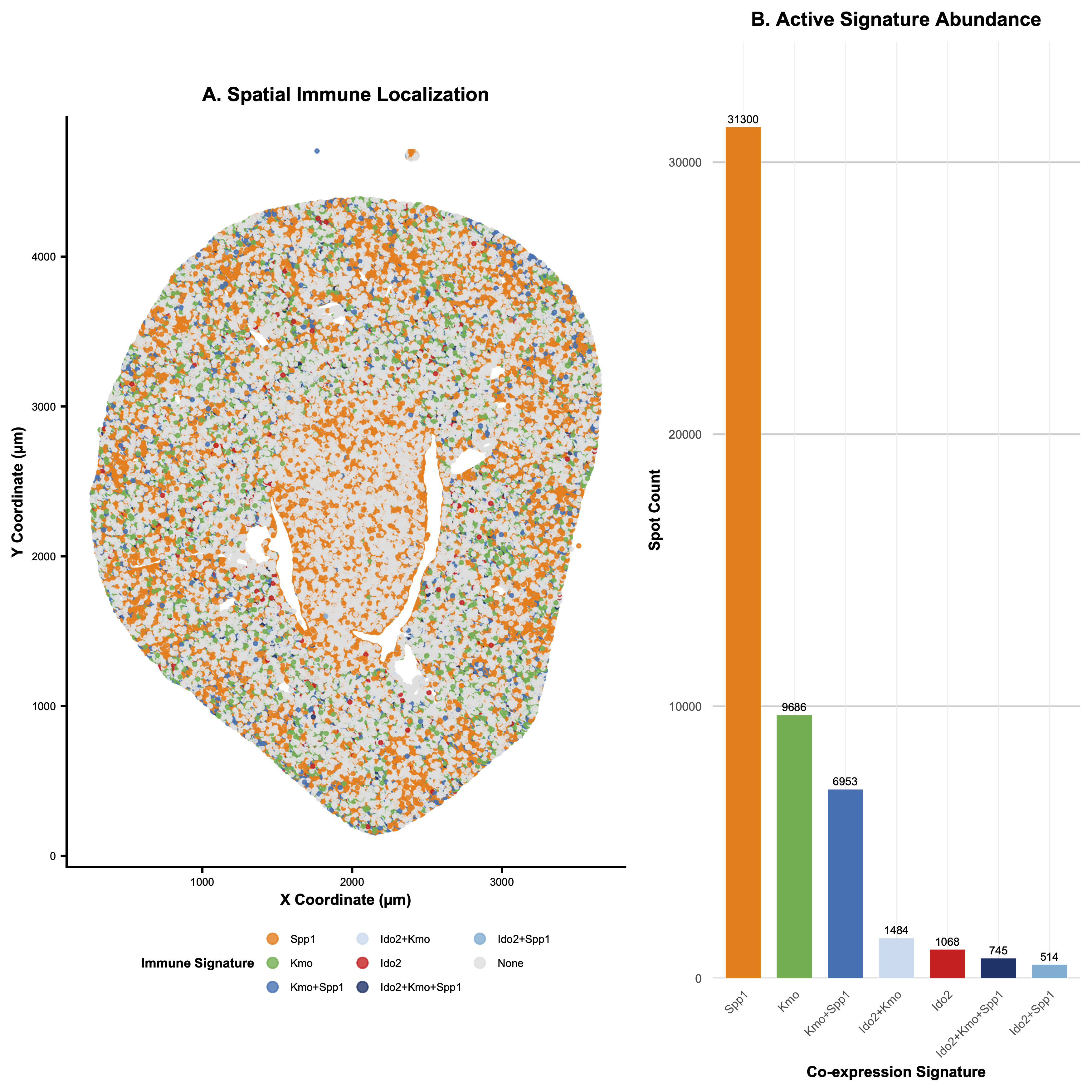
Abundance of and spatial relationship between co-expression of genes within the Kynurenine Pathway

1. What data types are you visualizing?
Categorical - each of the three genes and their respective overlaps are split into categories. Quantitative - the spot count for each gene expression is also displayed. Spatial - the x and y coordinate of where the gene expression is located
2. What data encodings (geometric primitives and visual channels) are you using to visualize these data types?
I utilized the geometric primitive of dots and areas. Dots are used in the spatial plot on the left to show where each gene is expressed. Areas are used in the upset plot on the right to show the abundance of each expression. I utilized the visual channels of hue and saturation to distinguish between each category (hues are used to distinguish independently expressed genes, while various saturations of the color blue were used to distinguish between their spatial overlaps). I also used (x and y) position to display the spatial location of each gene expression, and I used y position in the upset plot to quantify spot count and x position to distinguish between gene categories.
3. What about the data are you trying to make salient through this data visualization?
After doing some research on the dataset, I found out that the image was taken from a research paper studying the effect of ischemia-reperfusion injury on kidney tissue. I identified 3 genes related to the Kynurenine Pathway, which controls immunologic response in the kidney.
4. What Gestalt principles or knowledge about perceptiveness of visual encodings are you using to accomplish this?
I utilized the increased saliency of positional visual encoding to inform my decision to add an upset plot to the right of my spatial data graph: I wanted it to be clear to the viewer how common each gene expression and combination of gene expressions within the same area was, which could be unclear just by looking at the spatial plot. Thus, I added the upset to clearly rank the relative magnitudes of the gene expressions’ spot counts. I also used the Gestalt principle of proximity (separating the two plots) and similarity (sharing the same category colors in the two plots) to more clearly express that the two plots are providing distinct information about the same dataset.
5. Code (paste your code in between the ``` symbols)
```# “To use this script with your own data, simply locate the file_path variable
near the top of the code and replace the text inside the quotes with the
specific location of your .csv or .csv.gz file; on a Mac, you can easily
get this by right-clicking your file and holding the Option key to
“Copy as Pathname.” The script is designed to be completely autonomous,
so you don’t need to worry about manually installing libraries. It includes
a built-in “Package Guardian” that automatically checks for and downloads
ggplot2 (for the mapping), gridExtra (for the side-by-side layout), and
scales (for the axis labeling) if they aren’t already on your system.”
################################################################################
COLLABORATIVE RESEARCH ACKNOWLEDGEMENT
#
This visualization provides a high-resolution, integrated spatial-frequency
analysis of immune-regulating genes (Ido2, Kmo, Spp1) for kidney IRI research.
#
CONTRIBUTIONS:
1. Dual-Panel Integration: Synchronized a high-detail spatial map (A)
with a quantitative signature distribution plot (B).
2. Multibyte Fix: Implemented gzcon() and textConnection() to handle
compressed web-streams and prevent “multibyte string” errors.
3. Scale Optimization: Utilized a Linear Scale with explicit count labels.
4. Targeted Signature Focus: Filtered abundance to focus on active immune
signatures, removing ‘None’ background for quantitative clarity.
5. Autonomous Environment: The “Package Guardian” automatically detects
and installs all dependencies (ggplot2, gridExtra, scales).
#
FULL PROMPT HISTORY:
1. “what datapoints are in this dataset”
2. “does it contain brac1”
3. “are there any genes related to parkinsons disease”
4. “create a plot in r studio that shows the concentration of acmsd, sppl,
and kmo in their spatial positions.”
5. “what are some genes in the dataset with very high expression”
6. “yeah let’s edit the plot to only show Cyp4b1”
7. “increase the size of the data points”
8. “actually make them smaller”
9. “what is the dataset looking at?”
10. “can you create an upset plot of the data with the 5 genes in key focus”
11. “make the font size smaller, and make the template more aesthetic”
12. “reduce the size of data labels”
13. “now comment the contributions you made… and give me back the code”
14. “im trying to give you credit… create a comment where you summarize help”
15. “cool, can you include the prompts i made as well”
16. “instead of an upset plot, create x versus y… hue based on 5 genes”
17. “now let’s make the graph only for the three genes for immune response”
18-28. Refined side-by-side layouts, log vs linear scales, and autonomous setup.
################################################################################
— 1. AUTONOMOUS ENVIRONMENT SETUP (PACKAGE GUARDIAN) —
required_libs <- c(“ggplot2”, “gridExtra”, “scales”) new_libs <- required_libs[!(required_libs %in% installed.packages()[,”Package”])]
if(length(new_libs) > 0) { message(“Guardian: Missing dependencies detected. Installing now…”) install.packages(new_libs, repos = “https://cloud.r-project.org/”) }
library(ggplot2) library(gridExtra) library(scales) message(“Environment Ready.”)
— 2. DATA INPUT (FIXED FOR GITHUB .GZ STREAMS) —
file_path <- “https://raw.githubusercontent.com/JEFworks-Lab/genomic-data-visualization-2026/main/data/Xenium-IRI-ShamR_matrix.csv.gz”
message(“Opening decompressed connection to GitHub…”)
Fix: Wrap the URL in a decompressed connection to avoid multibyte/null errors
con <- gzcon(url(file_path)) df <- read.csv(textConnection(readLines(con))) close(con)
message(“Data loaded successfully. Mapping signatures…”)
— 3. CORE ANALYSIS: IMMUNE SIGNATURES —
immune_genes <- c(“Ido2”, “Kmo”, “Spp1”)
Create categorical co-expression signatures
df$ImmuneSignature <- apply(df[immune_genes], 1, function(row) { active <- immune_genes[row > 0] if (length(active) == 0) return(“None”) return(paste(active, collapse = “+”)) })
Define the Master Aesthetic Palette
immune_colors <- c( “Ido2” = “#E41A1C”, # Red “Kmo” = “#4DAF4A”, # Green “Spp1” = “#FF7F00”, # Orange “Ido2+Kmo” = “#C6DBEF”, # Saturated Blue Gradient “Ido2+Spp1” = “#6BAED6”, “Kmo+Spp1” = “#2171B5”, “Ido2+Kmo+Spp1” = “#08306B”, “None” = “#E0E0E0” # Background Grey )
Frequency Ranking (Exclude ‘None’ from bar chart)
ranking_data <- as.data.frame(table(df$ImmuneSignature)) colnames(ranking_data) <- c(“Signature”, “Count”) ranking_data <- ranking_data[ranking_data$Signature != “None”, ] ranking_data <- ranking_data[order(-ranking_data$Count), ] ranking_data$Signature <- factor(ranking_data$Signature, levels = ranking_data$Signature)
Synchronize levels for spatial legend
df$ImmuneSignature <- factor(df$ImmuneSignature, levels = c(levels(ranking_data$Signature), “None”))
— 4. PANEL A: SPATIAL LOCALIZATION (LEFT) —
plot_left <- ggplot(df, aes(x = x, y = y, color = ImmuneSignature)) + geom_point(size = 0.5, alpha = 0.8) + scale_color_manual(values = immune_colors, name = “Immune Signature”) + theme_classic() + theme( text = element_text(size = 6), axis.title = element_text(size = 7, face = “bold”), axis.text = element_text(size = 5), legend.position = “bottom”, legend.box.margin = margin(t = -5), legend.title = element_text(size = 6, face = “bold”), legend.text = element_text(size = 5), legend.key.size = unit(0.2, “cm”), plot.title = element_text(hjust = 0.5, size = 9, face = “bold”) ) + labs(title = “A. Spatial Immune Localization”, x = “X Coordinate (µm)”, y = “Y Coordinate (µm)”) + coord_fixed() + guides(color = guide_legend(nrow = 3, override.aes = list(size = 2)))
— 5. PANEL B: ACTIVE SIGNATURE ABUNDANCE (RIGHT) —
plot_right <- ggplot(ranking_data, aes(x = Signature, y = Count, fill = Signature)) + geom_bar(stat = “identity”, width = 0.7, color = “white”, linewidth = 0.1) + scale_y_continuous(expand = expansion(mult = c(0, 0.15))) + geom_text(aes(label = Count), vjust = -0.5, size = 1.8) + scale_fill_manual(values = immune_colors) + theme_minimal() + theme( text = element_text(size = 6), axis.text.x = element_text(angle = 45, hjust = 1, size = 5.5), axis.title = element_text(size = 7, face = “bold”), axis.text.y = element_text(size = 5.5), panel.grid.minor = element_blank(), panel.grid.major.x = element_line(linewidth = 0.1, color = “grey92”), panel.grid.major.y = element_line(linewidth = 0.4, color = “grey80”), legend.position = “none”, plot.title = element_text(hjust = 0.5, size = 9, face = “bold”) ) + labs(title = “B. Active Signature Abundance”, x = “Co-expression Signature”, y = “Spot Count”)
— 6. FINAL ASSEMBLY —
grid.arrange(plot_left, plot_right, ncol = 2, widths = c(1.4, 1)) ```