HW 1 Spatial Distribution of Aqp1 and Aqp2 Expressing Cells

1. What are the data types represented?
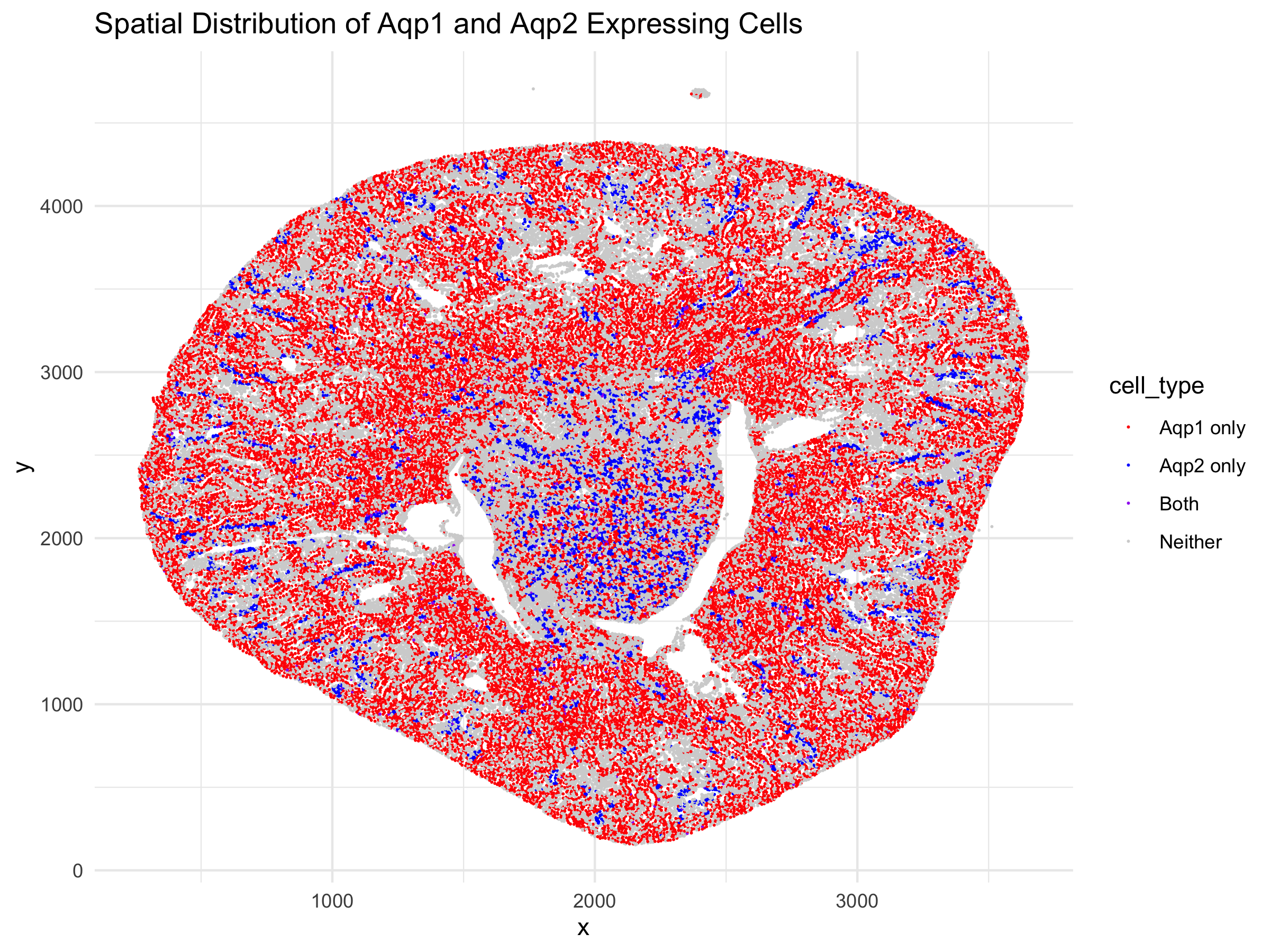
I am visualizing the cells in a kidney tissue cross section that contain the genes for two water channels, Aqp1 and Aqp2. I am visualizing quantitative x and y coordinate continuous data representing the spatial position of each cell in the tissue and categorical nominal data of cells with Aqp1, Aqp2, both, or no gene expression, derived from quantitative discrete data that described gene expression.
2. What data encodings (geometric primitives and visual channels) are you choosing to visualize these data types?
I am using the geometric primitive of points to represent each cell. To encode spatial x coordinate, the visual channel of position on the x-axis was used. To encode spatial y coordinate, the visual channel of position on the y-axis was used. The visual channel of color (hue) was used to encode the gene expression presence of each cell - red for Aqp1, blue for Aqp2, purple for both, and grey for neither.
3. What about the data would you like to make salient through this data visualization?
My data visualization seeks to make more salient what the spatial relationship between the two water channels is in the kidney tissue. The main goal is to show that these two water channel genes are found in distinct cells at different regions of the tissue. Aqp1 should be found in the outer cortex where the proximal tubules and descending limbs are found, while Aqp2 should be found in the inner medulla, closer to collecting ducts. Overall, they shouldn’t be coexpressed in the same cells often.
4. What Gestalt principles and/or knowledge about perceptiveness of visual encodings are you using to accomplish this?
The Gestalt principle of proximity was utilized in showing the physical location of the cells in reference to each other. It makes it easier for the viewer to perceive that certain cells, that contain Aqp1 are concentrated to the outer cortex whil cells containing Aqp2 are concentrated to the medulla. Additionally, similarity in the form of color is used to guide the viewer’s mind to group the same expression pattern cells by color, allowing the perception of distinct regions of the kidney tissue. I focused on position and hue as the visual channels utilized because they are better encoding data types for comparing categorical data types. As a result, I chose distinct colors of red and blue to differentiate the two genes and purple, the middle-ground color to show both.
5. Code
1
2
3
4
5
6
7
8
9
10
11
12
13
14
15
16
17
18
19
20
21
22
23
24
25
26
27
28
29
30
31
32
33
34
35
36
37
38
39
40
41
42
43
44
45
46
# set working directory and load data
setwd("/Users/emmameihofer/Documents/GitHub/genomic-data-visualization-2026")
data <- read.csv("data/Xenium-IRI-ShamR_matrix.csv.gz")

print(dim(data))
# 85880 cells and 302 genes

print(head(data))

# LLM: Help me write code in R to plot the x and y location
# of cells containing the genes Aqp1 and Aqp2 with occurence of
# only Aqp1 in red, occurence of only Aqp2 in blue, and
# co-occurrence in purple. Use ggplot to make the scatterplot.

# Create position dataframe
pos <- data[, c('x', 'y')]
rownames(pos) <- data[,1]

# Create gene expression dataframe
gexp <- data[, 4:ncol(data)]
rownames(gexp) <- data[,1]

# Load libraries
library(ggplot2)
library(dplyr)  # needed for case_when

# Create Data Visualization
df <- data.frame(pos,
                 Aqp1 = gexp[, 'Aqp1'],
                 Aqp2 = gexp[, 'Aqp2'])

df$cell_type <- case_when(
  df$Aqp1 > 0 & df$Aqp2 > 0 ~ "Both",
  df$Aqp1 > 0 ~ "Aqp1 only",
  df$Aqp2 > 0 ~ "Aqp2 only",
  TRUE ~ "Neither"
)

ggplot(df) +
  geom_point(aes(x = x, y = y, col = cell_type), size = 0.001) +
  scale_color_manual(values = c("Both" = "purple", "Aqp1 only" = "red",
                                 "Aqp2 only" = "blue", "Neither" = "lightgray")) +
  labs(title = "Spatial Distribution of Aqp1 and Aqp2 Expressing Cells") +
  theme_minimal()

ggsave("/Users/EmmaMeihofer/Downloads/emeihof1_HW1.png", width = 8, height = 6)