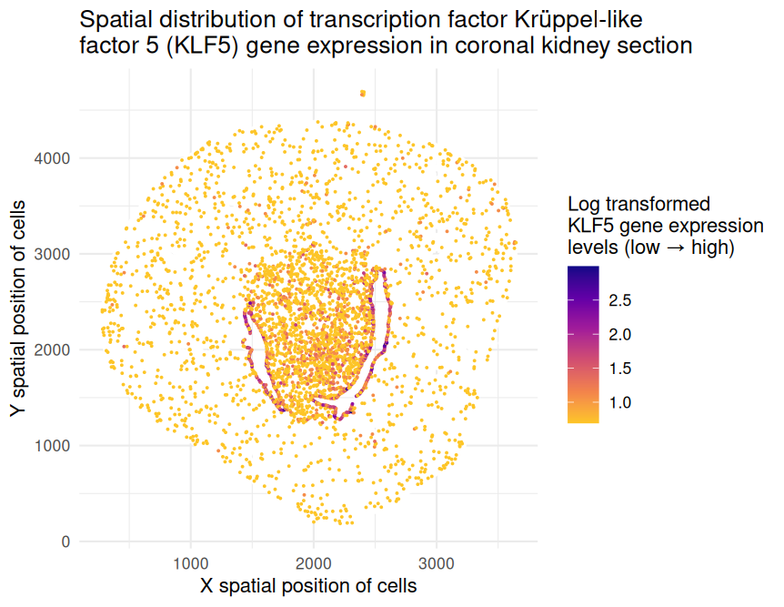
Spatial distribution of transcription factor Krüppel‐like factor 5 (KLF5) gene expression in coronal kidney section
1. What data types are you visualizing?
The represented data type is quantitative (x and y spatial positions of cells as well as levels of KLF5 gene expression on the log scale).
2. What data encodings (geometric primitives and visual channels) are you using to visualize these data types?
I have visualized this quantitative data by using the geometric primitive of points to represent cells within the coronal kidney section. I have used the visual channel of position along the x- and y-axes to encode the x and y spatial positions, respectively, of these cells. Furthermore, I have used the visual channel of color hue to encode the levels of gene expression on the log scale. Magenta and indigo-colored points represent cells with higher expression while yellow and orange-colored points represent cells with lower expression.
3. What about the data are you trying to make salient through this data visualization?
I would like to make salient the spatial distribution of KLF5 gene expression in the provided coronal kidney section. Transcription factor Krüppel‐like factor 5 (KLF5) plays an important role in the tumor microenvironment by regulating gene expression, cell proliferation, and apoptosis. Studies have indicated that KLF5 may serve as a tumor suppressor due to its downregulation in renal cancer cell lines and patient tumor samples. Through this data visualization, I aim to emphasize the patterns of KLF5 gene expression, specifically its localization at the center of the kidney section, which may suggest immune cell infiltration in this region.
4. What Gestalt principles or knowledge about perceptiveness of visual encodings are you using to accomplish this?
I relied on the Gestalt Principle of Similarity to encourage viewers to perceive different-colored points as separate groups. This allows the viewer to distinguish between levels of KLF5 gene expression. The viewer can also notice localized patterns of expression by searching for regions with a higher number of magenta and indigo-colored points. Moreover, the perception chart states that human viewers can more easily understand quantitative data when it is encoded using position. Therefore, I used position along the x- and y-axes to encode the x and y spatial positions, respectively, of the cells.
5. Code
1
2
3
4
5
6
7
8
9
10
11
12
13
14
15
16
17
18
19
20
21
22
23
24
25
26
27
28
29
30
31
32
33
34
35
36
37
38
39
40
41
42
43
44
45
46
47
48
49
50
51
52
53
54
# Upload data to PositCloud cloud and read data
data <- read.csv('Xenium-IRI-ShamR_matrix.csv.gz')

# Obtain number of rows and columns
dim(data)

# Retrieve structure of data
class(data)

# Observe first few rows of input data frame
head(data)

# Observe first five rows and first five columns of data frame
data[1:5,1:5]

# Split up spatial data and gene expression data
pos <- data[,c('x','y')]
rownames(pos) <- data[,1]
head(pos)

gexp <- data[,4:ncol(data)]
rownames(gexp) <- data[,1]
gexp[1:5,1:5]
dim(gexp)

# Type install.packages('ggplot2')
library(ggplot2)

# Check whether specific gene is present in current data set
'Klf5' %in% colnames(gexp)

# Create new data frame for one specific gene
df <- data.frame(pos, gene=gexp[,'Klf5'])
head(df)

# Create data visualization
ggplot(df) +
  # Background cells (gene = 0)
  geom_point(data = df[df$gene == 0, ], aes(x = x, y = y), color = "white", size = 0.25) +
  # Expressing cells (gene > 0)
  geom_point(data = df[df$gene > 0, ], aes(x = x, y = y, color = log(gene + 1)), size = 0.25) +
  scale_color_viridis_c(option = "plasma", direction = -1, begin = 0, end = 0.88, name = "Log transformed\nKLF5 gene expression\nlevels (low → high)") +
  labs(x = "X spatial position of cells", y = "Y spatial position of cells", title = "Spatial distribution of transcription factor Krüppel‐like\nfactor 5 (KLF5) gene expression in coronal kidney section") +
  theme_minimal()

# Online resources
# I consulted https://ggplot2.tidyverse.org/reference/labs.html to help myself add axis labels on my plot.
# I consulted https://discourse.julialang.org/t/index-dataframe-in-rcalls-r-macro/16073 to help myself access columns in the data frame using df$.

# Prompts to ChatGPT
# The current color scheme is a blue scale where dark blue corresponds with the lowest values and light blue corresponds with the highest values. It is difficult to view the gene expression patterns. What other color schemes can I use, and how do I implement them into this exact code?
# I like the use of plasma, but how can I reverse the colors so that yellow corresponds with the lowest values and indigo corresponds with the highest values?
# How can I separate cells that express the gene vs. cells that do not express the gene using df$? I want the cells without expression to be white and the cells with expression to use the current reversed plasma color scheme.
# How can I add a legend name, and how can I truncate the plasma color scheme to exclude the extremely light and dark shades?