Kidney Oxygen Depletion Visualization
1. What data types are you visualizing?
Cell identification is ordinal, in that it is number and letter labeled bins/categories in which I am counting gene expression. There is spatial data in the physical location of the cell in the x and y coordinates. There is quantitative data, representing how much of a gene is expressed in each cell.
2. What data encodings (geometric primitives and visual channels) are you using to visualize these data types?
I am using points -> areas as geometric principles. The size of the areas derived from the points, specifically the size of colored areas that themselves are derived from the quantitative data of gene expression in that cell, is used to create large mappings of space where it is clear that the gene setup I am tracking is clearly being expressed. The colors themselves are a tracking of hue, with cooler hues attributed to lower expressed regions and warmer hues in higher expression regions. Because of this, position is also an important geometric feature, and, you could argue, texture, as the final image looks like a textured, colored map.
3. What about the data are you trying to make salient through this data visualization?
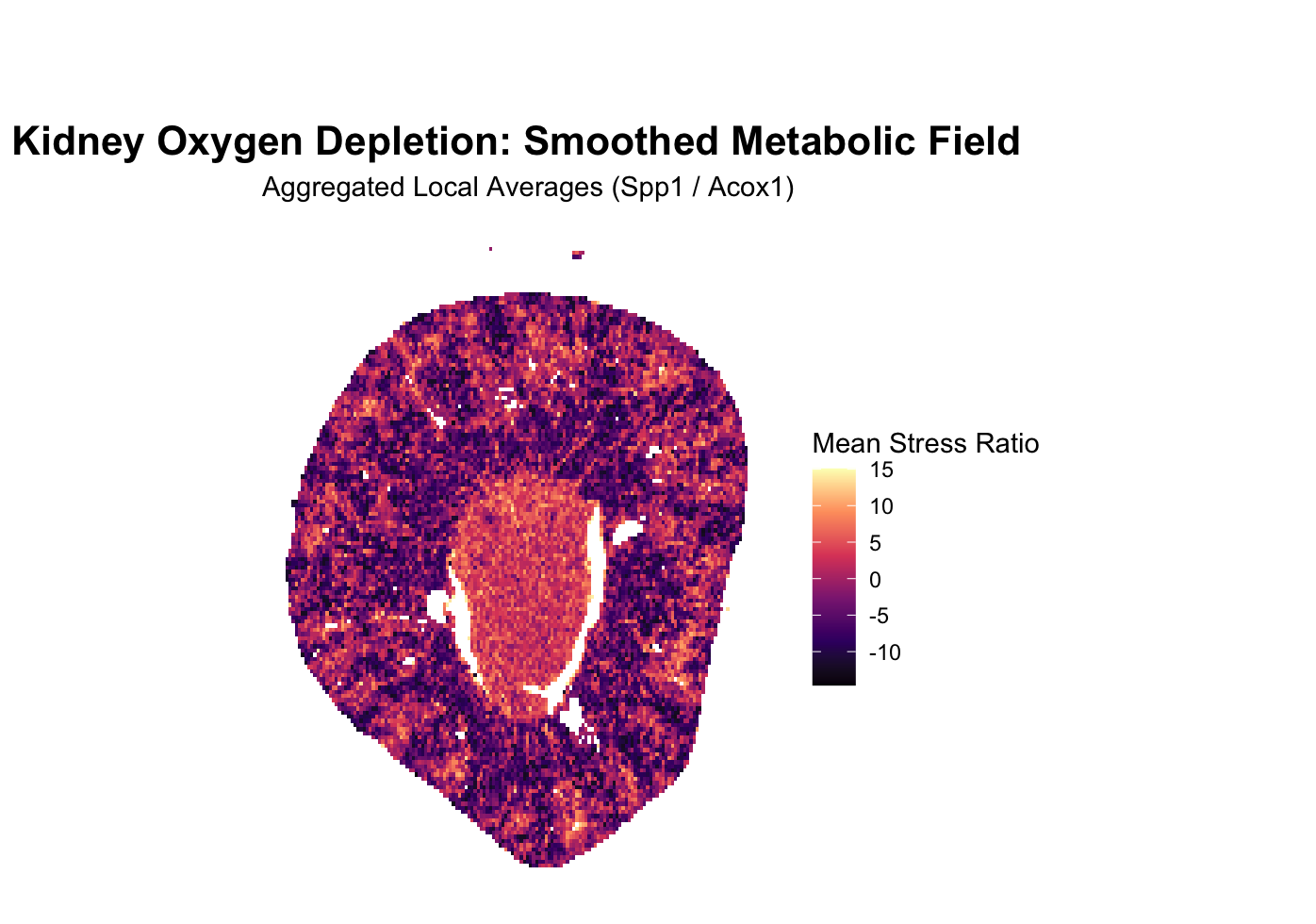
The kidney is structured into two low oxygen and high oxygen zones. To visualize the kidney’s metabolic architecture, this visualization focuses on the distinct boundary between its high-oxygen outer cortex and low-oxygen inner medulla. I wanted to see if there was a way to visualize this transition via the genes being expressed. I settled on the genes Spp1 and Acox1. When the cell is lacking in oxygen, the master hypoxia-sensing protein HIF-1alpha is activated, which activates Spp1, a molecular distress signal and one of the genes tracked in the imaging, downstream. Another gene tracked is Acox1, which encodes an enzyme for an oxygen-dependent metabolic pathway that cells must shut down in hypoxic conditions. Spp1 increases, Acox1 decreases, so dividing the expression count per cell of Spp1 by Acox1 will result in a higher signal of oxidative stress in that region. This avenue was chosen because imaging based techniques allow for rich information as to where a gene, broadly, is being expressed, relative to the entire organ structure, or section of imaging, a unique advantage of imaging over sequencing, allowing us to derive rich spatial morphological data such as this.
4. What Gestalt principles or knowledge about perceptiveness of visual encodings are you using to accomplish this?
Similarity of color is utilized to denote connected regions of high expression of the gene setup being tracked, in order to differentiate between regions of high expression of this setup and regions with low expression of this setup. Of course, this too implies the use of proximity and continuity in addition to color similarity, that similar colors grouped close together marks a relevant region. Enclosure with a colored circle would have been used, but I realized that the visualization was salient as is, one, and two, using a hard edged circle, thick enough to see, would have reduced information as to the sharpness of the change or gradient of change, as it would likely cover over the transition point.
5. Code (paste your code in between the ``` symbols)
1
2
3
4
5
6
7
8
9
10
11
12
13
14
15
16
17
18
19
20
21
22
23
24
25
26
27
28
29
30
31
32
33
34
35
36
37
38
39
40
41
42
43
44
45
46
47
48
49
50
51
52
53
54
55
56
57
58
59
60
61
62
63
64
65
66
67
68
69
70
71
72
73
74
75
76
77
78
79
80
81
82
83
84
85
86
87
88
89
90
91
92
93
94
95
96
97
98
99
100
101
102
103
104
105
106
107
108
109
110
111
112
113
114
115
116
117
118
119
120
121
122
123
124
125
126
127
128
129
130
131
132
133
134
135
136
137
138
139
140
141
142
143
144
145
146
147
148
149
150
151
152
153
154
155
156
157
158
159
160
161
162
163
164
165
166
167
168
169
170
171
172
#prompt: read the data
# Snippet 1: Load Libraries and Read Data
library(data.table)

# Define the file path
# Note: fread automatically handles .csv or .csv.gz
fname <- "Xenium-IRI-ShamR_matrix.csv"

cat("Reading dataset: ", fname, "...\n")

# Read the data using data.table for speed
# stringsAsFactors = FALSE is default in newer R, but good for compatibility
df <- fread(fname)

# Identify the coordinate columns
# Usually 'x' and 'y', but we check for common variations
x_col <- grep("^x$", names(df), ignore.case = TRUE, value = TRUE)
y_col <- grep("^y$", names(df), ignore.case = TRUE, value = TRUE)

if(length(x_col) == 0 || length(y_col) == 0) {
  stop("Could not find x and y coordinate columns. Please check column names.")
}

# Preview the dimensions
cat("Successfully loaded data.\n")
cat("Observations (Cells):", nrow(df), "\n")
cat("Variables (Genes + Coords):", ncol(df), "\n")

# Peek at the coordinates
print(head(df[, c(..x_col, ..y_col)]))


#prompt: snippet 2, apply specific gene count, count amount of Spp1 and Acox1 per cell. Provide comments explaining why these map properly, Spp1 is stress gene, expressed by HIF-1alpha, divide it by Acox1, which depends on high levels of oxygen, meant to amplify values and make low oxygen zone salient

# Corrected Snippet 2: Extract Genes and Calculate the Stress Ratio

# 1. Identify ONLY numeric gene columns
# This prevents the 'ShamR_...' ID column from breaking the rowSums function
all_cols <- names(df)
numeric_cols <- names(df)[sapply(df, is.numeric)]
gene_cols <- setdiff(numeric_cols, c(x_col, y_col))

cat("Found", length(gene_cols), "numeric gene columns for calculation.\n")

# 2. Normalize by Library Size
# We use only the numeric gene columns identified above
df[, total_counts := rowSums(.SD), .SDcols = gene_cols]

# Avoid division by zero
df[total_counts == 0, total_counts := 1]

# 3. Extract and Scale Target Genes to 'Counts Per 10,000' (CP10k)
# We use the original column names (Spp1 and Acox1) directly from the numeric set
df[, Spp1_norm := (Spp1 / total_counts) * 10000]
df[, Acox1_norm := (Acox1 / total_counts) * 10000]

# 4. Calculate the Stress Ratio
# Spp1 (HIF-1alpha distress) / Acox1 (Oxygen-dependent metabolism)
# We add 0.1 to dampen noise and prevent division by zero
df[, stress_ratio := (Spp1_norm + 0.1) / (Acox1_norm + 0.1)]

# 5. Log-Transformation for Saliency
# Log2 helps compress outliers while making the central cluster 'glow'
df[, stress_log := log2(stress_ratio)]

cat("Stress Ratio calculated. Range:", range(df$stress_log, na.rm=TRUE), "\n")


#Prompt: create 2d visualization, first we do dot mapping, and we apply the "temperature" gradient to represent high count at that location, don't smoothen anything yet

# Snippet 3: 2D Dot Mapping with Temperature Gradient
library(ggplot2)
library(viridis)

# 1. Visualization Setup
# We use 'stress_log' as our color variable.
# Points are set to a small size (0.3) to handle the 86k cell density
# without completely overlapping and blurring the raw signal.

cat("Generating 2D Dot Map...\n")

dot_map <- ggplot(df, aes_string(x = x_col, y = y_col, color = "stress_log")) +
  # Use geom_point for raw dot mapping
  geom_point(size = 0.3, alpha = 0.8) +

  # 2. Temperature Gradient
  # 'option = "magma"' provides a "Cold-to-Hot" scale:
  # Black/Purple (Cold/Low Stress) -> Red/Orange (Warm) -> Yellow/White (Hot/Peak Stress)
  scale_color_viridis_c(option = "magma", name = "Stress Log Ratio") +

  # 3. Clean Aesthetics
  # White background as requested, removing grid lines and axis ticks
  # to focus purely on the biological data.
  theme_minimal() +
  theme(
    panel.grid = element_blank(),
    axis.text = element_blank(),
    axis.ticks = element_blank(),
    plot.background = element_rect(fill = "white", color = NA),
    plot.title = element_text(hjust = 0.5, face = "bold", size = 14)
  ) +

  # Ensure the aspect ratio is 1:1 so the kidney shape isn't distorted
  coord_fixed() +

  labs(
    title = "Kidney Oxygen Depletion: Raw Dot Map",
    subtitle = "Calculated via Spp1 (Stress) / Acox1 (Metabolism)",
    x = NULL, y = NULL
  )

# 4. Display or Save the Plot
# If running in an interactive session, this will show the plot.
print(dot_map)

# To save a high-resolution version:
# ggsave("oxygen_dot_map_raw.png", dot_map, width = 10, height = 8, dpi = 300)


#prompt: apply smoothing/heatmap layer

# Snippet 4: Smoothed Heatmap (Weather Map) Layer

# 1. Configuration
# 'bins' determines the "grain" of the heatmap.
# Higher bins = more detail; Lower bins = smoother "blobs."
n_bins <- 150

cat("Generating Smoothed Heatmap (Bins =", n_bins, ")...\n")

heatmap_plot <- ggplot(df, aes_string(x = x_col, y = y_col, z = "stress_log")) +

  # 2. The Smoothing Layer
  # stat_summary_2d takes the 'z' value (stress_log) and calculates the
  # mean for all dots in a rectangular bin. This "blurs" the individual
  # grains into a continuous metabolic field.
  stat_summary_2d(bins = n_bins, fun = mean) +

  # 3. Apply the Temperature Gradient
  # We use the same 'magma' scale for consistency.
  scale_fill_viridis_c(option = "magma", name = "Mean Stress Ratio") +

  # 4. Refined Aesthetics
  theme_minimal() +
  theme(
    panel.grid = element_blank(),
    axis.text = element_blank(),
    axis.ticks = element_blank(),
    plot.background = element_rect(fill = "white", color = NA),
    legend.position = "right",
    plot.title = element_text(hjust = 0.5, face = "bold", size = 16),
    plot.margin = margin(t = 50, r = 10, b = 10, l = 10)
  ) +

  # Keep aspect ratio 1:1
  coord_fixed() +

  labs(
    title = "Kidney Oxygen Depletion: Smoothed Metabolic Field",
    subtitle = "Aggregated Local Averages (Spp1 / Acox1)",
    x = NULL, y = NULL
  )

# 5. Display the Plot
print(heatmap_plot)

# Note: If you want a "Double Layer" look (Heatmap with raw dots on top),
# you can add: + geom_point(aes(color = stress_log), size = 0.1, alpha = 0.2)