HW 2

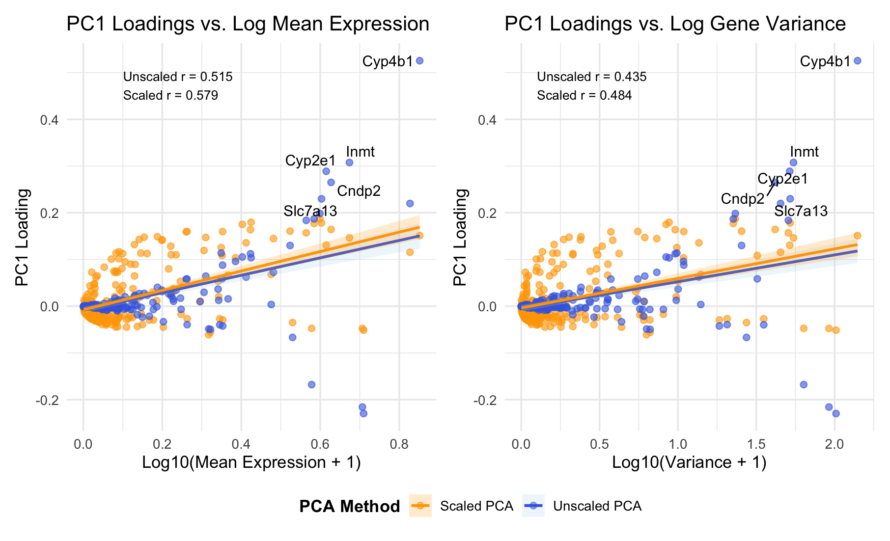
###Summary PC1 loadings correlate positively with both mean expression (r = 0.52-0.58) and variance (r = 0.44-0.48). This indicates PC1 primarily captures overall expression magnitude - highly expressed genes dominate the first principal component. Top-loading genes (Cyp4b1, Cyp2e1, Inmt) are metabolic enzymes, suggesting PC1 reflects metabolic activity or cell-type identity.
Data Visualization Description
I am visualizing quantitative data representing PC1 gene loadings and two gene-level features: mean expression level and variance, comparing both unscaled and scaled PCA approaches. I am using the geometric primitive of points to represent each gene. I also use the geometric primitive of lines to represent the linear regression fits and highlight the relationships between PC1 loadings and gene features. To encode PC1 loading values, I am using the visual channel of position along the y-axis. To encode gene statistics (mean expression in the left panel, variance in the right panel), I am using the visual channel of position along the x-axis. To encode the PCA method type, I use the visual channel of color: blue for unscaled PCA and orange for scaled PCA. I also use saturation (alpha = 0.6) to reduce overplotting in dense regions, making it easier to distinguish overlapping points. ###Salience I want to make salient the relationship between PC1 gene loadings and mean expression versus variance. From the visualization, it’s clear that there is a strong positive correlation between PC1 loadings and mean expression. Additionally, I am trying to make salient that mean expression is a stronger predictor than variance, and that scaling does not eliminate this mean-dependency (scaled r = 0.579), indicating genuine biological structure. The labeled genes (Cyp4b1, Cyp2e1, Inmt) that drive PC1 are metabolic enzymes, suggesting PC1 captures metabolic activity or cell-type identity. The gestalt principle of similarity is used by consistently coloring unscaled PCA blue and scaled PCA orange across both panels. This reinforces that they represent different analytical methods. Proximity is applied through the side-by-side panel layout, inviting direct comparison between mean versus variance relationships. Continuity is applied through the regression lines, guiding the viewer smoothly across the data and making correlations immediately apparent. I leverage the perceptual effectiveness of position as the most accurately perceived visual channel for encoding the key quantitative relationships, while color hue effectively distinguishes the two PCA methods categorically.
5. Code (paste your code in between the ``` symbols)
1
2
3
4
5
6
7
8
9
10
11
12
13
14
15
16
17
18
19
20
21
22
23
24
25
26
27
28
29
30
31
32
33
34
35
36
37
38
39
40
41
42
43
44
45
46
47
48
49
50
51
52
53
54
55
56
57
58
59
60
61
62
63
64
65
66
67
68
69
70
71
72
73
74
75
76
77
78
79
80
81
82
83
84
85
86
87
88
89
90
91
92
93
94
95
96
97
98
99
100
101
102
103
104
105
106
107
108
109
110
111
112
113
114
115
116
117
118
119
120
121
122
123
124
125
126
127
128
129
130
131
132
133
134
135
136
137
138
139
140
141
142
143
144
145
146
147
148
149
150
151
152
153
154
155
156
157
158
159
160
161
162
163
164
165
166
167
168
169
170
171
172
173
174
175
176
177
178
179
180
181
182
183
184
185
186
187
188
189
190
191
192
193
194
195
196
197
198
199
200
201
202
203
204
205
206
207
208
209
210
211
212
213
# ============================================================
# Load Data
# ============================================================
data <- read.csv("~/Desktop/Xenium-IRI-ShamR_matrix.csv.gz")
# Expression matrix (genes only)
gexp <- data[, 4:ncol(data)]
rownames(gexp) <- data[,1]
library(ggplot2)
library(patchwork)
library(ggrepel)

# Here, I took help from AI, and here is the prompt:
# I have a gene expression dataset where the first 3 columns are metadata and columns 4 onward are gene expression values. Each row is a cell/sample and each column (from column 4) is a gene.
#Please create R code that:
#Extracts the gene expression matrix (columns 4 to end)
# Calculates mean expression and variance for each gene
# Performs PCA two ways: Unscaled PCA (center = TRUE, scale = FALSE) and Scaled PCA (center = TRUE, scale = TRUE)
# Extracts PC1 loadings from both methods
# Creates two side-by-side scatter plots: Left plot shows PC1 loadings vs log10(mean expression + 1) and Right plot shows PC1 loadings vs log10(variance + 1)
# For both plots: Show both unscaled (blue) and scaled (orange) PCA results as overlaid points, add linear regression trend lines with confidence intervals for both methods, label the top 5 genes with highest absolute loadings (for unscaled PCA), display correlation coefficients as text annotations on each plot, and include a legend showing "Unscaled PCA" and "Scaled PCA"
# Combine both plots side-by-side with a shared legend at the bottom


# ============================================================
# Gene Statistics
# ============================================================
# Mean + Variance per gene
gene_means <- colMeans(gexp)
gene_vars  <- apply(gexp, 2, var)
gene_stats <- data.frame(
  gene = colnames(gexp),
  mean = gene_means,
  var  = gene_vars
)
# Log transform
gene_stats$log_mean <- log10(gene_stats$mean + 1)
gene_stats$log_var  <- log10(gene_stats$var + 1)

# ============================================================
# PCA (Unscaled)
# ============================================================
pca_unscaled <- prcomp(gexp, center = TRUE, scale. = FALSE)
pc1_unscaled <- pca_unscaled$rotation[,1]

# ============================================================
# PCA (Scaled)
# ============================================================
pca_scaled <- prcomp(gexp, center = TRUE, scale. = TRUE)
pc1_scaled <- pca_scaled$rotation[,1]

# ============================================================
# Combine Results
# ============================================================
gene_stats$PC1_unscaled <- pc1_unscaled[gene_stats$gene]
gene_stats$PC1_scaled   <- pc1_scaled[gene_stats$gene]

# Get top loading genes (for labeling)
top_genes <- gene_stats[
  order(abs(gene_stats$PC1_unscaled), decreasing = TRUE)[1:5],
  "gene"
]
gene_stats$label <- ifelse(
  gene_stats$gene %in% top_genes,
  gene_stats$gene,
  NA
)

# ============================================================
# Calculate Correlations
# ============================================================
cor_mean_unscaled <- cor(gene_stats$log_mean, gene_stats$PC1_unscaled)
cor_var_unscaled <- cor(gene_stats$log_var, gene_stats$PC1_unscaled)
cor_mean_scaled <- cor(gene_stats$log_mean, gene_stats$PC1_scaled)
cor_var_scaled <- cor(gene_stats$log_var, gene_stats$PC1_scaled)

# ============================================================
# Plot 1: PC1 vs Mean
# ============================================================
p1 <- ggplot(gene_stats) +

  geom_point(aes(log_mean, PC1_scaled, color = "Scaled PCA"), alpha = 0.6, size = 2) +
  geom_point(aes(log_mean, PC1_unscaled, color = "Unscaled PCA"), alpha = 0.6, size = 2) +

  # Add trend lines
  geom_smooth(
    aes(log_mean, PC1_unscaled, color = "Unscaled PCA", fill = "Unscaled PCA"),
    method = "lm",
    se = TRUE,
    linewidth = 1,
    alpha = 0.2
  ) +

  geom_smooth(
    aes(log_mean, PC1_scaled, color = "Scaled PCA", fill = "Scaled PCA"),
    method = "lm",
    se = TRUE,
    linewidth = 1,
    alpha = 0.2
  ) +

  geom_text_repel(
    aes(log_mean, PC1_unscaled, label = label),
    size = 4,
    max.overlaps = 10
  ) +

  # Manual color and fill scales
  scale_color_manual(
    name = "PCA Method",
    values = c("Unscaled PCA" = "royalblue", "Scaled PCA" = "orange")
  ) +
  scale_fill_manual(
    name = "PCA Method",
    values = c("Unscaled PCA" = "lightblue", "Scaled PCA" = "orange")
  ) +

  # Add correlation annotation
  annotate(
    "text",
    x = min(gene_stats$log_mean) + 0.1,
    y = max(gene_stats$PC1_unscaled) * 0.9,
    label = sprintf("Unscaled r = %.3f\nScaled r = %.3f",
                    cor_mean_unscaled, cor_mean_scaled),
    hjust = 0,
    size = 3.5,
    color = "black"
  ) +

  labs(
    title = "PC1 Loadings vs. Log Mean Expression",
    x = "Log10(Mean Expression + 1)",
    y = "PC1 Loading"
  ) +

  theme_minimal(base_size = 13) +
  theme(
    legend.position = "bottom",
    legend.title = element_text(face = "bold")
  )

# ============================================================
# Plot 2: PC1 vs Variance
# ============================================================
p2 <- ggplot(gene_stats) +

  geom_point(aes(log_var, PC1_scaled, color = "Scaled PCA"), alpha = 0.6, size = 2) +
  geom_point(aes(log_var, PC1_unscaled, color = "Unscaled PCA"), alpha = 0.6, size = 2) +

  # Add trend lines
  geom_smooth(
    aes(log_var, PC1_unscaled, color = "Unscaled PCA", fill = "Unscaled PCA"),
    method = "lm",
    se = TRUE,
    linewidth = 1,
    alpha = 0.2
  ) +

  geom_smooth(
    aes(log_var, PC1_scaled, color = "Scaled PCA", fill = "Scaled PCA"),
    method = "lm",
    se = TRUE,
    linewidth = 1,
    alpha = 0.2
  ) +

  geom_text_repel(
    aes(log_var, PC1_unscaled, label = label),
    size = 4,
    max.overlaps = 10
  ) +

  # Manual color and fill scales
  scale_color_manual(
    name = "PCA Method",
    values = c("Unscaled PCA" = "royalblue", "Scaled PCA" = "orange")
  ) +
  scale_fill_manual(
    name = "PCA Method",
    values = c("Unscaled PCA" = "lightblue", "Scaled PCA" = "orange")
  ) +

  # Add correlation annotation
  annotate(
    "text",
    x = min(gene_stats$log_var) + 0.1,
    y = max(gene_stats$PC1_unscaled) * 0.9,
    label = sprintf("Unscaled r = %.3f\nScaled r = %.3f",
                    cor_var_unscaled, cor_var_scaled),
    hjust = 0,
    size = 3.5,
    color = "black"
  ) +

  labs(
    title = "PC1 Loadings vs. Log Gene Variance",
    x = "Log10(Variance + 1)",
    y = "PC1 Loading"
  ) +

  theme_minimal(base_size = 13) +
  theme(
    legend.position = "bottom",
    legend.title = element_text(face = "bold")
  )

# ============================================================
# Combine with shared legend
# ============================================================
final_plot <- p1 + p2 +
  plot_layout(ncol = 2, guides = "collect") &
  theme(legend.position = "bottom")

print(final_plot)