HW 2 How Gene Loadings on the First PC Relates to Mean and Variance

1. What data types are you visualizing?
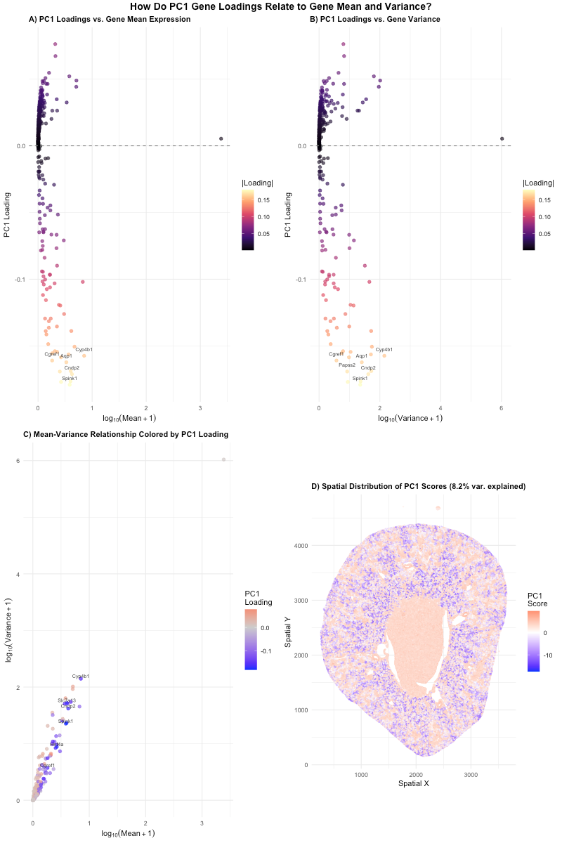
I am visualizing quantitative data for the genes, including the PC1 loadings, mean expression per gene, and variance per gene. I also visualized quantitative data for the cell, including spatial x and y coordinates and PC1 scores.
2. What data encodings (geometric primitives and visual channels) are you using to visualize these data types?
I am using the geometric primitive of points for all 4 panels. In panels A-C, each point represents a gene. In panel D it represents each cell.
For panels A and B, the y-axis position is used to encode PC1 loading while the x-axis position is used to encode gene mean expression for panel A and gene expression variance for panel B. For panels A and B, the visual channel of color hue from deep purple to light yellow was used to represent the absolute PC1 loading magnitude for each gene.
For panel C, the y-axis position encodes gene expression variance while the x-axis position encodes gene expression mean. The visual channel of color hue from blue to red was used to represent the PC1 loading for each gene.
In panel D, the y-axis position encoded spatial y position while the x-axis position encode spatial x position. The visual channel of color hue from blue to red was used to encode PC1 score.
3. What about the data are you trying to make salient through this data visualization?
My data visualization seeks to make more salient the relationship between PC1 gene loading and basic gene features (mean and variance). It shows that PC1 is driven by genes with a strong negative loading, including Spink1, Cndp2, Cyp4b1, and Aqp1. These genes are highlighted with labels in the graphs. These genes vary across gene expression mean and variance and are not only the highest expressing or most variable expressing genes. This statistical pattern can be seen in physical structure of the cell in panel D. The mapping of PC1 score onto the tissue shows that negative scoring cells stick to the outer region, showing that this gene expression correlates to anatomically distinct tissue, that is likely specific cell types or tissue compartments.
4. What Gestalt principles or knowledge about perceptiveness of visual encodings are you using to accomplish this?
I used the Gestalt principle of similarity, by having genes with similar PC1 loadings/contributions being similar hues in panels A-C. This allows viewers to quickly group the genes. In addition, combining color similarity with the Gestalt principle of proximity of the color hues to each other in panel D results in recognition of spatial regions based on PC1 score. Since quantitative data is being represented throughout all the panels, position is used since it is the best encoding method. Hue is just used to further exaggerate this information.
5. Code (paste your code in between the ``` symbols)
1
2
3
4
5
6
7
8
9
10
11
12
13
14
15
16
17
18
19
20
21
22
23
24
25
26
27
28
29
30
31
32
33
34
35
36
37
38
39
40
41
42
43
44
45
46
47
48
49
50
51
52
53
54
55
56
57
58
59
60
61
62
63
64
65
66
67
68
69
70
71
72
73
74
75
76
77
78
79
80
81
82
83
84
85
86
87
88
89
90
91
92
93
94
95
96
97
98
99
100
101
102
103
104
105
106
107
108
109
110
111
112
113
114
115
116
117
118
119
120
121
122
123
124
125
126
127
128
129
130
131
132
133
134
135
136
137
138
139
140
141
142
143
144
145
146
147
148
149
# LLM Prompt:  Write code in R to take the genes in the following data set and produce a 4-panel data visualization.  First, a scatter plot of PC1 loading vs mean gene pression for each gene, with color gradiant representing absolute value of PC1 loading.  Second, a scatter plot of PC1 loading vs gene variance for each gene, with the same color gradiant.  Third, a scatter plot of variance vs mean for each gene with a color gradient representing the PC1 loading.  The last panel should have the spatial distribution scatter plot of the cells, with each cell being encoded on a color gradient with the PC1 score.

library(ggplot2)
if (!requireNamespace("gridExtra", quietly = TRUE)) install.packages("gridExtra")
library(gridExtra)

# Set working directory and load data
setwd("/Users/emmameihofer/Documents/GitHub/genomic-data-visualization-2026")
data <- read.csv("data/Xenium-IRI-ShamR_matrix.csv.gz")

# Separate spatial coordinates from gene expression
pos <- data[, c('x', 'y')]
gexp <- data[, 3:ncol(data)]  # gene expression matrix (cells x genes)

# Compute Gene-Level Statistics
gene_means <- colMeans(gexp)
gene_vars  <- apply(gexp, 2, var)
gene_sd    <- apply(gexp, 2, sd)

# PCA on normalized gene expression
# Log-normalize to stabilize variance before PCA
gexp_norm <- log10(gexp + 1)

# Run PCA (centered and scaled)
pca_result <- prcomp(gexp_norm, center = TRUE, scale. = TRUE)

# Extract PC1 loadings (rotation matrix, first column)
pc1_loadings <- pca_result$rotation[, 1]

# Extract PC1 scores for each cell
pc1_scores <- pca_result$x[, 1]

# Proportion of variance explained by PC1
var_explained <- summary(pca_result)$importance[2, 1] * 100

# Build data frames for plotting
gene_df <- data.frame(
  gene       = names(pc1_loadings),
  loading    = pc1_loadings,
  mean_expr  = gene_means,
  var_expr   = gene_vars,
  log_mean   = log10(gene_means + 1),
  log_var    = log10(gene_vars + 1)
)

# Identify top 5 genes with highest absolute loadings for labeling
top_genes <- gene_df[order(abs(gene_df$loading), decreasing = TRUE), ][1:10, ]

spatial_df <- data.frame(
  x = pos$x,
  y = pos$y,
  pc1 = pc1_scores
)

# Panel A: PC1 Loading vs Log Mean Expression
pA <- ggplot(gene_df, aes(x = log_mean, y = loading)) +
  geom_point(aes(color = abs(loading)), size = 1.8, alpha = 0.7) +
  scale_color_viridis_c(option = "magma", name = "|Loading|") +
  geom_hline(yintercept = 0, linetype = "dashed", color = "grey50") +
  geom_text(data = top_genes, aes(label = gene),
            size = 2.5, nudge_y = 0.005, check_overlap = TRUE, color = "grey20") +
  labs(
    title = "A) PC1 Loadings vs. Gene Mean Expression",
    x = expression(log[10](Mean + 1)),
    y = "PC1 Loading"
  ) +
  theme_minimal(base_size = 11) +
  theme(
    plot.title = element_text(face = "bold", size = 11),
    legend.position = "right"
  )

# Panel B: PC1 Loading vs Log Variance
pB <- ggplot(gene_df, aes(x = log_var, y = loading)) +
  geom_point(aes(color = abs(loading)), size = 1.8, alpha = 0.7) +
  scale_color_viridis_c(option = "magma", name = "|Loading|") +
  geom_hline(yintercept = 0, linetype = "dashed", color = "grey50") +
  geom_text(data = top_genes, aes(label = gene),
            size = 2.5, nudge_y = 0.005, check_overlap = TRUE, color = "grey20") +
  labs(
    title = "B) PC1 Loadings vs. Gene Variance",
    x = expression(log[10](Variance + 1)),
    y = "PC1 Loading"
  ) +
  theme_minimal(base_size = 11) +
  theme(
    plot.title = element_text(face = "bold", size = 11),
    legend.position = "right"
  )

# Panel C: Mean-Variance Relationship colored by PC1 Loading
pC <- ggplot(gene_df, aes(x = log_mean, y = log_var)) +
  geom_point(aes(color = loading), size = 1.8, alpha = 0.7) +
  scale_color_gradient2(low = "blue", mid = "grey80", high = "red",
                        midpoint = 0, name = "PC1\nLoading") +
  geom_text(data = top_genes, aes(label = gene),
            size = 2.5, nudge_y = 0.05, check_overlap = TRUE, color = "grey20") +
  labs(
    title = "C) Mean-Variance Relationship Colored by PC1 Loading",
    x = expression(log[10](Mean + 1)),
    y = expression(log[10](Variance + 1))
  ) +
  theme_minimal(base_size = 11) +
  theme(
    plot.title = element_text(face = "bold", size = 11),
    legend.position = "right"
  )

# Panel D: Spatial map of PC1 scores
pD <- ggplot(spatial_df, aes(x = x, y = y)) +
  geom_point(aes(color = pc1), size = 0.3, alpha = 0.5) +
  scale_color_gradient2(low = "blue", mid = "white", high = "red",
                        midpoint = 0, name = "PC1\nScore") +
  labs(
    title = paste0("D) Spatial Distribution of PC1 Scores (",
                   round(var_explained, 1), "% var. explained)"),
    x = "Spatial X",
    y = "Spatial Y"
  ) +
  coord_fixed() +
  theme_minimal(base_size = 11) +
  theme(
    plot.title = element_text(face = "bold", size = 11),
    legend.position = "right"
  )

# Combine into multi-panel figure
final_plot <- grid.arrange(
  pA, pB, pC, pD,
  ncol = 2, nrow = 2,
  top = grid::textGrob("How Do PC1 Gene Loadings Relate to Gene Mean and Variance?",
                        gp = grid::gpar(fontface = "bold", fontsize = 14))
)

# Save image
png("hw2_pc1_loadings_vs_gene_features.png", width = 14, height = 11,
    units = "in", res = 300, bg = "white")
grid.arrange(
  pA, pB, pC, pD,
  ncol = 2, nrow = 2,
  top = grid::textGrob("How Do PC1 Gene Loadings Relate to Gene Mean and Variance?",
                        gp = grid::gpar(fontface = "bold", fontsize = 14))
)
dev.off()

cat("Figure saved as hw2_pc1_loadings_vs_gene_features.png\n")
cat(paste0("PC1 explains ", round(var_explained, 1), "% of variance\n"))
cat("Top 10 genes by |PC1 loading|:\n")
print(top_genes[, c("gene", "loading", "mean_expr", "var_expr")])