Comparing High and Low Loading Genes Across Spatial and PCA Spaces

Write a description explaining what you are trying to make salient and why you believe your data visualization is effective, using vocabulary terms from Lesson 1. (Question 2: How do the genes with high versus low loadings relate to each other? How are they patterned relative to each other in the tissue?)
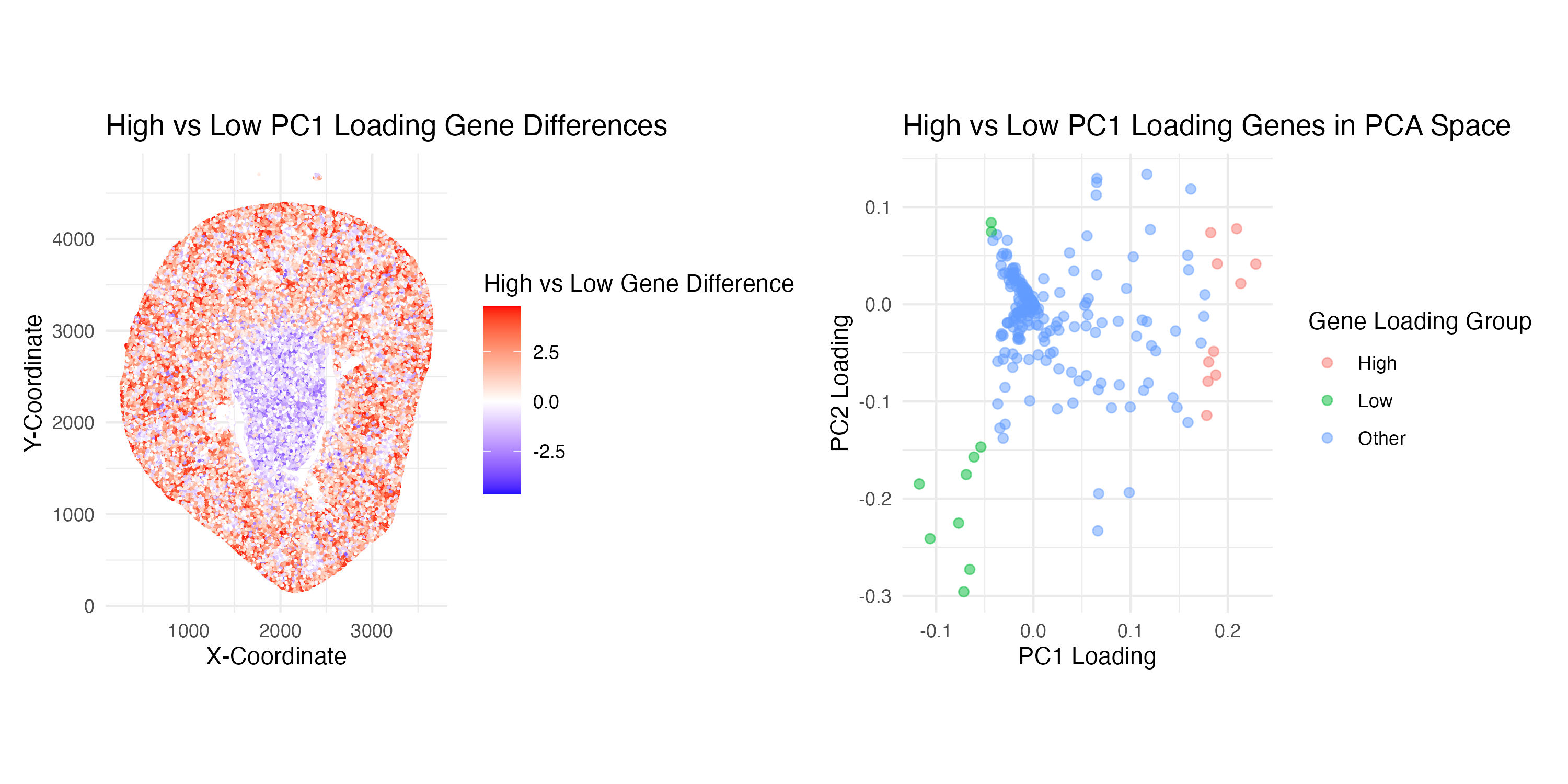
Through this visualization, I am trying to make salient the relationship between genes with high versus low loadings and deduce their relative spatial patterns in the kidney tissue sample. Specifically, I decided to work with the top 10 high and low-loading genes from PC1.
My first plot (on the left-hand side) aims to interpret the spatial pattern of high and low-loading genes. This visualization effectively uses the geometric primitive of spots to represent individual cells in the kidney sample. The visual channel of position encodes the spatial data of the location of each spot on the x and y-axes. Color hue also encodes quantitative data representing whether high or low loading gene expression dominates a spot, where on the color scale red = positive differences and blue = negative differences. Additionally, leveraging the Gestalt Principle of similarity, the spatial patterns of low and high-loading genes can easily be visualized as different loading expression levels are grouped by the same color. Ultimately, one can visualize that high-loading genes (red) tend to border the periphery and low-loading genes (blue) seem to stay centralized in the kidney tissue.
My second plot (on the right-hand side) aims to explore the relationship of how the top 10 high and low PC1 loading genes are distributed within the PC1 and PC2 space. This visualization uses the geometric primitive of spots to represent individual genes. The visual channel of position encodes the spatial location of each gene according to its quantitative loading values on the PC1 and PC2 axes. Color hue encodes the categorical data representing which gene loading group it is part of (either High, Low, or Other). This plot effectively utilizes the Gestalt Principle of similarity to group together genes within the same loading group by color, allowing the viewer to easily understand the relative relationships. Proximity is also used to support the visualization of these groups, as spots that appear closer together are also perceived as being related. Ultimately, the viewer can understand from this visualization that high and low loading genes do indeed seem to have a distinct separation based on their groupings in the PCA space.
1
2
3
4
5
6
7
8
9
10
11
12
13
14
15
16
17
18
19
20
21
22
23
24
25
26
27
28
29
30
31
32
33
34
35
36
37
38
39
40
41
42
43
44
45
46
47
48
49
50
51
52
53
54
55
56
57
58
59
60
61
62
63
64
65
66
67
68
69
70
71
72
73
74
75
76
77
78
79
80
81
82
83
84
85
86
87
88
89
90
91
92
93
94
95
96
97
98
99
100
101
102
103
104
105
106
107
108
109
110
111
# Load Libraries
library(ggplot2)
library(patchwork)

# Load in Data
data <- read.csv('/Users/gracexu/genomic-data-visualization-2026/data/Xenium-IRI-ShamR_matrix.csv')
pos <- data[,c('x', 'y')]
rownames(pos) <- data[,1]
gexp <- data[, 4:ncol(data)]
rownames(gexp) <- data[,1]
gexp[1:5,1:5]
dim(gexp)

# Normalize Data (Library-size normalization --> Counts per million --> Log transformation)
totgexp <- rowSums(gexp)
head(totgexp)
head(sort(totgexp, decreasing = TRUE))
mat <- log10(gexp / totgexp * 1e6 + 1)
dim(mat)

# PCA (Linear dimension reduction)
pcs <- prcomp(mat, center = TRUE, scale = FALSE)
names(pcs)
head(pcs$sdev)

# Explore Genes with High and Low Loadings-----------------------------------------
# Extract gene loadings
loadings <- pcs$rotation
head(loadings)

# Use loadings from PC1 to get the top 10 genes with high and low loadings
pc1 <- loadings[,1]
high_loading_genes <- names(sort(pc1, decreasing = TRUE))[1:10]
low_loading_genes <- names(sort(pc1, decreasing = FALSE))[1:10]

# Create Plots---------------------------------------------------------------------

## PLOT 1 ##
# Calculate the average expression of high and low loading genes at each spatial location
high_loading_exp <- rowMeans(mat[, high_loading_genes])
low_loading_exp  <- rowMeans(mat[, low_loading_genes])

gexpr_df <- data.frame(
  x = pos$x,
  y = pos$y,
  high = high_loading_exp,
  low = low_loading_exp
)

# Calculate differences in gene expression between high and low loading genes at each spatial point
## A positive value (red) --> spatial point is expressing more high loading genes
## A negative value (blue) --> spatial point is expressing more low loading genes
gexpr_df$diff <- gexpr_df$high - gexpr_df$low

p1 <- ggplot(gexpr_df, aes(x = x, y = y, color = diff)) +
  geom_point(size = 0.75, stroke = 0) +
  scale_color_gradient2(
    low = "blue",
    mid = "white",
    high = "red",
    midpoint = 0
  ) +
  coord_fixed() +
  theme_minimal() +
  labs(
    title = "High vs Low PC1 Loading Gene Differences",
    x = "X-Coordinate",
    y = "Y-Coordinate",
    color = "High vs Low Gene Difference"
  )

## PLOT 2 ##
# Create a dataframe containing loadings from PC1 and PC2
loadings_df <- data.frame(
  PC1 = loadings[,1],
  PC2 = loadings[,2],
  gene = rownames(loadings)
)

# Create category in the dataframe grouping genes classified by "high or low" loading or "other"
loadings_df$group <- "Other"
loadings_df$group[loadings_df$gene %in% high_loading_genes] <- "High"
loadings_df$group[loadings_df$gene %in% low_loading_genes] <- "Low"

p2 <- ggplot(loadings_df, aes(x = PC1, y = PC2, color = group)) +
  geom_point(alpha = 0.5, size = 1.8) +
  theme_minimal() +
  labs(
    title = "High vs Low PC1 Loading Genes in PCA Space",
    x = "PC1 Loading",
    y = "PC2 Loading",
    color = "Gene Loading Group"
  ) +
  coord_fixed()

# Combine the plots using patchwork
combined_plot <- p1 + p2

# Save the plot
ggsave(
  filename = "/Users/gracexu/genomic-data-visualization-2026/homework_submission/HW2_visualization.png",
  plot = combined_plot,
  width = 10,
  height = 5,
  dpi = 300
)

# Sources:
## Dr.Fan's code from class workshops
## ggplot2 Gradient colour scales: https://ggplot2.tidyverse.org/reference/scale_gradient.html
## To assist in line 80, I asked ChatGPT, “I have two lists of genes (high and low loadings). How can I add a column to a dataframe to assign loading categories to each row?”