Spatial Organization of Genes with Extreme PCA Loadings

1. What data types are you visualizing?
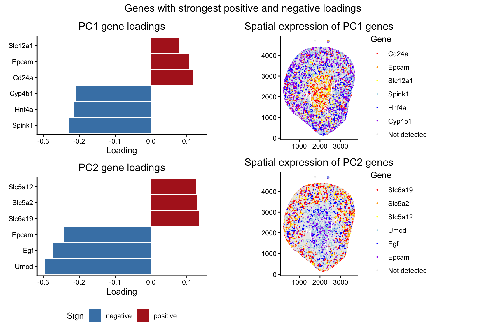
I’m visualizing both quantitative and categorical data. The dataset has quantitative spatial information of x and y coordinates for each spot in the tissue, and quantitative gene expression values for each gene at each location. From these gene expression values, I did PCA to identify genes that contribute most strongly to major axes of variation in the data. In the left panels, I visualized quantitative data of the gene loading values along PC1 and PC2. I also visualized categorical data, where each bar is labeled for the gene it represents. In the right panels, I visualized quantitative spatial data using the x and y coordinates of each spot in the tissue. I also visualized a categorical variable indicating which gene, among the six genes selected for each principal component, is most highly expressed at each spot. Spots where none of the selected genes were detected were assigned to a separate “Not detected” category.
2. What data encodings (geometric primitives and visual channels) are you using to visualize these data types?
In the left panels, I used the geometric primitive of lines/areas (the bars on the chart) to represent genes. The horizontal position and length of each bar encode the loading value of that gene along PC1 (in the top plot) or PC2 (in the bottom plot). The y position encodes the categorical variable of which gene it is, with the gene labeled along the y-axis. Color is used to encode the sign of the loading value, with red showing that the loading was positive and blue indicating that the loading was negative. In the right panels, I used the geometric primitive of points to represent the individual spots in the tissue. The x and y position of each point encode the spatial coordinates of the spot. Color encodes which gene of the six genes selected from the PCA loadings is most highly expressed at that spot. Spots where none of the selected genes are detected are grey (corresponding to not detected category). Genes where the PCA loading was positive were encoded as red, orange, or yellow, and where the PCA loading was negative were encoded as blue, dark blue, or purple.
3. What about the data are you trying to make salient through this data visualization?
The question I am trying to answer with this visualization is: “how do genes with high versus low loadings on principal components relate to each other, and how are they patterned relative to each other in the tissue?” I’m trying to make it salient that the sign of gene loadings along the first two PCs is associated with spatial organization in the tissue sample. To show this, I used the three genes with the highest positive loadings and the three genes with the most negative loadings for PC1 and PC2. By showing both the most extreme genes and their spatial expression patterns, the visualization shows how genes loading in opposite directions on the same PC tend to be expressed in different regions of the tissue. Specifically, for PC1, genes with positive loadings tend to have higher expression in the center of the tissue, while genes with negative loadings are more highly expressed in the outer regions. For PC2, the opposite pattern happens, with positive-loading genes expressed along the outer regions and negative-loading genes more highly expressed in the center.
4. What Gestalt principles or knowledge about perceptiveness of visual encodings are you using to accomplish this?
I used the Gestalt principle of similarity. In the left panels, genes with positive PCA loadings are shown in red and genes with negative loadings are shown in blue, so genes with similar loading direction can be perceived as related groups. In the right panels, I also used similarity through color, where genes with positive loadings are encoded using warm colors (red, orange, yellow), and genes with negative loadings are encoded using cool colors (blue, dark blue, purple). I also use proximity. In the left panels, genes associated with the same PC are close together within the same subplot, so it’s easy to compare genes with high versus low loadings along that PC.
5. Code (paste your code in between the ``` symbols)
1
2
3
4
5
6
7
8
9
10
11
12
13
14
15
16
17
18
19
20
21
22
23
24
25
26
27
28
29
30
31
32
33
34
35
36
37
38
39
40
41
42
43
44
45
46
47
48
49
50
51
52
53
54
55
56
57
58
59
60
61
62
63
64
65
66
67
68
69
70
71
72
73
74
75
76
77
78
79
80
81
82
83
84
85
86
87
88
89
90
91
92
93
94
95
96
97
98
99
100
101
102
103
104
105
106
107
108
109
110
111
112
113
114
115
116
117
118
119
120
121
122
123
124
125
126
127
128
129
130
131
132
133
134
135
136
137
138
139
140
141
142
143
144
145
146
147
148
library(ggplot2)
library(patchwork)

data <- read.csv("~/Desktop/Xenium-IRI-ShamR_matrix.csv.gz")

pos <- data[,c('x', 'y')]
rownames (pos) <- data[, 1]
gexp <- data[, 4: ncol(data)]
rownames (gexp) <- data[, 1]

totgexp = rowSums(gexp)
mat <-log10(gexp/totgexp *1e6 + 1)

df <- data.frame(pos, totgexp)

vg <- apply(mat, 2, var)
vargenes <- names(sort(vg, decreasing=TRUE)[1:250])
head(vargenes)

matsub <- mat[, vargenes]

#PCA
pcs <- prcomp(matsub)
load <- pcs$rotation

#function to get the 3 genes with highest and lowest loadings
get_top_bottom <- function(load_vec, N = 3) {
  list(
    pos = names(sort(load_vec, decreasing = TRUE))[1:N],
    neg = names(sort(load_vec, decreasing = FALSE))[1:N]
  )
}

tb1 <- get_top_bottom(load[, "PC1"], 3)
tb2 <- get_top_bottom(load[, "PC2"], 3)

# function to get dataframe for PCA loading plot
make_loading_df <- function(load_vec, tb, pc_name) {
  genes <- c(tb$neg, tb$pos)
  df <- data.frame(
    gene = genes,
    loading = load_vec[genes],
    Sign = ifelse(load_vec[genes] >= 0, "positive", "negative"),
    PC = pc_name,
    stringsAsFactors = FALSE
  )
  df$gene <- factor(df$gene, levels = genes)
  df
}

#dataframes for loading pc1 and 2
dfA1 <- make_loading_df(load[, "PC1"], tb1, "PC1")
dfA2 <- make_loading_df(load[, "PC2"], tb2, "PC2")

# x limit for the loadings plots
xlim_all <- range(c(dfA1$loading, dfA2$loading))

# PCA loading plots
pA1 <- ggplot(dfA1, aes(x = loading, y = gene, fill = Sign)) +
  geom_col(width = 0.95) +
  theme_classic() +
  scale_fill_manual(values = c(positive = "firebrick", negative = "steelblue")) +
  coord_cartesian(xlim = xlim_all) +
  labs(title = "PC1 gene loadings", x = "Loading", y = NULL) +
  theme(legend.position = "none")

pA2 <- ggplot(dfA2, aes(x = loading, y = gene, fill = Sign)) +
  geom_col(width = 0.95) +
  theme_classic() +
  scale_fill_manual(values = c(positive = "firebrick", negative = "steelblue")) +
  coord_cartesian(xlim = xlim_all) +
  labs(title = "PC2 gene loadings", x = "Loading", y = NULL) +
  theme(legend.position = "bottom")

#colors to use for genes
pos_cols <- c("red", "orange", "yellow")
neg_cols <- c("lightblue", "blue", "purple")

make_gene_color_map <- function(tb) {
  c(
    setNames(pos_cols, tb$pos),
    setNames(neg_cols, tb$neg),
    "Not detected" = "grey92"
  )
}

cols_pc1 <- make_gene_color_map(tb1)
cols_pc2 <- make_gene_color_map(tb2)

#function to create a spatial map of the gene with most occourences
make_winner_map_df <- function(genes, mat, pos) {
  X <- mat[, genes, drop = FALSE]
  idx <- max.col(X, ties.method = "first")
  winner_gene <- genes[idx]
  winner_expr <- X[cbind(seq_len(nrow(X)), idx)]

  winner_gene[winner_expr <= 0] <- NA

  data.frame(
    x = pos$x,
    y = pos$y,
    winner_gene = winner_gene,
    stringsAsFactors = FALSE
  )
}

# PC1 genes
genes_pc1 <- c(tb1$neg, tb1$pos)
dfB <- make_winner_map_df(genes_pc1, mat, pos)

dfB$winner_gene <- ifelse(is.na(dfB$winner_gene), "Not detected", dfB$winner_gene)

dfB$winner_gene <- factor(dfB$winner_gene, levels = names(cols_pc1))

pB <- ggplot(dfB, aes(x = x, y = y, col = winner_gene)) +
  geom_point(size = 0.3) +
  coord_fixed() +
  theme_classic() +
  scale_color_manual(values = cols_pc1) +
  labs(title = "Spatial expression of PC1 genes",x = NULL, y = NULL, col = "Gene")

# PC2 genes
genes_pc2 <- c(tb2$neg, tb2$pos)
dfC <- make_winner_map_df(genes_pc2, mat, pos)

dfC$winner_gene <- ifelse(is.na(dfC$winner_gene),"Not detected", dfC$winner_gene)

dfC$winner_gene <- factor(dfC$winner_gene, levels = names(cols_pc2))

pC <- ggplot(dfC, aes(x = x, y = y, col = winner_gene)) +
  geom_point(size = 0.3) +
  coord_fixed() +
  theme_classic() +
  scale_color_manual(values = cols_pc2) +
  labs(title = "Spatial expression of PC2 genes", x = NULL, y = NULL, col = "Gene")

# combine into the left column
left_col <- pA1 / pA2

# combine into the right column
right_col <- pB / pC

# combine columns
final_plot <- (left_col | right_col) +
  plot_annotation(title = "Genes with strongest positive and negative loadings") &
  theme(plot.title = element_text(hjust = 0.5))

print(final_plot)
Attributions: The first 25 lines of the code came from the in-class hands on component from the PCA lecture. AI was used to generate/implement the helper functions, for correct syntax in creating a multi-panel plot, and for debugging when unexpected errors occurred.