HW2

1. Write a description explaining what you are trying to make salient
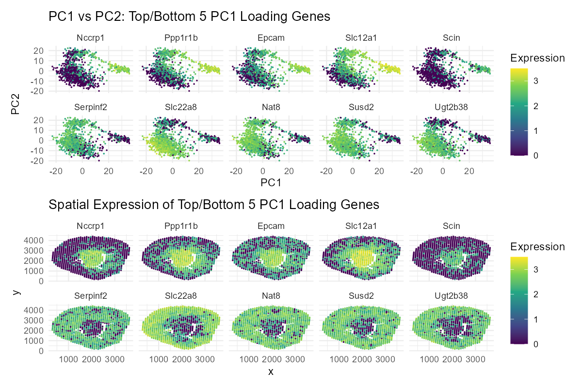
This visualization shows the expression of the five genes that contribute most positively and most negatively to PC1. By comparing their positions in PCA space (PC1 vs. PC2) with where they are expressed in the tissue, it helps connect the mathematical results of the analysis to real spatial patterns. This makes it easier to see whether genes with similar contributions to PC1 are active in the same tissue regions or in different areas, providing insight into how gene expression is organized across the tissue.
2. Why you believe your data visualization is effective using vocabulary terms from Lesson 1
I believe my visualization is effective because it helps the reader readily compare the top and bottom PC1 loadings (genes) and also observe how these genes are spatially arranged and correlated. I achieved this by using the geometric primitive of point, and the visual channels of color (hue), x-position, and y-position. The Gestalt principle of similarity is also used to accomplish this - spots with similar gene expression levels have the same colors.
3. Code
1
2
3
4
5
6
7
8
9
10
11
12
13
14
15
16
17
18
19
20
21
22
23
24
25
26
27
28
29
30
31
32
33
34
35
36
37
38
39
40
# set working directory and read in data
setwd("C:/Users/John-Paul/Documents/Doctoral_Doctor/PhD/LEARN/Gene_Data_Viz/genomic-data-visualization-2026")
data <- read.csv(gzfile("data/Visium-IRI-ShamR_matrix.csv.gz"))

# normalize gene expression
pos <- data[,c('x', 'y')]
rownames(pos) <- data[,1]
gexp <- data[, 4:ncol(data)]
rownames(gexp) <- data[,1]
totgexp <- rowSums(gexp)
mat <- log10(gexp/totgexp * 1e6 + 1)

# PCA and plots
pcs <- prcomp(mat, center=TRUE, scale=FALSE)
loadings_pc1 <- pcs$rotation[,1]
top5_genes <- names(sort(loadings_pc1, decreasing = TRUE))[1:5]
bottom5_genes <- names(sort(loadings_pc1, decreasing = FALSE))[1:5]
selected_genes <- c(top5_genes, bottom5_genes)
library(reshape2)
df_pc <- data.frame(pcs$x[,1:2], mat[, selected_genes])
df_pc_long <- melt(df_pc, id.vars = c("PC1", "PC2"), variable.name = "Gene", value.name = "Expression")
library(ggplot2)
p5 <- ggplot(df_pc_long, aes(x = PC1, y = PC2, color = Expression)) +
  geom_point(size = 0.15) +
  scale_color_viridis_c() +
  facet_wrap(~Gene, ncol = 5) +
  labs(title = "PC1 vs PC2: Top/Bottom 5 PC1 Loading Genes") +
  theme_minimal()
df <- data.frame(pos, mat[, selected_genes])
df_long <- melt(df, id.vars = c("x", "y"), variable.name = "Gene", value.name = "Expression")
library(ggplot2)
p6 <- ggplot(df_long, aes(x = x, y = y, color = Expression)) +
  geom_point(size = 0.15) +
  scale_color_viridis_c() +
  facet_wrap(~Gene, ncol = 5) +
  labs(title = "Spatial Expression of Top/Bottom 5 PC1 Loading Genes") +
  theme_minimal()
p5 / p6
ggsave("hw2_jakinba1.png", width = 1200, height = 800, units = "px", dpi = 150)
(AI prompts: I initially had the code for just the top gene and the bottom gene and then used generative AI to optimize for top 5 genes and bottom 5 genes faceted together.)