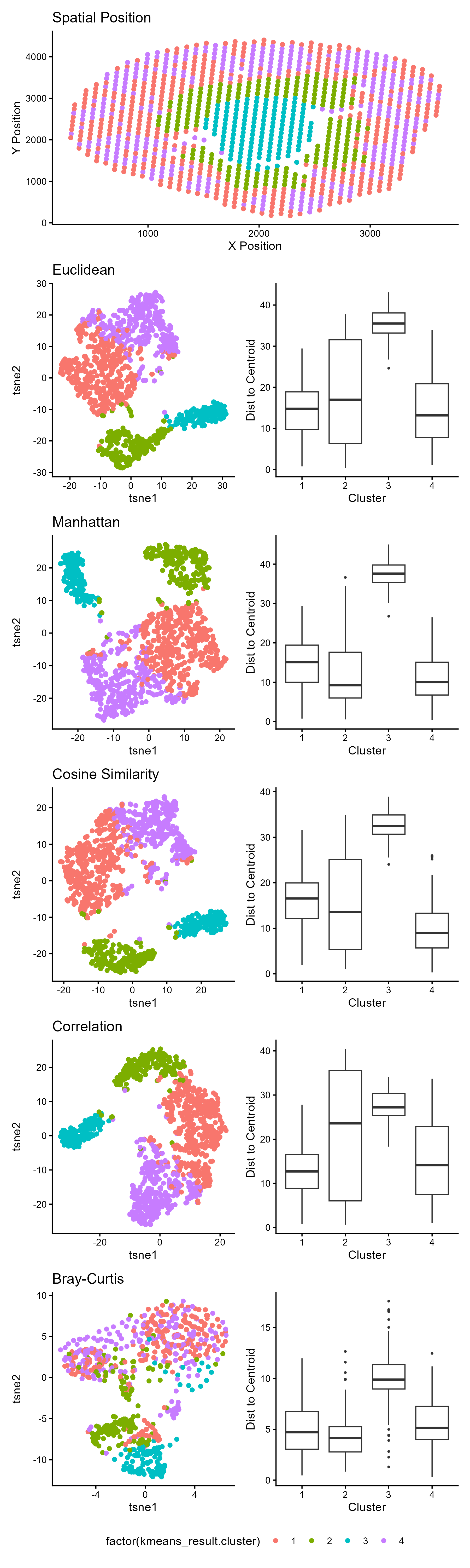
HW2: How Distance Metric in tSNE affects Spatial Tissue Structure

1. What data types are you visualizing?
- Spatial data: X and Y coordinates representing physical tissue location
- Quantitative data: t-SNE embeddings (continuous numerical values) and euclidean distances to centroids
- Categorical data: cluster assignments (4 distinct groups)
2. What data encodings (geometric primitives and visual channels) are you using to visualize these data types?
Geometric Primitives:
- Points: the visualization uses points to visualize the quantitative spatial data (X and Y coordinates) of the Visium spots, the quantitative t-SNE dimensions, and the cluster category in the spatial position and t-sne embedding plot. Points also encode the outliers Visium spots within a cluster on the ‘boxplot’ graphs.
- Lines: lines are used to encode quantitative data. Specifically, the ‘whiskers’ encode the range of distance values (continuous) while horizontal lines mark specific quantitative statistics (median, quartiles).
- Area: the area of the boxplot encode the interquartile range (IQR), representing the middle 50% of distance values for each cluster.
Visual Channels:
- position (both X and Y): Encodes spatial coordinates in the top panel and t-SNE dimensions (t-SNE1 and t-SNE2) in subsequent left-hand panels. For the right-hand visualization (boxplots), position of X represents the categorical clusters and the Y position represents the quantitative distance to centroid. The position of the ‘whiskers’ (line primitives) make the presence and magnitude of outliers salient. The longer the ‘whiskers’ extend beyond the box, the greater spread. The position of the points in upper and lower end of the Y-axis make salient outliers within the cluster.
- color hue: encodes categorical cluster identity in the tsne embedding and spatial plots.
- shape: Shape (circle vs. box) is used to categorically distinguish outliers from the main distribution.
3. What about the data are you trying to make salient through this data visualization?
I am trying to make salient the effectiveness of different distance metrics in preserving spatial tissue structure (that is implicitly seen in te gene expression clustering). when performing a t-SNE dimensionality reduction on spatial transcriptomics data. The visualization emphasizes how the choice of distance metric impacts cluster separation and within-cluster cohesion after t-SNE embedding. This is done by using the area of the box to make the distribution and compactness of each cluster immediately salient. A taller box indicates greater variability in distances to the cluster centroid, meaning the cluster is more spread out and less cohesive. The position of the geometric lines (‘whiskers’) on the boxplot makes salient the stability of cluster shape by showing the range of the data. The geometric point position (the outliers) make salient spots that are spatially or transcriptionally distant from their cluster, which may be transitional zones, noise, or disruptive fragmentation within that distance metric.
4. What Gestalt principles or knowledge about perceptiveness of visual encodings are you using to accomplish this?
- Proximity: points close together in the tsne embedding plot are perceived as belonging to the same cluster, which is reinforced by their shared color encoding
- Similarity: points sharing the same color are perceived as related members of the same cluster, even when spatially separated across different panels.
- Enclosure: The boxplots use enclosure (the box itself) to group data points belonging to each cluster, making the distribution boundaries clear. The legend encloses information about cluster identity.
My boxplot uses position, the most perceptually accurate visual channels, to make cluster spread and cohesion immediately visible. By mapping distance to centroid to vertical position and spread to y positions of the box, we can immediately see which metrics keep clusters tight. Outliers pop through shape contrast, highlighting deviations that might indicate spatial fragmentation or transition zones.
5. Code (paste your code in between the ``` symbols)
1
2
3
4
5
6
7
8
9
10
11
12
13
14
15
16
17
18
19
20
21
22
23
24
25
26
27
28
29
30
31
32
33
34
35
36
37
38
39
40
41
42
43
44
45
46
47
48
49
50
51
52
53
54
55
56
57
58
59
60
61
62
63
64
65
66
67
68
69
70
71
72
73
74
75
76
77
78
79
80
81
82
83
84
85
86
87
88
89
90
91
92
93
94
95
96
97
98
99
100
101
102
103
104
105
106
107
108
109
110
111
112
113
set.seed(123)
library(vegan)
library(Rtsne)
library(proxy)
library(ggplot2)
library(patchwork)

data <- read.csv('C:/users/lilli/Downloads/Visium-IRI-ShamR_matrix.csv.gz')

#gene expression data
gexp <- data[, 4:ncol(data)]
#rownames are the spots
rownames(gexp) <- data[,1]
#positions of the data
pos <- data[, c('x', 'y')]

#library size normalization
total_genexp <- rowSums(gexp)
mat <- log10(gexp/total_genexp*1e4+1)

#performing kmeans on the full gene expression data
kmeans_result <- kmeans(mat, centers = 4)

#perform PCR
pcs <- prcomp(mat, center=TRUE, scale=FALSE)
toppcs<- pcs$x[, 1:10]

#The idea for the distance metric was from
#Ozgode Yigin, B., & Saygili, G. (2023). Effect of distance measures on confidences of t-SNE embeddings and its implications on clustering for scRNA-seq data. Scientific reports, 13(1), 6567. https://doi.org/10.1038/s41598-023-32966-x
#I searched "How to use ___ distance in r?" I used the copilot search (AI overview) result
dist_matrices <- list(euclidean = dist(toppcs, method = 'euclidean'),
                      manhattan = dist(toppcs, method = 'manhattan'),
                      cosine_similarity = proxy::dist(toppcs, method = 'cosine'),
                      correlation = as.dist(1-cor(t(toppcs), method = 'pearson')),
                      braycurtis = vegdist(toppcs, method = 'bray'))

tsne_results <- list()
#To change the distance metric:
#https://stackoverflow.com/questions/53303236/how-can-i-change-the-t-sne-distance-in-r
for (dist_name in names(dist_matrices)) {
    tsne_result <- Rtsne(dist_matrices[[dist_name]], dims = 2, is_distance = TRUE, perplexity =30)
    tsne_results[[dist_name]] <- tsne_result$Y}

df<-data.frame(tsne_results$euclidean, tsne_results$manhattan, tsne_results$cosine_similarity, tsne_results$correlation, tsne_results$braycurtis, kmeans_result$cluster, pos)

#I searched "How to get rid of grid in ggplot2?"
#"How to turn numerical variables into categorical?"
#used the AI overview to get theme_classic() and what a factor variable is
#https://www.rdocumentation.org/packages/ggplot2/versions/4.0.1
p1<-ggplot(df, aes(x=x, y=y, col=factor(kmeans_result.cluster)))+
  geom_point()+
  theme_classic()+
  labs(x='X Position', y='Y Position', title='Spatial Position')

#making for loop for the distance metric plots
x_cols <- c('X1', 'X1.1', 'X1.2', 'X1.3', 'X1.4')
y_cols <- c('X2', 'X2.1', 'X2.2', 'X2.3', 'X2.4')
titles <- c('Euclidean', 'Manhattan', 'Cosine Similarity','Correlation', 'Bray-Curtis')
plots <- list()

for (i in 1:length(x_cols)){
  plots[[i]] <- ggplot(
    df,
    aes_string(x = x_cols[i],y = y_cols[i], col='factor(kmeans_result.cluster)'))+
    geom_point() +
    theme_classic() +
    labs(x = "tsne1", y = "tsne2",title = titles[i])}

#I got the boxplot idea from https://youtu.be/Qv42JieObog (Understanding Distance Metrics in the Machine Learning World Using Python)
#They used distribution to a cluster centroid by distance metric
#I calculated it for each cluster in kmeans

boxplots <- list()
#clusters are numerical on the boxplot
cluster_levels <- sort(unique(df$kmeans_result.cluster))
for (i in 1:length(tsne_results)) {
  #t-SNE coordinates and cluster labels
  d <- tsne_results[[i]]
  clust <- df$kmeans_result.cluster

  #calculate distances to centroid for each cluster
  dist_data <- data.frame(Cluster = numeric(0), Distance = numeric(0))
  for (c in unique(clust)) {
    #which spots belong in a cluster
    coords_belong_to_clust <- d[clust == c, , drop = FALSE]
    centroid <- colMeans(coords_belong_to_clust)
    #I used Euclidean distance from the centroid
    distances <- sqrt(rowSums((coords_belong_to_clust-centroid)^2))
    #I searched "How to append dataframe to another by row in r?" used the AI overview.
    dist_data <- rbind(dist_data,
                      data.frame(Cluster = factor(c, levels = cluster_levels),
                                 Distance = distances))}

  #I followed this https://www.geeksforgeeks.org/r-language/box-plot-in-r-using-ggplot2/
  #to make the boxplot
  boxplots[[i]] <- ggplot(dist_data, aes(x = Cluster, y = Distance)) +
    geom_boxplot() +
    theme_classic() +
    labs(x = 'Cluster',y = 'Dist to Centroid') +
    theme(legend.position = 'none')}

#I searched "How to format subplots?", "How to get rid of duplicate legends?"
combined <- p1/
  (plots[[1]] | boxplots[[1]])/
  (plots[[2]] | boxplots[[2]])/
  (plots[[3]] | boxplots[[3]])/
  (plots[[4]] | boxplots[[4]])/
  (plots[[5]] | boxplots[[5]]) +
  plot_layout(guides = 'collect') &
  theme(legend.position = 'bottom')

#I asked "how I can subplots in r fit?"
ggsave('hw2_llam9.png', combined, width = 6, height = 20,limitsize = FALSE)