Comparing high vs. low PC1 loading genes

Aim: How do the genes with high versus low loadings relate to each other? How are they patterned relative to each other in the tissue?
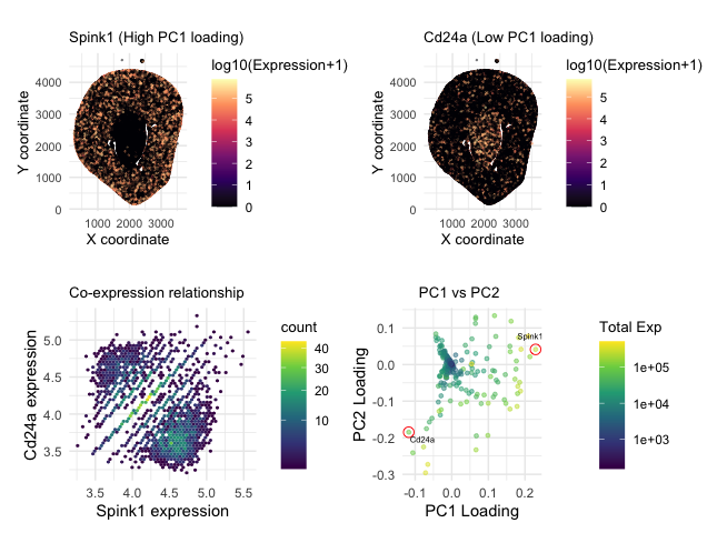
Note: Panel numbers reference the following layout - (p1 + p2)/(p3 + p4)
1. What data types are you visualizing?
P1 and P2 visualize spatial data regarding the x and y centroid positions of each cell. They also encode quantitative data of log-transformed expression levels. P3 encodes quantitative data of cell count and log transformed gene expression, as well as relational data between two categorical genes. P4 encodes categorical data of each gene, quantitative data of total expression and PC loading values.
2. What data encodings (geometric primitives and visual channels) are you using to visualize these data types?
P1 and P2 use points to represent each cell. Visual channel of hue through a Magma scale indicates log transformed gene expression levels for both the highest and lowest PC1 loading genes. X and Y position encode spatial data.
P3 uses hexagonal bins, which may be most similar to points to represent density of cells. Hue through the viridis scale encodes cell count or density in each of 50 bins. X and Y position encode highest and lowest PC1 loading gene expression values.
P4 uses points to represent each gene. Hue through the viridis scale encodes total gene expression for each gene. X and Y position encode PC1 loading values.
3. What about the data are you trying to make salient through this data visualization?
With this data, I am trying to make salient:
a) how a gene with the highest PC1 loading spatially relates to a gene with the lowest PC1 loading –> it is made salient through P1 and P2 that highest gene expression levels are in spatially distint regions of the tissue for Cd24a and Spink1.
b) how are these two genes co-expressed? For this, points at the 0 axes were filtered out to show more nuances between the bins’ cell density. We see two high-density “clusters” with a diagonal line separating the two. The “clusters” further show the exclusivity of the two genes, where there are more cells if one has a high expression and the other has a low expression. Additionally, the line separating the two might signify the spatial ring/boundary between the two regions.
c) Lastly, P4 aims to enforce the choice of genes by showing that they are “anchors” at the extreme ends of PC1 and PC2 loadings. The color scale emphazies the principal component analysis being biased towards genes with higher total gene expression levels as well.
4. What Gestalt principles or knowledge about perceptiveness of visual encodings are you using to accomplish this?
The principle of similarity allows the eye to group cells that are from different spatial regions by the similarity of their hue in P1 and P2. In P3, the similarity of the bins allows us to perceive areas of high density and the proximity gaps allow us to distinguish between the high Spink1, low Cd24a area; the low Spink1, high Cd24a area; and the diagonal line that separates them. In P4, the principle of enclosure draws our eyes to the selected genes and their positioning in terms of loading. The proximity of central blue points also indicates how most genes are near 0 PC loading value, and further drives the point that our chosen genes are outliers and at extremes.
5. Code (paste your code in between the ``` symbols)
1
2
3
4
5
6
7
8
9
10
11
12
13
14
15
16
17
18
19
20
21
22
23
24
25
26
27
28
29
30
31
32
33
34
35
36
37
38
39
40
41
42
43
44
45
46
47
48
49
50
51
52
53
54
55
56
57
58
59
60
61
62
63
64
65
66
67
68
69
70
71
72
73
74
75
76
77
78
79
80
81
82
83
84
85
86
87
88
89
90
91
92
93
94
#How do the genes with high versus low loadings relate to each other? How are they patterned relative to each other in the tissue?
library(ggplot2)
library(dplyr)
library(patchwork)

data <- read.csv('~/Desktop/GDV/Xenium-IRI-ShamR_matrix.csv.gz')
pos <- data[,c('x','y')]
rownames(pos)<-data[,1]
gexp<-data[,4:ncol(data)]
rownames(gexp)<-data[,1]
totgexp<-rowSums(gexp)
mat <- log10(gexp/totgexp * 1e6 + 1) #log transform and normalize

#performing PCA
pcs <- prcomp(mat, center=TRUE, scale=FALSE)
# PC1 gene loadings
pc1_loadings <- pcs$rotation[, 1]

pc1_sorted<- sort(pc1_loadings, decreasing = TRUE)
high_gene<- names(pc1_sorted)[1]        # highest loading
low_gene<- names(pc1_sorted)[length(pc1_sorted)]  # lowest loading

#creating data frames for highest and lowest PC1 loading gene
df<- data.frame(x = pos$x, y = pos$y, PC1 = pcs$x[,1])
pc1_load <- pcs$rotation[,1]
df_high<- data.frame(pos, gene = mat[, high_gene])
df_low<- data.frame(pos, gene = mat[, low_gene])

#plotting spatial plot for highest PC1 loading gene
p1 <- ggplot(df_high, aes(x, y, col = gene)) +
  geom_point(size = 0.15, alpha = 0.4) +
  scale_color_viridis_c(option="magma") +
  coord_fixed() +
  labs(title = paste(high_gene, "(High PC1 loading)"), col= "log10(Expression+1)", x = "X coordinate", y = "Y coordinate") +
  theme_minimal() +
  theme(plot.title = element_text(size = 10), legend.title = element_text(size = 10),
        axis.title = element_text(size = 10), axis.text = element_text(size = 8))

#plotting spatial plot for lowest PC1 loading gene
p2 <- ggplot(df_low, aes(x, y, col = gene)) +
  geom_point(size = 0.15, alpha = 0.4) +
  scale_color_viridis_c(option="magma") +
  coord_fixed() +
  labs(title = paste(low_gene, "(Low PC1 loading)"), col = "log10(Expression+1)", x = "X coordinate", y = "Y coordinate") +
  theme_minimal() +
  theme(plot.title = element_text(size = 10), legend.title = element_text(size = 10),
        axis.title = element_text(size = 10), axis.text = element_text(size = 8))

df_pair <- data.frame(high = mat[, high_gene], low  = mat[, low_gene])

df_pair_filt <- df_pair %>%
  dplyr::filter(high>0 & low> 0)

#plotting hexbin expression plot
p3 <- ggplot(df_pair_filt, aes(high, low)) +
  geom_hex(bins = 50) +
  scale_fill_viridis_c(trans ="sqrt") +
  labs(x = paste(high_gene, "expression"), y = paste(low_gene, "expression"),
       title = "Co-expression relationship", col="count")+
  coord_fixed()+
  theme_minimal()+
  theme(plot.title = element_text(size = 10), legend.title = element_text(size = 10))

df_loadings <- data.frame(
  PC1 = pcs$rotation[, 1], PC2 = pcs$rotation[, 2], total_exp = colSums(gexp), gene_name = colnames(gexp)
)

#plotting pc1 vs. pc2 loading values for all genes
p4 <- ggplot(df_loadings, aes(x = PC1, y = PC2, color = total_exp)) +
  geom_point(alpha = 0.5, size = 1) +
  geom_point(data = df_loadings %>% filter(gene_name %in% c(high_gene, low_gene)),
             color = "red", size = 3, shape = 1) +
  coord_fixed()+
  geom_text(data = df_loadings %>% filter(gene_name %in% c(low_gene)),
            aes(label = gene_name), color = "black", vjust = 1.7, hjust = -0.05, size = 2) +
  geom_text(data = df_loadings %>% filter(gene_name %in% c(high_gene)),
            aes(label = gene_name), color = "black", vjust = -1.7, hjust = 0.7, size = 2) +
  scale_color_viridis_c(name = "Total Exp", trans = "log10") +
  labs(x = "PC1 Loading", y = "PC2 Loading", title = "    PC1 vs PC2") +
  theme_minimal()+
  theme(plot.title = element_text(size = 10), legend.title = element_text(size = 10))

#patchwork layout
(p1+p2)/(p3+p4)

#references
#course hands-on component code
#https://ggplot2.tidyverse.org/reference/index.html
#https://patchwork.data-imaginist.com/
#AI prompts used
#how do I create labels for the highest and lowest loading genes? annotate them with a red circle
#how do I filter out the points at 0,0
#what data frame should I make if I want to plot the co-expression of the highest and lowest loading gene?
#Plot the PC1 vs PC2 loading values for all genes. Encode the expression with the aes fill parameter.