HW2

Question explored: “How do tSNE coordinates change as you increase or decrease the perplexity?”
Write a description explaining what you are trying to make salient and why you believe your data visualization is effective using vocabulary terms from Lesson 1.
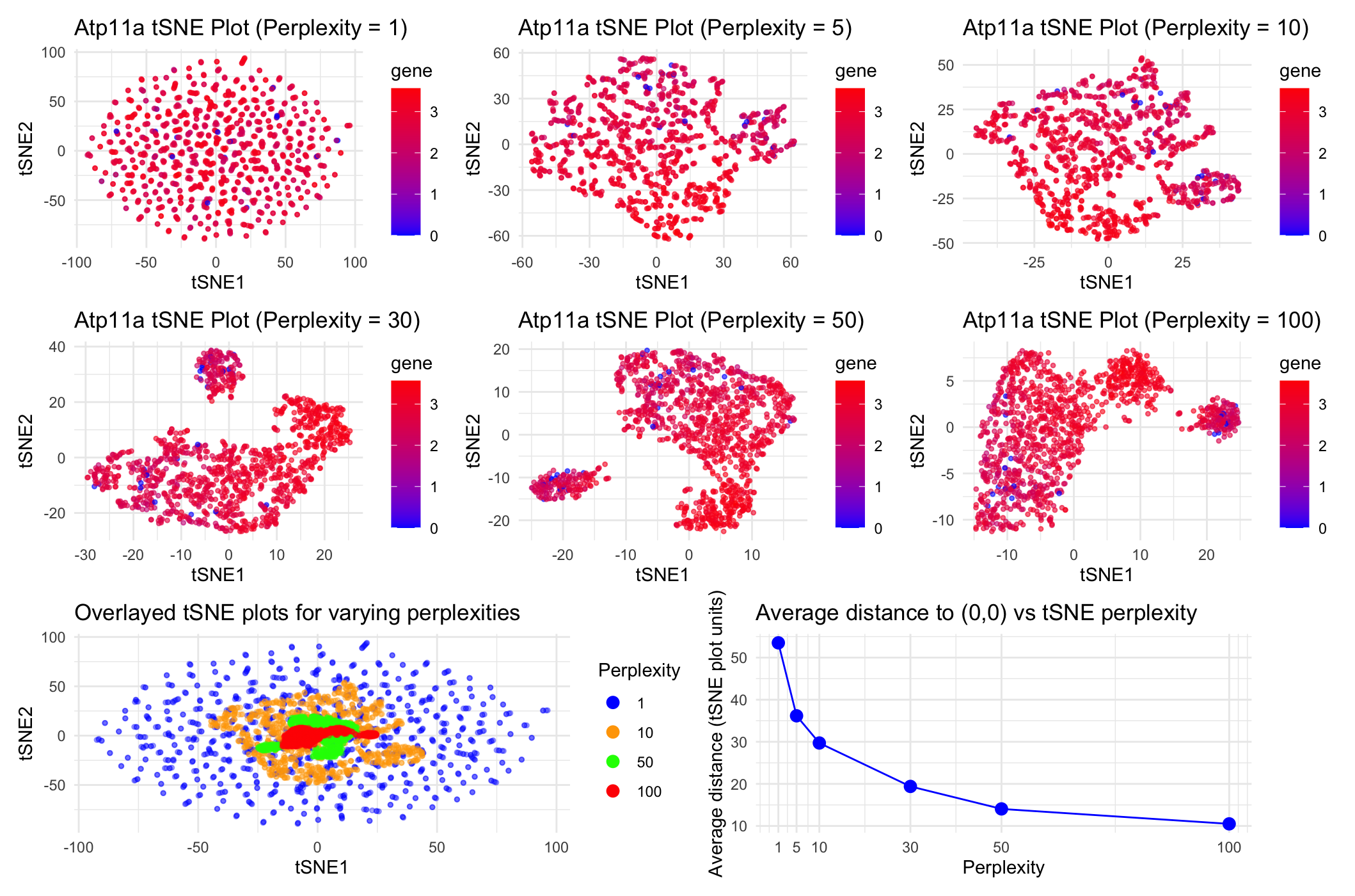
Through these data visualizations, I was trying to explore how increasing the perplexity of tSNE nonlinear dimensionality reduction on the Visium dataset impacts tSNE coordinates on a plot of tSNE1 vs. tSNE2. To achieve this, I first did linear dimensionality reduction with PCA and then did nonlinear tSNE dimensionality reduction on the top 7 PCA datasets. To then play around with the perplexities of the tSNE dimensinality reduction, I chose 6 total perplexities (1, 5, 10, 30, 50, and 100) to test. I initially plotted tSNE1 vs. tSNE2 for each of these 6 perplexities separately for the gene Atp11a, with blue points representing spots with low gene expression and red points representing spots with high gene expression as seen in the legend. To directly compare between tSNE coordinates for this range of perplexities, I chose to overlay the tSNE1 vs. tSNE2 plots for perplexities 1, 10, 50 and 100 on the same ggplot to understand how the scales of the tSNE coordinates compare to each other at varying perplexities. In this overlaid plot, the color of the dots represents the perplexity used to conduct the tSNE dimensionality reduction rather than Atp11a expression levels. Finally, to quantify the difference in scale/spread of the point coordinates for each of the 6 perplexities’ tSNE plots, I computed the average distance of each point to the tSNE coordinate origin (0,0) for each of the tSNE plots for each of the perplexities. I then graphed these averages in a final plot to understand how distance from the origin and spread of the points trends as perplexity increases. I ultimately aimed to make it apparent that as perplexity increases during tSNE dimensionality reduction, we notice that there is closer, more condensed and specific clustering of the spots. In this case, because we are conducting dimensionality reduction on gene expression data for the gene Atp11a, this trend tells us that increasing the perplexity (or the number of neighboring spots the program considers) to an extent helps us more closely group spots that share more related Atp11a expression data.
The data types represented include quantitative data types (gene expression levels for Atp11a as shown in the blue-red legends of the uppermost 6 plots, perplexity levels, average distances from (0,0) on tSNE plots), as well as spatial data (tSNE1 vs. tSNE2 coordinates for each spot in the dataset that were used to calculate average distances from (0,0)). I chose to convert from spatial data to quantitative data (distance) for the final plot to make trends in coordinate spread vs. closer clustering in tSNE plots more apparent and objectively quantifiable.
The data encodings chosen include points (representing each spot in the dataset and its corresponding tSNE1 and tSNE2 coordinates, gene expression levels for Atp11a, and distance from the origin), as well as lines (that connect the points in the distance from the origin plot and represent the linear trend between each of the two points to make a broader exponential decreasing trend more salient). Visual channels included here are color (hue), which represent the gene expression levels and perplexities depending on the plot, as well as position, which represent the tSNE1 and tSNE2 coordinate values for each spot or average distance from the origin and perplexity depending on the plot.
Several Gestalt principles and tips for perceptions of visual encodings were used here. Similarity of color (hue) was used to group spots either by gene expression levels for Atp11a (uppermost 6 plots) or perplexity for tSNE (bottom left plot). Proximity was also used here to group spots by similarities in Atp11a expression levels based on points’ similar tSNE coordinates. Finally, continuity was employed in the bottom right plot to connect each of the points in the graph to make the exponential decreasing trend between distance to the origin and perplexity more apparent and salient to the viewer. I thought color, rather than other visual channels like shape or size, made differences in quantitative data like gene expression and perplexities most apparent in these graphs. I also tried to choose higher contrast colors and make the points a bit translucent so viewers could more easily identify the full scope of differences in these quantitative data.
Code:
```r
library(patchwork) library(ggplot2)
#Using code we discussed together in the in-class example:
data <- read.csv(“~/Desktop/Visium-IRI-ShamR_matrix.csv.gz”)
positions <- data[,c(‘x’, ‘y’)] rownames(positions) <- data[,1] gene_exp <- data[, 4:ncol(data)] rownames(gene_exp) <- data[,1]
#Normalizing total gene expression data total_gene_exp <- rowSums(gene_exp) mat <- log10(gene_exp/total_gene_exp * 1e6 + 1) #Log transform to make more Gaussian distributed and interpretable, get rid of NaN points
#Dimensionality reduction
#Linear DR: PCA PCs <- prcomp(mat, center = TRUE, scale = FALSE) print(PCs$rotation[1:5,1:5]) #show 1st 5 PC’s gene loading for 1st 5 genes; rotation = loading plot(PCs$sdev[1:25]) #dips at some point where PC’s are not capturing much more variance in the data; we see plateau at around PC 7
#Nonlinear DR: tSNE on top 7 PCs top_PCs <- PCs$x[, 1:7] tsne_1 <- Rtsne::Rtsne(top_PCs, dims = 2, perplexity = 1) tsne_5 <- Rtsne::Rtsne(top_PCs, dims = 2, perplexity = 5) tsne_10 <- Rtsne::Rtsne(top_PCs, dims = 2, perplexity = 10) tsne_30 <- Rtsne::Rtsne(top_PCs, dims = 2, perplexity = 30) tsne_50 <- Rtsne::Rtsne(top_PCs, dims = 2, perplexity = 50) tsne_100 <- Rtsne::Rtsne(top_PCs, dims = 2, perplexity = 100)
#Plotting tSNE coordinates for all perplexities being tested, color-coded by gene expression data #Also used ggplot tools here that were implemented in HW1 & https://rstudio.github.io/cheatsheets/data-visualization.pdf #Got help from ChatGPT with the following prompt: “Why isn’t the specified color gradient being applied to the following code when col = gene? (I then entered my plot_1 definition line where col = gene and scale_fill_gradient() had originally been used together rather than col = gene and scale_color_gradient())
emb_1 <- tsne_1$Y rownames(emb_1) <- rownames(mat) colnames(emb_1) <- c(‘tSNE1’, ‘tSNE2’) head(emb_1) df_1 <- data.frame(emb_1, PCs$x[,1:7], gene=mat[,”Atp11a”]) plot_1 <- ggplot(df_1, aes(x=tSNE1, y=tSNE2, col=gene)) + geom_point(size=0.9, alpha=0.6) + labs(title=”Atp11a tSNE Plot (Perplexity = 1)”) + scale_color_gradient(low=’blue’, high=’red’) + theme_minimal()
emb_5 <- tsne_5$Y rownames(emb_5) <- rownames(mat) colnames(emb_5) <- c(‘tSNE1’, ‘tSNE2’) head(emb_5) df_5 <- data.frame(emb_5, PCs$x[,1:7], gene=mat[,”Atp11a”]) plot_5 <- ggplot(df_5, aes(x=tSNE1, y=tSNE2, col=gene)) + geom_point(size=0.9, alpha=0.6) + labs(title=”Atp11a tSNE Plot (Perplexity = 5)”) + scale_color_gradient(low=’blue’, high=’red’) + theme_minimal()
emb_10 <- tsne_10$Y rownames(emb_10) <- rownames(mat) colnames(emb_10) <- c(‘tSNE1’, ‘tSNE2’) head(emb_10) df_10 <- data.frame(emb_10, PCs$x[,1:7], gene=mat[,”Atp11a”]) plot_10 <- ggplot(df_10, aes(x=tSNE1, y=tSNE2, col=gene)) + geom_point(size=0.9, alpha=0.6) + labs(title=”Atp11a tSNE Plot (Perplexity = 10)”) + scale_color_gradient(low=’blue’, high=’red’) + theme_minimal()
emb_30 <- tsne_30$Y rownames(emb_30) <- rownames(mat) colnames(emb_30) <- c(‘tSNE1’, ‘tSNE2’) head(emb_30) df_30 <- data.frame(emb_30, PCs$x[,1:7], gene=mat[,”Atp11a”]) plot_30 <- ggplot(df_30, aes(x=tSNE1, y=tSNE2, col=gene)) + geom_point(size=0.9, alpha=0.6) + labs(title=”Atp11a tSNE Plot (Perplexity = 30)”) + scale_color_gradient(low=’blue’, high=’red’) + theme_minimal()
emb_50 <- tsne_50$Y rownames(emb_50) <- rownames(mat) colnames(emb_50) <- c(‘tSNE1’, ‘tSNE2’) head(emb_50) df_50 <- data.frame(emb_50, PCs$x[,1:7], gene=mat[,”Atp11a”]) plot_50 <- ggplot(df_50, aes(x=tSNE1, y=tSNE2, col=gene)) + geom_point(size=0.9, alpha=0.6) + labs(title=”Atp11a tSNE Plot (Perplexity = 50)”) + scale_color_gradient(low=’blue’, high=’red’) + theme_minimal()
emb_100 <- tsne_100$Y rownames(emb_100) <- rownames(mat) colnames(emb_100) <- c(‘tSNE1’, ‘tSNE2’) head(emb_100) df_100 <- data.frame(emb_100, PCs$x[,1:7], gene=mat[,”Atp11a”]) plot_100 <- ggplot(df_100, aes(x=tSNE1, y=tSNE2, col=gene)) + geom_point(size=0.9, alpha=0.6) + labs(title=”Atp11a tSNE Plot (Perplexity = 100)”) + scale_color_gradient(low=’blue’, high=’red’) + theme_minimal()
#With help from ChatGPT, prompt = “Given this code, how can I create an overlaid ggplot that layers the tSNE tSNE1 vs. tSNE2 coordinate plots for perplexities 1, 10, 50, and 100 in varying high-contrast colors with size = 1, alpha = 0.35 and a legend that indicates perplexity based on the color of the dots” #Also used ggplot tools here that were implemented in HW1
#Adding column indicating perplexity to each of the tSNE dataframes established earlier; combining data frames into 1 dataframe for easy overlaid plotting df_1$perplexity <- “1” df_10$perplexity <- “10” df_50$perplexity <- “50” df_100$perplexity <- “100” df_overlaid <- rbind(df_1, df_10, df_50, df_100)
#Ordering perplexity for increasing perplexity legend labels df_overlaid$perplexity <- factor(df_overlaid$perplexity, levels = c(“1”, “10”, “50”, “100”))
#Plotting overlaid tSNE plots for perplexities 1, 10, 50, and 100 overlay_plot <- ggplot(df_overlaid, aes(x = tSNE1, y = tSNE2, color = perplexity)) + geom_point(size = 1, alpha = 0.35) + scale_color_manual(values = c(“1” = “blue”, “10” = “orange”, “50” = “green”, “100” = “red”), name = “Perplexity”) + labs(title = “Overlayed tSNE plots for varying perplexities”, x = “tSNE1”, y = “tSNE2”) + theme_minimal() + guides(color = guide_legend(override.aes = list(alpha = 1, size = 3)))
#With help from ChatGPT, prompt = “Based on this code, how can I create a plot showing all the average distances of the points on the tSNE1 and tSNE2 scatterplots to the origin (tSNE1 = 0, tSNE2 = 0) for perplexities = 1, 5, 10, 30, 50, 100” #Plotting average distances from (0,0) of each point on the tSNE1 vs. tSNE2 plots for each of the perplexities we’re testing
#General mean distance function from given points to the origin avg_dist_to_origin <- function(emb) { distances <- sqrt(emb[, “tSNE1”]^2 + emb[, “tSNE2”]^2) mean(distances) }
#Computing average distances from origins for points from each perplexity plot avg_distances <- data.frame( perplexity = c(1, 5, 10, 30, 50, 100), avg_distance = c(avg_dist_to_origin(emb_1), avg_dist_to_origin(emb_5), avg_dist_to_origin(emb_10), avg_dist_to_origin(emb_30), avg_dist_to_origin(emb_50), avg_dist_to_origin(emb_100)) ) print(avg_distances)
#Plotting average distances from origin for each perplexity tSNE distances_plot <- ggplot(avg_distances, aes(x = perplexity, y = avg_distance)) + geom_point(size = 3, color=”blue”) + geom_line(color=’blue’) + scale_x_continuous(breaks = avg_distances$perplexity) + labs(title = “Average distance to (0,0) vs tSNE perplexity”, x = “Perplexity”, y = “Average distance (tSNE plot units)”) + theme_minimal()
#With help from Google AI ouput for search “How to display multiple ggplot plots in one output in R Studio” (plot_1 | plot_5 | plot_10) / (plot_30 | plot_50 | plot_100) / (overlay_plot | distances_plot)
’’’