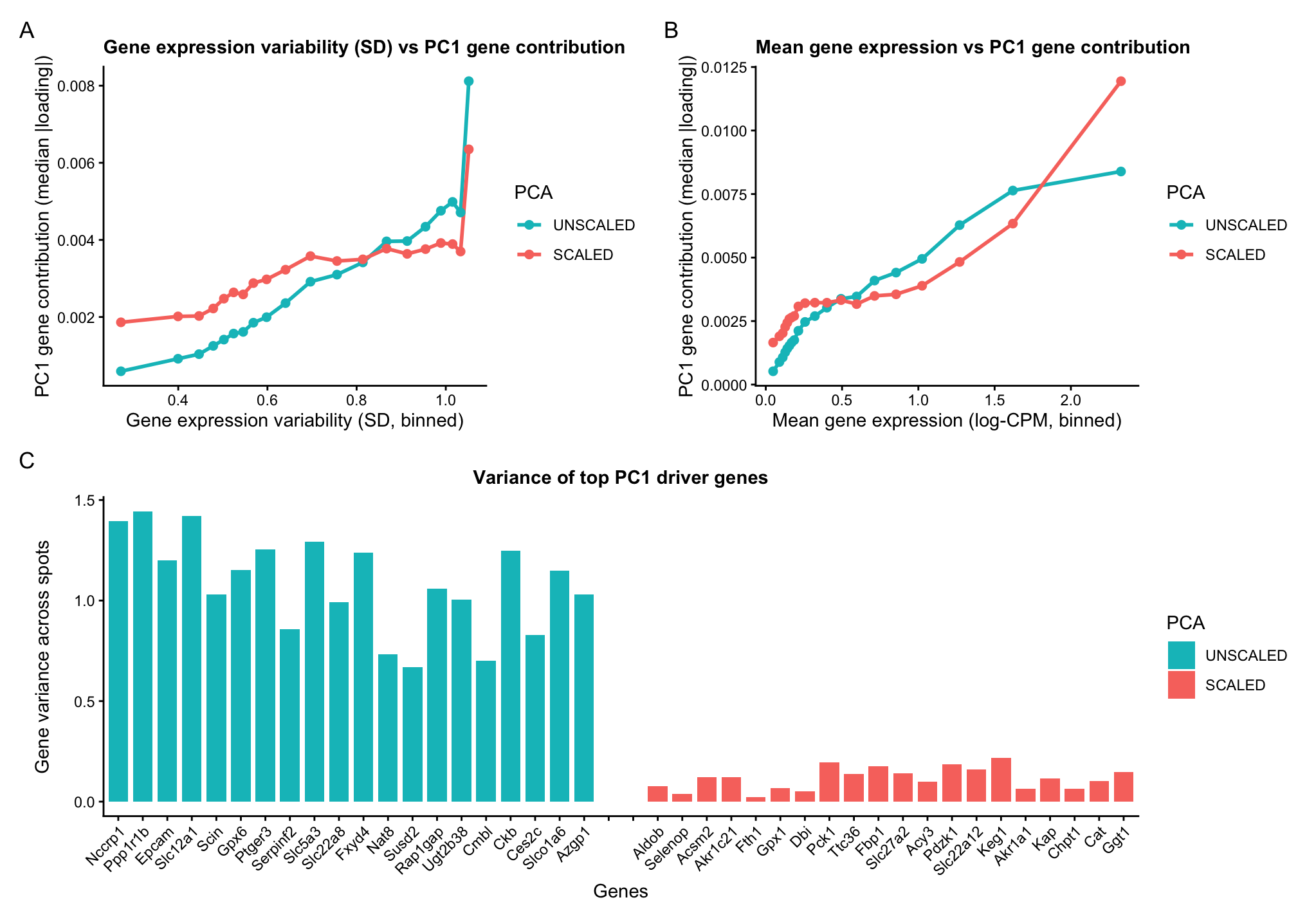
A multipanel data visualization of PC1 gene loadings against gene features

1. What data types are you visualizing?
Categorical- PCA unscaled and PCA scaled Quantitative data- PC1 gene loading Gene expression variability (variance) Mean gene expression
2. What data encodings (geometric primitives and visual channels) are you using to visualize these data types?
Geometric primitives- Points (representing binned summaries of genes) Lines (encoding gene variance in the bar chart) Visual channels- Colour hue (to differentiate between the scaled and unscaled PCA computation) Position along x axis encodes gene features, binned SD or binned mean expression in panels A and B Position along x axis encodes gene identity in panel C Position along y axis encodes gene loadings on PC1 in panels A and B Position along y axis encodes encodes gene variance across spots in panel C
3. What about the data are you trying to make salient through this data visualization?
Genes with higher variability tend to contribute more to PC1. In unscaled PCA, genes with higher variance disproportionately dominate PC1. In scaled PCA, variance differences are suppressed, and thus the curve is flatter but still increasing. Highly expressed genes (greater mean), have better signal-to-noise ratio, and therefore contribute more to PC1. Scaling reduces but does not eliminate this trend.
The identity of PC1-driving genes depends on scaling. This indicates that unscaled PCA is dominated by high variance genes whereas scaled PCA captures coordinated expression patterns independent of magnitude.
4. What Gestalt principles or knowledge about perceptiveness of visual encodings are you using to accomplish this?
Color hue is used to distinguish between PCA runs with and without scaling, as humans perceive differences in hue effectively for categorical data.
The Gestalt principle of continuity is used to highlight the relationship between gene loadings on the first principal component and gene features such as mean expression and variance. The connected line plots encourage the viewer to perceive smooth trends rather than isolated points.
In the bar chart, length is used to highlight quantitative differences in gene variance, as humans are effective at comparing magnitudes when length is used as the visual encoding.
Additionally, the Gestalt principle of proximity is used in the bar chart to group genes by PCA condition (scaled versus unscaled), helping the viewer quickly distinguish between the two sets of PC1 driving genes.
5. Code (paste your code in between the ``` symbols)
1
2
3
4
5
6
7
8
9
10
11
12
13
14
15
16
17
18
19
20
21
22
23
24
25
26
27
28
29
30
31
32
33
34
35
36
37
38
39
40
41
42
43
44
45
46
47
48
49
50
51
52
53
54
55
56
57
58
59
60
61
62
63
64
65
66
67
68
69
70
71
72
73
74
75
76
77
78
79
80
81
82
83
84
85
86
87
88
89
90
91
92
93
94
95
96
97
98
99
100
101
102
103
104
105
106
107
108
109
110
111
112
113
114
115
116
117
118
119
120
121
122
123
124
125
126
127
128
129
130
131
132
133
134
135
136
137
138
139
140
141
142
143
144
145
146
147
148
149
150
151
152
153
154
155
156
157
158
159
160
161
162
163
164
165
166
167
168
169
170
171
172
173
174
175
176
177
178
179
180
181
182
183
184
185
186
187
188
189
190
191
192
193
194
195
196
197
198
199
200
201
202
203
204
205
206
207
208
209
210
211
212
213
214
215
216
217
218
219
220
221
222
223
224
225
226
227
228
229
230
231
232
233
234
235
236
237
238
239
240
241
242

# Spatial transcriptomics PCA:
#   - Row 1: SD-binned trend (UNSCALED vs SCALED) + Mean-binned trend (UNSCALED vs SCALED)
#   - Row 2: Top PC1 driver genes bar chart (UNSCALED and SCALED)

install.packages(c("ggplot2","dplyr","patchwork","ggrepel"))
library(ggplot2)
library(dplyr)
library(patchwork)
library(ggrepel)

# reset theme- I had to do this as I was getting errors on and off
theme_set(theme_gray())

# consistent use of colour heus across figures
pca_colors <- c(
  "UNSCALED" = "#00BFC4",  # teal
  "SCALED"   = "#F8766D"   # coral
)

# Read data
data <- read.csv('~/Documents/genomic-data-visualization-2026/data/Visium-IRI-ShamR_matrix.csv.gz')

# get familiar with the data
pos <- data[, c('x','y')]
rownames(pos) <- data[,1]
gexp <- data[, 4:ncol(data)]
rownames(gexp) <- data[,1]
gexp <- as.matrix(gexp)
storage.mode(gexp) <- "numeric"

# log transformed counts per million normalize
totgexp <- rowSums(gexp)
mat <- log10(sweep(gexp, 1, totgexp, "/") * 1e6 + 1)  # spots x genes

# compute gene features across spots
gene_mean <- colMeans(mat)
gene_sd   <- apply(mat, 2, sd)

# Keep only genes with nonzero SD and finite values
keep <- is.finite(gene_sd) & gene_sd > 0
mat <- mat[, keep, drop = FALSE]
gene_mean <- gene_mean[keep]
gene_sd   <- gene_sd[keep]

# PCA- Unscaled
pca_ns <- prcomp(mat, center = TRUE, scale. = FALSE)
pc1_load <- pca_ns$rotation[, 1]

# PCA- Scaled genes: z-score each gene across spots
mat_scaled <- scale(mat, center = TRUE, scale = TRUE)
pca_s <- prcomp(mat_scaled, center = FALSE, scale. = FALSE)
pc1_load_s <- pca_s$rotation[, 1]

# Build gene-level data frames (aligned by gene names)
df <- data.frame(
  gene = names(pc1_load),
  pc1_loading = as.numeric(pc1_load),
  mean = gene_mean[names(pc1_load)],
  sd   = gene_sd[names(pc1_load)]
)

df_s <- data.frame(
  gene = names(pc1_load_s),
  pc1_loading = as.numeric(pc1_load_s),
  mean = gene_mean[names(pc1_load_s)],
  sd   = gene_sd[names(pc1_load_s)]
)

# Remove directionality: use |loading| for contribution magnitude
df$abs_loading   <- abs(df$pc1_loading)
df_s$abs_loading <- abs(df_s$pc1_loading)


# bin gened based on standard deviation and mean for easy of visualization
n_bins <- 20

# unscaled
df_var_binned <- df %>%
  mutate(var_bin = ntile(sd, n_bins)) %>%
  group_by(var_bin) %>%
  summarise(
    mean_sd = mean(sd),
    median_abs_loading = median(abs_loading),
    .groups = "drop"
  )

# scaled
df_s_var_binned <- df_s %>%
  mutate(var_bin = ntile(sd, n_bins)) %>%
  group_by(var_bin) %>%
  summarise(
    mean_sd = mean(sd),
    median_abs_loading = median(abs_loading),
    .groups = "drop"
  )

# unscaled
df_mean_binned <- df %>%
  mutate(mean_bin = ntile(mean, n_bins)) %>%
  group_by(mean_bin) %>%
  summarise(
    mean_expr = mean(mean),
    median_abs_loading = median(abs_loading),
    .groups = "drop"
  )

# scaled
df_s_mean_binned <- df_s %>%
  mutate(mean_bin = ntile(mean, n_bins)) %>%
  group_by(mean_bin) %>%
  summarise(
    mean_expr = mean(mean),
    median_abs_loading = median(abs_loading),
    .groups = "drop"
  )

# Combine scaled and unscaled for overlay plots
df_var_binned$PCA   <- "UNSCALED"
df_s_var_binned$PCA <- "SCALED"
df_var_combined <- bind_rows(df_var_binned, df_s_var_binned) %>%
  mutate(PCA = factor(trimws(PCA), levels = c("UNSCALED","SCALED")))

df_mean_binned$PCA   <- "UNSCALED"
df_s_mean_binned$PCA <- "SCALED"
df_mean_combined <- bind_rows(df_mean_binned, df_s_mean_binned) %>%
  mutate(PCA = factor(trimws(PCA), levels = c("UNSCALED","SCALED")))

# Plot A
p_var <- ggplot(df_var_combined,
                aes(x = mean_sd, y = median_abs_loading, color = PCA)) +
  geom_line(linewidth = 1) +
  geom_point(size = 2) +
  scale_color_manual(values = pca_colors, drop = FALSE) +
  labs(
    title = "Gene expression variability (SD) vs PC1 gene contribution",
    x = "Gene expression variability (SD, binned)",
    y = "PC1 gene contribution (median |loading|)",
    color = "PCA"
  ) +
  theme_classic() +
  theme(
    plot.title   = element_text(size = 11, , face="bold"),
    axis.title.x = element_text(),
    axis.title.y = element_text()
  )

# Plot B
p_mean <- ggplot(df_mean_combined,
                 aes(x = mean_expr, y = median_abs_loading, color = PCA)) +
  geom_line(linewidth = 1) +
  geom_point(size = 2) +
  scale_color_manual(values = pca_colors, drop = FALSE) +
  labs(
    title = "Mean gene expression vs PC1 gene contribution",
    x = "Mean gene expression (log-CPM, binned)",
    y = "PC1 gene contribution (median |loading|)",
    color = "PCA"
  ) +
  theme_classic() +
  theme(
    plot.title   = element_text(size = 11, face="bold"),
    axis.title.x = element_text(),
    axis.title.y = element_text()
  )

# use a bar chart to show variance and identity of the top PC1-driver genes (scaled vs unscaled)
top_n <- 20

top_unscaled <- df %>%
  arrange(desc(abs_loading)) %>%
  slice_head(n = top_n) %>%
  mutate(PCA = "UNSCALED")

top_scaled <- df_s %>%
  arrange(desc(abs_loading)) %>%
  slice_head(n = top_n) %>%
  mutate(PCA = "SCALED")

top_bars <- bind_rows(top_unscaled, top_scaled) %>%
  select(gene, PCA, pc1_loading, abs_loading, sd) %>%
  mutate(
    PCA = factor(trimws(PCA), levels = c("UNSCALED","SCALED")),
    variance = sd^2
  )

# Spacer levels create a true gap between groups
spacers <- c("SPACER1", "SPACER2")

x_levels <- c(
  paste0("UNSCALED__", top_unscaled$gene),
  spacers,
  paste0("SCALED__",   top_scaled$gene)
)

spacer_df <- data.frame(
  gene = NA,
  PCA = factor("SPACER", levels = c("UNSCALED","SCALED","SPACER")),
  pc1_loading = NA,
  abs_loading = NA,
  sd = NA,
  variance = NA,
  x_id = spacers
)

top_bars <- top_bars %>%
  mutate(x_id = paste0(as.character(PCA), "__", gene)) %>%
  bind_rows(spacer_df) %>%
  mutate(
    x_id = factor(x_id, levels = x_levels),
    PCA  = factor(as.character(PCA), levels = c("UNSCALED","SCALED","SPACER"))
  )

# plot: SAME X, but Y = variance
p_topN_var <- ggplot(top_bars, aes(x = x_id, y = variance, fill = PCA)) +
  geom_col(width = 0.8, na.rm = TRUE) +
  scale_x_discrete(labels = function(z)
    ifelse(grepl("SPACER", z), "", sub(".*__", "", z))
  ) +
  scale_fill_manual(
    values = c(pca_colors, "SPACER" = NA),
    breaks = c("UNSCALED","SCALED"),
    drop = FALSE
  ) +
  labs(
    title = paste0("Variance of top PC1 driver genes"),
    x = "Genes",
    y = "Gene variance across spots",
    fill = "PCA"
  ) +
  theme_classic() +
  theme(
    plot.title   = element_text(size = 11, hjust = 0.5, face="bold"),
    axis.text.x  = element_text(angle = 45, hjust = 1),
    axis.title.x = element_text(),
    axis.title.y = element_text()
  )

# multi panel visualization
((p_var | p_mean) / (p_topN_var)) +
  plot_annotation(tag_levels = "A")
6. Resources
I used R documentation and the ? help function on R itself to understand functions.
I used ChatGpt for clean up tasks, in my plots. The following are a few prompts used. Increase the space between the two categories to show greater proximity. Make the colour heu used consistent across plots.