HW3
Instructions:
Create a multi-panel data visualization that includes at minimum the following components: (1) A panel visualizing your one cluster of interest in reduced dimensional space (PCA, tSNE, etc), (2) A panel visualizing your one cluster of interest in physical space, (3) A panel visualizing differentially expressed genes for your cluster of interest, (4) A panel visualizing one of these genes in reduced dimensional space (PCA, tSNE, etc), (5) A panel visualizing one of these genes in space.
Response
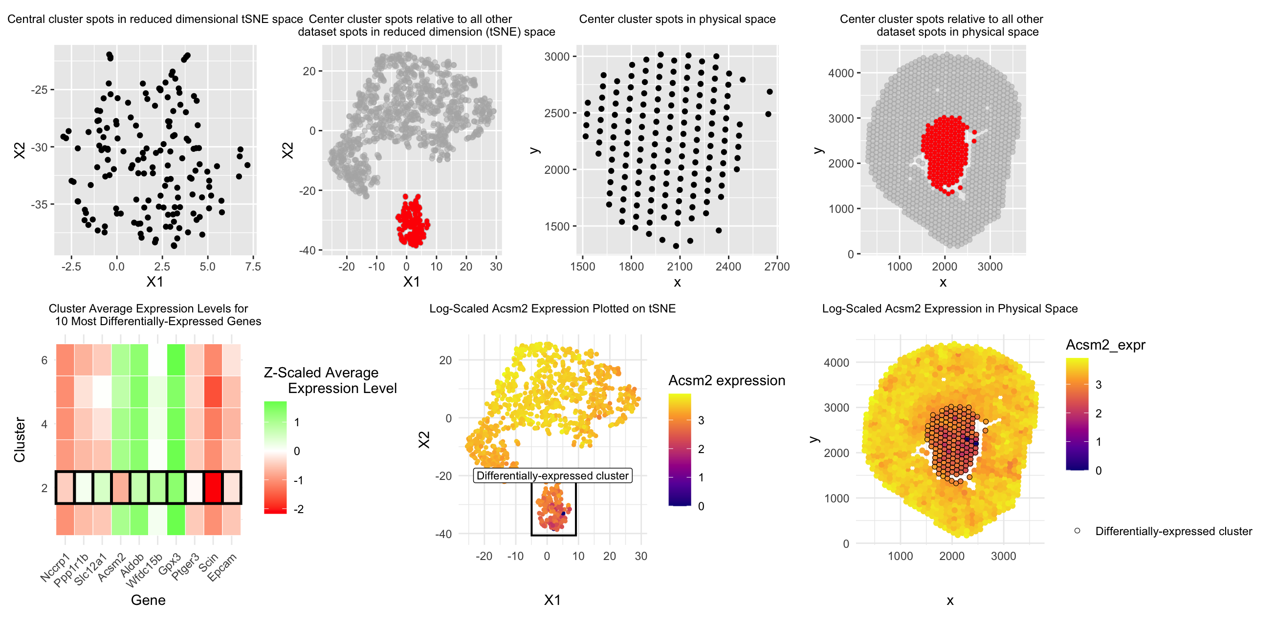
Moving from top down and left to right, the first and second graphs are meant to answer prompt #1, which asks us to represent one cluster of interest in reduced dimensional space. I chose to represent my cluster of choice (the most central cluster in physical space when dividing into 6 clusters) in 2D tSNE reduced dimensional space by simply plotting each of the spots in that cluster on the tSNE X1 and X2 axes (1st graph) as well as plotting the whole dataset of spots on the tSNE X1 and X2 axes while highlighting the spots belonging to the central cluster in red (2nd graph). Similarly, for the second prompt, I represented this central cluster in physical space first by simply plotting each spot in that cluster along the x and y axis (3rd graph), as well as plotting all spots in the dataset on the x and y axis while highlighting the spots in our central cluster in red (4th graph) to put that cluster’s position into context of the whole tissue sample.
For the third prompt, in the 5th graph I decided to represent the expression levels of the top ten most differentially-expressed genes (determined by p-value) for each gene and each of the clusters. Expression level was Z-score scaled in order to be relative to each gene and color-coded (red = low expression and green = high expression). To emphasize which row corresponded to our central cluster of interest, I used the principle of enclosure to surround each box in the central cluster row with a black outline to make it salient to the reader which cluster had significantly differential expression of these genes compared to the other 5 clusters.
For the final two prompts, I decided to focus on the Acsm2 gene from our top ten most differentially-expressed genes for the central cluster, as the central cluster was the only cluster to express a negative/”low” level of that gene compared to all other 5 clusters in graph #5, so I was interested in learning more about this difference. For prompt #4, in order to visualize differentially expressed Acsm2 in reduced dimensional space, in graph #6 I plotted all dataset spots on 2D tSNE X1 and X2, color-coded by log-scaled Acsm2 expression, and once again used the principle of enclosure to make a box outlining which spots belonged to our differentially-expressed central cluster of interest.
For prompt #5, in graph #7 I once again plotted all dataset spots on the x and y physical space axis, color-coded by log-scaled Acsm2 expression, and used the principle of enclosure to draw a black outline around the spots belonging to the differentially-expressed central cluster. By doing this, I hoped to make it more salient to the viewer how this central cluster did have spots with visibly less yellow/”more purple” colors, confirming that this cluster indeed showed lower levels of Acsm2 expression compared to all other clusters.
According to prior literature, Acsm2 is a gene expressed almost exclusively in mouse kidney proximal tubules (1). Its gene name is short for acyl-CoA synthetase medium-chain family member 2 (2), as it assists with the process of beta-oxidation to help mitochondria energize the cell (1). Acsm2 is regarded as a proximal tubule differentiation marker that increases in expression after 2 weeks post-birth as proximal tubules mature (1,3,4). Additionally, low Acsm2 expression has been associated with kidney injury (1,4). Higher Acsm2 expression was found in a prior study to occur more in the kidney cortex (1) (the outer layer of cells shown in our dataset), which corresponds to our finding that Acsm2 was underexpressed in the central-most cluster compared to the outer/cortex spots. Another study that also found that “proliferated and less fully-differentiated (proximal tubule cell) phenotypes” were greater in number following kidney injury (5), which supports the idea that this proximal tubule cell phenotype prior to proximal tubule maturation and during kidney injury both may have decreased Acsm2 expression. Thus, based on this data, we conclude that the spots highlighted in the “central cluster” in the code below are comprised of more of these less-differentiated/proliferative/immature proximal tubule cell types compared to the clusters in other, more outer regions of the kidney. While there is not a lot of literature on this mouse proximal tubule cell subtype yet, these studies show an association between low Acsm2 expression and relative immaturity of proximal tubule cells, supporting this conclusion.
Literature sources:
- https://pmc.ncbi.nlm.nih.gov/articles/PMC7642889/
- https://www.cell.com/cell-metabolism/fulltext/S1550-4131(23)00475-8
- https://www.nature.com/articles/s41467-022-31772-9
- https://pmc.ncbi.nlm.nih.gov/articles/PMC8791845/
- https://www.nature.com/articles/s41598-024-73102-7
Code:
```r
#Sofia Arboleda HW 3 - 2/8/2026
library(patchwork) library(ggplot2)
#Using code we discussed together in the in-class examples:
data <- read.csv(“~/Desktop/Visium-IRI-ShamR_matrix.csv.gz”)
positions <- data[,c(‘x’, ‘y’)] rownames(positions) <- data[,1] gene_exp <- data[, 4:ncol(data)] rownames(gene_exp) <- data[,1]
#Normalizing total gene expression data total_gene_exp <- rowSums(gene_exp) mat <- log10(gene_exp/total_gene_exp * 1e6 + 1) #Log transform to make more Gaussian distributed and interpretable, get rid of NaN points df <- data.frame(positions, total_gene_exp)
#Dimensionality reduction
#Linear DR: PCA PCs <- prcomp(mat, center = TRUE, scale = FALSE) print(PCs$rotation[1:5,1:5]) #show 1st 5 PC’s gene loading for 1st 5 genes; rotation = loading plot(PCs$sdev[1:25]) #dips at some point where PC’s are not capturing much more variance in the data; we see plateau at around PC 7 df <- data.frame(PCs$x, total_gene_exp)
#Nonlinear DR: tSNE on top 7 PCs top_PCs <- PCs$x[, 1:7] tsne <- Rtsne::Rtsne(top_PCs, dims = 2, perplexity = 30) emb <- tsne$Y df <- data.frame(emb, total_gene_exp)
#K means clustering of tSNE data clusters <- as.factor(kmeans(tsne$Y, centers = 6)$cluster) #centers = selected k cell_data <- data.frame(emb, clusters, top_PCs, positions) ggplot(cell_data, aes(x=X1, y=X2, col=clusters)) + geom_point() ggplot(cell_data, aes(x=x, y=y, col=clusters)) + geom_point()
#With help from ChatGPT (prompt = “How to set a variable describing the cluster with the smallest average distance from each cell in the cluster to the x and y origin in order to create a separate dataframe with the cell data for that cluster only” and “Why does center_clusters only show tSNE data and total gene expression data?”) cell_data$dist_to_center <- sqrt(((cell_data$x) - 2250)^2 + ((cell_data$y) - 2250)^2) #changed to (2250, 2250) since this was my estimate for center point of graph which was more appropriate compared to origin cluster_mean_dist <- aggregate( #Adding distance to center data to cluster data dist_to_center ~ clusters, data = cell_data, FUN = mean ) closest_cluster <- cluster_mean_dist$clusters[ #Calculating which cluster is closest to center which.min(cluster_mean_dist$dist_to_center) ] center_cluster <- cell_data[cell_data$clusters == closest_cluster, ] #Creating new center cluster dataframe to isolate this cluster for graphing head(center_cluster)
1) Plotting our cluster of interest (center cluster) in reduced dimensional space (tSNE X1 vs. X2)
#With help from ChatGPT (prompt = “How can I plot the cells of the center cluster in a different color from the rest of the cells when plotting all the cells in tSNE X1 vs. X2” plot1 <- ggplot(center_cluster, aes(x=X1, y=X2)) + geom_point() + labs(title = “Central cluster spots in reduced dimensional tSNE space”) + theme( plot.title = element_text(hjust = 0.5, size = 9) ) plot2 <- ggplot(cell_data, aes(x = X1, y = X2)) + geom_point(color = “grey70”, alpha = 0.5) + geom_point( data = center_cluster, aes(x = X1, y = X2), color = “red”, size = 1 ) + coord_fixed() + labs(title = “Center cluster spots relative to all other dataset spots in reduced dimension (tSNE) space”) + theme(plot.title = element_text(hjust = 0.5, size = 9))
2) Plotting our cluster of interest (center cluster) in physical space (x coordinate vs. y coordinate)
#With help from ChatGPT (prompt = “How to change title size”) plot3 <- ggplot(center_cluster, aes(x=x, y=y)) + geom_point() + ggtitle(“Center cluster spots in physical space”) + theme( plot.title = element_text(hjust = 0.5, size = 9) ) #With help from ChatGPT (prompt = “How can I plot the cells of the center cluster in a different color from the rest of the cells when plotting all the cells in physical space (x vs. y coordinates)” and “How to center a title in ggplot” and “How to change title size”) plot4 <- ggplot(cell_data, aes(x = x, y = y)) + geom_point(color = “grey70”, alpha = 0.5) + geom_point( data = center_cluster, aes(x = x, y = y), color = “red”, size = 1 ) + coord_fixed() + labs(title = “Center cluster spots relative to all other dataset spots in physical space”) + theme(plot.title = element_text(hjust = 0.5, size = 9))
3) A panel visualizing differentially expressed genes for your cluster of interest
#With help from in-class code from lecture 6 & ChatGPT (prompt = “In order to run a Wilcox test, separate our normalized cell expression data into that which belongs to our center cluster and that which belongs to all the other cells/clusters”) center_cells <- rownames(center_cluster) non_center_cells <- rownames(cell_data)[!rownames(cell_data) %in% center_cells] out <- sapply(colnames(mat), function(gene) { x1 <- mat[center_cells, gene] x2 <- mat[non_center_cells, gene] wilcox.test(x1, x2, alternative=’two.sided’)$p.value }) #With help from ChatGPT (prompt = “Given this code for applying a Wilcox test to all genes in the dataset, how can I extract the top 10 genes with the lowest p-value from the Wilcox test?”) wilcox_p_values <- data.frame( gene = names(out), p_value = out, stringsAsFactors = FALSE ) top10_DE_genes <- wilcox_p_values[order(wilcox_p_values$p_value), ][1:10, ] top10_DE_genes
#With help from ChatGPT (prompt = “Can you make a “heatmap” style plot with each cluster’s average expression level for our top 10 most significantly differentially-expressed genes, with blue representing significant underexpression and red representing significant overexpression” and “Can you highlight the closest_cluster row by enclosing it with a box or black outline”) top10_gene_names <- top10_DE_genes$gene #Calculating average expression level for the top 10 genes to compare across clusters in “heatmap” style plot expr_df <- data.frame(mat[, top10_gene_names], cluster = cell_data$clusters) library(dplyr) avg_expr <- expr_df %>% group_by(cluster) %>% summarise(across(all_of(top10_gene_names), mean)) avg_expr_mat <- as.matrix(avg_expr[, -1]) rownames(avg_expr_mat) <- avg_expr$cluster #Scaling expression data by each gene so expression levels relative within genes scaled_expr <- t(scale(t(avg_expr_mat))) #Reformatting to be able to plot in ggplot library(reshape2) melted_expr <- melt(scaled_expr) colnames(melted_expr) <- c(“Cluster”, “Gene”, “Expression”) melted_expr$highlight <- melted_expr$Cluster == closest_cluster #Plotting relative gene expression data for each cluster for each of the top 10 genes and color coding by over vs. underexpression plot5 <- ggplot(melted_expr, aes(x = Gene, y = Cluster, fill = Expression)) + geom_tile(color = “white”) + #Making lines around center (significant) cluster bolded to highlight differential expression between this cluster and the other clusters geom_tile(data = subset(melted_expr, highlight), aes(x = Gene, y = Cluster), fill = NA, color = “black”, size = 1) + scale_fill_gradient2( low = “red”, mid = “white”, high = “green”, #red = low expression, green = high expression midpoint = 0 ) + theme_minimal() + theme( axis.text.x = element_text(angle = 45, hjust = 1), plot.title = element_text(hjust = 0.5, size = 9) ) + labs( title = “Cluster Average Expression Levels for 10 Most Differentially-Expressed Genes”, fill = “Z-Scaled Average Expression Level” )
4) A panel visualizing one of these genes in reduced dimensional space (PCA, tSNE, etc)
#Visualizing Acsm2 in reduced dimensional space (tSNE) #With help from ChatGPT (prompt = “Can you plot all spots on tSNE X1 vs. X2 and color code by expression levels of Acsm2 while enclosing spots included in the closest_cluster in a black outline?” and “Make the center of the rectangle and label shift according to the average x and y value of the spots in closest_cluster”) #With help from GoogleAI output (prompt = “How to overlay a square on a ggplot”, “How to make ggplot square have transparent fill”, and “How to add a label to a ggplot square”) cell_data$Acsm2_expr <- mat[rownames(cell_data), “Acsm2”]
cluster_bounds <- cell_data %>% filter(clusters == closest_cluster) %>% #Finding bounds of cluster to help create enclosure to highlight differentially-expressed cluster summarise( xmin = min(X1), xmax = max(X1), ymin = min(X2), ymax = max(X2), x_center = mean(X1), y_center = max(X2) + 2 )
plot6 <- ggplot(cell_data, aes(x = X1, y = X2)) + geom_point(aes(color = Acsm2_expr), size = 1) + geom_rect( #Making rectangle to enclose differentially-expressed cluster; coordinates move as cluster tSNE coordinates change with each run of tSNE data = cluster_bounds, inherit.aes = FALSE, aes(xmin = xmin-2, xmax = xmax+2, ymin = ymin-2, ymax = ymax+2), fill = NA, color = “black”, linewidth = 0.7 ) + geom_label( data = cluster_bounds, inherit.aes = FALSE, aes(x = x_center, y = y_center), label = “Differentially-expressed cluster”, color = “black”, fill = “white”, size = 3 ) + scale_color_viridis_c(option = “plasma”) + theme_minimal() + labs( title = “Log-Scaled Acsm2 Expression Plotted on tSNE”, color = “Acsm2 expression” ) + theme(plot.title = element_text(hjust = 0.5, size = 9))
5) A panel visualizing one of these genes in space
#Visualizing Acsm2 expression in physical space
#With help from ChatGPT (prompt = “How can I make a ggplot of each spot in physical space (x vs. y coordinates) where all the spots within cluster 1 are enclosed by black outlines” and “How to add legend element mentioning that black outlines correspond to the differentially-expressed cluster”)
plot7 <- ggplot(cell_data, aes(x=x, y=y)) + geom_point(aes(color = Acsm2_expr), size = 1.5) +
geom_point(
data = subset(cell_data, clusters == closest_cluster),
aes(shape = “Differentially-expressed cluster”),
fill = NA,
color = “black”,
stroke = 0.3,
size = 1.6) +
scale_color_viridis_c(option = “plasma”) +
theme_minimal() +
labs(
title = “Log-Scaled Acsm2 Expression in Physical Space”,
shape = “”
) +
scale_shape_manual(
values = c(“Differentially-expressed cluster” = 21)
) +
theme(
plot.title = element_text(hjust = 0.5, size = 9)
)
#With help from ChatGPT (prompt = “How to confine each plot to take a certain amount of space”) combined <- (plot1 + plot2 + plot3 + plot4) / (plot5 + plot6 + plot7) combined <- combined + plot_layout(heights = c(2, 1)) combined <- (plot1 + plot2 + plot3 + plot4 + plot_layout(widths = c(1,1,1,1))) / (plot5 + plot6 + plot7 + plot_layout(widths = c(2,2,2))) combined
’’’