Identification of Proximal Tubule Cells in Kidney Tissue

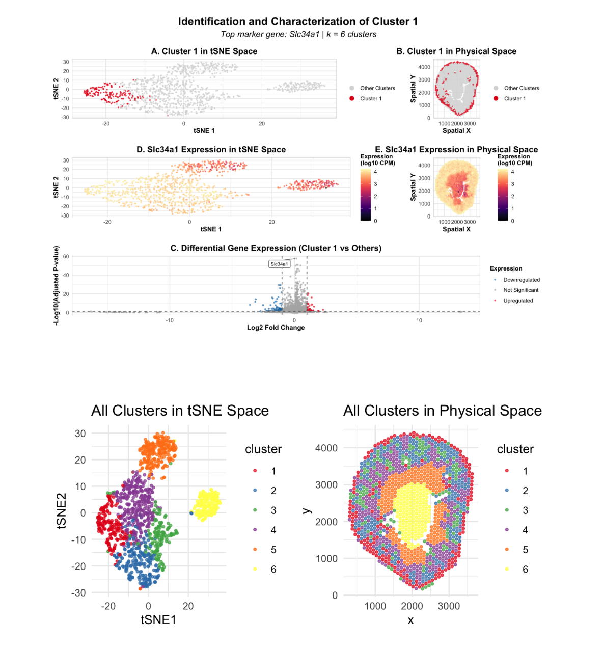
In this data visualization, I explored the gene expression patterns of Cluster 2 from a Visium spatial transcriptomics dataset of kidney tissue. The visualization consists of five integrated panels that together tell the story of cluster identification and characterization. The two uppermost panels (A and B) highlight the cluster of interest by showing Cluster 2 cells as red points against a grey background of other clusters, displayed in both tSNE embedding space and physical tissue space, respectively. I identified 6 total clusters using k-means clustering, with k=6 determined by analyzing the elbow plot of within-cluster sum of squares. The middle panels (D and E) focus on the expression of Slc34a3, a top marker gene characteristic of Cluster 2. These panels use a color gradient from purple (low expression) to yellow (high expression) to visualize gene expression levels. Comparing these middle plots to the upper panels reveals that Slc34a3 expression strongly localizes to the spatial location of Cluster 2, demonstrating marker specificity. The bottom panel (C) presents a volcano plot visualizing differentially expressed genes in Cluster 2 compared to all other clusters. Red points represent upregulated genes, blue represents downregulated genes, and grey represents non-significant genes. The most statistically significant genes are labeled. Based on this analysis, I conclude that Cluster 2 represents proximal tubule cells in the kidney. This interpretation is strongly supported by the high expression of Slc34a3 (sodium-phosphate cotransporter), which according to the Human Protein Atlas, is highly enriched in kidney proximal tubules. Additional top upregulated genes include Lrp2 (megalin), Pck1 (PEPCK), and Slc5a2, which are all consistent with proximal tubule reabsorption function. Furthermore, the spatial distribution of this cluster—displaying tubular patterns concentrated in the outer cortical region—matches the known anatomical location of proximal tubules in the kidney, providing additional validation of this cell-type annotation. Resources:
Slc34a3 expression: https://www.proteinatlas.org/ENSG00000198569-SLC34A3/tissue Lrp2 single-cell data: https://www.proteinatlas.org/ENSG00000160213-LRP2/single+cell Pck1 tissue expression: https://www.proteinatlas.org/ENSG00000124253-PCK1/tissue
Code
1
2
3
4
5
6
7
8
9
10
11
12
13
14
15
16
17
18
19
20
21
22
23
24
25
26
27
28
29
30
31
32
33
34
35
36
37
38
39
40
41
42
43
44
45
46
47
48
49
50
51
52
53
54
55
56
57
58
59
60
61
62
63
64
65
66
67
68
69
70
71
72
73
74
75
76
77
78
79
80
81
82
83
84
85
86
87
88
89
90
91
92
93
94
95
96
97
98
99
100
101
102
103
104
105
106
107
108
109
110
111
112
113
114
115
116
117
118
119
120
121
122
123
124
125
126
127
128
129
130
131
132
133
134
135
136
137
138
139
140
141
142
143
144
145
146
147
148
149
150
151
152
153
154
155
156
157
158
159
160
161
162
163
164
165
166
167
168
169
170
171
172
173

#load required packages
library(ggplot2)
library(patchwork)
library(Rtsne)
library(ggrepel)
library(viridis)

#data loading
data <- read.csv('~/Documents/GitHub/genomic-data-visualization-2026/data/Visium-IRI-ShamR_matrix.csv.gz')
pos <- data[, c('x', 'y')]
rownames(pos) <- data[, 1]
gexp <- data[, 4:ncol(data)]
rownames(gexp) <- data[, 1]

#normalization
totgexp <- rowSums(gexp)
mat <- log10(gexp / totgexp * 1e6 + 1)

#PCA
pcs <- prcomp(mat, center = TRUE, scale = FALSE)
toppcs <- pcs$x[, 1:10]

#tSNE
set.seed(123)
tsne <- Rtsne::Rtsne(toppcs, dims = 2, perplexity = 30)
emb <- tsne$Y
colnames(emb) <- c('tSNE1', 'tSNE2')

#k-means clustering
optimal_k <- 6
set.seed(123)
km <- kmeans(toppcs, centers = optimal_k, nstart = 25, iter.max = 100)
cluster <- as.factor(km$cluster)

#create master dataframe
df <- data.frame(pos, emb, cluster, toppcs, totgexp)

#visualize clusters
p_all_tsne <- ggplot(df, aes(x = tSNE1, y = tSNE2, col = cluster)) +
  geom_point(size = 0.8, alpha = 0.7) +
  scale_color_brewer(palette = "Set1") +
  theme_minimal() +
  labs(title = "All Clusters in tSNE Space")

p_all_space <- ggplot(df, aes(x = x, y = y, col = cluster)) +
  geom_point(size = 0.8, alpha = 0.7) +
  scale_color_brewer(palette = "Set1") +
  coord_fixed() +
  theme_minimal() +
  labs(title = "All Clusters in Physical Space")

print(p_all_tsne | p_all_space)

#select cluster
cluster_of_interest <- 1
in_cluster <- df$cluster == cluster_of_interest

#differential expression
mean_in <- colMeans(mat[in_cluster, ])
mean_out <- colMeans(mat[!in_cluster, ])
logFC <- log2((mean_in + 1e-6) / (mean_out + 1e-6))

pvals <- sapply(colnames(mat), function(gene) {
  wilcox.test(mat[in_cluster, gene], mat[!in_cluster, gene])$p.value
})

pvals_adj <- p.adjust(pvals, method = "BH")
top_genes <- names(sort(pvals_adj))[1:20]

#select marker gene
marker_gene <- top_genes[1]

#volcano plot
volcano_df <- data.frame(
  gene = colnames(mat),
  logFC = logFC,
  neglog10p = -log10(pvals_adj + 1e-300)
)

volcano_df$category <- "Not Significant"
volcano_df$category[volcano_df$logFC > 1 & pvals_adj < 0.05] <- "Upregulated"
volcano_df$category[volcano_df$logFC < -1 & pvals_adj < 0.05] <- "Downregulated"

genes_to_label <- volcano_df[order(pvals_adj)[1:10], ]

#theme
my_theme <- theme_minimal() +
  theme(
    plot.title = element_text(size = 14, face = "bold", hjust = 0.5),
    axis.title = element_text(size = 11, face = "bold"),
    axis.text = element_text(size = 9),
    legend.title = element_text(size = 10, face = "bold"),
    legend.text = element_text(size = 9),
    panel.border = element_rect(color = "grey80", fill = NA, linewidth = 0.5),
    plot.margin = margin(10, 10, 10, 10)
  )

#panel 1: cluster in tSNE
p1 <- ggplot(df, aes(x = tSNE1, y = tSNE2)) +
  geom_point(aes(color = cluster == cluster_of_interest), size = 0.6, alpha = 0.7) +
  scale_color_manual(values = c("grey85", "#E31A1C"),
                     labels = c("Other Clusters", paste("Cluster", cluster_of_interest)),
                     name = "") +
  labs(title = paste("A. Cluster", cluster_of_interest, "in tSNE Space"),
       x = "tSNE 1", y = "tSNE 2") +
  my_theme +
  guides(color = guide_legend(override.aes = list(size = 3, alpha = 1)))

#panel 2: cluster in physical space
p2 <- ggplot(df, aes(x = x, y = y)) +
  geom_point(aes(color = cluster == cluster_of_interest), size = 0.6, alpha = 0.7) +
  scale_color_manual(values = c("grey85", "#E31A1C"),
                     labels = c("Other Clusters", paste("Cluster", cluster_of_interest)),
                     name = "") +
  coord_fixed() +
  labs(title = paste("B. Cluster", cluster_of_interest, "in Physical Space"),
       x = "Spatial X", y = "Spatial Y") +
  my_theme +
  guides(color = guide_legend(override.aes = list(size = 3, alpha = 1)))

#panel 3: volcano plot
p3 <- ggplot(volcano_df, aes(x = logFC, y = neglog10p)) +
  geom_point(aes(color = category), size = 0.8, alpha = 0.6) +
  geom_hline(yintercept = -log10(0.05), linetype = "dashed", color = "grey40", linewidth = 0.5) +
  geom_vline(xintercept = c(-1, 1), linetype = "dashed", color = "grey40", linewidth = 0.5) +
  geom_label_repel(data = genes_to_label, aes(label = gene), size = 2.8,
                   box.padding = 0.5, point.padding = 0.3, segment.size = 0.3,
                   max.overlaps = 15, min.segment.length = 0, force = 2) +
  scale_color_manual(values = c("Upregulated" = "#E31A1C",
                                "Downregulated" = "#1F78B4",
                                "Not Significant" = "grey70"),
                     name = "Expression") +
  labs(title = paste("C. Differential Gene Expression (Cluster", cluster_of_interest, "vs Others)"),
       x = "Log2 Fold Change", y = "-Log10(Adjusted P-value)") +
  my_theme +
  theme(legend.position = "right")

#panel 4: marker gene in tSNE
df$marker_expr <- mat[, marker_gene]

p4 <- ggplot(df, aes(x = tSNE1, y = tSNE2, color = marker_expr)) +
  geom_point(size = 0.6, alpha = 0.7) +
  scale_color_viridis(option = "magma", name = "Expression\n(log10 CPM)") +
  labs(title = paste("D.", marker_gene, "Expression in tSNE Space"),
       x = "tSNE 1", y = "tSNE 2") +
  my_theme +
  theme(legend.position = "right")

#panel 5: marker gene in physical space
p5 <- ggplot(df, aes(x = x, y = y, color = marker_expr)) +
  geom_point(size = 0.6, alpha = 0.7) +
  scale_color_viridis(option = "magma", name = "Expression\n(log10 CPM)") +
  coord_fixed() +
  labs(title = paste("E.", marker_gene, "Expression in Physical Space"),
       x = "Spatial X", y = "Spatial Y") +
  my_theme +
  theme(legend.position = "right")

#final figure
final_figure <- (p1 | p2) / (p4 | p5) / p3 +
  plot_annotation(
    title = paste("Identification and Characterization of Cluster", cluster_of_interest),
    subtitle = paste("Top marker gene:", marker_gene, "| k =", optimal_k, "clusters"),
    theme = theme(plot.title = element_text(size = 18, face = "bold", hjust = 0.5),
                  plot.subtitle = element_text(size = 14, hjust = 0.5, face = "italic"))
  )

print(final_figure)

#save figure
ggsave("final_genomic_visualization.png", plot = final_figure,
       width = 14, height = 16, dpi = 300, bg = "white")
AI Prompts
help me complete code for the assignment specifications. i have given a student example, and the class code. make sure to include everything in one pannel. take into account Gestault principles and ways to make the data salient.