HW3

Description
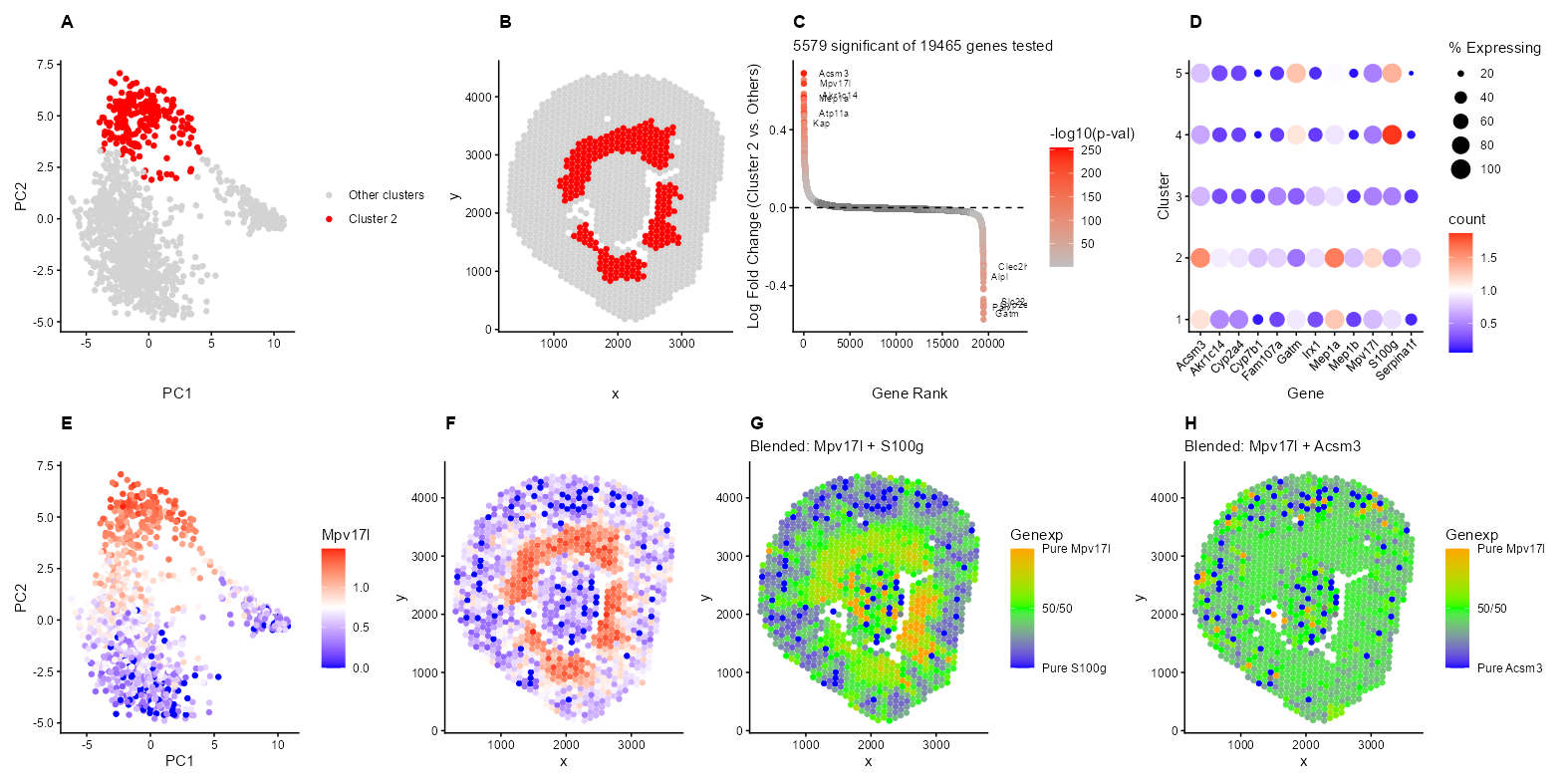
I’m depicting the identification and characterization of Cluster 2 in the Visium spatial transcriptomics data from a mouse kidney sample. The top row shows the discovery and validation of this cluster. Panel A shows Cluster 2 (red) standing out in PCA space, indicating it has a distinct transcriptional profile from other kidney regions in PC1 and PC2. Panel B reveals the spatial pattern within the kidney, where these spots form a ring around the middle of the kidney structure, separated by the holes with no Visium spots. Panel C is a ranked differential expression plot with 5,579 significant genes and top markers including Acsm3, S100g, Gatm, and Kap. All genes are ordered by logFC, highest to lowest, on the x-axis, and the y-axis shows the log fold change. The color shows the -log10(p-value), but only for significant genes (p < 0.05) using the t-test. Non-significant genes are gray. Panel D is a dotplot showing that these markers are specific to Cluster 2, with differing expression patterns in other clusters. The color hue/saturation shows the mean expression level of the gene in that cluster, while the dot size shows the percentage of spots expressing the gene in that cluster.
The bottom row validates the spatial coherence of this cluster through gene expression patterns. Panels E-H focus on Mpv17l expression, which localizes to the same peripheral ring region seen in Panel B. The blend plots (G-H) provide additional insight into marker co-expression patterns. Panel G shows the expression ratio of Mpv17l and S100g (with blue indicating S100g-dominated spots, orange indicating Mpv17l-dominated spots, and green being equal expression levels (~1:1 ratio) of both genes. The spatial distribution reveals distinct domains of S100g expression in one region and Mpv17l expression in another, with a transition zone of green at the boundary where both genes are expressed at similar levels. This might suggest that these genes are adjacent, but not really overlapping cell populations with a defined interface. In contrast, Panel H demonstrates that Mpv17l and Acsm3 show extensive yellow/green throughout the peripheral ring, which implies a balanced expression of both genes across the same region rather than segregation into distinct domains.
I believe that my cluster corresponds to the S3 segment of the Proximal Tubule (Proximal Straight Tubule). This interpretation is strongly supported by several key marker genes identified in Panels C and D. Kap (Kidney Androgen-regulated Protein) is one of the most specific markers for the S3 segment of the proximal tubule in mice and is shown as significant and highly expressed in Panel C. This marker was definitively identified as a PST marker in the comprehensive single-cell atlas by Miao et al., who state ‘Kap for proximal straight tubules (PST)’ in their characterization of mouse kidney cell types (Miao, Z., Balzer, M.S., Ma, Z. et al. Single cell regulatory landscape of the mouse kidney highlights cellular differentiation programs and disease targets. Nat Commun 12, 2277 (2021). https://doi.org/10.1038/s41467-021-22266-1).
Mpv17l provides some evidence for the S3 segment identity. This gene is highly upregulated in this cluster, as seen in Panels C, D, E, and F and is known to be enriched in the proximal tubule S3 segment. Mpv17l localizes to the mitochondria of kidney proximal tubular epithelial cells, which is particularly relevant given that the S3 segment has high mitochondrial density compared to other kidney segments to support its intense metabolic activity (Iida, R., & Yasuda, T. (2025). Overview of M-LP/MPV17L, a novel atypical PDE and possible target for drug development. European Journal of Pharmacology, 996, 177569. doi:10.1016/j.ejphar.2025.177569). Furthermore, Acsm3 and Gatm serve as characteristic markers of the proximal tubule, specifically associated with metabolic functions found in the straight portion. These genes reflect the intense metabolic activity and specialized transport functions of the S3 segment (Tissue expression of ASCM3 - Staining in kidney - The Human Protein Atlas, https://www.proteinatlas.org/ENSG00000005187-ACSM3/tissue/kidney; Tissue expression of GATM - Staining in kidney https://www.proteinatlas.org/ENSG00000171766-GATM/tissue/kidney). I found that many of my genes tend to relate back to metabolic activity, which makes sense due to the straight proximal tubule role of glucose reabsorption and metabolism ( Melanie P Hoenig, Craig R Brooks, Ewout J Hoorn, Andrew M Hall, Biology of the proximal tubule in body homeostasis and kidney disease, Nephrology Dialysis Transplantation, Volume 40, Issue 2, February 2025, Pages 234–243, https://doi.org/10.1093/ndt/gfae177).
The negative markers provide additional support for this interpretation. Panel G shows a blended plot of Mpv17l (Cluster 2 marker) versus S100g (a marker for the Connecting Tubule/Distal Tubule segments). The limited colocalization of Mpv17l and S100g in the Visium data likely represents the physical boundary where the S3 proximal tubules and distal nephron segments, including distal convoluted tubule cells, renal connecting tubule cells, and renal collecting duct principal and intercalated cells, converge within the outer medulla (https://www.proteinatlas.org/ENSG00000169906-S100G/tissue/kidney). Since Visium spots capture 55um spots, these overlapping signals usually reflect the tight spatial packing of distinct tubule types rather than a single cell expressing both markers. The S3 segment transitions to distal structures in the outer medulla (http://hsc.edu.kw/student/materials/course_notes/renal/OutAnat.htm), creating regions where both cell types may be captured within the same Visium spot despite being functionally and transcriptionally distinct populations.
In HW1, I showed with the UpSet plot that spots can contain many cell types. My k-means clustering analysis (k=5) groups spots based on their dominant transcriptional signature rather than identifying pure cell populations. While I interpret Cluster 2 as primarily representing S3 proximal tubule cells based on Kap and Mpv17l, these spots likely contain a mixture of cell types. The tissue captured in each spot may include not only the predominant epithelial cells but also resident immune cells (macrophages, lymphocytes), endothelial cells, and fibroblasts. The simple k-means approach I used cannot separate these mixed cell populations as it can only identify the overall transcriptional neighborhood, which is usually dominated by the most abundant or transcriptionally active cell type. Therefore, my interpretation should be understood as identifying the predominant cell type in Cluster 2 rather than claiming these are pure S3 proximal tubule populations.
Code
set.seed(123)
library(proxy)
library(ggplot2)
library(patchwork)
library(tidyverse)

data <- read.csv('C:/users/lilli/Downloads/Visium-IRI-ShamR_matrix.csv.gz')

#gene expression data
gexp <- data[, 4:ncol(data)]
#rownames are the spots
rownames(gexp) <- data[,1]
#positions of the data
pos <- data[, c('x', 'y')]

#library size normalization (log10 transform)
total_genexp <- rowSums(gexp)
mat <- log10(gexp/total_genexp*1e4+1)

#perform kmeans on high dimensional space
kmeans_result <- kmeans(mat, centers = 5)

#perform PCA
pcs <- prcomp(mat, center=TRUE, scale=FALSE)

df<- data.frame(pcs$x, kmeans_result$cluster, mat, pos)

#plot of cluster in PCA space
p1<- ggplot(df, aes(x=PC1, y=PC2))+
  geom_point(aes(color=kmeans_result.cluster==2))+
  #I asked AI: "How do I get rid of the TRUE/FALSE legend?
  #How do I color cluster 2 red and grey everything else"
  scale_color_manual(values = c('TRUE' = 'red', 'FALSE' = 'lightgray'),
                     labels = c('TRUE' = 'Cluster 2', 'FALSE' = 'Other clusters'),
                     name = '') +
  theme_classic()+
  labs(title= 'A', x='PC1', y='PC2')+
  theme(plot.title = element_text(face = 'bold'))

#plot of cluster in physical space
p2<- ggplot(df, aes(x=x, y=y, colour = kmeans_result.cluster==2))+
geom_point()+
scale_color_manual(values = c('TRUE' = 'red', 'FALSE' = 'lightgray'),
                    labels = c('TRUE' = 'Cluster 2', 'FALSE' = 'Other clusters'),
                    name = '')+
theme_classic()+
labs(title= 'B', x='x', y='y')+
theme(plot.title = element_text(face = 'bold'))

assign_clus <- kmeans_result$cluster
#I am interested in cluster 2
in_clus <-names(assign_clus[assign_clus == 2])
out_clus <-setdiff(rownames(mat), in_clus)

#differential expression: t-test for each gene
p_values <- numeric(ncol(mat))
logFC <- numeric(ncol(mat))

for (i in 1:ncol(mat)) {
  group1 <- mat[in_clus, i]
  group2 <- mat[out_clus, i]

  #two-way t-test
  test <- t.test(group1, group2)
  p_values[i] <- test$p.value
  #I logged transformed the original data before
  logFC[i] <- mean(group1) - mean(group2)}

results <- data.frame(Gene = colnames(mat), logFC = logFC, p_value = p_values)

#filter significant genes (p < 0.05)
sig_genes <- subset(results, p_value < 0.05)

results <- results[order(results$logFC, decreasing = TRUE), ]
results$rank <- 1:nrow(results)
#following the y axis of the volcano plot
results$neg_log10_p <- -log10(results$p_value)
#only want the significant p-values colored
results$sig_neg_log10_p <- ifelse(rownames(results) %in% rownames(sig_genes), results$neg_log10_p, NA)

#I asked AI: I only want to label the top 6 genes in my results dataframe with the highest log fold change (upregulated and downregulated)
#that are statisitcally significant.

#6 most significant upregulated (lowest p-value among positive logFC)
up_sig <- results[results$logFC > 0, ]
up_sig <- up_sig[order(up_sig$p_value), ]
results$label[rownames(results) %in% rownames(up_sig)[1:6]] <- results$Gene[rownames(results) %in% rownames(up_sig)[1:6]]

#6 most significant downregulated (lowest p-value among negative logFC)
down_sig <- results[results$logFC < 0, ]
down_sig <- down_sig[order(down_sig$p_value), ]
results$label[rownames(results) %in% rownames(down_sig)[1:6]] <- results$Gene[rownames(results) %in% rownames(down_sig)[1:6]]

p3 <- ggplot(results, aes(x = rank, y = logFC)) +
  #made the color based on the p-value significance
  geom_point(aes(color = sig_neg_log10_p)) +
  #Asked AI: How to make my text not overlap?
  geom_text(aes(label = label), hjust = -0.5, size = 2.5) +
  geom_hline(yintercept = 0, linetype = 'dashed') +
  scale_color_gradient(low = 'gray', high = 'red', name = '-log10(p-val)')+
  theme_classic() +
  labs(title= 'C', subtitle = paste(nrow(sig_genes), 'significant of', nrow(results), 'genes tested'),
       x = 'Gene Rank',
       y = 'Log Fold Change (Cluster 2 vs. Others)') +
  theme(plot.title = element_text(face = 'bold'))+
  xlim(c(0, 23000))

cluster_ids <- sort(unique(assign_clus))

#data frame to hold all the information for dotplot
#source for making the dotplot: https://davemcg.github.io/post/lets-plot-scrna-dotplots/#lets-glue-them-together-with-cowplot
dotplot_data <- data.frame()

for (cluster_id in cluster_ids) {
  spots_in_cluster <- names(assign_clus[assign_clus == cluster_id])

  #calculate mean expression and %expressing in each gene
  #I am following the equations from the tutorial
  for (gene in colnames(mat)) {
    gene_values <- mat[spots_in_cluster, gene]
    mean_expr <- mean(gene_values)
    pct_expressing <- (sum(gene_values>0)/length(gene_values))*100
    spot_ct <- length(spots_in_cluster)
    #spots expressing
    spot_exp_ct <- sum(gene_values>0)

    #add to data frame
    dotplot_data <- rbind(dotplot_data, data.frame(
      Gene= gene,
      cluster=cluster_id,
      spot_ct=spot_ct,
      spot_exp_ct = spot_exp_ct,
      count = mean_expr,
      pct_expressing = pct_expressing))}}

#top genes by differential expression
#top 10 genes by absolute logFC
markers<- sig_genes[order(abs(sig_genes$logFC), decreasing = TRUE),]$Gene[1:12]

p4<- dotplot_data %>%
  filter(Gene %in% markers) %>%
  mutate(`% Expressing` = (spot_exp_ct/spot_ct) * 100) %>%
  ggplot(aes(x = Gene, y = cluster, color = count, size = `% Expressing`)) +
  theme_classic()+
  geom_point()+
  #from 2/11 class. Also documentation: https://ggplot2.tidyverse.org/reference/scale_gradient.html
  scale_color_gradient2(low = 'blue', mid= 'white', high = 'red',  midpoint = 1)+
  labs(title = 'D', x='Gene', y='Cluster')+
  #I search: How to angle text to fit on x-axis?
  theme(axis.text.x = element_text(angle = 45, hjust = 1),
        plot.title = element_text(face = 'bold'))

p5<- ggplot(df, aes(x=PC1, y=PC2, color = Mpv17l))+
  geom_point()+
  theme_classic()+
  scale_color_gradient2(low = 'blue', mid= 'white', high = 'red',  midpoint = 0.75)+
  labs(title = 'E', x='PC1', y='PC2')+
  theme(plot.title = element_text(face = 'bold'))

p6<- ggplot(df, aes(x=x, y=y, colour = Mpv17l))+
  geom_point()+
  theme_classic()+
  #Note: I had to actually look for the midpoint to assign it
  scale_color_gradient2(low = 'blue', mid= 'white', high = 'red',  midpoint = 0.75)+
  labs(title='F', x='x', y='y')+
  theme(plot.title = element_text(face = 'bold'))

#genes to blend
gene1 <- 'Mpv17l'
gene2 <- 'S100g'
gene3<- 'Acsm3'

df$gene1_expr <- mat[, gene1]
df$gene2_expr <- mat[, gene2]
df$gene3_expr <- mat[, gene3]

#get the ratio of the expression domanience of these 2 genes
df$blend_ratio_12 <- df$gene1_expr / (df$gene1_expr+ df$gene2_expr)
df$blend_ratio_13 <- df$gene1_expr / (df$gene1_expr+ df$gene3_expr)

p7<- ggplot(df, aes(x = x, y = y)) +
  geom_point(aes(color = blend_ratio_12)) +
  theme_classic()+
  #I asked AI: How to make a color gradiant legend?
  scale_color_gradient2(low = 'blue', mid='green', high = 'orange', midpoint=0.5,
                      name = 'Genexp',
                      breaks = c(0, 0.5, 1),
                      labels = c(paste0('Pure ', gene2), '50/50', paste0('Pure ', gene1)),
                      limits = c(0, 1))+
  labs(title = 'G', x='x', y='y', subtitle= paste('Blended:', gene1, '+', gene2)) +
  theme(plot.title = element_text(face = 'bold'))

p8<- ggplot(df, aes(x = x, y = y)) +
  geom_point(aes(color = blend_ratio_13)) +
  theme_classic()+
  scale_color_gradient2(low = 'blue', mid='green', high = 'orange', midpoint=0.5,
                      name = 'Genexp',
                      breaks = c(0, 0.5, 1),
                      labels = c(paste0('Pure ', gene3), '50/50', paste0('Pure ', gene1)),
                      limits = c(0, 1))+
  labs(title = 'H',  x='x', y='y', subtitle= paste('Blended:', gene1, '+', gene3)) +
  theme(plot.title = element_text(face = 'bold'))

p2 <- p2 + theme(legend.position = "none")
p6 <- p6 + theme(legend.position = "none")

#I asked AI: How to fit graphs that are getting cut off?
#I then experimented with some of the outputs
combined <- (p1 | p2 | p3 | p4) +
  plot_layout(widths = c(1,1,1,1)) +
  plot_annotation(theme = theme(plot.margin = margin(5, 5, 5, 5, "pt")))

#combine with bottom row
combined <- combined / (p5 | p6 | p7 | p8)+
  plot_layout(heights = c(3, 3))

#I asked AI: How to lower image size in r?
ggsave("hw3_llam9.png", combined, width = 40, height = 20, units = 'cm', dpi = 100, limitsize = FALSE)