A multipanel data visualization distinguishing the ascending loop of henle in mouse kidney tissue

Describe your figure briefly so we know what you are depicting (you no longer need to use precise data visualization terms as you have been doing). Write a description to convince me that your cluster interpretation is correct. Your description may reference papers and content that allowed you to interpret your cell cluster as a particular cell-type. You must provide attribution to external resources referenced. Links are fine; formatted references are not required. You must include the entire code you used to generate the figure so that it can be reproduced.
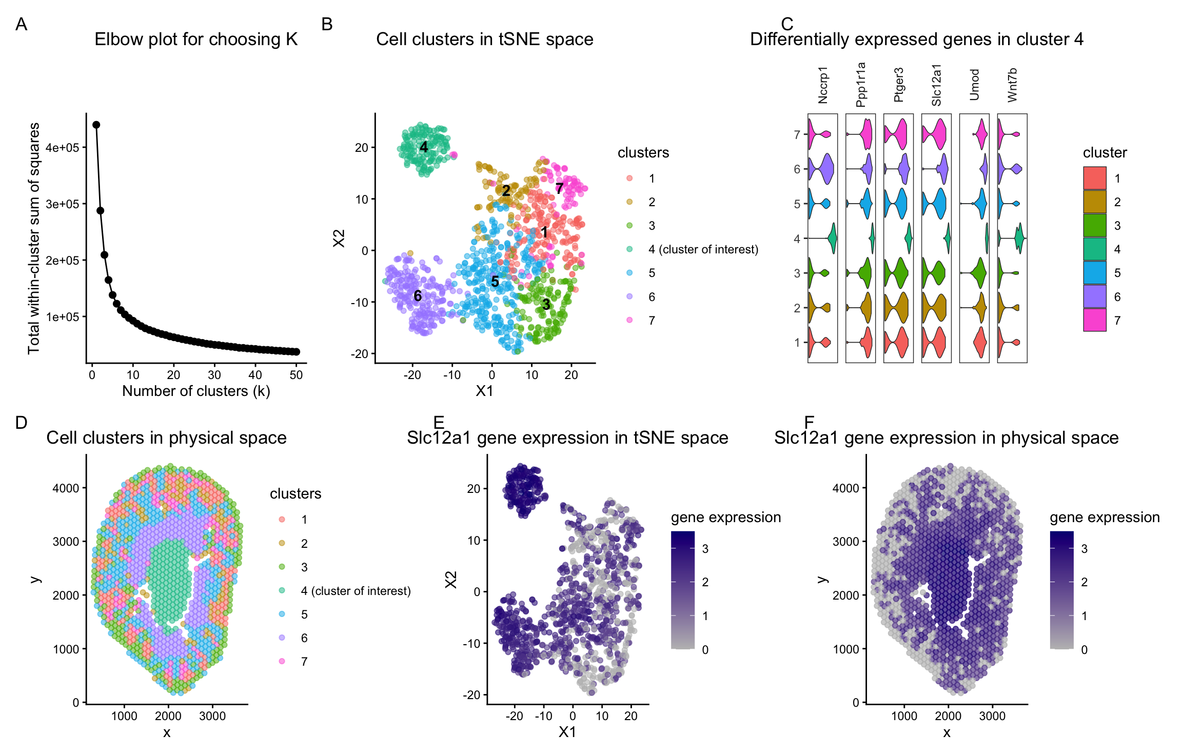
Identified cell type- Ascending Loop of Henle
In panels B and D of my figure, the identified clusters are visualized in both tSNE space and physical tissue space. Using k-means clustering on the top 10 principal components, I identified 7 clusters. To determine an appropriate value of k, I used the total withiness parameter and observed it on an elbow plot for different values of k. The decrease in total within-cluster sum of squares becomes marginal beyond k = 7, suggesting diminishing returns from additional clusters. I therefore picked 7 centers for dowstream analysis. I also confirmed whether with this number of k clusters could be meaningfully distinguished along at least one of the principal components used for clustering by visualizing it in reduced dimensional space.
Cluster 4 remained stable across increasing values of k in tSNE, PCA, and physical space. This suggests that it represents a transcriptionally distinct population. Because of its consistent separation, I focused further analysis on this cluster.
To characterize cluster 4, I performed differential expression analysis comparing cells in cluster 4 to all other clusters. This identified several upregulated genes, including Slc12a1 and Umod. These genes are described in the 2018 Science paper titled “Single-cell transcriptomics of the mouse kidney reveals potential cellular targets of kidney disease” (Park et al., 2018; https://www.science.org/doi/10.1126/science.aar2131). In Figure 1B of that paper, both Slc12a1 and Umod are shown to be marker genes for cells of the ascending loop of Henle in the kidney.
To further validate this interpretation, I visualized the expression of these differentially expressed genes using violin plots (panel C). The violins corresponding to cluster 4 are shifted toward higher expression values compared to other clusters, with greater density at those higher values. This indicates that a substantial proportion of cells in cluster 4 express these marker genes at elevated levels. Taken together, the consistent separation of cluster 4 across dimensionality reduction methods and its strong enrichment for known ascending loop of Henle marker genes support the interpretation that cluster 4 corresponds to ascending loop of Henle cells.
5. Code (paste your code in between the ``` symbols)
1
2
3
4
5
6
7
8
9
10
11
12
13
14
15
16
17
18
19
20
21
22
23
24
25
26
27
28
29
30
31
32
33
34
35
36
37
38
39
40
41
42
43
44
45
46
47
48
49
50
51
52
53
54
55
56
57
58
59
60
61
62
63
64
65
66
67
68
69
70
71
72
73
74
75
76
77
78
79
80
81
82
83
84
85
86
87
88
89
90
91
92
93
94
95
96
97
98
99
100
101
102
103
104
105
106
107
108
109
110
111
112
113
114
115
116
117
118
119
120
121
122
123
124
125
126
127
128
129
130
131
132
133
134
135
136
137
138
139
140
141
142
143
144
145
146
147
148
149
150
151
152
153
154
155
156
157
158
159
160
161
162
163
164
165
166
167
168
169
170
171
172
173
174
175
176
177
178
179
180
181
182
183
184
185
186
187
188
189
190
191
192
193
194
195
196
197
198
199
200
201
202
203
204
205
206
207
208
209
210
211
212
213
214
215
216
217
218
219
220
221
222
223
224
225
226
227
228
229
230
231
232
233
234
235
236
237
238
239
240
241
242
243
244
245
246
247
248
249
250
251
252
253
254
255
256
257
258
259
260
261
262
263
264
265
266
267
268
269
270
271
272
273
274
275
276
277
278
279
280
281
282
283
284
285
286
287
288
289
290
291
292
293
294
295
296
297
298
299
300

# load data
data <- read.csv("~/Documents/genomic-data-visualization-2026/data/Visium-IRI-ShamR_matrix.csv.gz")

# get the spatial positions
pos <- data[,c('x', 'y')]
rownames(pos) <- data[,1]

# get gene expression values
gexp <- data[, 4:ncol(data)]
rownames(gexp) <- data[,1]

# PLAN
#
# 1. Normalize and log transform.
# 2. dimensionality reduction PCA
# 3. tSNE
# 4. kmeans clustering- on first 5 PCs
# 5. statistical testing to identify differentially expressed genes
# 6. check what cell type the cluster could belong to.

# 1. perform normalization/ log-transform
totgexp= rowSums(gexp)
mat <- log10(gexp/totgexp *1e6 +1)

# 2. linear dimensionality reduction
pcs <- prcomp(mat)
# visualize PC
df <- data.frame(
  pos,
  pcs$x
)

# 3. tSNE
ts <- Rtsne::Rtsne(pcs$x[,1:10], dim=2)
names(ts)
emb <- ts$Y
df <- data.frame(
  emb,
  totgexp= totgexp
)

names(df)

# 4. clustering

# plot total withinness elbow plot to see an appropriate value for k
wcss <- numeric()
k_vals <- 1:50   # try k from 1 to 15

for (k in k_vals) {
  km <- kmeans(pcs$x[,1:5], centers = k, nstart = 25)
  wcss[k] <- km$tot.withinss
}

elbow_df <- data.frame(
  k = k_vals,
  WCSS = wcss
)

elbow_plot <- ggplot(elbow_df, aes(x = k, y = WCSS)) +
  geom_line() +
  geom_point(size = 2) +
  labs(
    title = "Elbow plot for choosing K",
    x = "Number of clusters (k)",
    y = "Total within-cluster sum of squares"
  ) +
  theme_classic() +
  theme(plot.title = element_text(hjust = 0.5))

set.seed(1) # for luster labels to remain the same throughout runs
clusters <- as.factor(kmeans(pcs$x[,1:5], centers= 7)$cluster)

# see how many cells are in each cluster
table(clusters)

df <- data.frame(
  emb,
  pos,
  clusters,
  totgexp= totgexp,
  gene=mat[,'Slc34a1'],
  pcs$x
)

################ VIEW CLUSTERS- IDENTIFY AN OPTIMUM K VALUE #######################

# clusters on physical spatial data
p_spatial <- ggplot(df, aes(x=x, y=y, col=clusters))+
  geom_point( alpha=0.5)+
  scale_colour_discrete(labels = function(x) ifelse(x == "4", "4 (cluster of interest)", x))+
  # scale_color_manual(values = cluster_colors)+
  labs(
    title= "Cell clusters in physical space"
  )+
  theme_classic() +
  theme(
    plot.title = element_text(hjust = 0.5)
  )

# clusters visualized against PC1 and PC2
# compute label positions
centroids_pc <- aggregate(cbind(PC1, PC2) ~ clusters, data = df, FUN = median)

p_pc_1_2 <- ggplot(df, aes(x = PC1, y = PC2, col = clusters)) +
  geom_point(alpha = 0.5) +
  scale_colour_discrete(labels = function(x) ifelse(x == "4", "4 (cluster of interest)", x))+
  # scale_color_manual(values = cluster_colors)+
  geom_text(
    data = centroids_pc,
    aes(x = PC1, y = PC2, label = clusters),
    inherit.aes = FALSE,
    color = "black",
    fontface = "bold",
    size = 4
  )+
  labs(
    title= "Cell clusters in PC space"
  )+
  theme_classic() +
  theme(
    plot.title = element_text(hjust = 0.5)
  )

# clusters visualized against tsne
# compute label positions
centroids_tsne <- aggregate(cbind(X1, X2) ~ clusters, data = df, FUN = median)

p_tsne <- ggplot(df, aes(x = X1, y = X2, col = clusters)) +
  geom_point(alpha = 0.5) +
  scale_colour_discrete(labels = function(x) ifelse(x == "4", "4 (cluster of interest)", x))+
  # scale_color_manual(values = cluster_colors)+
  geom_text(
    data = centroids_tsne,
    aes(x = X1, y = X2, label = clusters),
    inherit.aes = FALSE,
    color = "black",
    fontface = "bold",
    size = 4
  )+
  labs(
    title= "Cell clusters in tSNE space"
  )+
  theme_classic() +
  theme(
    plot.title = element_text(hjust = 0.5)
  )


################ CLUSTER OF INTEREST #######################

# identify cluster of interest as 4
clusterofinterest_a <- names(clusters)[clusters == 4]
clusterofinterest_b <- names(clusters)[clusters != 4]

# identify differentially expressed genes
out <- sapply(colnames(mat), function(gene){
  x1 <- mat[clusterofinterest_a,gene]
  x2 <- mat[clusterofinterest_b,gene]
  wilcox.test(x1, x2, alternative = "greater")$p.value
})

# the lower the P value, the greater the relative upregulation in x1 compared to x2
sort(out)[1:20]

# view the expression of a few of the top 20 differentially expressed genes within these clusters
df <- data.frame(
  gene1= mat[,'Nccrp1'],
  gene2= mat[,'Slc12a1'],
  gene3= mat[,'Ptger3'],
  gene4= mat[,'Ppp1r1a'],
  gene5= mat[,'Wnt7b'],
  gene6= mat[,'Umod'],
  pcs$x,
  pos,
  clusters,
  emb
)

library(ggplot2)

# pick genes to show
genes <- c("Nccrp1","Slc12a1","Ptger3","Ppp1r1a","Wnt7b","Umod")

# matrix of genes of interest and their expression in cells
expr_mat <- mat[, genes, drop = FALSE]

violin_df <- data.frame(
  cluster = rep(as.factor(clusters), times = length(genes)),
  gene    = rep(genes, each = nrow(expr_mat)),
  expr    = as.vector(as.matrix(expr_mat))
)

# optional: order clusters 1..K nicely
violin_df$cluster <- factor(violin_df$cluster, levels = sort(unique(as.integer(as.character(violin_df$cluster)))))

p_violin <- ggplot(violin_df, aes(x = cluster, y = expr, fill=cluster)) +
  geom_violin(scale = "width", trim = TRUE, linewidth = 0.25) +
  scale_colour_discrete(labels = function(x) ifelse(x == "4", "4 (cluster of interest)", x))+
  # scale_fill_manual(values = cluster_colors)
  coord_flip() +                              # makes violins horizontal (like your screenshot)
  facet_grid(. ~ gene, scales = "free_x") +    # one column per gene (thin panels)
  labs(
    title= "Differentially expressed genes in cluster 4"
  )+
  theme_bw() +
  theme(
    panel.grid = element_blank(),
    axis.title = element_blank(),
    strip.background = element_blank(),
    # strip.text.x = element_text(angle = 90, vjust = 0.5, hjust = 1),
    axis.text.x = element_blank(),
    axis.ticks.x = element_blank(),
    plot.margin = margin(5.5, 5.5, 5.5, 5.5),
    plot.title = element_text(hjust = 0.5),
    strip.text.x = element_text(angle = 90, vjust = 0.5, hjust = 0.5),
  )

library(patchwork)

p1 <- ggplot(df, aes(x= PC1, y= PC2, col= gene1))+ geom_point(alpha=0.6)+
  scale_colour_gradient(
    low = "grey",
    high = "darkblue"
  )
p2 <- ggplot(df, aes(x= PC1, y= PC2, col= gene2))+ geom_point(alpha=0.6)+
  scale_colour_gradient(
    low = "grey",
    high = "darkblue"
  )+
  labs(
    title= "Slc12a1 gene expression in PC space",
    col="gene expression"
  )+
  theme_classic() +
  theme(
    plot.title = element_text(hjust = 0.5)
  )
p3 <- ggplot(df, aes(x= PC1, y= PC2, col= gene3))+ geom_point(alpha=0.6)+
  scale_colour_gradient(
    low = "grey",
    high = "darkblue"
  )
p4 <- ggplot(df, aes(x= PC1, y= PC2, col= gene4))+ geom_point(alpha=0.6)+
  scale_colour_gradient(
    low = "grey",
    high = "darkblue"
  )
p5 <- ggplot(df, aes(x= PC1, y= PC2, col= gene5))+ geom_point(alpha=0.6)+
  scale_colour_gradient(
    low = "grey",
    high = "darkblue"
  )
p6 <- ggplot(df, aes(x= PC1, y= PC2, col= gene6))+ geom_point(alpha=0.6)+
  scale_colour_gradient(
    low = "grey",
    high = "darkblue"
  )

p7 <- ggplot(df, aes(x= X1, y= X2, col= gene2))+ geom_point(alpha=0.6)+
  scale_colour_gradient(
    low = "grey",
    high = "navyblue"
  )+
  labs(
    title= "Slc12a1 gene expression in tSNE space",
    col="gene expression"
  )+
  theme_classic() +
  theme(
    plot.title = element_text(hjust = 0.5)
  )

# multi panel visualization
((p1 | p2 | p3) / (p4| p5| p6)) +
  plot_annotation(
    tag_levels = "A",
    title= "Upregulation comparison focused on cluster 4"
  )

# chosen gene marker- Slc12a1
p2_spatial <- ggplot(df, aes(x=x, y=y, col=gene2))+
  geom_point(alpha=0.7)+
  scale_colour_gradient(
    low = "grey",
    high = "navyblue"
  )+
  labs(
    title= "Slc12a1 gene expression in physical space",
    col="gene expression"
  )+
  theme_classic() +
  theme(
    plot.title = element_text(hjust = 0.5)
  )

(elbow_plot|p_tsne|p_violin)/(p_spatial|p7|p2_spatial)+
  plot_annotation(tag_levels = "A")
6. Resources
I used R documentation and the ? help function on R itself to understand functions.
Park et al, “Single-cell transcriptomics of the mouse kidney reveals potential cellular targets of kidney disease,” Science 2018; https://www.science.org/doi/10.1126/science.aar2131
I used ChatGpt to help me add cluster labels on the clusters itself for easy of distinguidhing. he following is an example promt. “Add cluster labels on the clusters in the plot itself in addition to the legend.”