HW3

Discussion
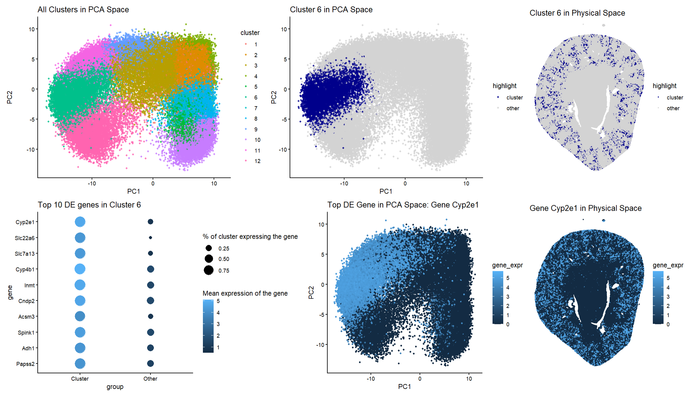
My figure depicts how cells in the Xenium dataset are clustered based on gene expression and where these clusters are spatially located in the tissue space. To determine k means clustering, a scree plot was used and the elbow was defined to be around 12 clusters. Panel A uses hue to differentiate twelve different clusters in PCA space. Panel B (answering the first question of the homework) uses hue again to allow viewers to visualize my chosen cluster of interest, cluster 6. I chose cluster 6 as it is a compact region that is distinct from other clusters. Panel C is another visualization of cluster 6 except rather than being in PCA space, it is mapped to the physical tissue space (answering the second question of the homework). This allows for an understanding of the spatial distribution of cluster 6. The pattern of this cluster forms a ring-like pattern on the peripheral of the kidney tissue. Panel D (answering the third question of the homework) depicts a dot plot of the top ten differentially expressed genes in cluster 6 compared to all the other clusters. It utilizes dot size to inform viewers about the percentage of cells that express the gene. It also utilizes hue and saturation to indicate the mean expression level of the genes. Panel E (answering the fourth question of the homework) uses hue and saturation to allow viewers to visualize where the top differentially expressed gene, Cyp2e1, is located in PCA space. Finally, Panel F (answering the fifth question in the homework) visualizes Cyp2e1 in the tissue space, allowing viewers to compare the expression levels of this gene spatially.
Putting these panels together shows that cluster 6 is transcriptionally distinct and has strong spatial organization. Furthermore, the differential expression analysis shows that cluster 6 has a strong about of the following genes: Cyp2e1, Slc22a6, Slc7a13, Cyp4b1, Inmt, Cndp2, Acsm3, Spink1, Adh1, and Papss2. Many of these genes are well-established markers of proximal tubule epithelial cells. For example, Slc22a6 is a well-known proximal tubule transporter that is located in the basolateral membrane of the proximal tubular cells. Cyp2e1 is expressed highly in proximal tubule segments and is involved in xenobiotic metabolism in the kidney and is responsible for the bioactivation of several clinically relevant nephrotoxins. Therefore, understanding its location can be essential in renal drug handling and toxicity risk. The gene Cyp4b1 is also reported to be highly expressed in proximal tubule cells and is thought to be used in the metabolism of fatty acids and xenobiotics. This further supports that this cluster is distinct and that this cluster could play a metabolic role in the kidney. This is supported by Panel D as many of these genes are expressed highly in cluster 6 but have much lower expression levels in other clusters. This indicates that this cluster could be a transcriptionally specialized population of genes rather than generic epithelial kidney cells. It is important to recognize that Cyp2e1 can be seen to be highly expressed in other clusters outside of cluster 6 when looking at Panel E. However, Panel D does indicate that it has a higher expression in cluster 6 when compared to other clusters. This could suggest that the proximal tubule cells in this cluster could contribute greatly to xenobiotic bioactivation within the tissue. This high level expression alongside other genes that are markers for proximal tubule epithelial cells provides strong evidence that cluster 6 contains proximal tubule epithelial cells. Additionally, the spatial location of cluster 6 supports the idea that this cluster represents proximal tubule epithelial cells. Looking at Panel C, viewers can see that this cluster is distributed throughout the renal cortex and follows tubular structures instead of forming glomerular cultures or medullary stripes. This is consistent with the anatomical organization of the proximal tubules in the cortex and the outer stripe in the outer medulla. The spatial organization of this cluster matches very closely to the way the proximal tubules are organized in the kidney. Finally, the spatial expression of Cyp2e1 matches the distribution of cluster 6 closely which demonstrates that this cluster has transcriptional significance and corresponds to a biologically and spatially organized cell population and its appearance is not due to the dimensionality reduction that was performed.
Sources:
https://pmc.ncbi.nlm.nih.gov/articles/PMC3775882/ https://pmc.ncbi.nlm.nih.gov/articles/PMC8722798/ https://pubmed.ncbi.nlm.nih.gov/27614971/ https://pmc.ncbi.nlm.nih.gov/articles/PMC3775882/
Code
```r library(ggplot2) library(patchwork) library(dplyr)
read in data
data <- read.csv(‘C:/Users/gtbud/Downloads/Xenium-IRI-ShamR_matrix.csv.gz’)
pos <- data[,c(‘x’, ‘y’)] rownames(pos) <- data[, 1] gexp <- data[, 4: ncol(data)] rownames(gexp) <- data[, 1]
totgexp <- rowSums(gexp) mat <- log10(gexp / totgexp * 1e6 + 1)
df <- data.frame(pos, totgexp)
vg <- apply(mat, 2, var) vargenes <- names(sort(vg, decreasing=TRUE)[1:250]) matsub <- mat[, vargenes]
PCA
pcs <- prcomp(matsub)
plot(pcs$sdev[1:50], type=”b”, main=”Scree plot (first 50 PCs)”)
k means elbow plot to figure out the number of clusters to use
X <- pcs$x[, 1:10] Ks <- 2:25 wss <- sapply(Ks, function(k) kmeans(X, centers = k)$tot.withinss)
elbow_df <- data.frame(K = Ks, WSS = wss)
ggplot(elbow_df, aes(K, WSS)) + geom_point() + theme_classic() + ggtitle(“k means clustering”)
k means clustering and set seed so that clusters are always the same
set.seed(1) km <- kmeans(X, centers = 12)
clusters <- factor(km$cluster) names(clusters) <- rownames(mat)
PCA + dataframes
pc_df <- data.frame( PC1 = pcs$x[,1], PC2 = pcs$x[,2], cluster = clusters )
space_df <- data.frame( x = pos$x, y = pos$y, cluster = clusters )
go through to find cluster
cluster_of_interest <- “6”
pc_df$highlight <- ifelse(pc_df$cluster == cluster_of_interest, “cluster”, “other”) space_df$highlight <- ifelse(space_df$cluster == cluster_of_interest, “cluster”, “other”)
differential expression
in_cells <- names(clusters)[clusters == cluster_of_interest] out_cells <- names(clusters)[clusters != cluster_of_interest]
mat_in <- mat[in_cells, , drop = FALSE] mat_out <- mat[out_cells, , drop = FALSE]
mean_in <- colMeans(mat_in) mean_out <- colMeans(mat_out) logFC <- mean_in - mean_out
pct_in <- colMeans(mat_in > 0) pct_out <- colMeans(mat_out > 0)
genes <- colnames(mat) pval <- sapply(genes, function(g) wilcox.test(mat_in[, g], mat_out[, g])$p.value)
de <- data.frame( gene = genes, logFC = logFC[genes], pct_in = pct_in[genes], pct_out = pct_out[genes], pval = pval )
de$padj <- p.adjust(de$pval, method = “BH”) de$neglog10p <- -log10(de$padj) de <- de[order(-de$logFC, de$padj), ]
identify the top 10 genes
head(de, 10)
top_gene <- de$gene[1] top10_genes <- de$gene[1:10]
make the dot plot for visualization
dot_df <- do.call(rbind, lapply(top10_genes, function(g) { data.frame( gene = g, group = c(“Cluster”, “Other”), mean_expr = c( mean(mat[in_cells, g]), mean(mat[out_cells, g]) ), pct_expr = c( mean(mat[in_cells, g] > 0), mean(mat[out_cells, g] > 0) ) ) }))
dot_df$gene <- factor(dot_df$gene, levels = rev(top10_genes))
p4_dotplot <- ggplot(dot_df, aes(group, gene)) + geom_point(aes(size = pct_expr, color = mean_expr)) + scale_size(range = c(2, 8)) + theme_classic() + ggtitle(“Top 10 DE genes in Cluster 6”) + labs(size = “% of cluster expressing the gene”, color = “Mean expression of the gene”)
overlays for gene expression
pc_df$gene_expr <- mat[rownames(pc_df), top_gene] space_df$gene_expr <- mat[rownames(space_df), top_gene]
make the visualization
p1_all_clusters <- ggplot(pc_df, aes(PC1, PC2, color = cluster)) + geom_point(size = 1, alpha = 0.8) + theme_classic() + ggtitle(“All Clusters in PCA Space”)
p2_highlight_cluster <- ggplot(pc_df, aes(PC1, PC2, color = highlight)) + geom_point(size = 1, alpha = 0.8) + scale_color_manual(values = c(other = “lightgrey”, cluster = “darkblue”)) + theme_classic() + ggtitle(paste(“Cluster”, cluster_of_interest, “in PCA Space”))
p3_cluster_space <- ggplot(space_df, aes(x, y, color = highlight)) + geom_point(size = 0.6, alpha = 0.8) + scale_color_manual(values = c(other = “lightgrey”, cluster = “darkblue”)) + coord_fixed() + theme_void() + ggtitle(paste(“Cluster”, cluster_of_interest, “in Physical Space”))
p5_gene_pca <- ggplot(pc_df, aes(PC1, PC2, color = gene_expr)) + geom_point(size = 1) + theme_classic() + ggtitle(paste(“Top DE Gene in PCA Space: Gene”, top_gene))
p6_gene_space <- ggplot(space_df, aes(x, y, color = gene_expr)) + geom_point(size = 0.6) + coord_fixed() + theme_void() + ggtitle(paste(“Gene”, top_gene, “in Physical Space”))
combine all the panels
final_plot <- (p1_all_clusters | p2_highlight_cluster | p3_cluster_space) / (p4_dotplot | p5_gene_pca | p6_gene_space) + plot_annotation(tag_levels = “A”)
final_plot
The beginning of the code was done in class with Prof. Fan (setting up the data to work with it, PCA, and k means)
AI was used to learn how to create my dot plot for my top 10 DE genes (How do I create a dot plot for my differentially expressed genes in R?)
AI was used to set-up the R sytax to figure out my differentially expressed genes