HW 3

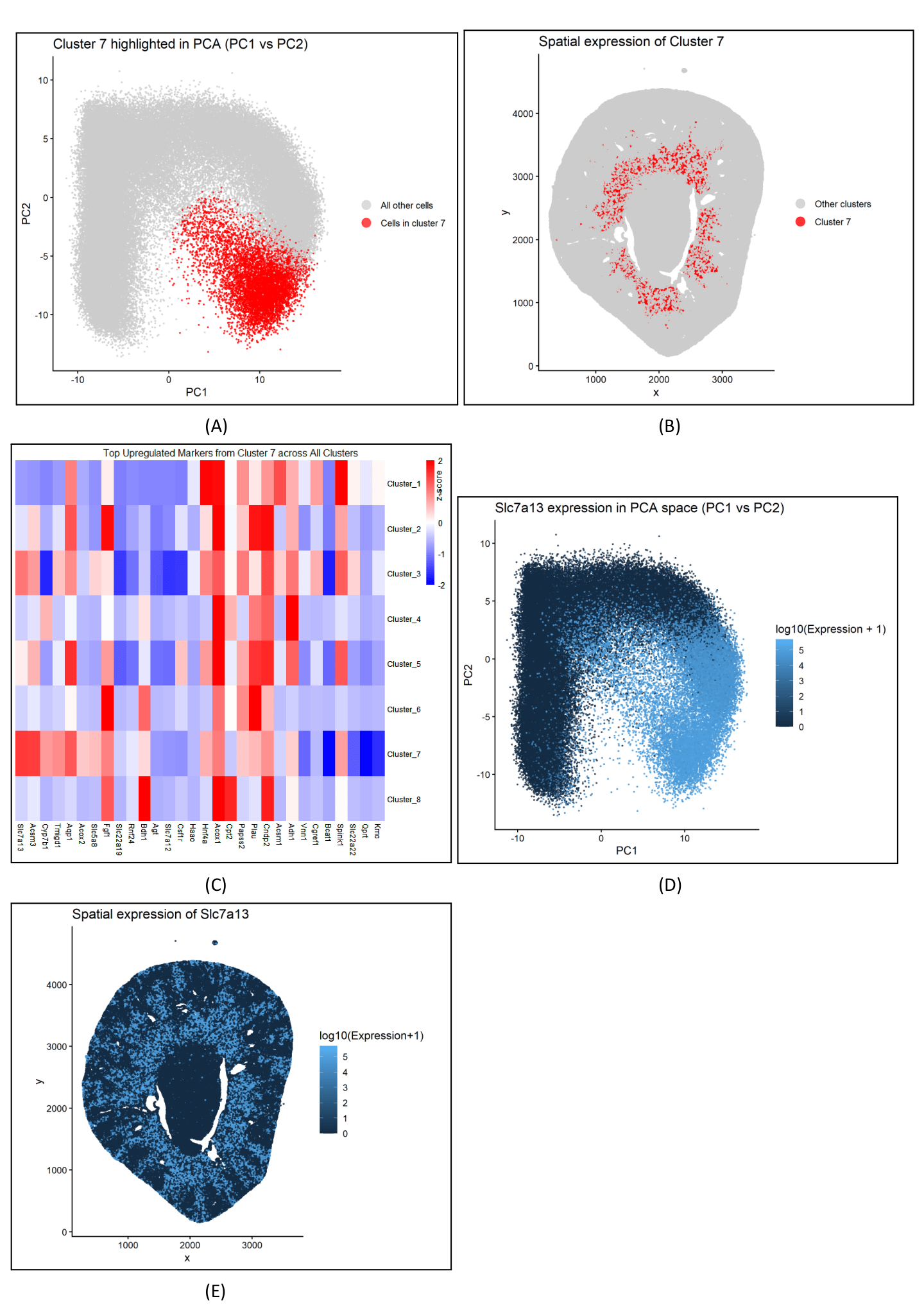
Figure description
Panel A describes the PCA plot between cluster 7 and all other cells, depicting the distinct separation of cluster 7 in the reduced dimensional space. Panel B visualizes cluster 7 in physical space, with red cells concentrated in the inner stripe of the outer medulla. Panel C shows a heatmap of the gene expression of the top upregulated genes within cluster 7 across all clusters. Gene expression values were z‑scored to highlight which genes have relatively high expression in cluster 7 compared to other clusters. Panel D visualizes Slc7a13 expression in PCA space (PC1 vs PC2), showing a concentration of high-expression that aligns with the cluster 7 area in Panel A. Slc7a13 is a membrane transporter that marks proximal tubule S3 epithelial cells in the inner stripe of the outer medulla, localizing to the cell surface facing the tubule lumen (apical brush border), facilitating reabsorption of key small molecules. Panel E maps Slc7a13 expression in physical space, overlapping with cluster 7 region from Panel B within the inner stripe of the outer medulla. Panel E includes additional expression in nearby areas outside cluster 7.
Classifying cluster
Cluster 7 most likely represents proximal tubule S3 epithelial cells. This is supported by its inner stripe/outer medulla localization (Panel B), strong and specific upregulation of the S3 marker Slc7a13 (Panels C–E), and the similar localization of high Slc7a13 expression within cluster 7’s PCA position (Panel D), which is consistent with an S3 segment–biased proximal tubule identity. Additionally, the heatmap shows that Slc7a13 and other transport and energy-use genes, such as Aqp1, Hnf4a, and Acsm3, exhibit similar gene expressions, suggesting a coordinated pattern in the proximal tubule and supporting the classification of cluster 7 as S3 proximal tubule cells. This interpretation is further supported by a study that identified SLC7A13 as the second cystine transporter specifically localized to the apical membrane of proximal tubule S3 cells, reinforcing the classification of cluster 7 as S3 proximal tubule epithelium.
https://www.pnas.org/doi/10.1073/pnas.1519959113
Code
1
2
3
4
5
6
7
8
9
10
11
12
13
14
15
16
17
18
19
20
21
22
23
24
25
26
27
28
29
30
31
32
33
34
35
36
37
38
39
40
41
42
43
44
45
46
47
48
49
50
51
52
53
54
55
56
57
58
59
60
61
62
63
64
65
66
67
68
69
70
71
72
73
74
75
76
77
78
79
80
81
82
83
84
85
86
87
88
89
90
91
92
93
94
95
96
97
98
99
100
101
102
103
104
105
106
107
108
109
110
111
112
113
114
115
116
117
118
119
120
121
122
123
124
125
126
127
128
129
130
131
132
133
134
135
136
137
138
139
140
141
142
143
144
145
146
147
148
149
150
151
152
153
154
155
156
157
158
159
160
161
162
163
164
165
166
167
168
169
170
171
172
173
174
175
176
177
178
179
180
181
182
183
184
185
186
187
188
189
190
191
192
193
194
195
196
197
198
199
200
201
202
203
204
205
206
207
208
209
210
211
212
213
214
215
216
217
218
219
220
221
222
223
224
225
226
227
228
229
230
231
232
233
234
235
236
237
238
239
240
241
242
243
244
245
246
247
248
249
250
251
252
253
254
255
256
257
258
259
260
261
262
263
264
265
266
267
268
269
270
271
272
273
274
275
276
277
278
279
280
281
282
283
284
285
286
287
288
289
290
291
292
293
294
295
296
297
298
299
300
301
302
303
304
305
306
307
308
309
310
311
312
313
314
315
316
317
318
319
320
321
322
323
324
325
326
327
328
329
330
331
332
333
334
335
336
337
338
339
340
341
342
343
344
345
346
347
348
349
350
351
352
353
354
355
356
357
358
359
360
361
362
363
364
365
# Read in data
data <- read.csv("Xenium-IRI-ShamR_matrix.csv.gz") # image-based
data[1:5, 1:5]
pos <- data[, c('x', 'y')]
rownames(pos) <- data[,1]
gexp <- data[, 4:ncol(data)]
rownames(gexp) <- data[,1]
head(pos)
gexp[1:5, 1:5]
dim(pos)
dim(gexp)

# Normalize and log transform data
totgexp <- rowSums(gexp)
head(totgexp)
head(sort(totgexp, decreasing=TRUE))
mat <- log10(gexp / totgexp * 1e6 + 1 )
dim(mat)

# PCA
## no scaling
pcs <- prcomp(mat, center=TRUE, scale=FALSE)
names(pcs)
head(pcs$sdev)
length(pcs$sdev)
plot(pcs$sdev[1:50]) # scree plot reveals 8 or 9 points before the elbow
pc_scores <- pcs$x[, 1:4, drop=FALSE]
colnames(pc_scores) <- paste0("PC", 1:4)


# PCA plotting
pca_plot_df <- data.frame(
  cell = rownames(pc_scores),
  x = pos$x,
  y = pos$y,
  PC1 = pc_scores[, "PC1"],
  PC2 = pc_scores[, "PC2"],
  PC3 = pc_scores[, "PC3"],
  PC4 = pc_scores[, "PC4"]
)


# visualize: two plots
# 1) PC1 vs PC2: x encodes PC1, y encodes PC2, color encodes PC3 (hue)
# 2) PC3 vs PC4: x encodes PC3, y encodes PC4, color encodes PC1 (hue)
library(ggplot2)
library(viridis)
set.seed(123)

p12 <- ggplot(pca_plot_df, aes(PC1, PC2, color = PC3)) +
  geom_point(size = 0.3) +
  scale_color_viridis(option = "C", name = "PC1", guide = guide_colorbar(barheight = 6)) +
  labs(title = "PC1 vs PC2") + theme_classic()
p34 <- ggplot(pca_plot_df, aes(PC3, PC4, color = PC1)) +
  geom_point(size = 0.3) +
  scale_color_viridis(option = "C", name = "PC4", guide = guide_colorbar(barheight = 6)) +
  labs(title = "PC3 vs PC4") + theme_classic()
p12 # about 5 different clusters based on different hues
p34
ggsave("PC12.png", p12, width = 6, height = 5, dpi = 300)
ggsave("PC34.png", p34, width = 6, height = 5, dpi = 300)

# begin kmeans clustering

# choose top 9 PCs
pcs_use <- pcs$x[, 1:9, drop=FALSE]

# determine k through total within-ness
wss <- sapply(2:12, function(k) {
kmeans(pcs_use, centers = k, nstart = 50, iter.max = 100)$tot.withinss
})
wss_df <- data.frame(k = 2:12, wss = wss)
determine_k_plot <- ggplot(wss_df, aes(k, wss)) + geom_line() + geom_point() +
labs(x="k", y="Total within-cluster SS", title="K-means elbow (PCs)")
ggsave("determine_k_plot.png", determine_k_plot, width = 6, height = 5, dpi = 300)
# choosing 6 because after k=6, the gap between k's stops increasing significantly

# run k-means
km <- kmeans(pcs_use, centers = 6, nstart = 100, iter.max = 300)
clusters <- km$cluster

# df for k-means plot
k_means_df <- data.frame(
PC1 = pcs_use[, 1],
PC2 = pcs_use[, 2],
cluster = factor(clusters)
)

# visualize clusters
k_means_plot <- ggplot(k_means_df, aes(PC1, PC2, color = cluster)) +
geom_point(size = 0.5) +
labs(x = "PC1", y = "PC2", title = "K-means clusters on PCs 1–9", color = "Cluster") +
theme_classic()

ggsave("k_means_plot.png", k_means_plot, width = 6, height = 5, dpi = 300)

# set up df for differential expression
library(matrixStats)

# Used AI to determine which transcriptionally distinct cluster of cells to focus on
# Prompt: how would I use differential expression to determine a transcriptionally distinct cluster of cells?
# Response: Most of the code between lines 105 - 184 is from AI, but I asked for a breakdown of each line and
# included my own comments so that I understood what was being performed

# align data to a common set of cells
common_cells <- Reduce(intersect, list(rownames(mat), rownames(pcs_use), names(clusters)))
mat <- mat[common_cells, , drop = FALSE]
pcs_use <- pcs_use[common_cells, , drop = FALSE]
clusters <- clusters[common_cells]
genes <- colnames(mat)

# define AUROC: nonparametric effect size equivalent to Wilcoxon U normalized to [0,1]
# interpretation: 0.5 → no separation; 1.0 → perfect separation (all in-cluster > all out-of-cluster)
# used AUROC to determine the how strong the separation is between clusters
# wilcoxon test determines the p-value/significance
auroc_gene <- function(x_in, x_out) {
  n_in <- length(x_in); n_out <- length(x_out)
  r <- rank(c(x_in, x_out)) # average ranks for ties
  U <- sum(r[1:n_in]) - n_in * (n_in + 1) / 2
  U / (n_in * n_out)
}

# define expression threshold b/c data is log-transformed (log10(2) ~ 0.301)
expr_threshold <- log10(2)

# extract all 8 cluster IDs
clusters_all <- sort(unique(clusters))
# prepare to store "distinctness score" for each cluster
distinct_scores <- numeric(length(clusters_all))
names(distinct_scores) <- as.character(clusters_all)

# begin loop for differential expression per cluster
for (cid in clusters_all) {
  # define in-cluster and out-cluster cells
  cl_cells <- names(clusters)[clusters == cid]
  ot_cells <- names(clusters)[clusters != cid]

  # set up expression matrixes for in- and out-cluster cells
  mat_in  <- mat[cl_cells, genes, drop = FALSE]
  mat_out <- mat[ot_cells, genes, drop = FALSE]

  # perform Wilcoxon rank-sum test
  # p-values for "greater" (upregulated in cluster)
  # specifically looking for upregulated marker genes
  wilcox_p <- sapply(genes, function(g) {
  wilcox.test(mat_in[, g], mat_out[, g], alternative = "greater")$p.value
  })

  # multiple testing correction using benjamini-hochberg
  wilcox_fdr <- p.adjust(wilcox_p, method = "BH")

  # determine effect sizes
  # use AUROC to measure how well each gene separates cluster vs rest
  auc <- sapply(genes, function(g) auroc_gene(mat_in[, g], mat_out[, g]))

  # calculates percent of cluster cells expressing gene
  pct_in  <- colMeans(mat_in  > expr_threshold) # colmeans() calculates the mean of each column
  # calculates percent of non-cluster cells expressing gene
  pct_out <- colMeans(mat_out > expr_threshold)
  # calculates percent expressed difference
  pct_diff <- pct_in - pct_out

  # calculate log-scale mean difference as a secondary check for upregulation
  mean_diff <- colMeans(mat_in) - colMeans(mat_out)

  # identify marker genes:
  # a gene is considered a candidate if FDR < 0.05 and its mean expression is higher in the cluster
  marker_idx <- which(wilcox_fdr < 0.05 & mean_diff > 0)
  # if no marker genes are found, cluster gets scored a "0"
  if (length(marker_idx) == 0) {
  distinct_scores[as.character(cid)] <- 0
  next
  }

  # rank candidate markers by AUROC (primary) and pct_diff (secondary)
  ord <- order(auc[marker_idx], pct_diff[marker_idx], decreasing = TRUE)
  marker_idx <- marker_idx[ord]

  # compute distinctness score = sum of top N AUROC values + sum of top N pct_diff
  # this rewards strong separation and higher detection fraction in the cluster.
  N <- min(50, length(marker_idx)) # use up to top 50 markers
  score <- sum(auc[marker_idx][1:N]) + sum(pct_diff[marker_idx][1:N])

  distinct_scores[as.character(cid)] <- score
}

# determine transcriptionally distinct cluster aka highest score
distinct_cluster <- as.integer(names(which.max(distinct_scores)))
distinct_cluster # cluster 7

# begin creating data visualizations on cluster 7
library(dplyr)

# pcs$x: PCs, pos: spatial x, y coordinates, clusters: cluster id; gene: gene expression
# data frame with labels for clusters
cluster_7_df <- data.frame(
  pcs$x[, 1:2, drop = FALSE], # PC1–PC2
  x = pos$x,
  y = pos$y,
  cluster = factor(clusters),
  is_cluster7 = clusters == 7  # TRUE if cluster id equals 7, else FALSE
)


# pca plot of cluster 7
pc12_plot <- ggplot(cluster_7_df, aes(PC1, PC2, color = is_cluster7)) +
  geom_point(size = 0.5, alpha = 0.7) +
  scale_color_manual(
    values = c("FALSE" = "gray80", "TRUE" = "red"),
    labels = c("TRUE" = "Cells in cluster 7",
               "FALSE" = "All other cells"),
    name = NULL
  ) +
  guides(color = guide_legend(override.aes = list(size = 4))) +  # increase legend dot size
  labs(
    title = "Cluster 7 highlighted in PCA (PC1 vs PC2)",
    x = "PC1",
    y = "PC2"
  ) +
  theme_classic()

pc12_plot
ggsave("pc12_cluster_7.png", pc12_plot, width = 6, height = 5, dpi = 300)


# cluster 7 in physical space
physical_space_plot <- ggplot(cluster_7_df, aes(x = x, y = y, color = is_cluster7)) +
  geom_point(size = 0.6, alpha = 0.8) +
  scale_color_manual(
    values = c("FALSE" = "gray80", "TRUE" = "red"),
    labels = c("TRUE" = "Cluster 7",
               "FALSE" = "Other clusters"),
    name = NULL
  ) +
  guides(color = guide_legend(override.aes = list(size = 4))) +
  labs(
    title = "Spatial expression of Cluster 7",
    x = "x",
    y = "y"
  ) +
  theme_classic() +
  coord_equal()

physical_space_plot
ggsave("physical_space_plot.png", physical_space_plot, width = 6, height = 5, dpi = 300)

# trying to characterize cluster 7:

# identify upregulated genes in cluster 7  vs other clusters
# Align to common cells to avoid mismatches
common_cells <- intersect(rownames(mat), names(clusters))
mat_use <- mat[common_cells, , drop = FALSE]
clusters_use <- clusters[common_cells]
genes <- colnames(mat_use)

# Define cluster 7 vs rest
cl_cells <- names(clusters_use)[clusters_use == 7]
ot_cells <- names(clusters_use)[clusters_use != 7]
# Extract matrices
mat_in  <- mat_use[cl_cells, genes, drop = FALSE]
mat_out <- mat_use[ot_cells, genes, drop = FALSE]
# Wilcoxon rank-sum p-values (upregulated in cluster 7)
wilcox_p <- sapply(genes, function(g) {
wilcox.test(mat_in[, g], mat_out[, g], alternative = "greater")$p.value
})
wilcox_fdr <- p.adjust(wilcox_p, method = "BH")
# Effect sizes
mean_diff <- colMeans(mat_in) - colMeans(mat_out)           # magnitude on log scale
pct_in    <- colMeans(mat_in  > expr_threshold)             # detection in cluster 7
pct_out   <- colMeans(mat_out > expr_threshold)             # detection outside
pct_diff  <- pct_in - pct_out
auroc     <- sapply(genes, function(g) auroc_gene(mat_in[, g], mat_out[, g]))  # separation
# Assemble results table
de_7 <- data.frame(
gene = genes,
wilcox_p = wilcox_p,
wilcox_fdr = wilcox_fdr,
mean_diff = mean_diff,
pct_in = pct_in,
pct_out = pct_out,
pct_diff = pct_diff,
auroc = auroc,
stringsAsFactors = FALSE
)
# Keep upregulated, significant genes and rank by strength (AUROC, then pct_diff, then mean_diff)
markers_7 <- subset(de_7, wilcox_fdr < 0.05 & mean_diff > 0)
markers_7 <- markers_7[order(-markers_7$auroc, -markers_7$pct_diff, -markers_7$mean_diff), ]
head(markers_7, 20)

# plot heatmap of cluster-averaged expression for top markers
# select top N upregulated markers for cluster 7
topN <- 30
top_genes <- head(markers_7$gene, topN)
top_genes <- top_genes[top_genes %in% colnames(mat)]  # ensure present

# compute average expression per cluster for these genes
cl_levels <- sort(unique(clusters))

avg_by_cluster <- sapply(cl_levels, function(c) {
  cells_c <- names(clusters)[clusters == c]
  colMeans(mat[cells_c, top_genes, drop = FALSE])
})

# transform so that clusters are rows and genes are columns
avg_by_cluster <- t(avg_by_cluster)

colnames(avg_by_cluster) <- top_genes
rownames(avg_by_cluster) <- paste0("Cluster_", cl_levels)

# z-score genes across clusters
# purpose: make genes comparable versus using raw values for gene expression
z <- t(scale(t(avg_by_cluster)))

# Define color scale: blue (neg) → white (0) → red (pos)
# used AI to revise the look of the heat map
# prompt: could you revise this code so that the cluster labels are on the
# left side of the y-axis and that the gene labels are read from left to right.
# additionally, add a label for the legend "z-score" and set white = 0 with positive
# z score at red and negative at blue. additionally, remove clustering tree
library(pheatmap)
heatmap_plot <- pheatmap(
  z,
  cluster_rows = FALSE,      # remove dendrogram (tree) for clusters
  cluster_cols = FALSE,      # remove dendrogram for genes
  color = colorRampPalette(c("blue", "white", "red"))(100),
  breaks = seq(-2, 2, length.out = 101),   # ensures white centered at 0
  main = "",
  fontsize_row = 9,
  fontsize_col = 9,
  border_color = NA
)
# add legend title "z-score"
library(grid)
grid::grid.text("z-score", x = unit(0.97, "npc"), y = unit(0.9, "npc"), rot = 90, gp = gpar(cex = 0.9))

# add custom title
grid.text(
  "Top Upregulated Markers from Cluster 7 across All Clusters",
  x = 0.5,
  y = 0.98,
  gp = gpar(fontsize = 12, fontface = "plain")
)

ggsave("heatmap_plot.png", heatmap_plot, width = 6, height = 5, dpi = 300)

# visualize Hnf4a and Slc7a13 in reduced dimensional space (PCA)
Slc7a13_df <- data.frame(PC1 = pcs$x[,1], PC2 = pcs$x[,2], Slc7a13 = mat[, "Slc7a13"])

# Slc7a13
specific_gene_pca_plot <- ggplot(Slc7a13_df, aes(PC1, PC2, color = Slc7a13)) +
geom_point(size = 0.5, alpha = 0.7) +
labs(title = "Slc7a13 expression in PCA space (PC1 vs PC2)", x = "PC1", y = "PC2", color = "log10(Expression + 1)") +
theme_classic()
ggsave("specific_gene_pca_plot.png", specific_gene_pca_plot, width = 6, height = 5, dpi = 300)

library(ggplot2)

Slc7a13_spatial_df <- data.frame(x = pos$x, y = pos$y, Slc7a13 = mat[, "Slc7a13"])
Slc7a13_spatial_plot <- ggplot(Slc7a13_spatial_df, aes(x, y, color = Slc7a13)) +
  geom_point(size = 0.5, alpha = 0.8) +
  labs(title = "Spatial expression of Slc7a13", x = "x", y = "y", color = "log10(Expression+1)") +
  coord_equal() + theme_classic()
ggsave("Slc7a13_spatial_plot.png", Slc7a13_spatial_plot, width = 6, height = 5, dpi = 300)