Characterizing Cell Type in Cluster 2 of Visium Dataset Using Dimensionality Reduction and Differential Expression Analysis

Description of Data Visualization:
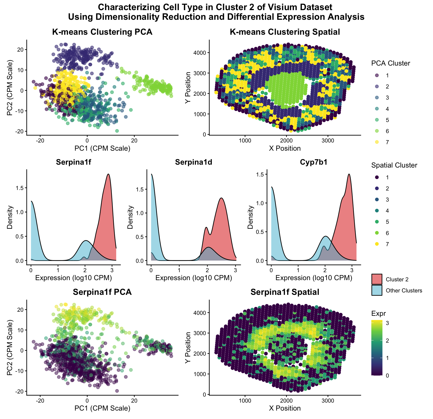
The Visium dataset was normalized (CPM) and its dimensionality was reduced using principal component analysis. The data was then plotted in 2 dimensional (PC1, PC2) space and k means clustering was applied to classify the data into 7 distinct clusters.
K=7 clusters were chosen as opposed to the k=9 clusters chosen in HW3 because the researcher was debating between 7 and 9 in HW3, unsure of which was the correct “elbow” of the withinness scree plot. After Dr. Fan mentioned that 7 clusters was possibly the more correct interpretation in class, the researcher chose to use 7 clusters here, also wondering if this would lead to a different conclusion than the one made in HW3.
Once the clusters were plotted in xy space, cluster 2 (second darkest purple on the spatial plot) was identified as the cluster identified as “cluster 8” in HW3, the cluster of interest for this reanalysis. A one-sided Wilcox rank-sum test was conducted to identify the genes that were most differentially expressed in cluster 2, with Serpina1f being the gene with the lowest p-value. Density plots for the 3 genes with the lowest p-value were displayed to show the differences in gene expression, and Serpina1f was chosen for further analysis due to its low p-value and little overlap between cluster 2 and other clusters expression in the density plots.
When the Serpina1f gene expression was plotted on the PCA and spatial plots, areas of high Serpina1f expression corresponding to cluster 2 as mapped in the PCA cluster and spatial cluster plots, further indicating that that upregulation of Serpina1f corresponds to this particular cluster.
Upon literature review, Serpina1f is highly expressed in proximal tubule epithelial cells (Swarna et al., 2025), thus supporting our conclusion in HW3 that this central “donut-shaped” cluster of cells around the holes of the podocyte tissue contains proximal tubule cells.
Sources:
Swarna, N. P., Booeshaghi, A. S., Rebboah, E., Gordon, M. G., Kathail, P., Li, T., Alvarez, M., Ye, C. J., Wold, B., Mortazavi, A., & Pachter, L. (2025). Determining gene specificity from multivariate single-cell RNA sequencing data. bioRxiv : the preprint server for biology, 2025.11.21.689845. https://doi.org/10.1101/2025.11.21.689845
Code:
1
2
3
4
5
6
7
8
9
10
11
12
13
14
15
16
17
18
19
20
21
22
23
24
25
26
27
28
29
30
31
32
33
34
35
36
37
38
39
40
41
42
43
44
45
46
47
48
49
50
51
52
53
54
55
56
57
58
59
60
61
62
63
64
65
66
67
68
69
70
71
72
73
74
75
76
77
78
79
80
81
82
83
84
85
86
87
88
89
90
91
92
93
94
95
96
97
98
99
100
101
102
103
104
105
106
107
108
109
110
111
112
113
114
115
116
117
118
119
120
121
122
123
124
125
126
127
128
129
130
131
# after writing my initial script, I asked Claude to integrate my graphs into a multi-panel visualization
# and to specify CPM on the normalized data

# Required libraries
library(ggplot2)
library(patchwork)

# read in data (removed duplicate library call)
data <- read.csv('/Users/henryaceves/genomic-data-visualization-2026/data/Visium-IRI-ShamR_matrix.csv.gz')

# build data-frame
pos <- data[,c('x','y')]
rownames(pos) <- data[,1]
gexp <- data[,4:ncol(data)]
rownames(gexp) <- data[,1]

# normalization
totgexp <- rowSums(gexp)
mat <- log10(gexp/totgexp*1e6 + 1)

# PCA
pcs <- prcomp(mat, center = TRUE, scale = FALSE)

# FIX 1: Define toppcs before using it in kmeans
toppcs <- pcs$x[, 1:10]  # Using first 10 PCs (adjust as needed)

# kmeans
set.seed(123)
clusters <- as.factor(kmeans(toppcs, centers=7)$cluster)

df <- data.frame(pcs$x, pos, clusters)

# differential expression analysis
clusterofinterest <- names(clusters)[clusters == 2]
othercells <- names(clusters)[clusters != 2]
out <- sapply(colnames(mat), function(gene) {
  x1 <- mat[clusterofinterest, gene]
  x2 <- mat[othercells, gene]
  wilcox.test(x1, x2, alternative='greater')$p.value
})
head(sort(out))

# FIX 2: Define top3_genes before using it in the loop
top3_genes <- names(sort(out))[1:3]

# 1. K-means PCA plot
kmeans_pca_plot <- ggplot(df, aes(x = PC1, y = PC2, col = clusters)) +
  geom_point(size = 2, alpha = 0.6) +
  scale_color_viridis_d() +
  labs(title = "K-means Clustering PCA", col = "PCA Cluster",
       x = "PC1 (CPM Scale)", y = "PC2 (CPM Scale)") +
  theme_classic() +
  theme(
    plot.title = element_text(hjust = 0.5, face = "bold"),
    axis.text = element_text(color = "black"),
    legend.position = "right"
  )

# 2. K-means Spatial plot
kmeans_spatial_plot <- ggplot(df, aes(x = x, y = y, col = clusters)) +
  geom_point(size = 2) +
  scale_color_viridis_d() +
  labs(title = "K-means Clustering Spatial", col = "Spatial Cluster",
       x = "X Position", y = "Y Position") +
  theme_classic() +
  theme(
    plot.title = element_text(hjust = 0.5, face = "bold"),
    axis.text = element_text(color = "black"),
    legend.position = "right"
  )

# 3. Create density plots for the top 3 genes
hist_plots <- list()
for(i in 1:3) {
  gene <- top3_genes[i]
  df_hist <- data.frame(
    expression = mat[, gene],
    group = ifelse(clusters == 2, "Cluster 2", "Other Clusters")
  )

  hist_plots[[i]] <- ggplot(df_hist, aes(x = expression, fill = group)) +
    geom_density(alpha = 0.5) +
    scale_fill_manual(values = c("Cluster 2" = "#DC0000", "Other Clusters" = "#4DBBD5")) +
    labs(title = gene, x = "Expression (log10 CPM)", y = "Density", fill = "") +
    theme_classic() +
    theme(
      plot.title = element_text(hjust = 0.5, face = "bold", size = 12),
      axis.text = element_text(color = "black"),
      legend.position = "right"
    )
}

# 4. Create PCA plot for Serpina1f
df_gene <- data.frame(pcs$x, pos, clusters, gene = mat[, "Serpina1f"])

serpina1f_pca_plot <- ggplot(df_gene, aes(x = PC1, y = PC2, col = gene)) +
  geom_point(size = 2, alpha = 0.5) +
  scale_color_viridis_c() +
  labs(title = "Serpina1f PCA", col = "Expr",
       x = "PC1 (CPM Scale)", y = "PC2 (CPM Scale)") +
  theme_classic() +
  theme(
    plot.title = element_text(hjust = 0.5, face = "bold"),
    axis.text = element_text(color = "black"),
    legend.position = "right"
  )

# 5. Create spatial plot for Serpina1f
serpina1f_spatial_plot <- ggplot(df_gene, aes(x = x, y = y, col = gene)) +
  geom_point(size = 2) +
  scale_color_viridis_c() +
  labs(title = "Serpina1f Spatial", col = "Expr",
       x = "X Position", y = "Y Position") +
  theme_classic() +
  theme(
    plot.title = element_text(hjust = 0.5, face = "bold"),
    axis.text = element_text(color = "black"),
    legend.position = "right"
  )

# Combined plot
combined_plot <- (kmeans_pca_plot + kmeans_spatial_plot) /
  (hist_plots[[1]] + hist_plots[[2]] + hist_plots[[3]]) /
  (serpina1f_pca_plot + serpina1f_spatial_plot) +
  plot_layout(guides = "collect") +
  plot_annotation(title = "Characterizing Cell Type in Cluster 2 of Visium Dataset \nUsing Dimensionality Reduction and Differential Expression Analysis",
                  theme = theme(plot.title = element_text(hjust = 0.5, face = "bold", size = 14)))

# Display the combined plot
print(combined_plot)