HW 4

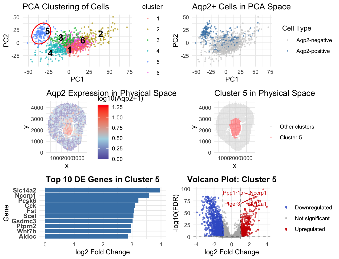
Figure Description and Interpretation
In Homework 3, I analyzed the Xenium dataset using k-means clustering with k = 10 and identified cluster 3 as an Aqp2-enriched population corresponding to collecting duct principal cells. In Homework 4, I applied the same analysis pipeline to the Visium dataset. Because Visium data has lower spatial resolution and measures gene expression at the spot level rather than at the single-cell level, the transcriptional structure was less granular. Therefore, I re-evaluated the optimal number of clusters using an elbow analysis in PCA space and selected k = 6. Using this updated clustering, I identified cluster 5 as the Aqp2-enriched population. In both datasets, Aqp2-positive cells formed a distinct region in PCA space and localized to a coherent region in physical space. Spatial visualization showed that Aqp2 expression and the Aqp2-enriched cluster overlapped strongly in both analyses. Differential expression analysis further supported this interpretation, as cluster 3 in HW3 and cluster 5 in HW4 had a higher level of known collecting duct markers including Aqp2, Slc14a2, Wnt7b. In HW4, I additionally visualized differential expression using a volcano plot to examine both upregulated and downregulated genes. I used the same blue to mark the cluster 5 and the Aqp2 enriched cells in the PCA space, using similarity to enhance salience. I also used enclosure ot make cluster 5 more evident and numbers to label the clusters. Although the specific cluster number and clustering parameters differed between datasets, these changes were necessary to account for differences in spatial resolution and signal complexity. Despite these differences, consistent marker gene expression, PCA separation, and spatial localization demonstrate that probably the same collecting duct principal cell population was identified in both datasets.
Code (paste your code in between the ``` symbols)
1
2
3
4
5
6
7
8
9
10
11
12
13
14
15
16
17
18
19
20
21
22
23
24
25
26
27
28
29
30
31
32
33
34
35
36
37
38
39
40
41
42
43
44
45
46
47
48
49
50
51
52
53
54
55
56
57
58
59
60
61
62
63
64
65
66
67
68
69
70
71
72
73
74
75
76
77
78
79
80
81
82
83
84
85
86
87
88
89
90
91
92
93
94
95
96
97
98
99
100
101
102
103
104
105
106
107
108
109
110
111
112
113
114
115
116
117
118
119
120
121
122
123
124
125
126
127
128
129
130
131
132
133
134
135
136
137
138
139
140
141
142
143
144
145
146
147
148
149
150
151
152
153
154
155
156
157
158
159
160
161
162
163
164
165
166
167
168
169
170
171
172
173
174
175
176
177
178
179
180
181
182
183
184
185
186
187
188
189
190
191
192
193
194
195
196
197
198
199
200
201
202
203
204
205
206
207
208
209
210
211
212
213
214
215
216
217
218
219
220
221
222
223
224
225
226
227
228
229
230
231
232
233
234
235
236
237
238
239
240
241
242
243
244
245
246
247
248
249
250
251
252
253
254
255
256
257
258
259
260
261
262
263
264
265
266
267
268
269

data <- read.csv("~/Desktop/Visium-IRI-ShamR_matrix.csv.gz")
library(ggplot2)
library(dplyr)
library(stats)
library(gridExtra)

head(data)

# Positions
pos <- data[, c("x", "y")]
rownames(pos) <- data$X
# Find where genes start
gene_start_col <- which(colnames(data) == "y") + 1
# Gene expression matrix
gexp <- data[, gene_start_col:ncol(data)]
loggexp <- log10(gexp + 1)
rownames(gexp) <- data$X
# Remove genes with zero variance
gene_sd <- apply(loggexp, 2, sd)
keep_genes <- gene_sd > 0

#scale
loggexp_filt <- loggexp[, keep_genes]
scaled_gexp <- scale(loggexp_filt)

# PCA
pca <- prcomp(scaled_gexp)
df_pca <- data.frame(pca$x)
df_pca$cell_id <- rownames(gexp)


#what should k be? using first 20 PCs only cause otherwise takes too much time
pca_data <- pca$x[, 1:20]
set.seed(42)
wss <- sapply(2:15, function(k) {kmeans(pca_data, centers = k, nstart = 10)$tot.withinss})
plot(2:15, wss, type = "b", xlab = "k", ylab = "Within-cluster SS", main = "Elbow")
#I chose k=6 based on elbow

# K-means
set.seed(42)
kmeans_res <- kmeans(scaled_gexp, centers = 6)
clusters <- as.factor(kmeans_res$cluster)
names(clusters) <- rownames(gexp)
df_pca$cluster <- clusters

#check if same gene exists
"Aqp2" %in% colnames(gexp)

#focus on aqp2

# Find Aqp2 column
aqp2_col <- grep("^Aqp2$", colnames(gexp), value = TRUE, ignore.case = TRUE)
if (length(aqp2_col) == 0) {stop("Aqp2 not found in dataset")}

# Extract expression
aqp2_exp <- gexp[, aqp2_col]
aqp2_log_exp <- loggexp[, aqp2_col]

# Cluster-level stats
cluster_aqp2 <- data.frame(cluster = levels(clusters),
  mean_exp = tapply(aqp2_exp, clusters, mean),
  pct_positive = tapply(aqp2_exp > 0, clusters, mean) * 100,
  n_cells = as.numeric(table(clusters)))

# Identify max cluster
aqp2_cluster <- cluster_aqp2$cluster[which.max(cluster_aqp2$mean_exp)]
cat(sprintf("\nCluster %s has highest Aqp2 expression\n", aqp2_cluster))

# ADD AQP2 + CLUSTER INFO
aqp2_exp <- gexp[, "Aqp2"]
aqp2_log_exp <- log10(aqp2_exp + 1)

df_pca$cluster <- clusters
df_pca$aqp2_exp <- aqp2_log_exp

pos$cluster <- clusters
pos$aqp2_exp <- aqp2_log_exp

# Threshold for Aqp2+
aqp2_threshold <- 0.6

df_pca$aqp2_positive <- aqp2_log_exp > aqp2_threshold
pos$aqp2_positive <- aqp2_log_exp > aqp2_threshold


# PLOT 1: PCA + CLUSTERS
#p1 <- ggplot(df_pca, aes(PC1, PC2, col = cluster)) + geom_point(size = 0.5, alpha = 0.6) + ggtitle("PCA Clustering of Cells") + theme_minimal() + theme(legend.position = "right")
#i used AI to help me label the clusters and enclose the cluster; prompt: can you give me the code to label the clusters on the plot and make a ring around cluster 5
centroids <- df_pca %>%
  group_by(cluster) %>%
  summarise(PC1 = mean(PC1), PC2 = mean(PC2))
library(ggrepel)

p1 <- ggplot(df_pca, aes(PC1, PC2, col = cluster)) +
  geom_point(size = 0.5, alpha = 0.6) +
  # Ellipse around cluster 5
  stat_ellipse(
    data = subset(df_pca, cluster == 5),
    aes(PC1, PC2),
    color = "red",
    linewidth = 0.7,
    level = 0.95
  ) +
  # Add cluster labels
  geom_text_repel(
    data = centroids,
    aes(label = cluster),
    size = 5,
    fontface = "bold",
    color = "black",
    show.legend = FALSE) +ggtitle("PCA Clustering of Cells") +theme_minimal()

# PLOT 2: AQP2+ ON PCA
p2 <- ggplot(df_pca, aes(PC1, PC2, col = aqp2_positive)) + geom_point(size = 0.5, alpha = 0.6) + scale_color_manual(values = c("gray80", "steelblue"),labels = c("Aqp2-negative", "Aqp2-positive"), name = "Cell Type") + ggtitle("Aqp2+ Cells in PCA Space") + theme_minimal()

# PLOT 3: AQP2 SPATIAL
p3 <- ggplot(pos, aes(x, y, col = aqp2_exp)) +
  geom_point(size = 0.3, alpha = 0.3) +
  scale_color_gradient2(
    low = "navy",
    mid = "lightblue",
    high = "red",
    midpoint = quantile(aqp2_log_exp, 0.75),
    name = "log10(Aqp2+1)") +ggtitle("Aqp2 Expression in Physical Space") + theme_minimal() +coord_fixed()

# PLOT 4: CLUSTER 5 SPATIAL
plot_data5 <- data.frame(
  x = pos$x,
  y = pos$y,
  cluster = clusters, is_aqp2_cluster = clusters == aqp2_cluster)

p5 <- ggplot(plot_data5, aes(x, y, col = is_aqp2_cluster)) +
  geom_point(size = 0.3, alpha = 0.3) +
  scale_color_manual(
    values = c("gray80", "red"),
    labels = c("Other clusters", paste("Cluster", aqp2_cluster)),
    name = ""
  ) +ggtitle(paste("Cluster", aqp2_cluster, "in Physical Space")) + theme_minimal() + coord_fixed()


# DIFFERENTIAL EXPRESSION

cellsOfInterest <- names(clusters)[clusters == aqp2_cluster]
otherCells <- names(clusters)[clusters != aqp2_cluster]


# Wilcoxon tests
p_values <- sapply(colnames(gexp), function(g)
  tryCatch(wilcox.test(gexp[cellsOfInterest, g], gexp[otherCells, g], alternative = "two.sided")$p.value, error = function(e) 1))


# Build DE table
p_values_df <- data.frame(
  gene = names(p_values),
  p_value = p_values,
  mean_in = colMeans(gexp[cellsOfInterest, ]),
  mean_out = colMeans(gexp[otherCells, ]),
  pct_in = colMeans(gexp[cellsOfInterest, ] > 0) * 100,
  pct_out = colMeans(gexp[otherCells, ] > 0) * 100
) %>%
  mutate(
    adj_p = p.adjust(p_value, "fdr"),
    fc = (mean_in + 0.01)/(mean_out + 0.01),
    log2_fc = log2(fc)
  ) %>%
  arrange(desc(log2_fc))


# ===============================
# TOP 10 GENES
# ===============================

top10 <- head(p_values_df, 10)

p4 <- ggplot(top10, aes(log2_fc, reorder(gene, log2_fc))) +
  geom_col(fill = "steelblue") +
  labs(
    x = "log2 Fold Change",
    y = "Gene",
    title = paste("Top 10 DE Genes in Cluster", aqp2_cluster)
  ) +
  theme_minimal() +
  theme(
    axis.text.y = element_text(size = 10, face = "bold"),
    plot.title = element_text(size = 13, face = "bold", hjust = 0.5)
  )


#volcano plot
library(ggrepel)

#help from AI: can you help me make a volcano plot for the downregualted, upregulated adn not significant genes in cluster 5 of my dataset. Label some of the upregulated markers.

#prep data
volcano_df <- p_values_df %>%
  mutate(neg_log10_p = -log10(adj_p),
    signif = case_when(
      adj_p < 0.05 & log2_fc > 1  ~ "Upregulated",
      adj_p < 0.05 & log2_fc < -1 ~ "Downregulated",
      TRUE ~ "Not significant"))

table(volcano_df$signif)


# Label top significant genes
label_df <- volcano_df %>%
  filter(signif != "Not significant") %>%
  arrange(desc(neg_log10_p)) %>%
  head(15)

# ===============================
# Volcano plot
# ===============================

p_volcano <- ggplot(volcano_df,
                    aes(x = log2_fc,
                        y = neg_log10_p,
                        color = signif)) +

  # Points
  geom_point(alpha = 0.6, size = 0.7) +

  # Colors
  scale_color_manual(
    values = c(
      "Upregulated" = "red3",
      "Downregulated" = "royalblue3",
      "Not significant" = "gray70"
    )
  ) +

  # Threshold lines
  geom_vline(xintercept = c(-1, 1),
             linetype = "dashed",
             color = "black",
             alpha = 0.4) +

  geom_hline(yintercept = -log10(0.05),
             linetype = "dashed",
             color = "black",
             alpha = 0.4) +

  # Labels
  geom_text_repel(
    data = label_df,
    aes(label = gene),
    size = 3,
    max.overlaps = 10,
    box.padding = 0.4
  ) +

  # Labels & theme
  labs(
    title = paste("Volcano Plot: Cluster", aqp2_cluster),
    x = "log2 Fold Change",
    y = "-log10(FDR)",
    color = "") +
  theme_minimal() + theme(plot.title = element_text(size = 13, face = "bold", hjust = 0.5), legend.position = "right")


#FINAL FIGURE
grid.arrange(p1, p2, p3, p5, p4, p_volcano, ncol = 2)