Identifying a cluster of Proximal Tubule Epithelial Cells

Description
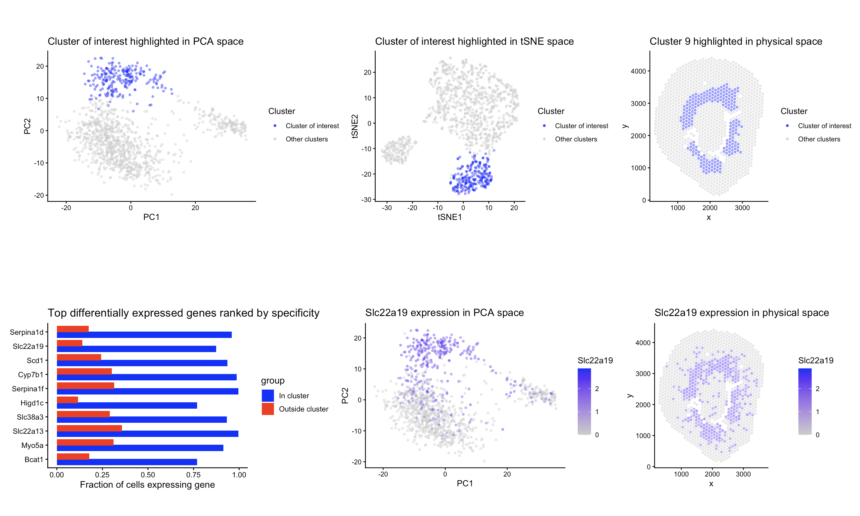
To identify the same group of cells in the Visium dataset, I adapted the same analysis I used previously for the Xenium dataset. Like before, I normalized the raw counts and did PCA for dimensionality reduction. I made a scree plot and decided to keep using the first 10 PCs, since the elbow in the scree plot was at a similar place as the Xenium dataset. I also made an elbow plot of withinness for kmeans. The curve also showed a flattening around k = 9, so I used 9 clusters for the analysis, and the number did not change between the two datasets.
After clustering, I visualized each cluster in tissue space to try and find the same cluster as before. Cluster 9 had a spatial pattern very similar to my previous cluster. I performed differential expression analysis comparing cluster 9 to all other spots in the same way as before, using a Wilcoxon rank-sum test (alternative = “greater”) to identify the genes upregulated in the cluster. I kept the genes with p < 0.05 and ranked them by specificity. The top differentially expressed genes were Serpina1d, Slc22a19, Scd1, and Cyp7b1. Both Slc22a19 and Cyp7b1 were also highly specific markers in the Xenium dataset. Slc22a19 has been experimentally localized to proximal tubule cells, and Cyp7b1 is expressed in kidney epithelial cells, including the tubules (https://www.proteinatlas.org/ENSG00000172817-CYP7B1/tissue/kidney and https://www.sciencedirect.com/science/article/abs/pii/S0022356524322852)and . The presence of these same markers supports the idea that cluster 9 represents the same cell type that I identified before. The other two differentially expressed genes (Serpina1d and Scd1) are specifically expressed in the proximal tubule epithelial cells as well. (https://www.bgee.org/gene/ENSMUSG00000071177 and https://pubmed.ncbi.nlm.nih.gov/25409434/)
The combination of spatial location, similar gene markers seen in the previous dataset, and other markers that are found in the proximal tubule epithelial cells, shows that cluster 9 in the Visium dataset corresponds to the same group of proximal tubule epithelial cells that I identified before in the Xenium dataset.
Overall, there were no changes that I needed to make to my code to identify the same dataset, other than selecting a different cluster of interest. When I evaluated whether changes to the number of principal components or clusters were necessary, both the screen and elbow plot showed similar optimal values, so I continued 10 PCs and k = 9. Because of that, I didn’t make any major changes to the clustering parameters.
Code (paste your code in between the ``` symbols)
1
2
3
4
5
6
7
8
9
10
11
12
13
14
15
16
17
18
19
20
21
22
23
24
25
26
27
28
29
30
31
32
33
34
35
36
37
38
39
40
41
42
43
44
45
46
47
48
49
50
51
52
53
54
55
56
57
58
59
60
61
62
63
64
65
66
67
68
69
70
71
72
73
74
75
76
77
78
79
80
81
82
83
84
85
86
87
88
89
90
91
92
93
94
95
96
97
98
99
100
101
102
103
104
105
106
107
108
109
110
111
112
113
114
115
116
117
118
119
120
121
122
123
124
125
126
127
128
129
130
131
132
133
134
135
136
137
138
139
140
141
142
143
144
145
146
147
148
149
150
151
152
153
154
#NOTE: view the final plot in full screen mode or else it looks squished

library(ggplot2)
library(patchwork)

data <- read.csv("~/Desktop/Visium-IRI-ShamR_matrix.csv.gz")


pos <- data[,c('x', 'y')]
rownames (pos) <- data[, 1]
gexp <- data[, 4: ncol(data)]
rownames (gexp) <- data[, 1]

totgexp = rowSums(gexp)
mat <-log10(gexp/totgexp *1e6 + 1)

vg <- apply(mat, 2, var)
vargenes <- names(sort(vg, decreasing=TRUE))

matsub <- mat[, vargenes]

#PCA (keeping top 10 PCS)
pcs <- prcomp(matsub)
selected_PCs <- pcs$x[, 1:10]

#kmeans (using 9 centers)
set.seed(1)
km <- kmeans(selected_PCs, centers = 9)
clusters <- factor(km$cluster)

pc_df <- data.frame(PC1 = pcs$x[,1], PC2 = pcs$x[,2], cluster = clusters)
space_df <- data.frame(x = pos$x, y = pos$y, cluster = clusters)


#highlight one cluster
space_df$highlight <- ifelse(space_df$cluster == "9", "Cluster of interest", "Other clusters")
pc_df$highlight <- ifelse(pc_df$cluster == "9", "Cluster of interest", "Other clusters")

#Plot with cluster 9 highlighted in PCA space
pca_cluster <- ggplot(pc_df, aes(x=PC1, y=PC2, color = highlight)) +
  geom_point(size = 1, alpha = 0.4) +
  scale_color_manual(name = "Cluster", values = c("Other clusters" = "grey80", "Cluster of interest" = "blue"),
                     guide = guide_legend(override.aes = list(size = 1, alpha = 0.8))) +
  theme_classic() +
  coord_fixed()+
  ggtitle("Cluster of interest highlighted in PCA space")

#Plot with cluter 9 highlighted in spatial space
space_cluster <- ggplot(space_df, aes(x, y, color = highlight)) +
  geom_point(size = 1, alpha = 0.4) +
  scale_color_manual(name = "Cluster", values = c("Other clusters" = "grey80", "Cluster of interest" = "blue"),
                     guide = guide_legend(override.aes = list(size = 1, alpha = 0.8))) +
  theme_classic() +
  coord_fixed()+
  ggtitle("Cluster 9 highlighted in physical space")


#Differentially expressed genes
#Define in vs out
in_cells  <- names(clusters)[clusters == "9"]
out_cells <- names(clusters)[clusters != "9"]

mat_in  <- mat[in_cells, , drop = FALSE]
mat_out <- mat[out_cells, , drop = FALSE]

#Percent detection
pct_in  <- colMeans(mat_in  > 0)
pct_out <- colMeans(mat_out > 0)

#Wilcoxon test per gene
genes <- colnames(mat)
pval <- sapply(genes, function(g) {
  wilcox.test(mat_in[, g], mat_out[, g], alternative='greater')$p.value
})

#make table
de <- data.frame(
  pct_in = pct_in,
  pct_out = pct_out,
  specificity = pct_in - pct_out,
  pval = pval
)

#Only keep significant genes (p < 0.05)
de_sig <- de[de$pval < 0.05, ]

#Sort by specificity
de_sig <- de_sig[order(de_sig$specificity, decreasing = TRUE), ]

head(de_sig, 10)

#Top 10 for plotting
top_de <- head(de_sig, 10)
top_de$gene <- factor(rownames(top_de), levels = rev(rownames(top_de)))
de_long <- data.frame(
  gene = rep(top_de$gene, 2),
  percent = c(top_de$pct_in, top_de$pct_out),
  group = rep(c("In cluster", "Outside cluster"), each = nrow(top_de))
)

de_pct_plot <- ggplot(de_long, aes(x = gene, y = percent, fill = group)) +
  geom_col(position = position_dodge(width = 0.8)) +
  coord_flip() +
  theme_classic(base_size = 12) +
  scale_fill_manual(values = c("In cluster" = "blue", "Outside cluster" = "red")) +
  ylab("Fraction of cells expressing gene") +
  xlab("") +
  ggtitle("Top differentially expressed genes ranked by specificity")

#tsne
library(Rtsne)
set.seed(1)

tsne <- Rtsne(selected_PCs, dims = 2, perplexity = 30)

tsne_df <- data.frame(
  tSNE1 = tsne$Y[, 1],
  tSNE2 = tsne$Y[, 2],
  cluster = clusters
)

#tSNE plot with cluster 9 highlighted
tsne_df$highlight <- ifelse(tsne_df$cluster == "9", "Cluster of interest", "Other clusters")
tsne_cluster <- ggplot(tsne_df, aes(tSNE1, tSNE2, color = highlight)) +
  geom_point(size = 1, alpha=0.4) +
  scale_color_manual(name = "Cluster", values = c("Other clusters" = "grey80", "Cluster of interest" = "blue"),
                     guide = guide_legend(override.aes = list(size = 1, alpha = 0.8))) +
  theme_classic() +
  coord_fixed()+
  ggtitle("Cluster of interest highlighted in tSNE space")

#plot gene expression in PCA and spatial space
pc_df$gene_expr <- mat[rownames(pc_df), "Slc22a19"]
space_df$gene_expr <- mat[rownames(space_df), "Slc22a19"]

pca_gene <- ggplot(pc_df, aes(x = PC1, y = PC2, color = gene_expr)) +
  geom_point(size = 1, alpha = 0.4) +
  theme_classic() +
  coord_fixed() +
  scale_color_gradient(low = "grey80", high = "blue")+
  ggtitle("Slc22a19 expression in PCA space") +
  labs(color = "Slc22a19")

space_gene <- ggplot(space_df, aes(x = x, y = y, color = gene_expr)) +
  geom_point(size = 1, alpha = 0.4) +
  theme_classic() +
  coord_fixed() +
  scale_color_gradient(low = "grey80", high = "blue")+
  ggtitle("Slc22a19 expression in physical space") +
  labs(color = "Slc22a19")

#NOTE: view the plot in full screen mode or else it looks squished
(pca_cluster | tsne_cluster | space_cluster) / (de_pct_plot | pca_gene | space_gene)
Attributions: Code adapted from HW3, all previous attributions still apply