HW4: Identifying Straight Proximal Tubule in Visium and Xenium Datasets

Description
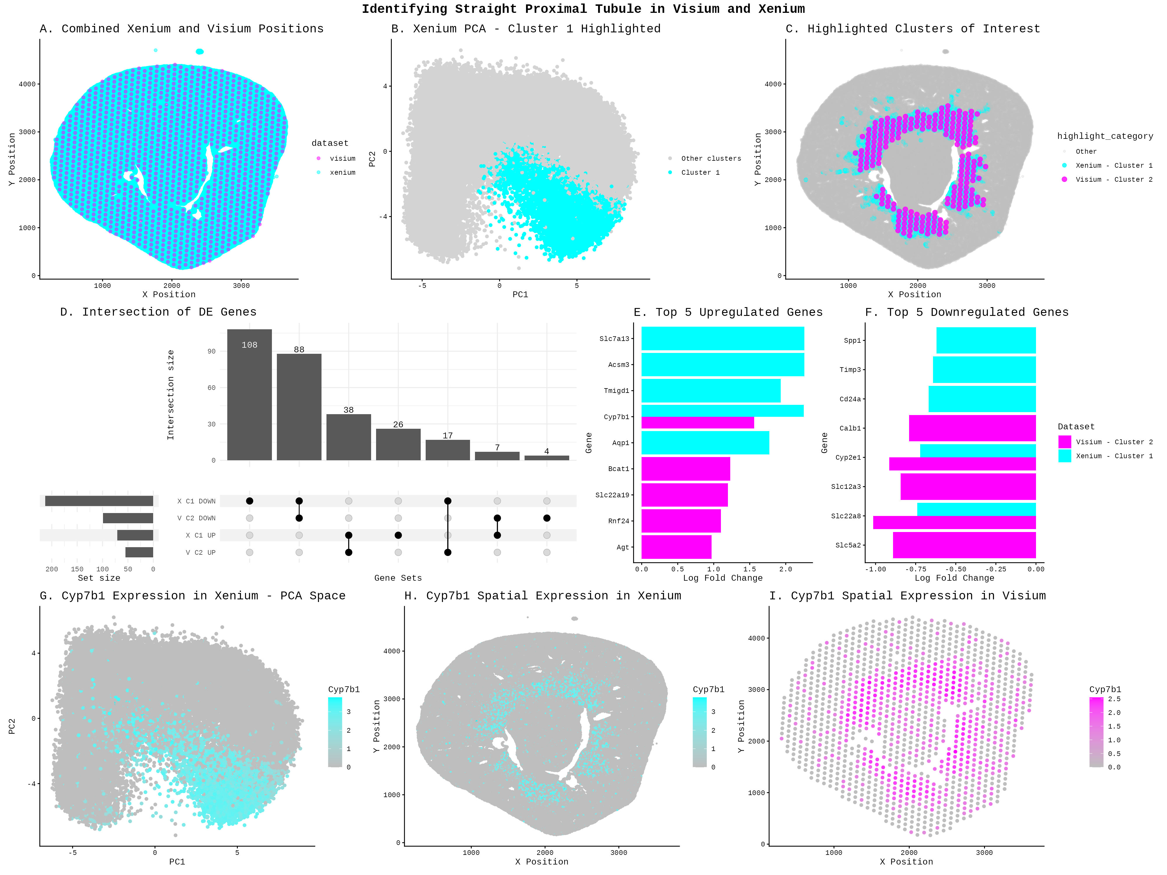
To identify the Straight Proximal Tubule (SPT) in the Xenium dataset using my HW3 Visium code, I increased the number of k-means clusters from 5 to 7 centers = 5 to centers = 7. Xenium contains far more cells (85,880) than Visium has spots (1224), and at single-cell resolution the tissue has much finer-grained heterogeneity (can see differences within a cell). This implies that I needed more clusters to separate distinct cell populations without merging different cell types together. With only 5 clusters, the SPT population likely gets lumped in with neighboring proximal tubule subtypes. I changed the cluster of interest from Cluster 2 to Cluster 1 because Xenium and Visium are different datasets. With different cells, resolutions, and gene panels, k-means partitions each dataset differently, and the SPT population separates into Cluster 1 in Xenium rather than Cluster 2 as in Visium. To identify which new cluster corresponded to SPT in the Xenium, I cross-referenced the spatial location against the Visium SPT region from HW3 (the ring-like structure visible in plot C) and confirmed the match using the shared marker gene Cyp7b1, which appeared highly expressed in both the Xenium Cluster 1 PCA region (plot G) and its spatial distribution (plot H), mirroring the Visium pattern in plot I. Finally, I changed the marker gene from Mpv17l (used in HW3) to Cyp7b1, because Mpv17l is not present in the Xenium panel (Xenium only has 301 genes compared to the 19468 in the Visium), whereas Cyp7b1 appears as a top upregulated gene in both datasets (plot E) and shows spatially concordant expression in both, making it a strong cross-platform SPT marker.
The differential expression visualization was also completely overhauled: HW3 used a rank-based scatter plot (panel C) to show all genes, while HW4 replaces this with an UpSet plot (panel D) to show overlapping DE gene sets across both datasets, and simple bar charts (panels E and F) to display the top 5 upregulated and downregulated genes per dataset. I chose visualizations to support a two-dataset comparison between Xenium and Visium, which required different plots than those used in HW3. Panel A was added as a combined spatial position plot to first establish that the two datasets cover the same tissue region, and to make sure that I did not need to use any tissue alignment tools. Panel C was introduced as a spatial overlay of both datasets’ clusters of interest, using distinct colors to show that Xenium Cluster 1 and Visium Cluster 2 occupy similar anatomical regions, which is a key piece of evidence for arguing they represent the same cell type. The UpSet plot in panel D was chosen over a single volcano or rank plot because there are now four gene sets to compare, upregulated and downregulated genes from each dataset, and an UpSet plot was an effective way to visualize overlaps across more than two sets simultaneously. Bar charts in panels E and F were used to highlight the top differentially expressed genes in a simple and readable format, making it easy to visually confirm that both datasets share key marker genes.
I was also a lot more limited in the genes that I could explore. I identified my cell type using Kap, Mpv17, S100g, and Gatm, which were all not in the Xenium dataset. From HW3, we know that Acsm3 is associated with the metabolic functions found in the straight portion (https://www.proteinatlas.org/ENSG00000005187-ACSM3/tissue/kidney). We see from Panel E that Slc7a13 is an upregulated marker, which is a transporter for L-cystine in S3 proximal tubules (https://www.proteinatlas.org/ENSG00000164893-SLC7A13/tissue/kidney). Cyp7b1 actively clearing 27-hydroxycholesterol (27-HC) in healthy proximal tubules ( Zhang, Yi-Lin1; Li, Xin-Yan1; Tang, Tao-Tao1; Yang, Qin1; Wang, Bo1; Li, Zuo-Lin1; Wen, Yi1; Wu, Qiu-Li1; Lv, Lin-Li1; Feng, Ye1,2; Ruan, Xiong-Zhong3; He, John Ci-Jiang2; Wang, Bin1; Liu, Bi-Cheng1. Metabolic Dysregulation of 27-Hydroxycholesterol Sensitizes Proximal Tubular Epithelial Cells to Ferroptosis in Ischemic Acute Kidney Injury. Journal of the American Society of Nephrology ():10.1681/ASN.0000000857, September 15, 2025. | DOI: 10.1681/ASN.0000000857), making it a marker for this cell type. The Upset plot showed that the datasets shared downregulated (88) and upregulated (38) genes between the two clusters, even after the datasets were restricted to common genes, supports the idea that they are the same cell type. However, the large unique set of Xenium downregulated genes (108) suggest the two technologies are also capturing some platform-specific signals, which is expected given that Xenium and Visium have different sensitivities and capture methods. Overall, the spatial co-localization in panel C, the shared upregulated markers Cyp7b1 and Slc7a13, and the overlapping DE genes in the UpSet plot together provide evidence that Xenium Cluster 1 and Visium Cluster 2 represent the same SPT population.
Code
library(ggplot2)
library(patchwork)
library(ComplexUpset)
library(tidyr)
library(dplyr)
library(patchwork)
library(tibble)

set.seed(123)
xenium <- read.csv('C:/users/lilli/Downloads/Xenium-IRI-ShamR_matrix.csv.gz')
visium <- read.csv('C:/users/lilli/Downloads/Visium-IRI-ShamR_matrix.csv.gz')

#gene expression data
gexp_x <- xenium[, 4:ncol(xenium)]
gexp_v <- visium[, 4:ncol(visium)]
#rownames are the spots
rownames(gexp_x) <- xenium[,1]
rownames(gexp_v) <- visium[,1]
#positions of the data
pos_x <- xenium[, c('x', 'y')]
pos_v <- visium[, c('x', 'y')]

#combine the position of both datasets
#searched up how to combine 2 dataframes in r
#used https://www.geeksforgeeks.org/r-language/rbind-in-r/ results
combined_pos <- rbind(cbind(pos_x, dataset = 'xenium'), cbind(pos_v, dataset = 'visium'))

p1<-ggplot(combined_pos, aes(x = x, y = y, color = dataset)) +
    geom_point(alpha = 0.5) +
    labs(title = 'A. Combined Xenium and Visium Positions', x = 'X Position', y = 'Y Position') +
    scale_colour_manual(values = c('visium' = 'magenta', 'xenium' = 'cyan')) +
    theme_classic()+
    theme(plot.title = element_text(size = 15))


#get gene names (column names) from both datasets
xenium_genes <- colnames(gexp_x)
visium_genes <- colnames(gexp_v)
#find common genes
common_genes <- intersect(xenium_genes, visium_genes)
#filter visium gene expression data to include only common genes
gexp_v <- gexp_v[, common_genes]

#library size normalization
total_genexp_x <- rowSums(gexp_x)
mat_x <- log10(gexp_x/total_genexp_x*1e4+1)
total_genexp_v <- rowSums(gexp_v)
mat_v <- log10(gexp_v/total_genexp_v*1e4+1)

#performing kmeans on the full gene expression data
kmeans_result_x <- kmeans(mat_x, centers = 7)
kmeans_result_v <- kmeans(mat_v, centers = 5)

#perform PCA
pcs_x <- prcomp(mat_x, center=TRUE, scale=FALSE)
pcs_v <- prcomp(mat_v, center=TRUE, scale=FALSE)

df_x <- data.frame(pos_x, mat_x, pcs_x$x, kmeans_result_x$cluster)

p2<-ggplot(df_x, aes(x=PC1, y=PC2, colour = kmeans_result_x.cluster==1))+
    geom_point()+
    scale_color_manual(values = c('TRUE' = 'cyan', 'FALSE' = 'lightgray'),
                        labels = c('TRUE' = 'Cluster 1', 'FALSE' = 'Other clusters'),
                        name = '')+
    labs(title = 'B. Xenium PCA - Cluster 1 Highlighted')+
    theme_classic()+
    theme(plot.title = element_text(size = 15))


#add cluster assignments to position data for both datasets
pos_x_clustered <- cbind(pos_x, cluster = as.factor(kmeans_result_x$cluster), dataset = 'xenium')
pos_v_clustered <- cbind(pos_v, cluster = as.factor(kmeans_result_v$cluster), dataset = 'visium')

#combine clustered position data for both datasets
combined_pos_clustered <- rbind(pos_x_clustered, pos_v_clustered)

#filter visium and xenium clustered data for cluster 1
#Asked AI: How to filter clusters in R?
cluster_1_xenium <- subset(pos_x_clustered, cluster == '1')
cluster_2_visium <- subset(pos_v_clustered, cluster == '2')

#combine the datasets
combined_cluster <- rbind(cluster_1_xenium, cluster_2_visium)

#new column to categorize points for highlighting
#used AI: I want to make a new column that assigns
#a position spot in cluster 2 in visium and position cell in cluster 1 in xensium in my combined dataframes.
combined_pos_clustered$highlight_category <- ifelse(
  combined_pos_clustered$cluster == '1' & combined_pos_clustered$dataset == 'xenium', 'Xenium - Cluster 1',
  ifelse(combined_pos_clustered$cluster == '2' & combined_pos_clustered$dataset == 'visium', 'Visium - Cluster 2','Other'))

#'Other' is the base layer in the plot
combined_pos_clustered$highlight_category <- factor(combined_pos_clustered$highlight_category,
                                                levels = c('Other', 'Xenium - Cluster 1', 'Visium - Cluster 2'))

#combined data with
#I looked up the documentation https://ggplot2.tidyverse.org/reference/scale_manual.html
p3<-ggplot(combined_pos_clustered, aes(x = x, y = y, color = highlight_category, size = highlight_category, alpha = highlight_category)) +
    geom_point() +
    labs(title = 'C. Highlighted Clusters of Interest', x = 'X Position', y = 'Y Position') +
    theme_classic() +
    scale_color_manual(values = c('Other' = 'grey', 'Xenium - Cluster 1' = 'cyan', 'Visium - Cluster 2' = 'magenta')) +
    scale_size_manual(values = c('Other' = 1, 'Xenium - Cluster 1' = 2, 'Visium - Cluster 2' = 2.5)) +
    scale_alpha_manual(values = c('Other' = 0.2, 'Xenium - Cluster 1' = 0.8, 'Visium - Cluster 2' = 0.8)) +
    theme(plot.title = element_text(size = 15))

#repeat of code from HW3, but for each dataset
assign_clus_x <- kmeans_result_x$cluster
assign_clus_v <- kmeans_result_v$cluster
#I am interested in cluster 1 for xenium and cluster 2 for visium
in_clus_x <-names(assign_clus_x[assign_clus_x == 1])
out_clus_x <-setdiff(rownames(mat_x), in_clus_x)
in_clus_v <-names(assign_clus_v[assign_clus_v == 2])
out_clus_v <-setdiff(rownames(mat_v), in_clus_v)

#differential expression: t-test for each gene
p_values_x <- numeric(ncol(mat_x))
logFC_x <- numeric(ncol(mat_x))
p_values_v <- numeric(ncol(mat_v))
logFC_v <- numeric(ncol(mat_v))

for (i in 1:ncol(mat_x)) {
  group1_x <- mat_x[in_clus_x, i]
  group2_x <- mat_x[out_clus_x, i]

  #two-way t-test
  test_x <- t.test(group1_x, group2_x)
  p_values_x[i] <- test_x$p.value
  #I logged transformed the original data before
  logFC_x[i] <- mean(group1_x) - mean(group2_x)}


for (i in 1:ncol(mat_v)) {
  group1_v <- mat_v[in_clus_v, i]
  group2_v <- mat_v[out_clus_v, i]

  #two-way t-test
  test_v <- t.test(group1_v, group2_v)
  p_values_v[i] <- test_v$p.value
  #I logged transformed the original data before
  logFC_v[i] <- mean(group1_v) - mean(group2_v)}

results_x <- data.frame(Gene = colnames(mat_x), logFC = logFC_x, p_value = p_values_x)
results_v <- data.frame(Gene = colnames(mat_v), logFC = logFC_v, p_value = p_values_v)

#subset by upregulated and downregulated genes
#I asked AI how to subset my this data by logFC so that I can get a gene set
sig_genes_x_up <- subset(results_x, p_value < 0.05 & logFC > 0)$Gene
sig_genes_x_down <- subset(results_x, p_value < 0.05 & logFC < 0)$Gene
sig_genes_v_up <- subset(results_v, p_value < 0.05 & logFC > 0)$Gene
sig_genes_v_down <- subset(results_v, p_value < 0.05 & logFC < 0)$Gene

#create gene sets with direction
gene_sets <- list('X C1 UP' = sig_genes_x_up,
                  'X C1 DOWN' = sig_genes_x_down,
                  'V C2 UP' = sig_genes_v_up,
                  'V C2 DOWN' = sig_genes_v_down)

#I realized that UpSetR is not a ggplot object, which means that patchwork would not work
#I asked AI how to use patchwork and it stated I needed to use ComplexUpset
#Asked AI to transform my gene_set so that I can imput it into ComplexUpset
#Followed this tutorial: https://krassowski.github.io/complex-upset/articles/Examples_R.html
upset_data <- gene_sets %>%
  stack() %>%
  mutate(value = 1) %>%
  pivot_wider(names_from = ind, values_from = value, values_fill = 0) %>%
  column_to_rownames('values')

p4<-upset(upset_data,
          names(gene_sets),
          name = 'Gene Sets',
          width_ratio = 0.25,
          min_size = 1)+
          ggtitle('D. Intersection of DE Genes')+
          theme(plot.title= element_text(vjust=65, hjust=-1, size=15))

#top 5 upregulated and downregulated genes for each dataset
top_xenium_up <- head(results_x[order(-results_x$logFC), ], 5)
top_xenium_down <- head(results_x[order(results_x$logFC), ], 5)
top_visium_up <- head(results_v[order(-results_v$logFC), ], 5)
top_visium_down <- head(results_v[order(results_v$logFC), ], 5)

#upregulated genes
#I am reusing my search on how rbind works that I did for my first graph
upregulated <- rbind(
  data.frame(Gene = top_xenium_up$Gene, logFC = top_xenium_up$logFC, Dataset = 'Xenium - Cluster 1'),
  data.frame(Gene = top_visium_up$Gene, logFC = top_visium_up$logFC, Dataset = 'Visium - Cluster 2'))

#downregulated genes
downregulated <- rbind(
  data.frame(Gene = top_xenium_down$Gene, logFC = top_xenium_down$logFC, Dataset = 'Xenium - Cluster 1'),
  data.frame(Gene = top_visium_down$Gene, logFC = top_visium_down$logFC, Dataset = 'Visium - Cluster 2'))

#upregulated genes
#I wanted the bar plot vertical, so I asked AI: How to make geom_bar vertical
p5<-ggplot(upregulated, aes(x = reorder(Gene, logFC), y = logFC, fill = Dataset)) +
  geom_bar(stat = 'identity', position = 'dodge') +
  coord_flip() +
  scale_fill_manual(values = c('Xenium - Cluster 1' = 'cyan', 'Visium - Cluster 2' = 'magenta')) +
  labs(title = 'E. Top 5 Upregulated Genes',
       x = 'Gene', y = 'Log Fold Change') +
  theme_classic() +
  theme(plot.title = element_text(size = 15))+
  theme(legend.position ='none')

#Downregulated genes
#same code as p5
p6<-ggplot(downregulated, aes(x = reorder(Gene, logFC), y = logFC, fill = Dataset)) +
  geom_bar(stat = 'identity', position = 'dodge') +
  coord_flip() +
  scale_fill_manual(values = c('Xenium - Cluster 1' = 'cyan', 'Visium - Cluster 2' = 'magenta')) +
  labs(title = 'F. Top 5 Downregulated Genes',
       x = 'Gene', y = 'Log Fold Change') +
  theme_classic() +
  theme(plot.title = element_text(size = 15))

#basically same plot code from HW3 for plot p7, p8, p9
#I used a different gene because Xenium did not have the original gene I used.
p7<-ggplot(df_x, aes(x=PC1, y=PC2, colour = Cyp7b1))+
  geom_point()+
  theme_classic()+
  scale_color_gradient(low = 'grey', high = 'cyan')+
  labs(title = 'G. Cyp7b1 Expression in Xenium - PCA Space', x='PC1', y='PC2')+
  theme(plot.title = element_text(size = 15))

p8<-ggplot(df_x, aes(x=x, y=y, color = Cyp7b1 ))+
  geom_point(size=0.5)+
  theme_classic()+
  scale_color_gradient(low = 'grey', high = 'cyan')+
  labs(title = 'H. Cyp7b1 Spatial Expression in Xenium', x='X Position', y='Y Position')+
  theme(plot.title = element_text(size = 15))

df_v <- data.frame(pos_v, mat_v, pcs_v$x)
p9<-ggplot(df_v, aes(x=x, y=y, color = Cyp7b1 ))+
  geom_point()+
  theme_classic()+
  scale_color_gradient(low = 'grey', high = 'magenta')+
  labs(title = 'I. Cyp7b1 Spatial Expression in Visium', x='X Position', y='Y Position')+
  theme(plot.title = element_text(size = 15))

#I searched: How to add title to patchwork? Used the copilot result.
combined <- (p1 | p2 | p3) /
            ((p4 | p5 | p6) +
            plot_layout(widths= c(3,1,1), heights = c(4, 1, 1))) /
            (p7 | p8 | p9) +
  plot_annotation(title = 'Identifying Straight Proximal Tubule in Visium and Xenium',
                  theme = theme(plot.title = element_text(hjust = 0.5, size = 16, face = 'bold')))

ggsave('hw4_llam9.png', combined, width = 20, height = 15, units = 'in', dpi = 200, limitsize = FALSE)