Validating Identity of Proximal Convoluted Tubule Segments

For this visualization, the Visium dataset is analyzed. The previous visualization with the Xenium dataset analysis brought to light the PCT cell-type, particularly the early segments of proximal tubules located across the renal cortex in a tubular pattern within a kidney coronal section.
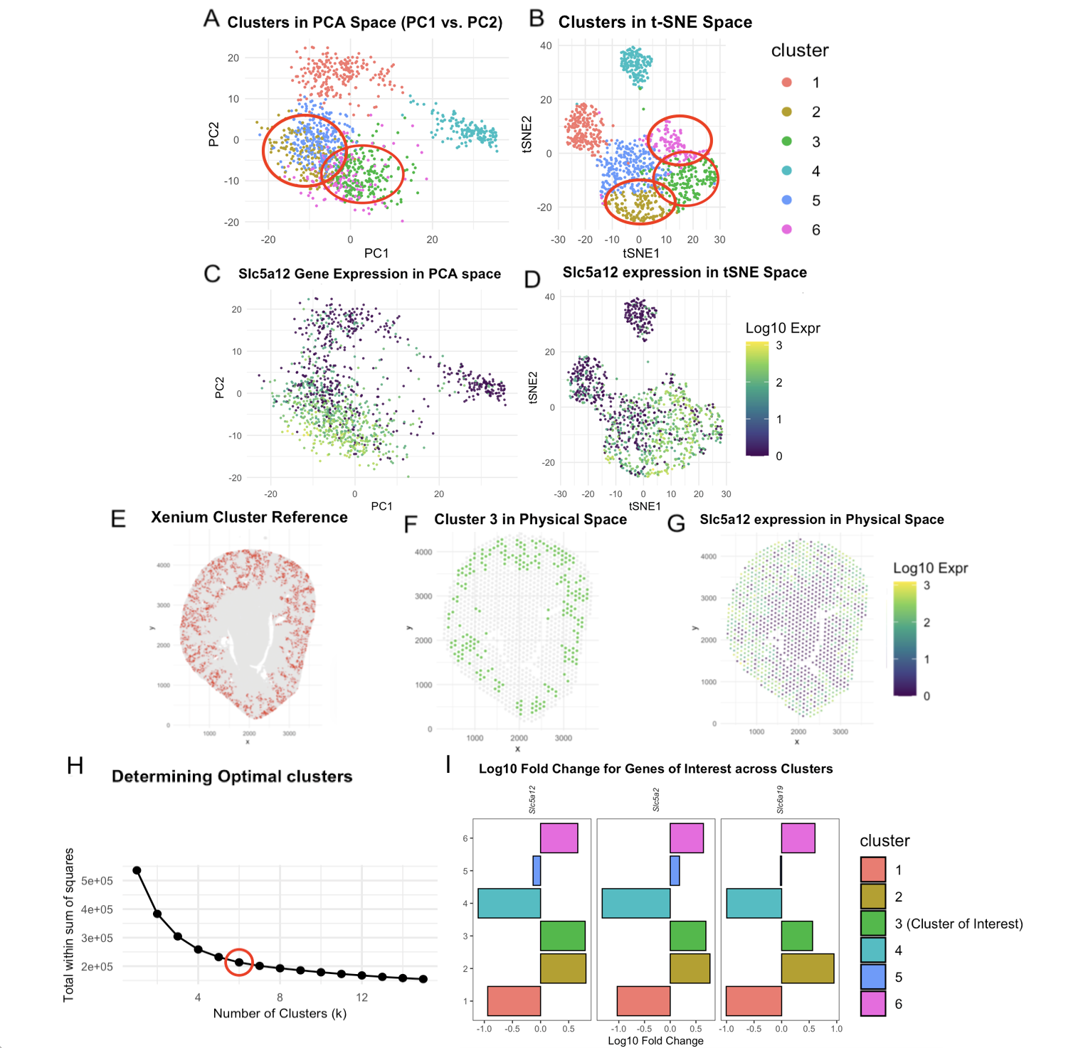
To locate the same cell type through the Visium dataset, a similar combination of concepts are utilized, including normalization/log-transformation, dimensionality reduction, k-means clustering, and differential expression.
For background about cluster choices, panel H provides context on the number of k being changed to 6 in Visium from 8 in Xenium. This was done after looking at the elbow plot plotting the total within-cluster sum of squares. I ran the code with k = 4 to k = 8, and settled on 6 based on the distinction of clusters in Panel B in the tSNE space and my speculation that the sharp drop stops and flattening begins in the elbow plot.
After k = 6 was chosen, to help decide which cluster our cell type of interest lies in, I decided on a two-pronged approach. First, it would be to analyze expression of the top 3 genes that were differentially expressed in the Xenium dataset’s cluster of interest: Slc5a12, Slc5a2, and Slc6a19. These were also the genes that helped form the hypothesis that we were looking at PCT segments. In Panel I, cluster 1, 4, 5 either downregulated these genes when looking at the logfold change or did not upregulate all 3. Clusters 2, 3, and 6, were of interest. These are highlighted in Panels A and B with the Gestalt principle of enclosure. The second approach was to compare spatially the cluster from the Xenium dataset and the narrowed down clusters 2,3,6 in visium. While all 3 of them depicted some level of similarity with Panel G, Cluster 3 did so with greatest likeness.
The tubules are approximately 60um in diameter. Given that each spot is 55um, it is highly likely that PCT are present in spots with other distinct cell-types. This may have split the cells from Xenium’s red cluster 1 (Panel E) into Clusters 2, 3, 6 as the cells may have been aggregated into spots with other cell types. Visium is taking into account 19000+ genes, with Xenium only considering ~300, so more patterns are taken into account for clustering. However, due to the lower resolution because of spots rather than single-cell, there may be fewer clusters. For next steps, spatial deconvolution would be useful to support this idea further.
Some other differences in the code, beyond the additional plot mentioned before, was changes in the color theme for easing cognitive load. In the Xenium dataset, consistent depiction was done in a coral-red tone, which is brought into consideration again in Panel E when using the spatial organization of the cluster as reference. For the Visium dataset Cluster 3 is green (Panel A, B, I), and this is consistently depicted by changing to a viridis scale for gene expression (Panel C, D, F, G) over magma to allow easier following. Additionally point size and alpha values were changed to better fit the sequencing-based spots. Based on prior feedback, repeating legends were also removed. Panels E and F have an intuitive true/false coloring, so legends were avoided to not overload information.
Based on the high spatial match, particularly the fact the Renal cortex is occupied between Panels E and F, Cluster 3 was chosen as the cluster of interest. However, it is likely Clusters 2 and 6 also have PCT segments present. When considering Slc5a12 expression, it is visible in Panel G that Cluster 3 maps to high areas of Slc5a12, but there is some level of Slc5a12 expression not captured by Cluster 3. As for Panels C and D, when mapping Slc5a12 gene expression, levels of high expression are almost completely captured in both the PCA and tSNE space by Clusters 2, 3, and 6.
With this visualization, I hope you are convinced that the same cell type found in the Xenium dataset is densely populated in Cluster 3, but may also have presence in Cluster 2 and 6 due to the basic principles of sequencing-based transcriptomics, and the fact that PCTs are spread across the renal cortex in a tubular manner, making them appear across multiple spots with other cell types. It is worthy to note that if I had analyzed the Visium data before the Xenium data, I would not have been able to resolve PCT vs PSTs, due to the fact that according to literature, there is no ‘sharp’ anatomical boundary, as the segments transform gradually. So almost certainly, there would be some overlap with a spot representing both convoluted and straight segments.
References
-
Lewis, S., Chen, L., Raghuram, V., Khundmiri, S. J., Chou, C. L., Yang, C. R., & Knepper, M. A. (2021). “SLC-omics” of the kidney: solute transporters along the nephron. American journal of physiology. Cell physiology, 321(3), C507–C518. https://doi.org/10.1152/ajpcell.00197.2021
-
https://www.proteinatlas.org/ENSG00000148942-SLC5A12
-
https://medlineplus.gov/genetics/gene/slc5a1/
-
https://maayanlab.cloud/Harmonizome/gene/SLC5A12
Code
1
2
3
4
5
6
7
8
9
10
11
12
13
14
15
16
17
18
19
20
21
22
23
24
25
26
27
28
29
30
31
32
33
34
35
36
37
38
39
40
41
42
43
44
45
46
47
48
49
50
51
52
53
54
55
56
57
58
59
60
61
62
63
64
65
66
67
68
69
70
71
72
73
74
75
76
77
78
79
80
81
82
83
84
85
86
87
88
89
90
91
92
93
94
95
96
97
98
99
100
101
102
103
104
105
106
107
108
109
110
111
112
113
114
115
116
117
118
119
120
121
122
123
124
125
126
127
128
129
130
131
132
133
134
135
136
137
138
139
140
141
142
143
144
145
146
147
148
149
150
151
152
153
154
155
156
157
158
159
160
161
162
163
164
165
166
167
168
169
170
171
172
173
174
175
176
177
178
179
180
181
library(ggplot2)
library(patchwork)
library(Rtsne)
library(png)
library(grid)

#Calling image from xenium dataset for comparison
img_path <- "~/Desktop/GDV/clusterinterest_xenium.png"
xenium_img <- readPNG(img_path)
p_xen <- rasterGrob(xenium_img, interpolate = TRUE)

#Converting png to a ggplot object
p_xen <- ggplot() +
  annotation_custom(p_xenium, xmin=-Inf, xmax=Inf, ymin=-Inf, ymax=Inf) +
  theme_void() +
  labs(title = "Xenium Cluster Reference") +
  theme(plot.title = element_text(size = 9, face = "bold", hjust = 0.5))
p_xen

data <- read.csv('~/Desktop/GDV/Visium-IRI-ShamR_matrix.csv.gz')
pos <- data[,c('x','y')]
rownames(pos) <- data[,1]
gexp <- data[,4:ncol(data)]
rownames(gexp) <- data[,1]

totgexp <- rowSums(gexp)
#normalizing the data
mat <- log10(gexp/totgexp * 1e6 + 1)

#PCA
pcs <- prcomp(mat, center = TRUE, scale = FALSE)
plot(pcs$sdev[1:50]) #first 10 pcs chosen based on this plot

#tSNE
set.seed(42)
tsne <- Rtsne::Rtsne(pcs$x[, 1:10], dims=2, perplexity=30, verbose=TRUE) #verbose parameter added for troubleshooting
emb <- tsne$Y
rownames(emb) <- rownames(mat)
colnames(emb) <- c('tSNE1', 'tSNE2')
head(emb)

# Determining optimal k
wss <- sapply(1:15, function(k){kmeans(pcs$x[,1:10], centers=k, nstart=10)$tot.withinss})
elbow_df <- data.frame(k=1:15, wss=wss)
p_elbow <- ggplot(elbow_df, aes(x=k, y=wss)) +
  geom_line() +
  geom_point() +
  theme_minimal() +
  labs(title="Determining Optimal clusters", x="Number of Clusters (k)", y="Total within sum of squares") +
  geom_point(data = elbow_df[elbow_df$k == 6, ], #estimated 6 as optimal k
             aes(x=k, y=wss),
             color="red", size=6, shape=1, stroke=1) +
  theme(plot.title = element_text(size = 9, face = "bold"))

clusters <- as.factor(kmeans(pcs$x[,1:10], centers = 6)$cluster)
df_clusters <- data.frame(pos, pcs$x[,1:10], emb, cluster = clusters)
p1 <- ggplot(df_clusters, aes(x=PC1, y=PC2, col=clusters)) +
  geom_point(size = 0.5) +
  theme_minimal() +
  theme(legend.position = "none") +
  coord_fixed()+
  annotate("path",
           x=mean(df_clusters$PC1[df_clusters$cluster==3]) + 10*cos(seq(0,2*pi,length.out=100)),
           y=mean(df_clusters$PC2[df_clusters$cluster==3]) + 7*sin(seq(0,2*pi,length.out=100)),
           color="red", size=1) +
  annotate("path",
           x=mean(df_clusters$PC1[df_clusters$cluster==6]) + 10*cos(seq(0,2*pi,length.out=100)),
           y=mean(df_clusters$PC2[df_clusters$cluster==6]) + 7*sin(seq(0,2*pi,length.out=100)),
           color="red", size=1) +
  labs(title="Clusters in PCA Space (PC1 vs. PC2)") +
  theme(plot.title = element_text(size = 9, face = "bold"))

p2 <- ggplot(df_clusters, aes(x=tSNE1, y=tSNE2, col=cluster)) +
  geom_point(size = 0.5) +
  theme_minimal() +
  coord_fixed()+
  annotate("path",
           x=mean(df_clusters$tSNE1[df_clusters$cluster==3]) + 12*cos(seq(0,2*pi,length.out=100)),
           y=mean(df_clusters$tSNE2[df_clusters$cluster==3]) + 10*sin(seq(0,2*pi,length.out=100)),
           color="red", size=1) +
  annotate("path",
           x=mean(df_clusters$tSNE1[df_clusters$cluster==2]) + 12*cos(seq(0,2*pi,length.out=100)),
           y=mean(df_clusters$tSNE2[df_clusters$cluster==2]) + 10*sin(seq(0,2*pi,length.out=100)),
           color="red", size=1) +
  annotate("path",
           x=mean(df_clusters$tSNE1[df_clusters$cluster==6]) + 12*cos(seq(0,2*pi,length.out=100)),
           y=mean(df_clusters$tSNE2[df_clusters$cluster==6]) + 10*sin(seq(0,2*pi,length.out=100)),
           color="red", size=1) +
  labs(title="Clusters in t-SNE Space") +
  guides(color = guide_legend(override.aes = list(size = 2, alpha = 1))) +
  theme(plot.title = element_text(size = 9, face = "bold"))

#finalize target cluster
target_cluster <- 3
#target cluster in physical space
p3 <- ggplot(df_clusters, aes(x=x, y=y, color=cluster == target_cluster)) +
  geom_point(size=0.8, alpha = 0.7) +
  coord_fixed() +
  scale_color_manual(values=c("grey90", "#0CB702")) +
  theme_minimal() +
  theme(legend.position = "none") +
  labs(title="Cluster 3 in Physical Space") +
  theme(plot.title = element_text(size = 9, face = "bold"))

target_gene <- "Slc5a12"
# Gene of interest in PCA space
df_gene <- data.frame(pcs$x, gene = mat[, target_gene])
p5 <- ggplot(df_gene, aes(x = PC1, y = PC2, color = gene)) +
  geom_point(size = 0.5, alpha = 0.8) +
  coord_fixed() +
  theme_minimal() +
  theme(legend.position = "none") +
  scale_color_viridis_c(name = "Log10 Expr") +
  labs(
    title = paste(target_gene, "Gene Expression in PCA space"),
    x = "PC1", y = "PC2", color = "Slca12 Gene Expression"
  ) +
  theme(plot.title = element_text(size = 9, face = "bold"))

df_clusters$gene_expr <- mat[, target_gene]
# Gene of interest in tSNE space
p6 <- ggplot(df_clusters, aes(x=tSNE1, y=tSNE2, color=gene_expr)) +
  geom_point(size=0.5, alpha=0.8) +
  coord_fixed() +
  scale_color_viridis_c(name = "Log10 Expr") +
  theme_minimal() +
  labs(title = paste(target_gene, "expression in tSNE Space")) +
  theme(plot.title = element_text(size = 9, face = "bold"))

# Gene of interest in physical space encoding gene expression levels
p7 <- ggplot(df_clusters, aes(x=x, y=y, color=gene_expr)) +
  geom_point(size=0.5, alpha = 0.7) +
  coord_fixed() +
  scale_color_viridis_c(name = "Log10 Expr") +
  theme_minimal() +
  labs(title = paste(target_gene, "expression in Physical Space")) +
  theme(plot.title = element_text(size = 9, face = "bold"))

genes <- c("Slc5a12", "Slc5a2", "Slc6a19")
#Gemini prompt: help me create a bar chart visualization depicting the log10 fold change of
#the genes Slc5a12, Slc5a2, Slc6a19 across all clusters. separate genes in
#different panels
#Mean(Cluster X) - Mean(All other clusters)
fc_list <- lapply(unique(clusters), function(cl) {
  cl_idx <- which(clusters == cl)
  other_idx <- which(clusters != cl)
  colMeans(mat[cl_idx, genes, drop=FALSE]) - colMeans(mat[other_idx, genes, drop=FALSE])
})

fc_df <- do.call(rbind, fc_list) %>%
  as.data.frame() %>%
  mutate(cluster = as.factor(unique(clusters))) %>%
  pivot_longer(cols = -cluster, names_to = "gene", values_to = "log10FC")
fc_df$gene <- factor(fc_df$gene, levels = genes)

p_fc <- ggplot(fc_df, aes(x = cluster, y = log10FC, fill = cluster)) +
  geom_bar(stat = "identity", color = "black", size = 0.2) +
  coord_flip() +
  facet_grid(. ~ gene, scales = "free_x") +
  scale_fill_discrete(labels = function(x) ifelse(x == "3", "3 (Cluster of Interest)", x)) +
  labs(title = "Log10 Fold Change for Genes of Interest across Clusters",
       y = "Log10 Fold Change", x = "Cluster") +
  theme_bw() +
  theme(
    panel.grid = element_blank(),
    axis.title.y = element_blank(),
    strip.background = element_blank(),
    strip.text.x = element_text(angle = 90, face = "italic", size = 8, vjust = 0.5),
    plot.title = element_text(hjust = 0.5, face = "bold")
  )
p_fc

final_plot <-  (p1 + p2) /
  (p6 + p7) /
  (p3 + p5) /
  (p_xen + p_elbow + p_fc) +
  plot_annotation(tag_levels = 'A')
final_plot

#reference https://patchwork.data-imaginist.com/articles/guides.html
#code is adapted from HW3 code, additional AI help beyond the ones mentioned in HW3 code is commented