HW4
Changes made to code from HW3:
- Switched from Visium to Xenium and had to cut down data frame to first 10,000 cells in order to make the dataset more manageable for the computer/program
- Changed the number of PC’s considered for tSNE analysis from 10 in HW3 to 7 in HW4 based on the new inflection point of the PC vs. standard deviation captured plot
- Did new analysis of what number of clusters are optimal for k clustering, which I forgot to do in HW3. This time, based on the elbow of the withinness vs. # clusters plot, I chose k = 6 clusters
- I slightly modified the coordinates of the center of the tissue sample to help determine which cluster was the central cluster (specifically, the center x coordinate was changed to 2000 instead of the 2250 from HW3)
- I got rid of plots 1 and 3 from HW 3, and instead when plotting the overall data in both physical and reduced dimensionality (tSNE) space, I only made two plots (plots 1 and 2 shown in the HW 4 image and code) showing the cluster of interest relative to the other clusters’ cells in both physical and tSNE space. This was to make the plots and information shown in these plots (cells in the cluster of interest) more relevant based on what the prompts for those two graphs were asking for.
- I adjusted the alpha values to be more transparent that the alpha values used in HW3 since now the Xenium dataset contains overlapping cells rather than non-overlapping spots, so I wanted the alpha values to allow visualization of all cells.
- For differential gene expression analysis, I plotted the top 15 differentially-expressed genes rather than top 10, since I found that the analysis I did revealed more than 10 genes all with a p-value of 0, so I wanted to include the full range of genes at this significance level.
- Since Acsm2 (gene I analyzed in HW3) was not in the Xenium dataset, based on plot3, I decided to investigate Plau expression in the cluster of interest instead.
- I changed the color scale for plot 5 from the plasma color scheme that was used in HW3/plot 4 because I found that it was hard to distinguish the cluster of interest in that color scale for the Plau gene.
- I changed the layout of the plots in patchwork to make the information shown in the plots easier for people to read/distinguish.
Cell type analysis
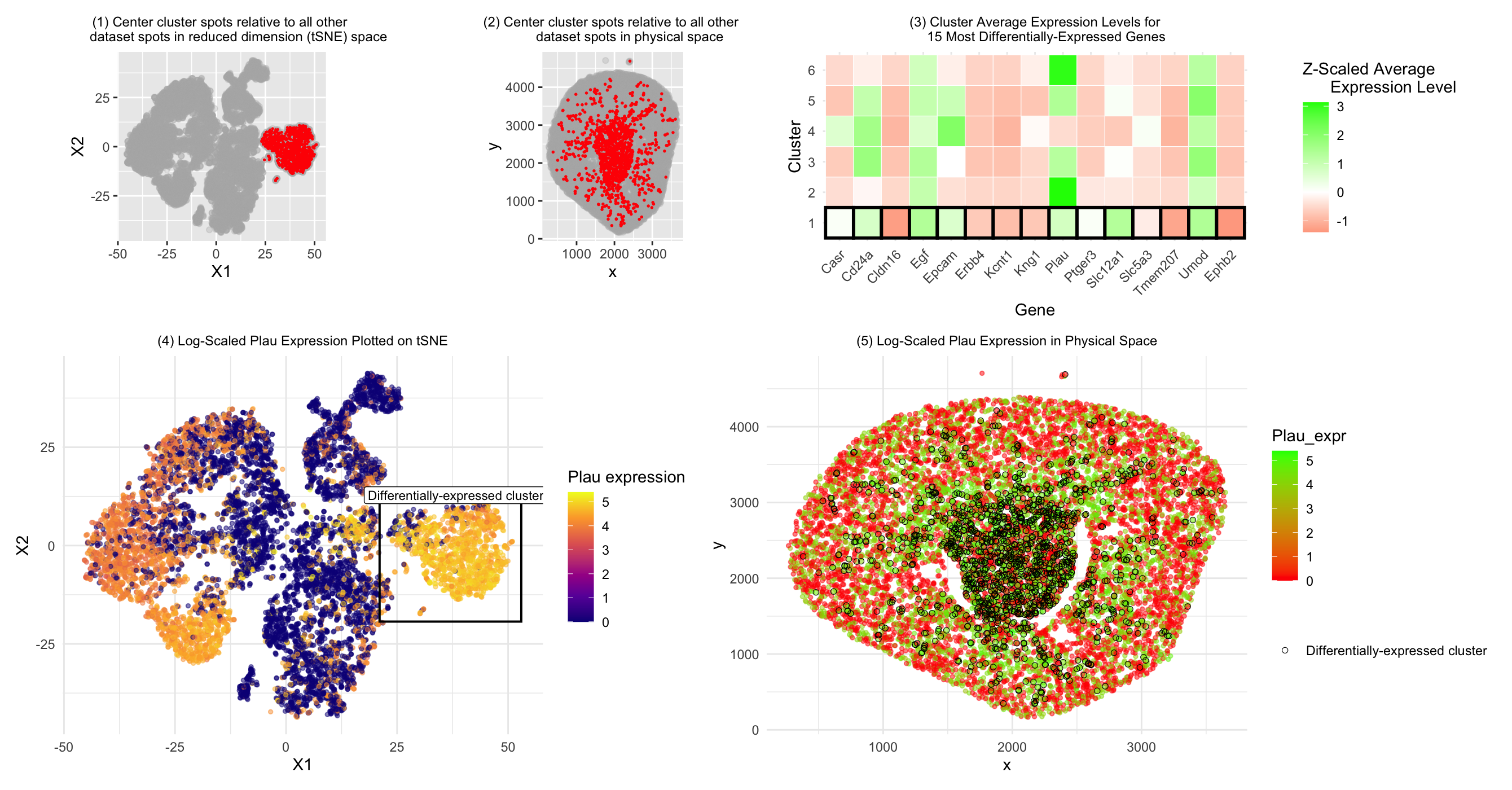
In HW3, we concluded that the central cell cluster (cluster of interest) was primarily composed of proximal tubule cells compared to the other clusters based on Acsm2 gene expression. Here, we investigated Plau expression instead. According to literature, Plau (also written as uPA or u-PA)(1) expression can be found in tubular epithelial cells in the kidney (2). Thus, based on this gene expression data, we come to a similar conclusion to the one we drew in HW3: that our central cluster of interest is primarily composed of tubular cells. The differences in gene expression between the cluster of interest in HW3 and HW4 may be due to the fact that HW3 used the Visium dataset, which is comprised of spots with potentially multiple cell types, whereas the Xenium dataset is comprised of individual cells. Thus, more uniform or obvious cell patterns may have emerged in the Visium dataset when various cell types were included in the same spots and we analyzed the average gene expression values for each spot, whereas for the Xenium dataset, because we can examine individual cells mixed together in similar regions/clusters, there is more visible variation and less obivous patterns may emerge. Drawing such a firm conclusion on cell type as was done in HW3 may also have been more difficult for this cluster’s cell type in HW4 because the Acsm2 gene was not included in the Xenium dataset, so Plau may not have been as strong a marker for (proximal) tubule cells as the gene we were able to analyze in HW3. Nonetheless, there is some literature evidence to support Plau expression in tubular cells, bringing us to a similar conclusion for the central cluster cell type.
Literature sources:
- https://www.ncbi.nlm.nih.gov/gene/18792
- https://pmc.ncbi.nlm.nih.gov/articles/PMC5733590/
Code:
```r
#Sofia Arboleda HW 4 - 2/17/2026
library(patchwork) library(ggplot2)
#Using code we discussed together in the in-class examples:
data <- read.csv(“~/Desktop/Xenium-IRI-ShamR_matrix.csv.gz”) data <- data[sample(1:nrow(data), 10000),] #to reduce data to more manageable size for program/computer data[1:5, 1:10]
positions <- data[,c(‘x’, ‘y’)] rownames(positions) <- data[,1] gene_exp <- data[, 4:ncol(data)] rownames(gene_exp) <- data[,1]
#Normalizing total gene expression data total_gene_exp <- rowSums(gene_exp) mat <- log10(gene_exp/total_gene_exp * 1e6 + 1) #Log transform to make more Gaussian distributed and interpretable, get rid of NaN points df <- data.frame(positions, total_gene_exp)
#Dimensionality reduction
#Linear DR: PCA PCs <- prcomp(mat, center = TRUE, scale = FALSE) print(PCs$rotation[1:5,1:5]) #show 1st 5 PC’s gene loading for 1st 5 genes; rotation = loading plot(PCs$sdev[1:25]) #dips at some point where PC’s are not capturing much more variance in the data; we see plateau at around PC 10 df <- data.frame(PCs$x, total_gene_exp)
#Nonlinear DR: tSNE on top 10 PCs top_PCs <- PCs$x[, 1:10] tsne <- Rtsne::Rtsne(top_PCs, dims = 2, perplexity = 30) emb <- tsne$Y df <- data.frame(emb, total_gene_exp)
#K means clustering of tSNE data #With help from Chat GPT (prompt = “For this code, how can I create a apply loop to plot the total withinness (y axis) for k means clustering analysis with cluster numbers ranging from 1 to 15 (x axis)?”) k_vals <- 1:15 set.seed(123) tot_withinss <- sapply(k_vals, function(k) { #Total withinness for each # of clusters km <- kmeans(emb, centers = k, iter.max = 100) km$tot.withinss }) plot(k_vals, tot_withinss, #Plotting total withinness for each # of clusters to determine optimal cluster # xlab = “Number of Clusters (k)”, ylab = “Total Within-Cluster Sum of Squares”, main = “Elbow Plot for K-means Clustering”) #Based on plot, inflection point @ k = 6 –> selected 6 clusters clusters <- as.factor(kmeans(emb, centers = 6)$cluster) #centers = selected k; there is 1 cluster that is separate from all the other clusters entirely and looks quite transcriptionally different cell_data <- data.frame(emb, clusters, top_PCs, positions) ggplot(cell_data, aes(x=X1, y=X2, col=clusters)) + geom_point(size = 0.7) ggplot(cell_data, aes(x=x, y=y, col=clusters)) + geom_point(size = 0.7)
#Modifying work from HW 3 to study our central cluster of interest #With help from ChatGPT (prompt = “How to set a variable describing the cluster with the smallest average distance from each cell in the cluster to the x and y origin in order to create a separate dataframe with the cell data for that cluster only” and “Why does center_clusters only show tSNE data and total gene expression data?”) cell_data$dist_to_center <- sqrt(((cell_data$x) - 2000)^2 + ((cell_data$y) - 2250)^2) #changed to (2250, 2250) since this was my estimate for center point of graph which was more appropriate compared to origin cluster_mean_dist <- aggregate( #Adding distance to center data to cluster data dist_to_center ~ clusters, data = cell_data, FUN = mean ) closest_cluster <- cluster_mean_dist$clusters[ #Calculating which cluster is closest to center which.min(cluster_mean_dist$dist_to_center) ] center_cluster <- cell_data[cell_data$clusters == closest_cluster, ] #Creating new center cluster dataframe to isolate this cluster for graphing head(center_cluster)
1) Plotting our cluster of interest (center cluster) in reduced dimensional space (tSNE X1 vs. X2)
plot1 <- ggplot(cell_data, aes(x = X1, y = X2)) + geom_point(color = “grey70”, alpha = 0.3) + geom_point( data = center_cluster, aes(x = X1, y = X2), color = “red”, size = 0.2 ) + coord_fixed() + labs(title = “(1) Center cluster spots relative to all other dataset spots in reduced dimension (tSNE) space”) + theme(plot.title = element_text(hjust = 0.5, size = 9)) plot1
2) Plotting our cluster of interest (center cluster) in physical space (x coordinate vs. y coordinate)
#With help from ChatGPT (prompt = “How to change title size”) #With help from ChatGPT (prompt = “How can I plot the cells of the center cluster in a different color from the rest of the cells when plotting all the cells in physical space (x vs. y coordinates)” and “How to center a title in ggplot” and “How to change title size”) plot2 <- ggplot(cell_data, aes(x = x, y = y)) + geom_point(color = “grey70”, alpha = 0.3) + geom_point( data = center_cluster, aes(x = x, y = y), color = “red”, size = 0.3 ) + coord_fixed() + labs(title = “(2) Center cluster spots relative to all other dataset spots in physical space”) + theme(plot.title = element_text(hjust = 0.5, size = 9)) plot2
3) A panel visualizing differentially expressed genes for your cluster of interest
#With help from in-class code from lecture 6 & ChatGPT (prompt = “In order to run a Wilcox test, separate our normalized cell expression data into that which belongs to our center cluster and that which belongs to all the other cells/clusters”) center_cells <- rownames(center_cluster) non_center_cells <- rownames(cell_data)[!rownames(cell_data) %in% center_cells] out <- sapply(colnames(mat), function(gene) { x1 <- mat[center_cells, gene] x2 <- mat[non_center_cells, gene] wilcox.test(x1, x2, alternative=’two.sided’)$p.value }) #With help from ChatGPT (prompt = “Given this code for applying a Wilcox test to all genes in the dataset, how can I extract the top 10 genes with the lowest p-value from the Wilcox test?”) wilcox_p_values <- data.frame( gene = names(out), p_value = out, stringsAsFactors = FALSE ) top15_DE_genes <- wilcox_p_values[order(wilcox_p_values$p_value), ][1:15, ] top15_DE_genes
#With help from ChatGPT (prompt = “Can you make a “heatmap” style plot with each cluster’s average expression level for our top 10 most significantly differentially-expressed genes, with blue representing significant underexpression and red representing significant overexpression” and “Can you highlight the closest_cluster row by enclosing it with a box or black outline”) top15_gene_names <- top15_DE_genes$gene #Calculating average expression level for the top 10 genes to compare across clusters in “heatmap” style plot expr_df <- data.frame(mat[, top15_gene_names], cluster = cell_data$clusters) library(dplyr) avg_expr <- expr_df %>% group_by(cluster) %>% summarise(across(all_of(top15_gene_names), mean)) avg_expr_mat <- as.matrix(avg_expr[, -1]) rownames(avg_expr_mat) <- avg_expr$cluster #Scaling expression data by each gene so expression levels relative within genes scaled_expr <- t(scale(t(avg_expr_mat))) #Reformatting to be able to plot in ggplot #With help from ChatGPT (prompt = “How to make it so all cluster numbers show on y axis”) library(reshape2) melted_expr <- melt(scaled_expr) colnames(melted_expr) <- c(“Cluster”, “Gene”, “Expression”) melted_expr$highlight <- melted_expr$Cluster == closest_cluster melted_expr$Cluster <- factor(melted_expr$Cluster, levels = 1:6) #Plotting relative gene expression data for each cluster for each of the top 10 genes and color coding by over vs. underexpression plot3 <- ggplot(melted_expr, aes(x = Gene, y = Cluster, fill = Expression)) + geom_tile(color = “white”) + #Making lines around center (significant) cluster bolded to highlight differential expression between this cluster and the other clusters geom_tile(data = subset(melted_expr, highlight), aes(x = Gene, y = Cluster), fill = NA, color = “black”, size = 1) + scale_fill_gradient2( low = “red”, mid = “white”, high = “green”, #red = low expression, green = high expression midpoint = 0 ) + theme_minimal() + theme( axis.text.x = element_text(angle = 45, hjust = 1), plot.title = element_text(hjust = 0.5, size = 9) ) + labs( title = “(3) Cluster Average Expression Levels for 15 Most Differentially-Expressed Genes”, fill = “Z-Scaled Average Expression Level” ) plot3
#With help from ChatGPT (prompt = “How to find if a column with a certain name exists in a dataframe”) “Acsm2” %in% colnames(df) #Seeing that Acsm2 doesn’t exist in this Xenium dataset, we have to explore the differential expression of other genes to determine the central cluster’s cell type #Based on “heat map” plot, we can investigate differential expression of Plau gene
4) A panel visualizing one of these genes in reduced dimensional space (PCA, tSNE, etc)
#Visualizing Plau in reduced dimensional space (tSNE) #With help from ChatGPT (prompt = “Can you plot all spots on tSNE X1 vs. X2 and color code by expression levels of Plau while enclosing spots included in the closest_cluster in a black outline?” and “Make the center of the rectangle and label shift according to the average x and y value of the spots in closest_cluster”) #With help from GoogleAI output (prompt = “How to overlay a square on a ggplot”, “How to make ggplot square have transparent fill”, and “How to add a label to a ggplot square”) cell_data$Plau_expr <- mat[rownames(cell_data), “Plau”]
cluster_bounds <- cell_data %>% filter(clusters == closest_cluster) %>% #Finding bounds of cluster to help create enclosure to highlight differentially-expressed cluster summarise( xmin = min(X1), xmax = max(X1), ymin = min(X2), ymax = max(X2), x_center = mean(X1), y_center = max(X2) + 2 )
plot4 <- ggplot(cell_data, aes(x = X1, y = X2)) + geom_point(aes(color = Plau_expr), size = 1, alpha = 0.5) + geom_rect( #Making rectangle to enclose differentially-expressed cluster; coordinates move as cluster tSNE coordinates change with each run of tSNE data = cluster_bounds, inherit.aes = FALSE, aes(xmin = xmin-2, xmax = xmax+2, ymin = ymin-2, ymax = ymax+2), fill = NA, color = “black”, linewidth = 0.7 ) + geom_label( data = cluster_bounds, inherit.aes = FALSE, aes(x = x_center, y = y_center), label = “Differentially-expressed cluster”, color = “black”, fill = “white”, size = 3 ) + scale_color_viridis_c(option = “plasma”) + theme_minimal() + labs( title = “(4) Log-Scaled Plau Expression Plotted on tSNE”, color = “Plau expression” ) + theme(plot.title = element_text(hjust = 0.5, size = 9)) plot4
5) A panel visualizing one of these genes in space
#Visualizing Plau expression in physical space #With help from ChatGPT (prompt = “How can I make a ggplot of each spot in physical space (x vs. y coordinates) where all the spots within cluster 1 are enclosed by black outlines” and “How to add legend element mentioning that black outlines correspond to the differentially-expressed cluster”) #With help from ChatGPT (prompt = “How to color-code lowest Plau gene expression as red, middle as white, highest as blue”) plot5 <- ggplot(cell_data, aes(x=x, y=y)) + geom_point(aes(color = Plau_expr), size = 1, alpha = 0.5) + geom_point( data = subset(cell_data, clusters == closest_cluster), aes(shape = “Differentially-expressed cluster”), fill = NA, color = “black”, stroke = 0.3, size = 1.6) + scale_color_gradient2( low = “red”, mid = “red”, high = “green”, midpoint = median(cell_data$Plau_expr, na.rm = TRUE) ) + theme_minimal() + labs( title = “(5) Log-Scaled Plau Expression in Physical Space”, shape = “” # legend title ) + scale_shape_manual( values = c(“Differentially-expressed cluster” = 21) ) + theme( plot.title = element_text(hjust = 0.5, size = 9) ) plot5
#With help from ChatGPT (prompt = “How to confine each plot to take a certain amount of space” and “How to make plot 3 take up only 2/5 of top row”) top_row <- plot1 + plot2 + plot3 + plot_layout(widths = c(1.5, 1.5, 2)) bottom_row <- plot4 + plot5 combined <- top_row / bottom_row + plot_layout(heights = c(1, 2)) combined
’’’