HW4

In HW3, I worked with the Visium dataset and identified a cluster corresponding to thick ascending limb (TAL) / distal tubule epithelial cells. That cluster stood out because of its strong expression of canonical kidney markers — Umod, Epcam, Slc12a1, Ptger3, and Slc5a3 — genes that are well known to define TAL identity.
For HW4, I shifted to the Xenium dataset with the goal of finding that same cell population again, but this time at true single-cell resolution.
What I changed and why
- K-means clustering: K = 4 → K = 6
In HW3 (Visium), I used K = 4 clusters. When I moved to the Xenium dataset, I re-evaluated clustering from scratch rather than assuming the same structure would hold. Using the elbow method on the first 15 principal components, I observed that the inflection point occurred around K ≈ 6.
This makes biological sense. Visium data aggregates transcripts across spatial spots, meaning multiple neighboring cells can contribute to a single measurement. Xenium, however, operates at single-cell resolution. That increased granularity naturally exposes more subtle transcriptional differences between cells. In other words, what looked like one broader cluster in Visium can resolve into multiple, more refined populations in Xenium. For that reason, K = 6 was more appropriate for this dataset.
- Number of principal components: 10 → 15
I next examined dimensionality reduction. For the Xenium dataset, I generated both a scree plot and a cumulative variance plot. Compared to Visium, the elbow in the scree plot extended slightly further, with meaningful variance contributions continuing through approximately PC 15.
Although reaching 80% cumulative variance required many more PCs (~95), the bulk of the biologically meaningful structure was concentrated within the first 15. Beyond that, additional PCs appeared to capture diminishing structure and increasing noise. Because Xenium captures single-cell variability that Visium smooths out, retaining slightly more PCs allowed me to preserve that added biological resolution without overfitting noise.
- Differential expression analysis: Wilcoxon test with Benjamini–Hochberg correction
To characterize each cluster, I performed differential expression testing using a Wilcoxon rank-sum test. For every gene, I compared expression in one cluster versus all other clusters combined. To control for multiple hypothesis testing, I applied Benjamini–Hochberg correction. I also calculated log₂ fold changes to determine whether genes were upregulated or downregulated in each cluster.
This approach provided a statistically robust way to define the transcriptional identity of each cluster.
Identification of the same cell type in Xenium
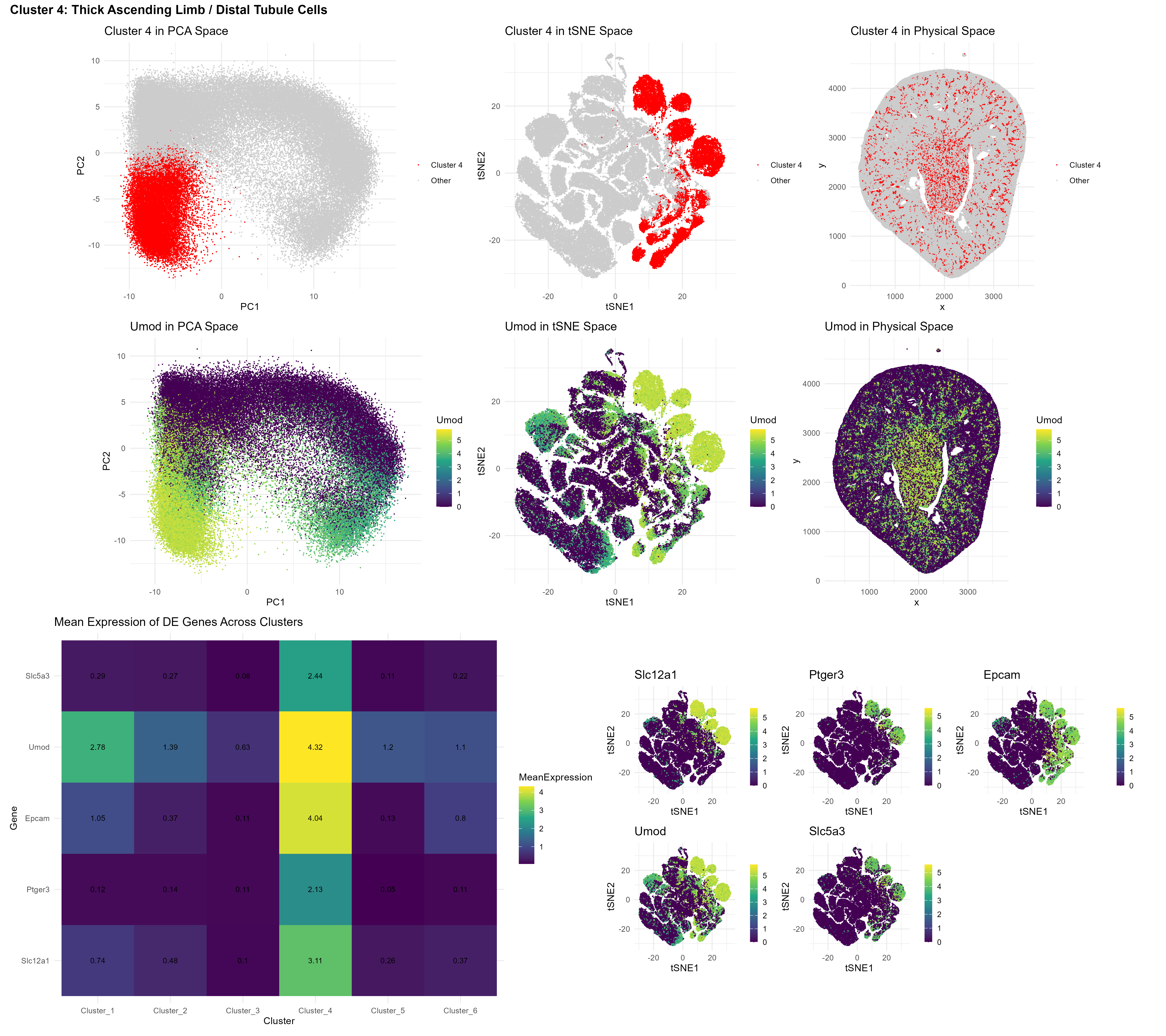
After clustering with K = 6, I examined the top upregulated genes within each cluster. I then specifically asked whether the marker genes identified in HW3 — Umod, Epcam, Slc12a1, Ptger3, and Slc5a3 — were strongly expressed in any of the Xenium clusters.
A heatmap of mean expression across clusters revealed a clear answer: Cluster 4 displayed markedly higher expression of all five marker genes relative to every other cluster.
The consistency was striking. Not just one marker. Not just partial enrichment. All five genes were strongly and coherently upregulated within the same cluster. This pattern strongly supports the conclusion that Cluster 4 in the Xenium dataset corresponds to the same thick ascending limb / distal tubule epithelial population previously identified in the Visium data.
This interpretation is further supported by biological context.
Umod (uromodulin) is highly specific to TAL cells.
Slc12a1 (NKCC2) encodes the primary sodium transporter of the TAL.
Epcam marks epithelial cell identity.
Finally, the multi-panel visualization reinforces this conclusion. In the top row, Cluster 4 is highlighted in PCA space, tSNE space, and physical tissue coordinates. In the middle row, Umod expression is displayed across the same three representations. The spatial and embedding-level overlap between Cluster 4 and Umod expression provides converging evidence that this cluster represents the TAL/distal tubule population. The bottom row displays a heatmap and feature plot grid displaying the previously identified differentially expressed genes in cluster 4.
Taken together, the clustering adjustments, dimensionality refinement, differential expression analysis, and spatial validation collectively confirm successful identification of the same cell type across two distinct spatial transcriptomics platforms.
References: Balzer MS, Rohacs T, Susztak K. How Many Cell Types Are in the Kidney and What Do They Do? Annu Rev Physiol. 2022 Feb 10;84:507-531. doi: 10.1146/annurev-physiol-052521-121841. Epub 2021 Nov 29. PMID: 34843404; PMCID: PMC9233501 Tang R, Meng T, Lin W, Shen C, Ooi JD, Eggenhuizen PJ, Jin P, Ding X, Chen J, Tang Y, Xiao Z, Ao X, Peng W, Zhou Q, Xiao P, Zhong Y, Xiao X. A Partial Picture of the Single-Cell Transcriptomics of Human IgA Nephropathy. Front Immunol. 2021 Apr 16;12:645988. doi: 10.3389/fimmu.2021.645988. PMID: 33936064; PMCID: PMC8085501 Park J, Shrestha R, Qiu C, Kondo A, Huang S, Werth M, Li M, Barasch J, Suszták K. Single-cell transcriptomics of the mouse kidney reveals potential cellular targets of kidney disease. Science. 2018 May 18;360(6390):758-763. doi: 10.1126/science.aar2131. Epub 2018 Apr 5. PMID: 29622724; PMCID: PMC6188645 Fendler A, Bauer D, Busch J, Jung K, Wulf-Goldenberg A, Kunz S, Song K, Myszczyszyn A, Elezkurtaj S, Erguen B, Jung S, Chen W, Birchmeier W. Inhibiting WNT and NOTCH in renal cancer stem cells and the implications for human patients. Nat Commun. 2020 Feb 17;11(1):929. doi: 10.1038/s41467-020-14700-7. PMID: 32066735; PMCID: PMC7026425 Wu H, et al. (2018). Comparative Analysis and Refinement of Human PSC-Derived Kidney Organoid Differentiation with Single-Cell Transcriptomics. JASN, 29(10), 2345–2360
- Code ``` setwd(“C:/Users/John-Paul/Documents/Doctoral_Doctor/PhD/LEARN/Gene_Data_Viz/genomic-data-visualization-2026”) data <- read.csv(gzfile(“data/Xenium-IRI-ShamR_matrix.csv.gz”)) dim(data) pos <- data[,c(‘x’, ‘y’)] rownames(pos) <- data[,1] gexp <- data[, 4:ncol(data)] rownames(gexp) <- data[,1] head(pos) gexp[1:5,1:5] dim(gexp)
normalize
totgexp = rowSums(gexp) mat <- log10(gexp/totgexp * 1e6 + 1) dim(mat)
pcs <- prcomp(mat, center=TRUE, scale=FALSE)
Scree plot for PCA
variance_explained <- pcs$sdev^2 / sum(pcs$sdev^2) * 100 plot(1:150, variance_explained[1:150], type = “b”, pch = 19, xlab = “Principal Component”, ylab = “% Variance Explained”, main = “PCA Scree Plot”)
Cumulative variance plot
cumvar <- cumsum(variance_explained) plot(1:150, cumvar[1:150], type = “b”, pch = 19, xlab = “Number of PCs”, ylab = “Cumulative % Variance Explained”, main = “Cumulative Variance Explained”) abline(h = 80, col = “red”, lty = 2) # 80% threshold line abline(h = 90, col = “blue”, lty = 2) # 90% threshold line
Find how many PCs to reach 80% and 90%
which(cumvar >= 80)[1] # PCs needed for 80% variance = 95 which(cumvar >= 90)[1] # PCs needed for 90% variance = 143
plot(pcs$sdev[1:95]) library(Rtsne)
tSNE
toppcs <- pcs$x[, 1:15]
what happens if we use more PCs?
tsne <- Rtsne::Rtsne(toppcs, dims=2, perplexity = 30)
emb <- tsne$Y rownames(emb) <- rownames(mat) colnames(emb) <- c(‘tSNE1’, ‘tSNE2’) head(emb)
Elbow method to determine optimal number of clusters
wss <- numeric() for (k in 1:15) { set.seed(123) wss[k] <- kmeans(pcs$x[, 1:15], centers = k)$tot.withinss } plot(1:15, wss, type = “b”, pch = 19, xlab = “Number of Clusters K”, ylab = “Total WSS”, main = “Elbow Method (on PCs)”)
set.seed(123) # Choose the number of clusters (try different values and use the elbow method) km <- kmeans(pcs$x[, 1:15], centers = 6) cluster <- as.factor(km$cluster) table(cluster)
Find Differentially expressed genes: DE genes per cluster (Wilcoxon test)
de_results <- list() for (cl in levels(cluster)) { in_cl <- cluster == cl pvals <- apply(mat, 2, function(g) wilcox.test(g[in_cl], g[!in_cl])$p.value) fc <- colMeans(mat[in_cl, ]) - colMeans(mat[!in_cl, ]) res <- data.frame(gene = names(pvals), p.adj = p.adjust(pvals, “BH”), log2fc = fc) de_results[[cl]] <- res[order(res$p.adj), ] }
Top 10 upregulated DE genes per cluster
for (cl in names(de_results)) { cat(“\n— Cluster”, cl, “—\n”) print(head(de_results[[cl]][de_results[[cl]]$log2fc > 0, ], 10)) }
Top 10 significant upregulated genes in cluster 4
cl <- de_results[[“4”]] cl4_up <- cl3[cl3$log2fc > 0 & cl3$p.adj < 0.05, ] head(cl4_up, 10)
library(ggplot2) library(patchwork)
df <- data.frame(pos, pcs$x[, 1:15], cluster, emb)
All clusters in PCA space
p_pca <- ggplot(df, aes(x = PC1, y = PC2, color = cluster)) + geom_point(size = 0.05) + labs(title = “Clusters in PCA Space”, color = “Cluster”) + theme_minimal() + coord_fixed()
All clusters in tSNE space
p_tsne <- ggplot(df, aes(x = tSNE1, y = tSNE2, color = cluster)) + geom_point(size = 0.05) + labs(title = “Clusters in tSNE Space”, color = “Cluster”) + theme_minimal() + coord_fixed()
All clusters in physical space
p_phys <- ggplot(df, aes(x = x, y = y, color = cluster)) + geom_point(size = 0.05) + labs(title = “Clusters in Physical Space”, color = “Cluster”) + theme_minimal() + coord_fixed()
| p_pca | p_tsne | p_phys |
Check mean expression of these genes across all clusters
genes_of_interest <- c(“Slc12a1”, “Ptger3”, “Epcam”, “Umod”, “Slc5a3”)
Mean expression per cluster
cluster_means <- sapply(levels(cluster), function(cl) { colMeans(mat[cluster == cl, genes_of_interest]) }) colnames(cluster_means) <- paste0(“Cluster_”, levels(cluster)) round(cluster_means, 3)
Heatmap visualization
library(reshape2) library(ggplot2) df_hm <- melt(cluster_means) colnames(df_hm) <- c(“Gene”, “Cluster”, “MeanExpression”)
p8 <- ggplot(df_hm, aes(x = Cluster, y = Gene, fill = MeanExpression)) + geom_tile() + scale_fill_viridis_c() + geom_text(aes(label = round(MeanExpression, 2)), size = 3) + labs(title = “Mean Expression of DE Genes Across Clusters”) + theme_minimal()
Cluster 4 visualization
cluster_of_interest <- 4 in_cluster <- cluster == cluster_of_interest df$Group <- ifelse(cluster == cluster_of_interest, “Cluster 4”, “Other”)
p1 <- ggplot(df, aes(x = PC1, y = PC2, color = Group)) + geom_point(size = 0.05) + scale_color_manual(values = c(“Other” = “grey80”, “Cluster 4” = “red”)) + labs(title = “Cluster 4 in PCA Space”, color = “”) + theme_minimal() + coord_fixed()
p2 <- ggplot(df, aes(x = tSNE1, y = tSNE2, color = Group)) + geom_point(size = 0.05) + scale_color_manual(values = c(“Other” = “grey80”, “Cluster 4” = “red”)) + labs(title = “Cluster 4 in tSNE Space”, color = “”) + theme_minimal() + coord_fixed()
p3 <- ggplot(df, aes(x = x, y = y, color = Group)) + geom_point(size = 0.05) + scale_color_manual(values = c(“Other” = “grey80”, “Cluster 4” = “red”)) + labs(title = “Cluster 4 in Physical Space”, color = “”) + theme_minimal() + coord_fixed()
| p1 | p2 | p3 |
Umod visualization
df$Umod <- as.numeric(mat[, “Umod”])
p4 <- ggplot(df, aes(x = PC1, y = PC2, color = Umod)) + geom_point(size = 0.05) + scale_color_viridis_c() + labs(title = “Umod in PCA Space”, color = “Umod”) + theme_minimal() + coord_fixed()
p5 <- ggplot(df, aes(x = tSNE1, y = tSNE2, color = Umod)) + geom_point(size = 0.05) + scale_color_viridis_c() + labs(title = “Umod in tSNE Space”, color = “Umod”) + theme_minimal() + coord_fixed()
p6 <- ggplot(df, aes(x = x, y = y, color = Umod)) + geom_point(size = 0.05) + scale_color_viridis_c() + labs(title = “Umod in Physical Space”, color = “Umod”) + theme_minimal() + coord_fixed()
| p4 | p5 | p6 |
Feature plot grid
plots <- lapply(genes_of_interest, function(g) { df$gene_exp <- mat[, g] ggplot(df, aes(x = tSNE1, y = tSNE2, color = gene_exp)) + geom_point(size = 0.05) + scale_color_viridis_c() + labs(title = g, color = “”) + theme_minimal() + coord_fixed() + theme(legend.key.width = unit(0.3, “cm”)) }) p7 <- wrap_plots(plots, ncol = 3)
layout <- (p1 | p2 | p3) / (p4 | p5 | p6) / (p8 | p7) + plot_layout(heights = c(1, 1, 1.5))
layout + plot_annotation( title = “Cluster 4: Thick Ascending Limb / Distal Tubule Cells”, theme = theme(plot.title = element_text(size = 14, face = “bold”)) ) ggsave(“hw4_jakinba1.png”, width = 15, height = 8, units = “in”, dpi = 300) ```
(I used AI prompts to optimize the feature plot grid, heatmap, finding my genes of interest, and finding the differentially expressed genes across all clusters)